I love a good graph or chart. It’s truly fascinating to see someone break down a ton of data and fit it efficiently into an infographic I, an idiot, can understand.
Keep kicking ass, nerds.
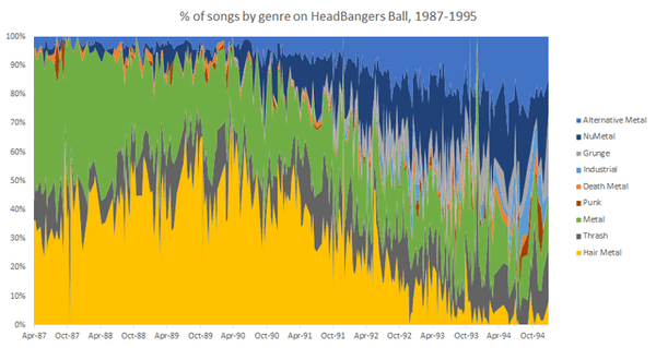
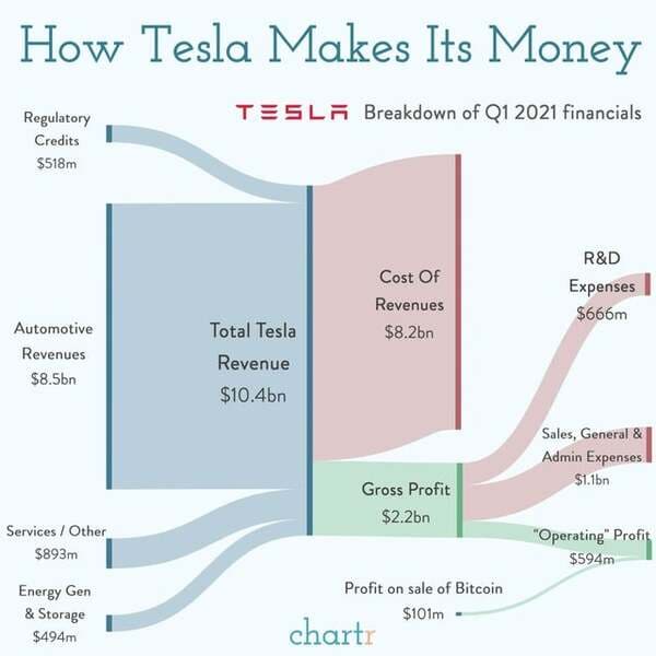
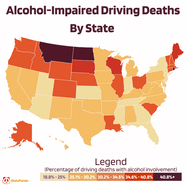
1.
2.
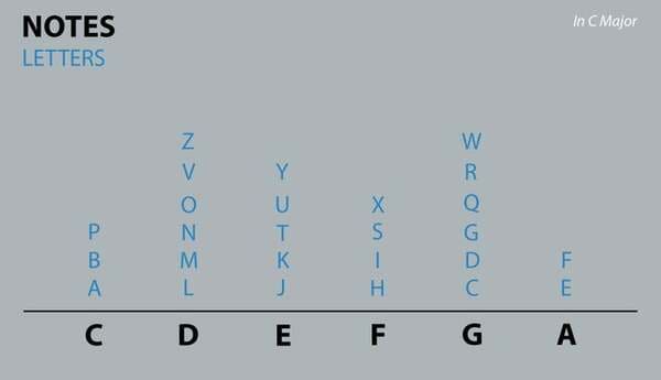
3. English alphabet organized by each letter’s note in ABC song.
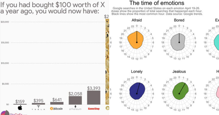
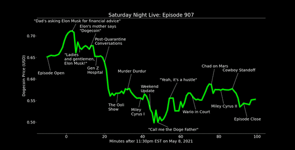
4. Price of Dogecoin during Elon Musk’s appearance on SNL
5.

6.
7.
8.

9.
10.
11.
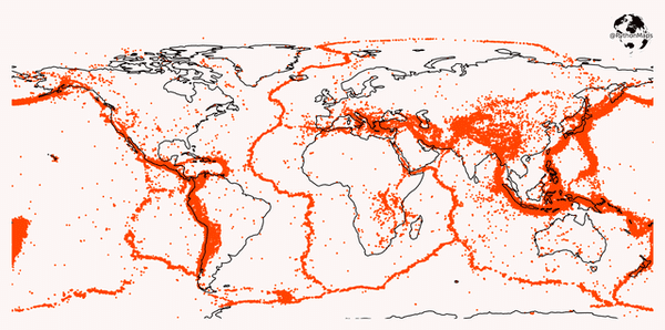
12. This map shows all of the earthquakes with a magnitude greater than 5.0 over the last 20 years.
13.
14.

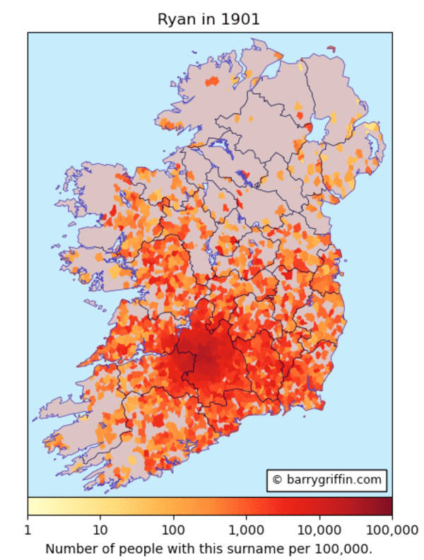
15. Distribution of the surname Ryan according to the 1901 census of Ireland
16.

17.
18.

19. Where are the world’s airports? This map shows the locations of the world’s airports and heliports.
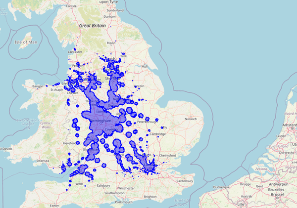
20. Isochrone map of areas reachable by rail/foot within two hours from Birmingham New Street Station.
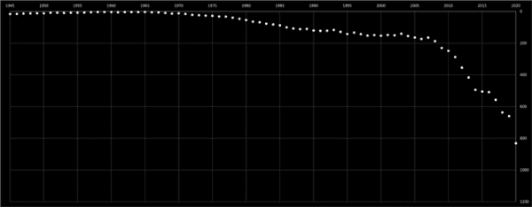
21. Karen baby name ranking 1945-2020
22.
23.