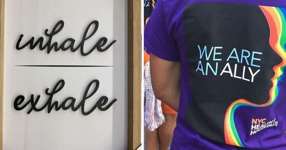
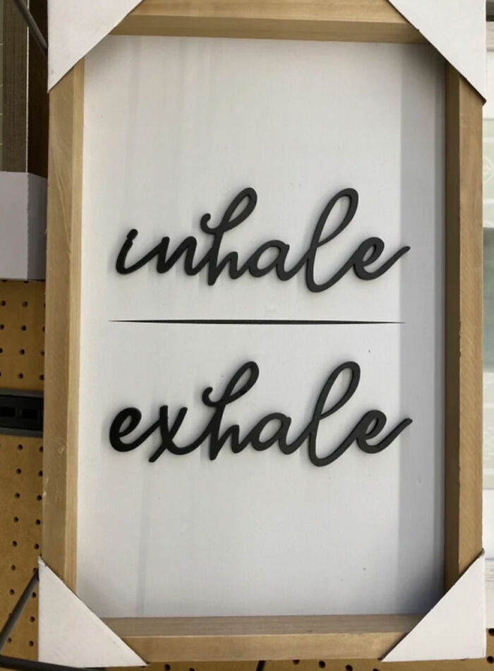
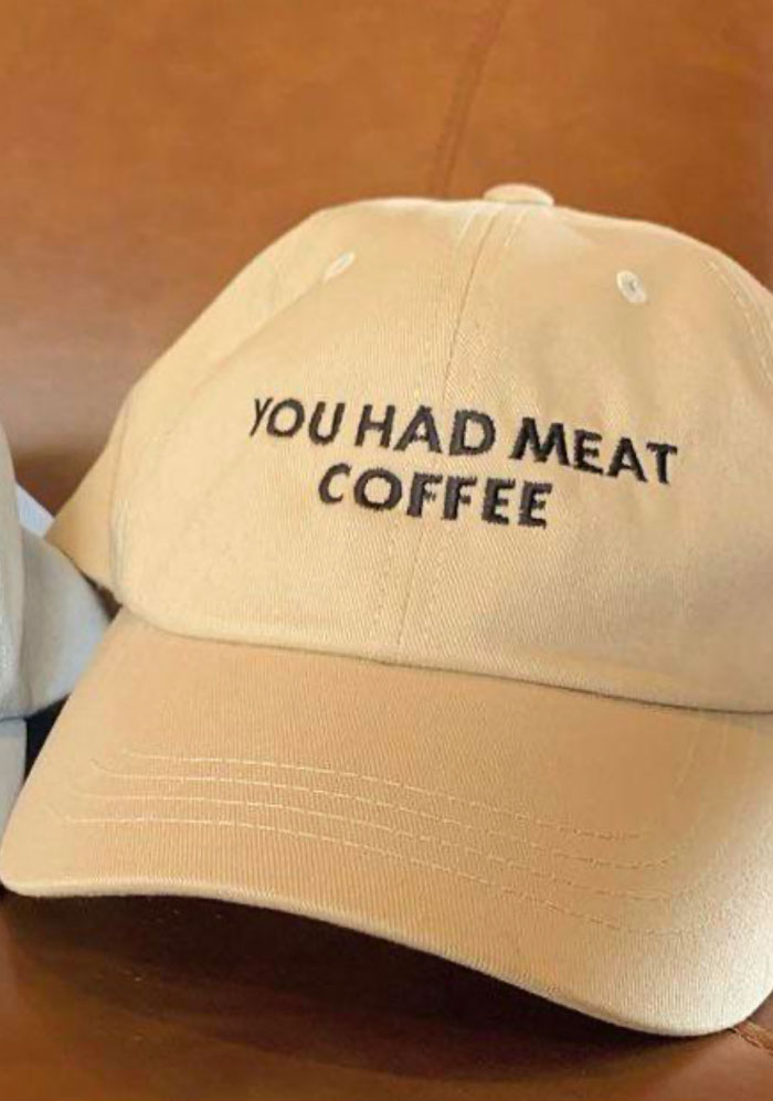
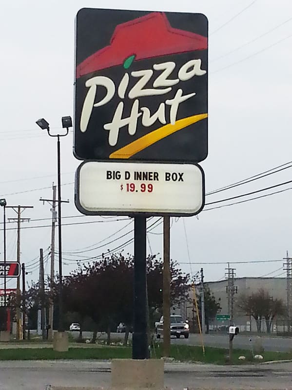
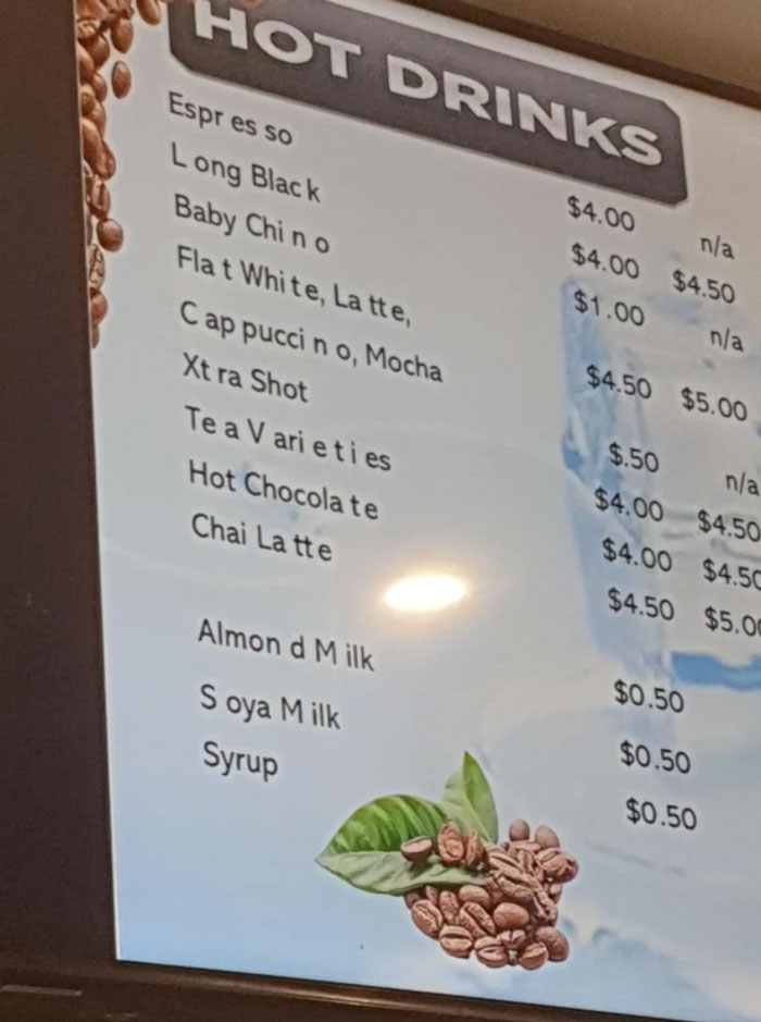
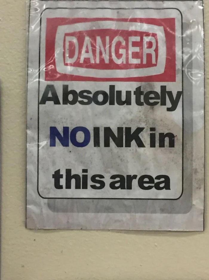
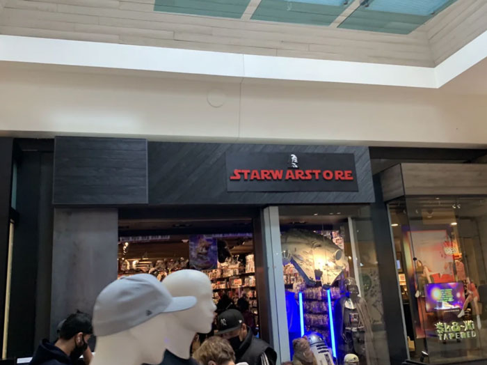
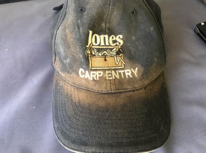
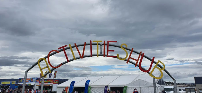
There’s a term for the typographical practice of inserting adequate space between letters, and that’s kerning.
Typically talked about in the world of design, I think everyone should know how important kerning is and consider the spacing between letters in design or even if you’re just writing something.
You’d be surprised to see how often bad letter spacing can change the meaning of a sentence. It could be a complete accident, or maybe someone is having a little fun with it.
1. Whale Emoji?
2.
3.
4.
5.

6.
7.
8.
9.
10.
11.
12.
13.
14.
15.
16.
17.
18.
19.
20.
21.
22.
23.

24.
25.
26.
27.
28. “BLT (with) cheese”
29.
30.
31.
32.
33.
34.

35.
36.
37.
38.
39.
40.
41.
42.
43.
44.
45.