These Maps Aren’t Helpful Unless You’re Looking For A Laugh (25 Pics)
I’m a big fan of Mike’s “There’s A Map For That” post, but not all maps are actually useful. So when I discovered Terrible Maps on Twitter I had to do a post about it. It’s a neverending compilation of maps that are so bad they’re actually good.
Follow Terrible Maps: Instagram | Twitter | Website
1.
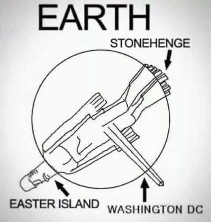
2.
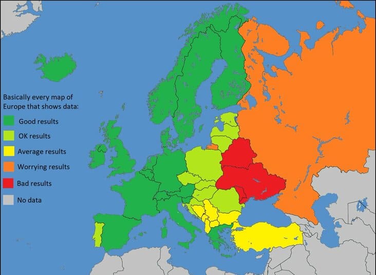
3. “Basically every data map of Europe”
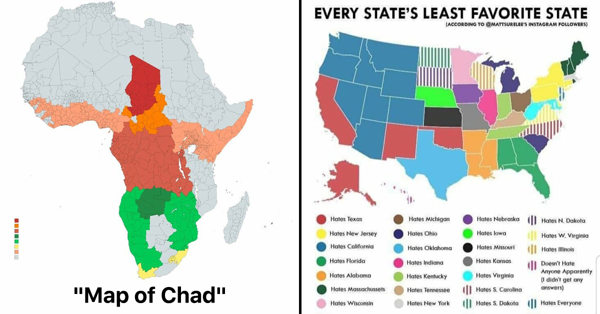
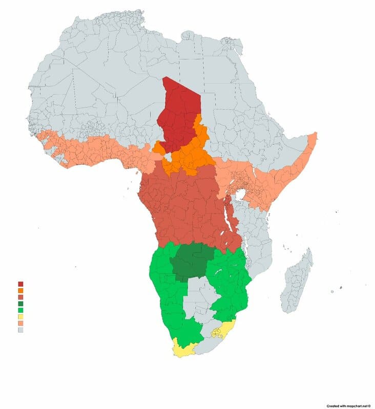
4. “Map of Chad”
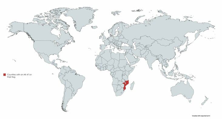
5. “Countries with an AK-47 on their flag”
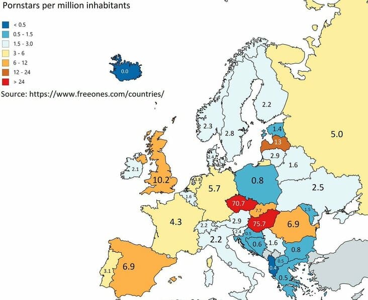
6. “Pornstars per million inhabitants”
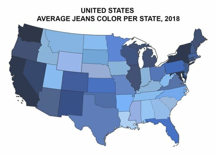
7. “Average jeans colour per US state”
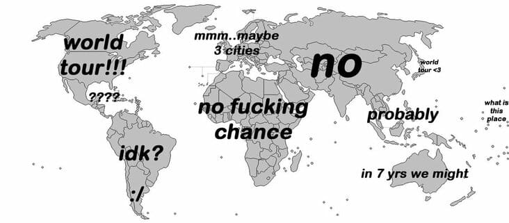
8. “When a band announces a world tour”
9. “Duck”
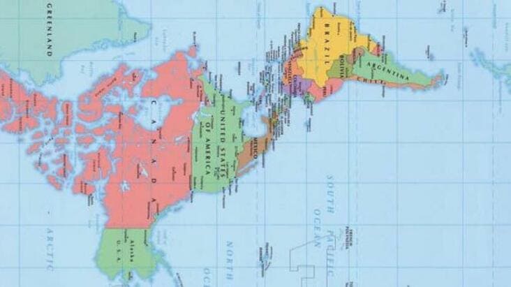
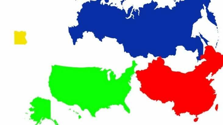
10. “Egypt is smaller than the United States, Russia and China combined”
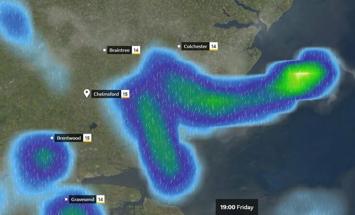
11. “It’s raining very hard in the UK right now”
12. “More people live in the green area than the blue area”
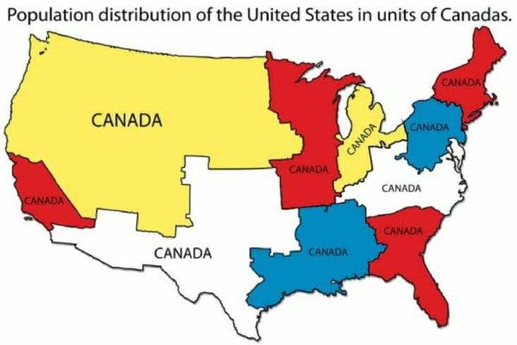
13. “Population distribution of the United States in units of Canadas”
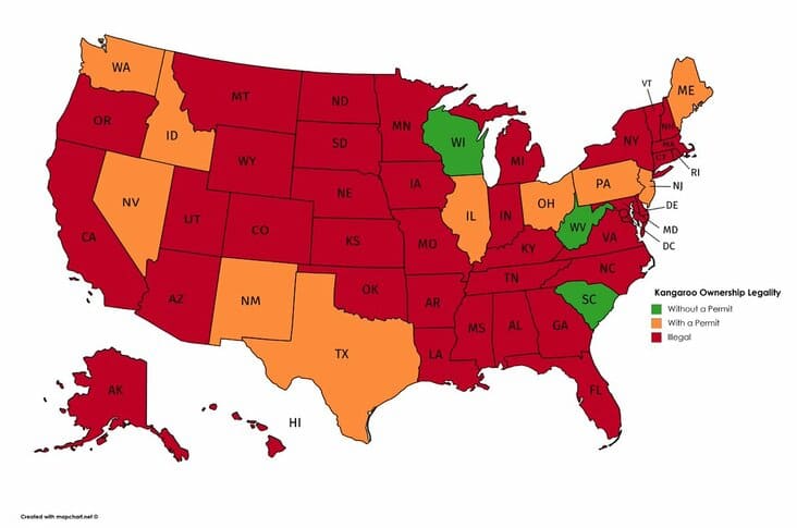
14. “The legality of owning a kangaroo in the United States”
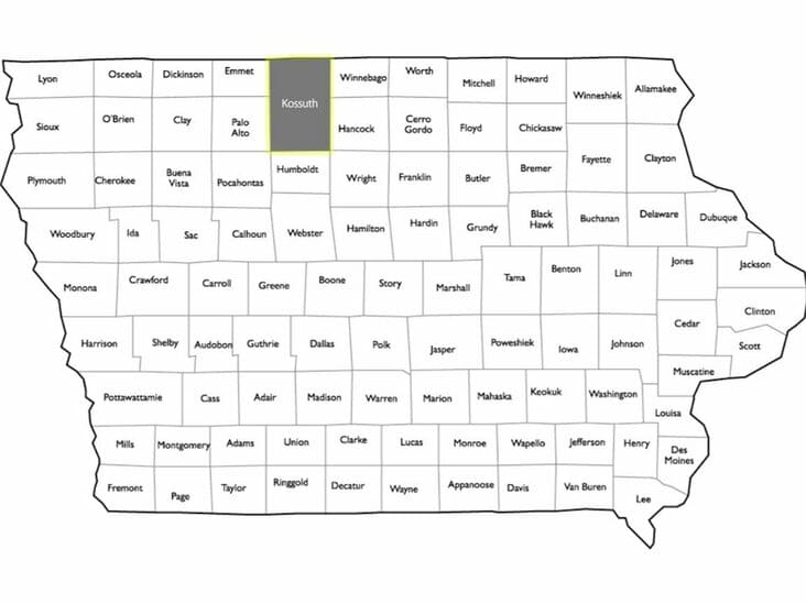
15. “Iowa has 99 counties. It could have an even 100 if not for this monstrosity”
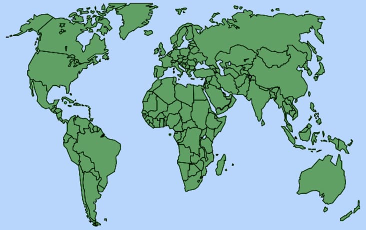
16. “World map according to fish”
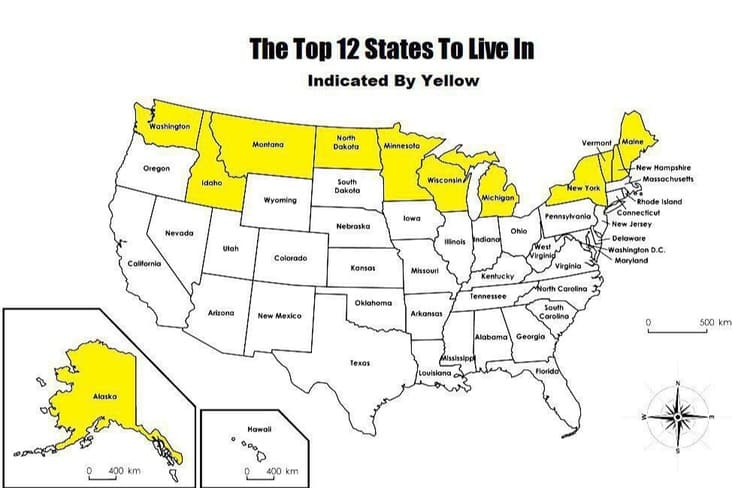
17. “The top 12 states to live in”
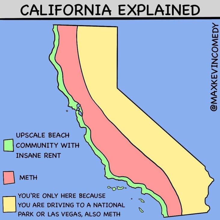
18. “California explained”
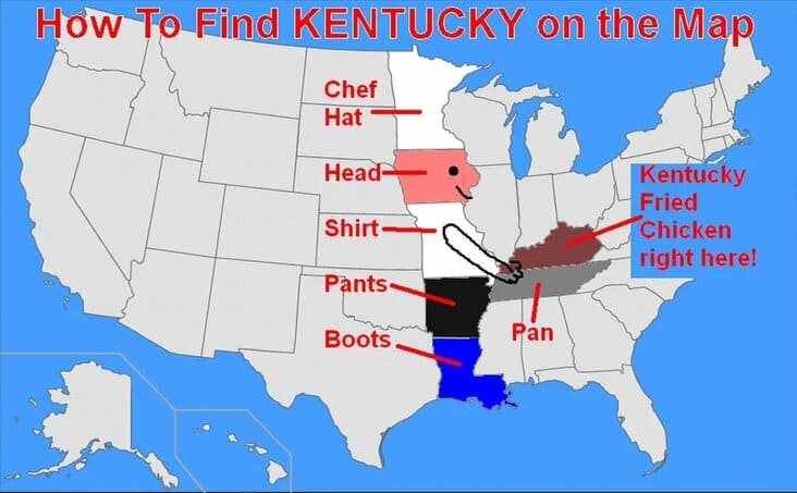
19. “How to find Kentucky on the map”
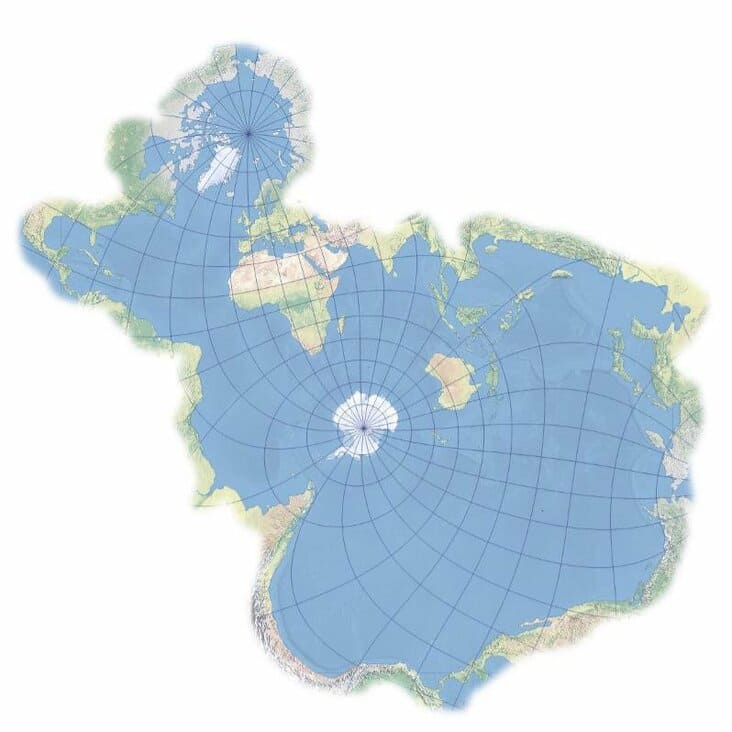
20. “Antarctica, the confusing continent.”
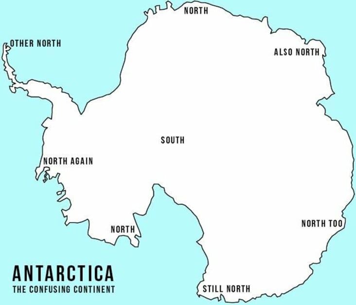
21. “Map of Africa using orange peel”
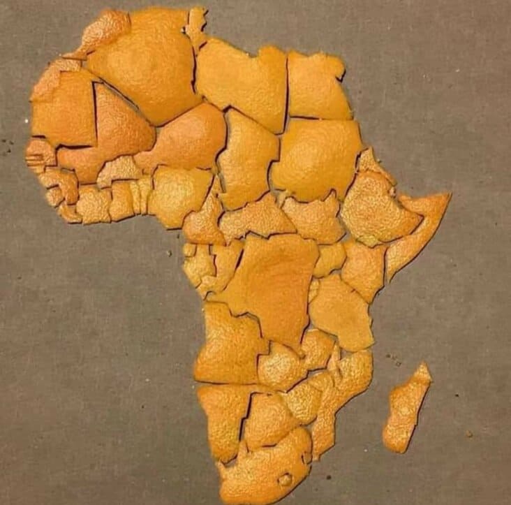
22. “How to create a T-Rex”
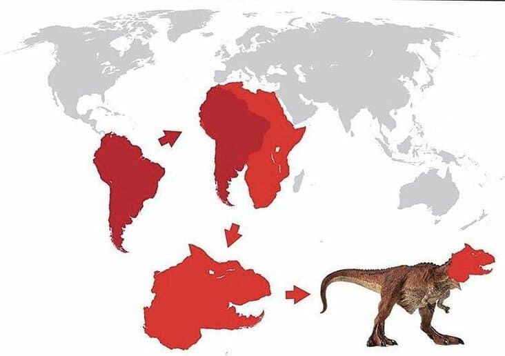
23. “Every state’s least favourite state”
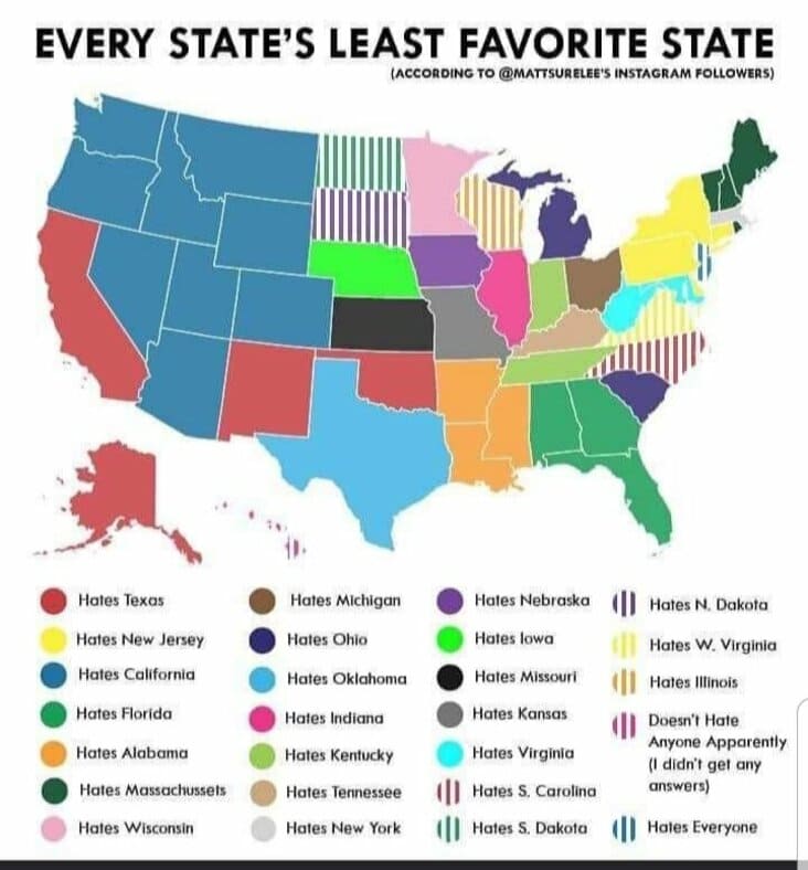
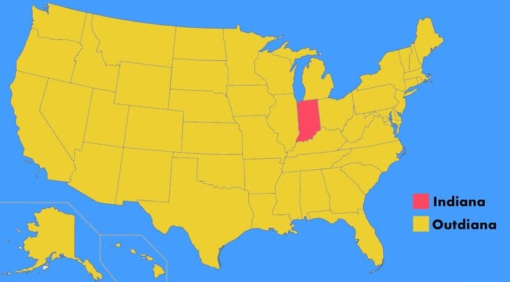
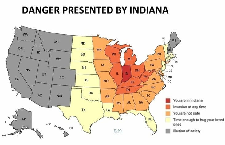
24. “Danger presented by Indiana”
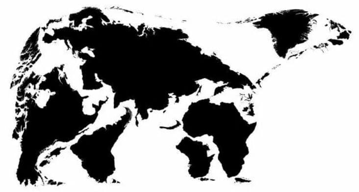
25. “Map of the Earth if it was a bear”
More Pics & Tweets:
- Hilarious 1-Star Amazon Movie Reviews That Deserve 5 Stars Themselves (25 Tweets)
- I May Need Someone To Explain These Photos To Me (31 Pics)
- “What’s A Tweet You Think About Randomly And Laugh Every Time?” (40 Tweets)
- Oof, That Is Unfortunate (27 Pics)
- Tricks For Appearing Smart In Meetings (22 Pics)

