Data Is Beautiful (21 Charts & Graphs)
I love a good graph or chart. It’s truly fascinating to see someone break down a ton of data and fit it efficiently into an infographic I, an idiot, can understand. Keep kicking ass, nerds.
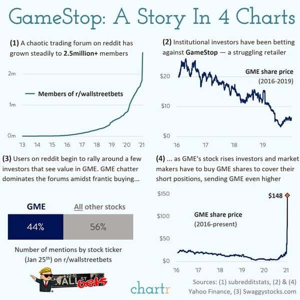
1. What’s going on with GameStop in 4 charts.
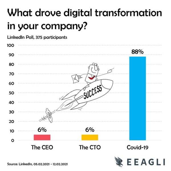
2. I ran a quick poll last week on digital transformation.
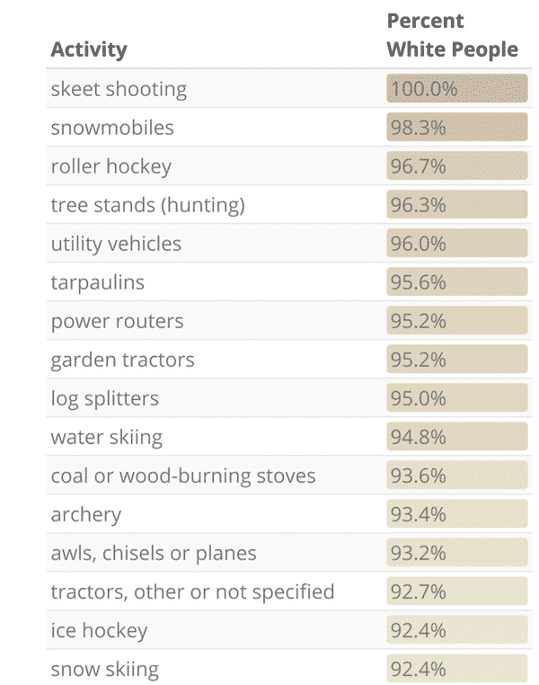
3. “Whitest” Injuries: Percentage of Individuals who went to the ER for a given activity who reported as White
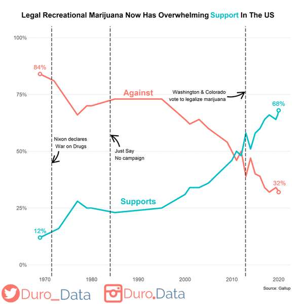
4. Recreational marijuana legalization now has support from over two-thirds of the American public.
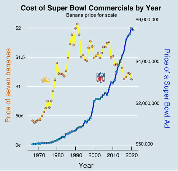
5. Cost of a 30-second Super Bowl commercial by year (bananas for scale)
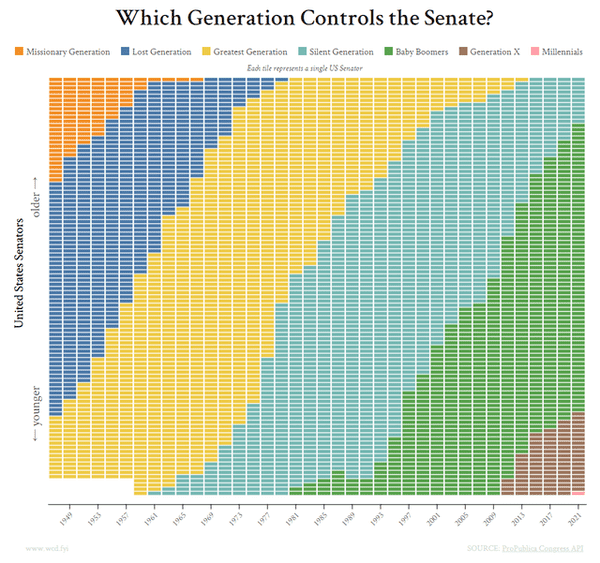
6. Which Generation Controls the Senate?
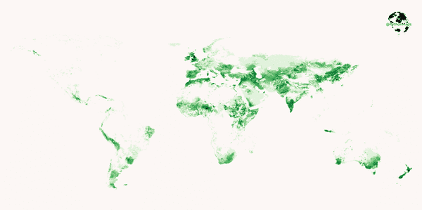
7. Where do the world’s ~1 billion sheep live?
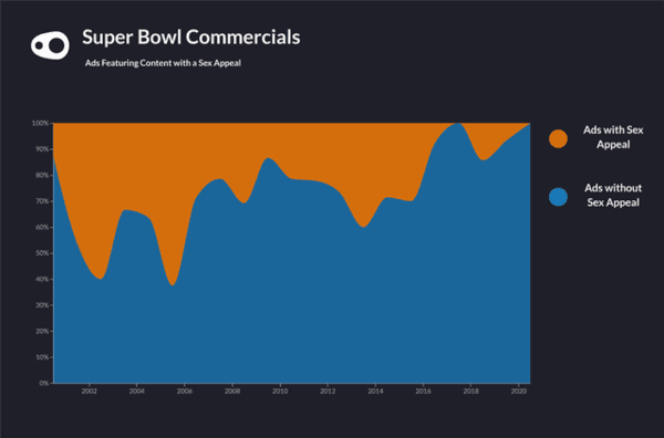
8. Super Bowl Ads: The use of sex as a selling device has almost been wiped out!
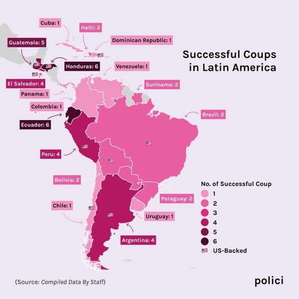
9. History and success of Coups and US involvement in the past.
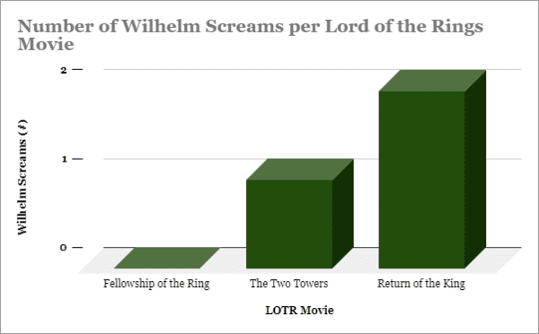
10. Number of Wilhelm Screams per Lord of the Rings Movie
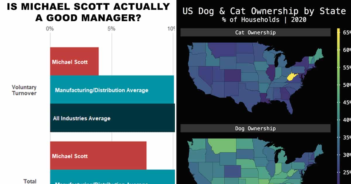
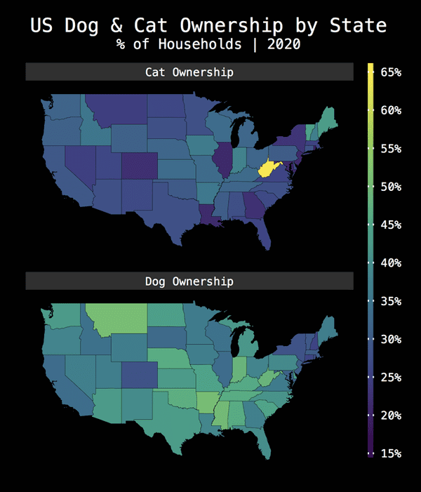
11. US Dog & Cat Ownership by State
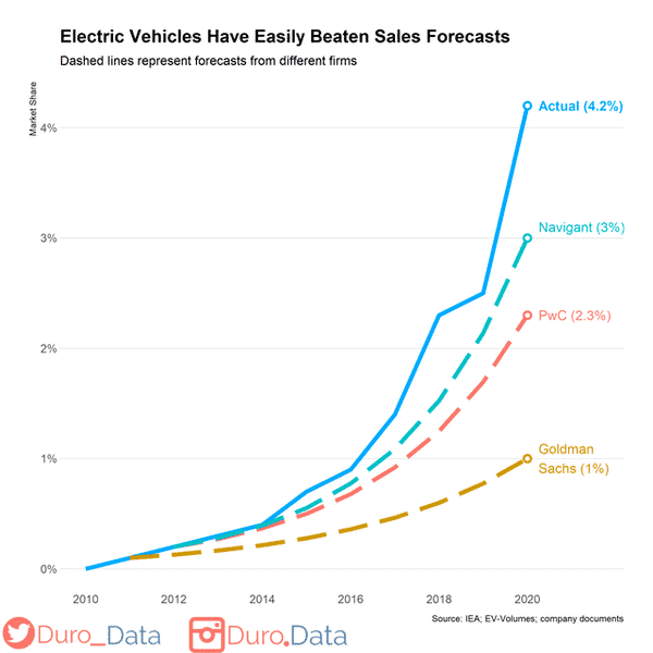
12. Electric vehicles have easily beaten sales forecasts over the past ten years.
13. US State Contribution to National GDP

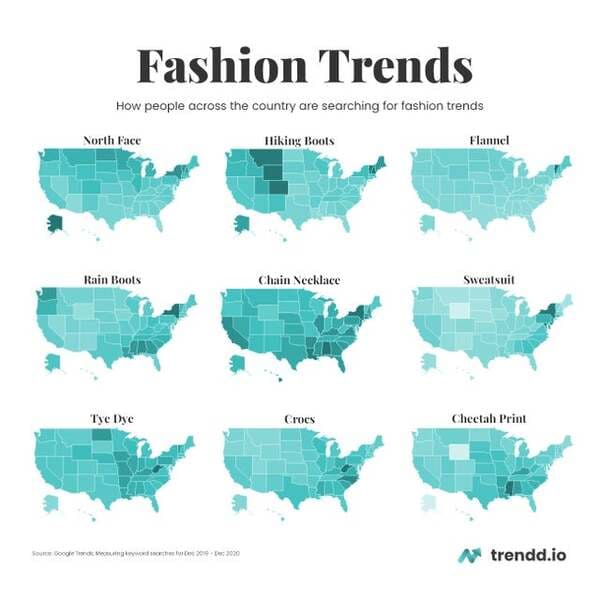
14. Fashion Trends according to Google
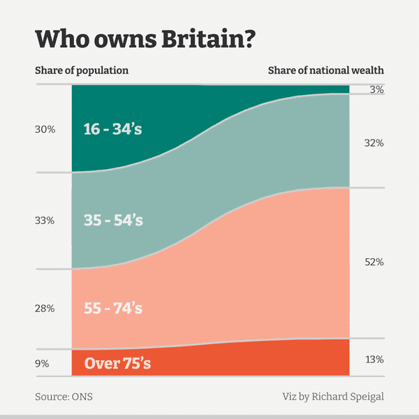
15. British wealth by age group.
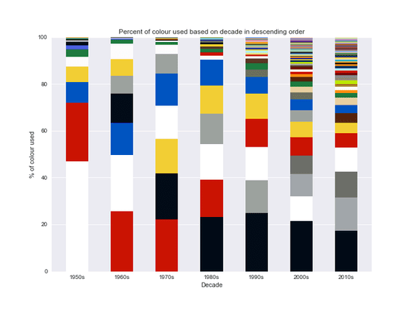
16. Percentage of colors used by LEGO each decade – Inspired from Carron, J. (2016). 67 Years of Lego Sets
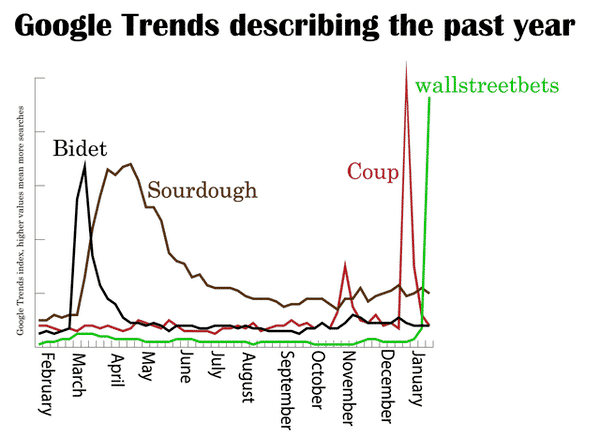
17. From bidets to wallstreetbets, this has been an interesting 12 months
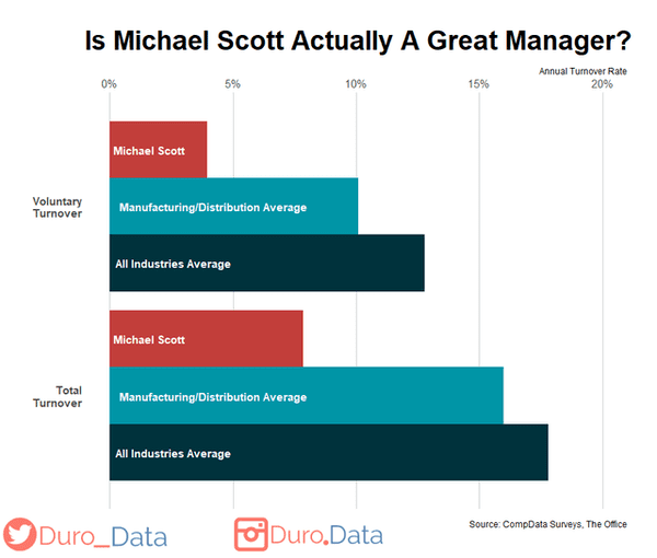
18. Michael Scott (from The Office) achieved substantially better turnover rates than the industry average
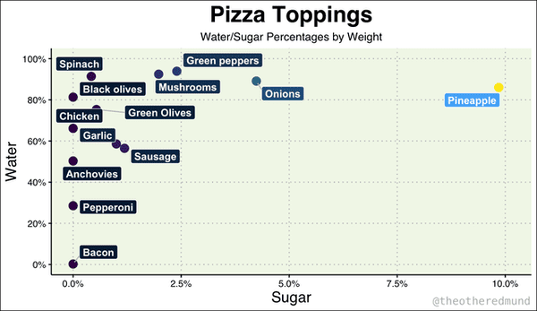
19. Pizza Toppings: One Is Not Like the Others
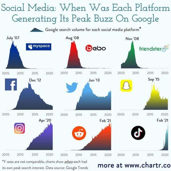
20. When Each Social Media Platform Was Generating Its Peak “Buzz” On Google
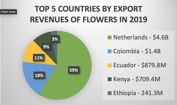
21. Top 5 Countries By Export Revenues of Flowers
