Data Is Beautiful (16 Charts & Graphs)
I love a good graph or chart. It’s truly fascinating to see someone break down a ton of data and fit it efficiently into an infographic I, an idiot, can understand. Keep kicking ass, nerds.
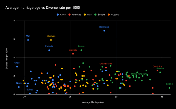
1. Average age of first marriage has little to no effect on divorce rates worldwide.
2. Colors used in paintings.

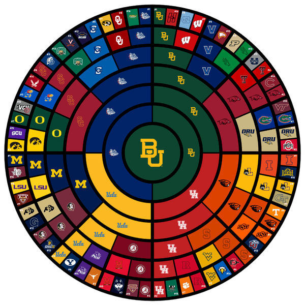
3. Circle Bracket of the 2021 NCAA Men’s March Madness Tournament
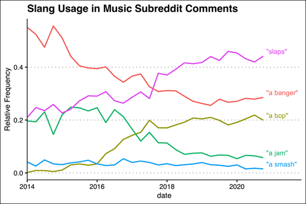
4. What the Kids are Saying: Slang Usage in Music Subreddits
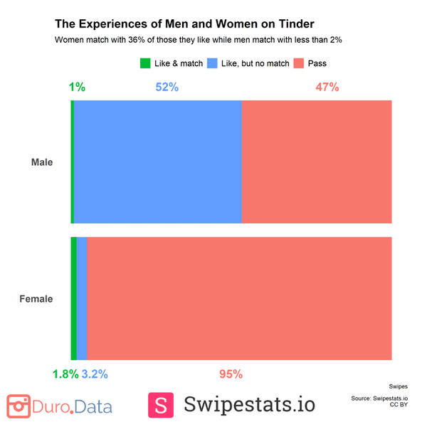
5. Despite being far more selective, women still match more frequently than men on Tinder.
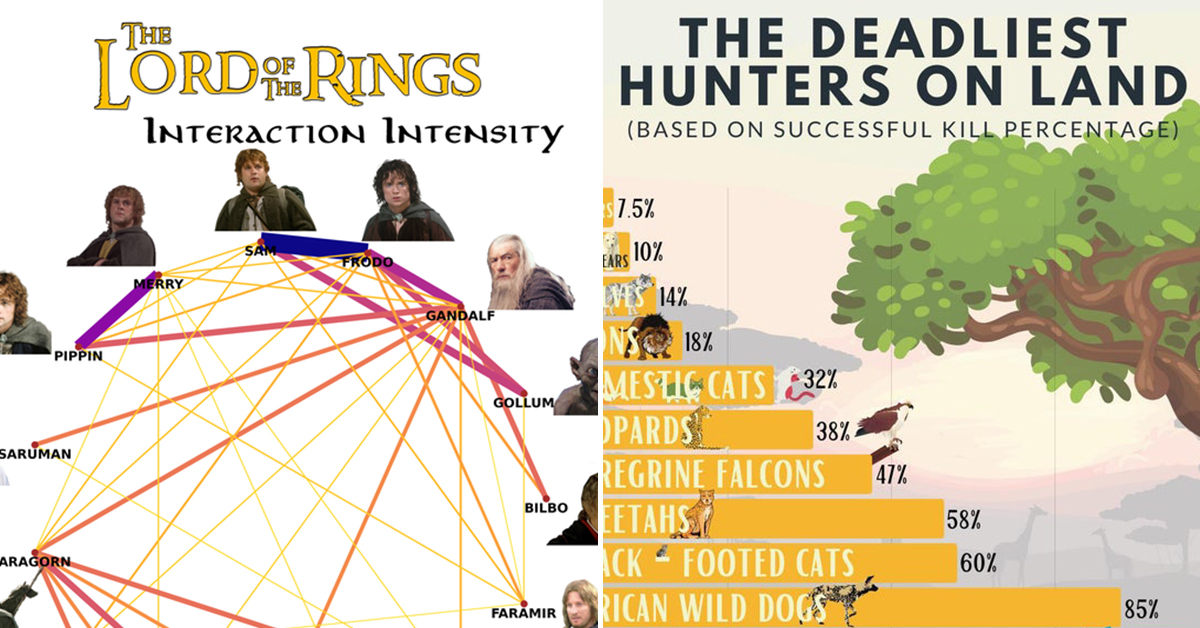
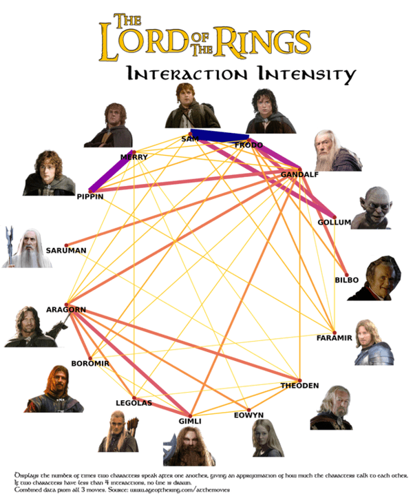
6. Interaction Intensity in Lord Of The Rings
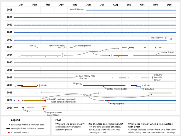
7. 13 years of my dating history as a straight woman (ages 19 to 32) in a large American city
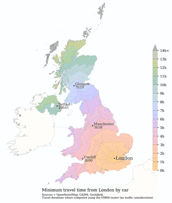
8. Minimum travel time from London by car.
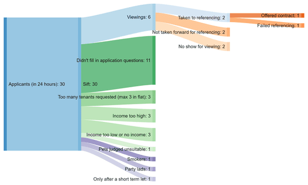
9. Letting a property – Landlord’s process
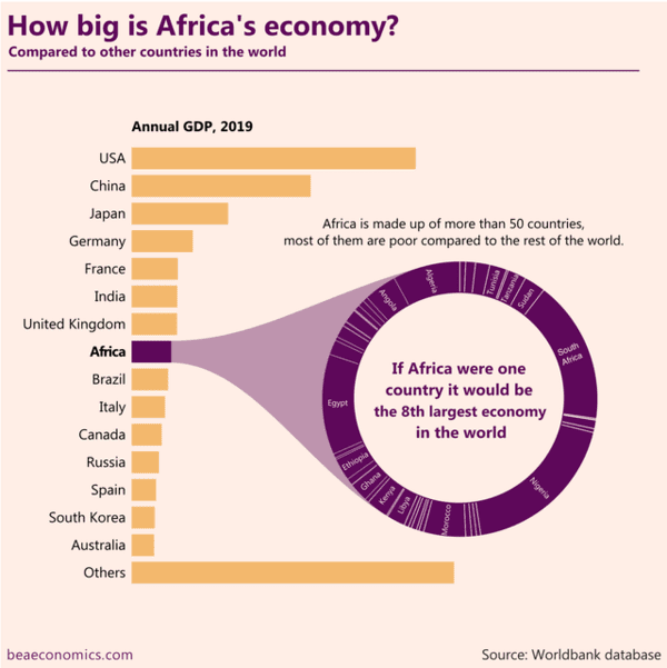
10. How big is Africa’s economy?
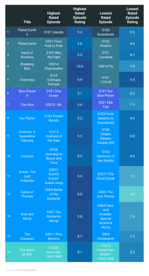
11. Highest and Lowest Rated Episodes of the TOP 10 TV Series (ranked by IMDb)
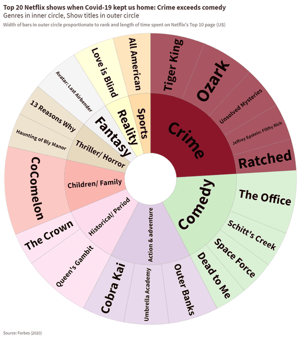
12. Top 20 Netflix shows while Covid-19 kept us home (2020)
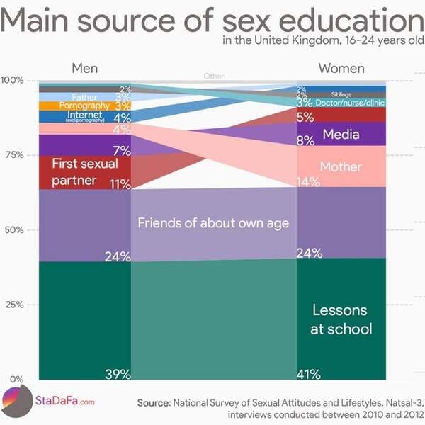
13. Main source of sex education for men and women.
14. The Deadliest Hunters On Land

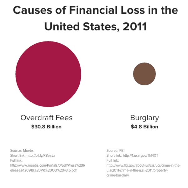
15. Causes of Financial Loss in the USA, 2011
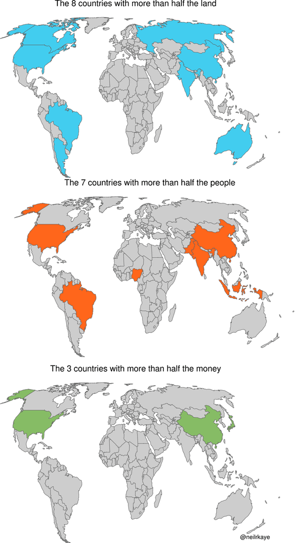
16. Fewest countries with more than half the land, people, and money.