These Illuminating Infographics Can Show You A Lot With Very Little (23 Pics)
I love a good graph or chart. It’s truly fascinating to see someone break down a ton of data and fit it efficiently into an infographic I, an idiot, can understand.
With attention spans shorter than ever in human history, infographics may be the way to go. Jam all of human knowledge into little squares with pictures and numbers.
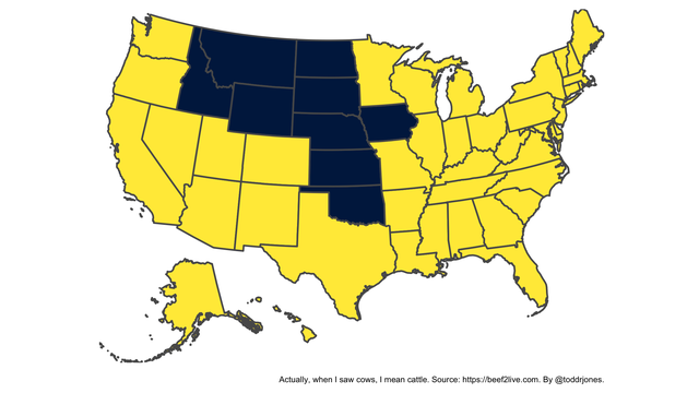
1. There are more cows than people in the states colored blue.
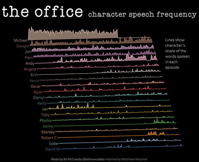
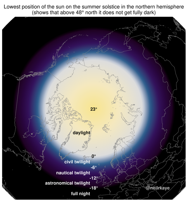
2.
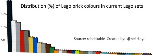
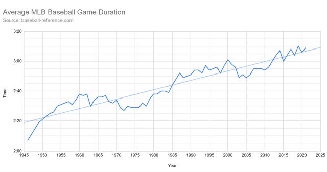
3.
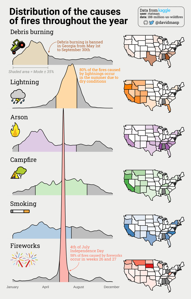
4.

5.
6.
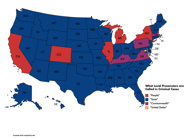
7. What the Prosecution is Called in the Different States
8.
9.
10.
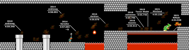
11. Super Mario Bros. Speedrun World Record Progression (2010-2021)
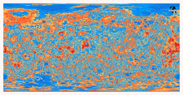
12. What would a wet Mercury look like? This is a topographical map that shows Mercury with an ocean covering ~70% of the surface.
13.
14.
15.
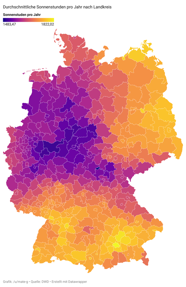
16. Average yearly sunshine hours of Germany.
17.
18.
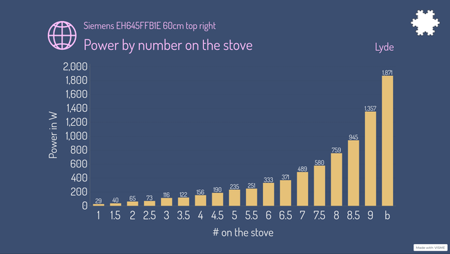
19. The power of my stovetop rises almost exponentially.
20. Number of Miss Americas by U.S. State

21.
22.
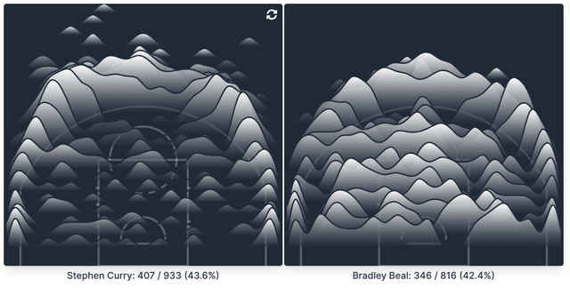
23. Every jump shot from the two leading scorers in the NBA this year, visualized.