These Poorly Designed Signs Are More Confusing Than Helpful (25 Pics)
We’ve seen a lot of crappy designs but these signs are so poorly designed, they’re actually hilarious. A good sign should convey a clear message to the person reading it. It should be easy to understand and designed in such a way that makes it obvious.
Take the stop sign, for example. It’s universally recognizable and sends a clear message. Unlike these poorly designed signs that people are sharing online.
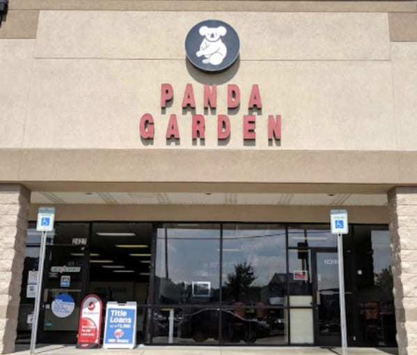
1. “A beautiful image of a panda on this sign”
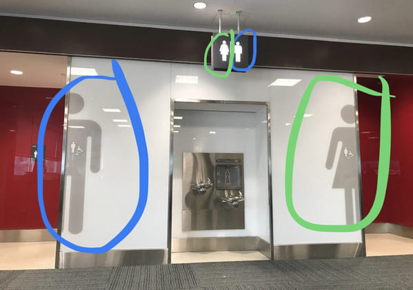
2. “Just watched a guy go into the wrong bathroom at Toronto Pearson Airport. He was looking at the top sign.”
3. “It’s Pretty Good Advice”
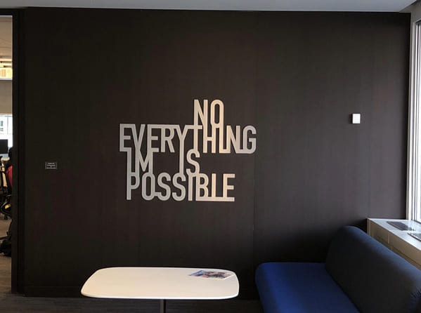
4. “This new wall art in my office.”
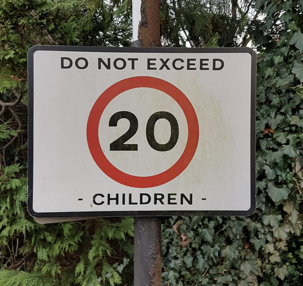
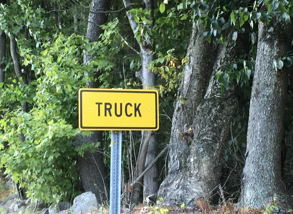
5. “Trying to figure out what this sign means for the past 5 years”
6. “You’re gonna pay for that free coffee, aren’t you?”

7. “I mean it’s self-explanatory and they failed.”
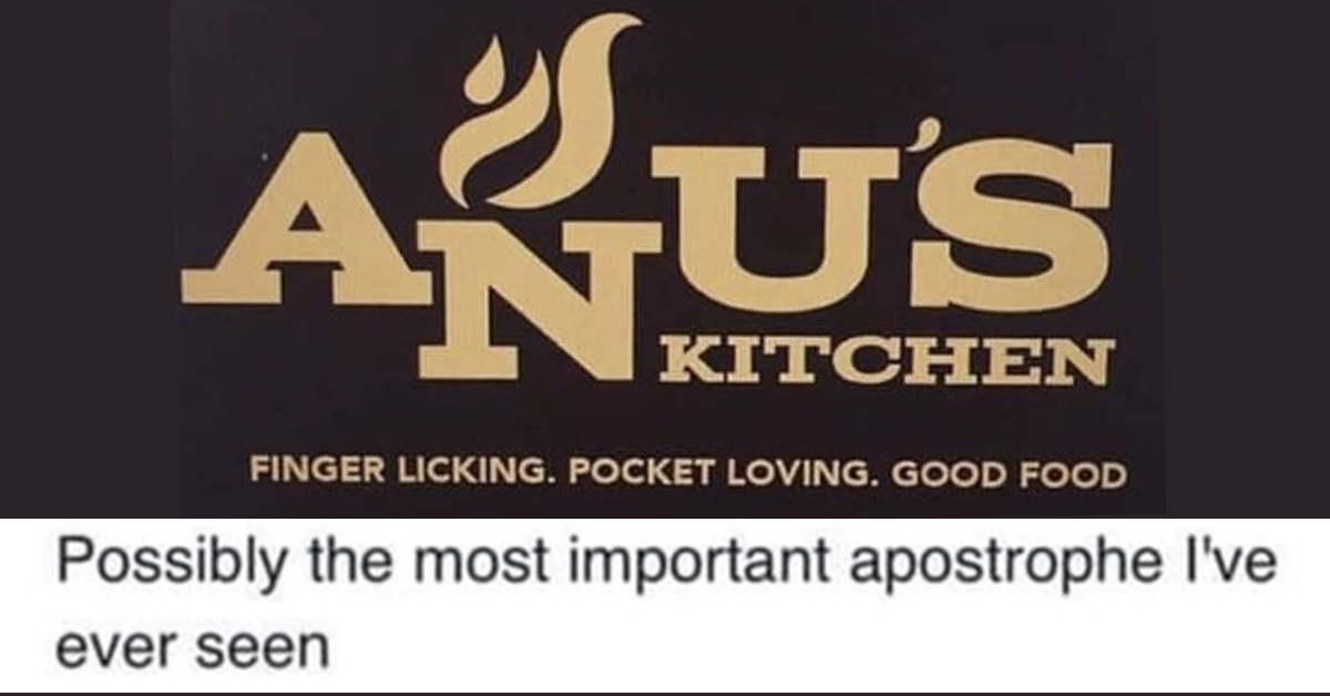
8. “Should PROBABLY put a little more emphasis on the apostrophe.”

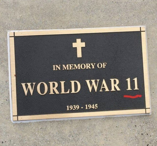
9. “I guess my world history class skipped quite a bit”
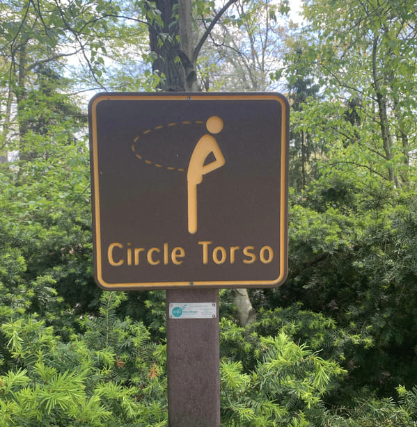
10. “This sign at the Akron Zoo looks like a man peeing in his own face.”
11. “Actually, on second thought, I’m not so hungry”
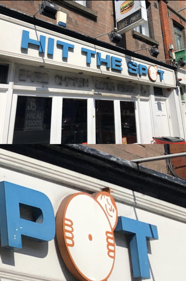
12. “EXPERIENCE”

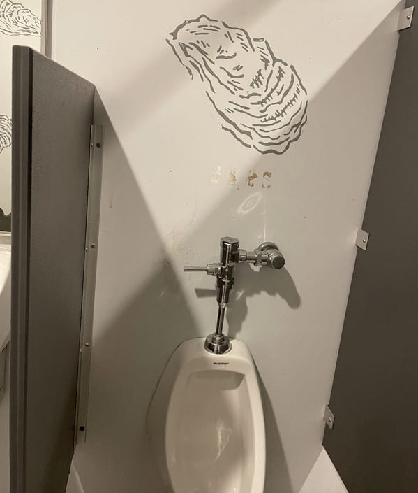
13. “I think it’s supposed to be an oyster – they were all over the bathroom”
14. “I’ve been going past this sign for at least 5 years and have yet to figure out its meaning”
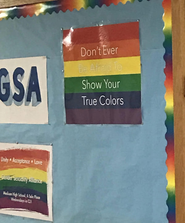
15. “At first glance, the white lettering on this Pride poster at my high school blends in with the yellow background. Changes the meaning drastically.”
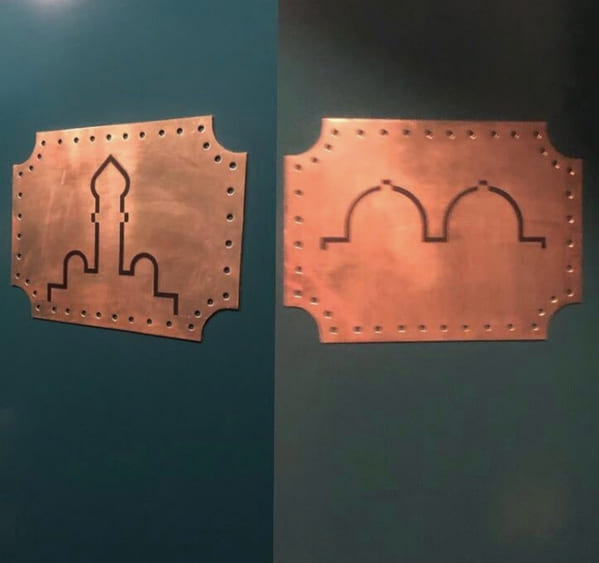
16. “Bathroom signs at an Indian restaurant in Madrid”
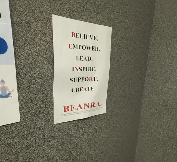
17. “This acronym for some student association plastered all over the college”
18. “low sodium”

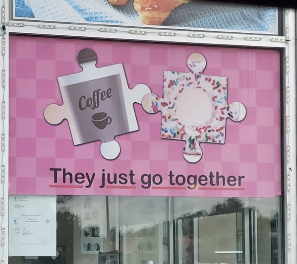
19. “They just don’t go together.”
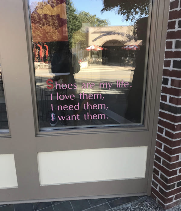
20. “The ‘S’ is a little hard to see from a distance”
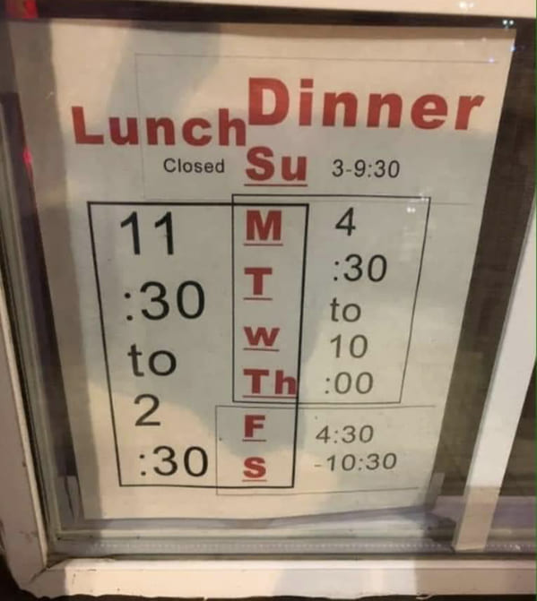
21. “I’d like to eat here. Unsure when is ok.”
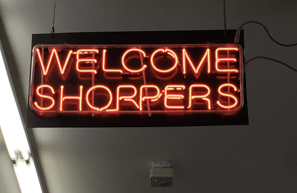
22. “Welcome Shorpers”
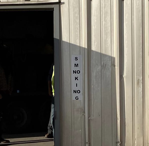
23. “This Sign SMNOKINOG”
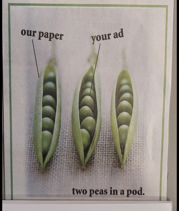
24. “The marketing for the local newspaper doesn’t quite understand the idiom.”
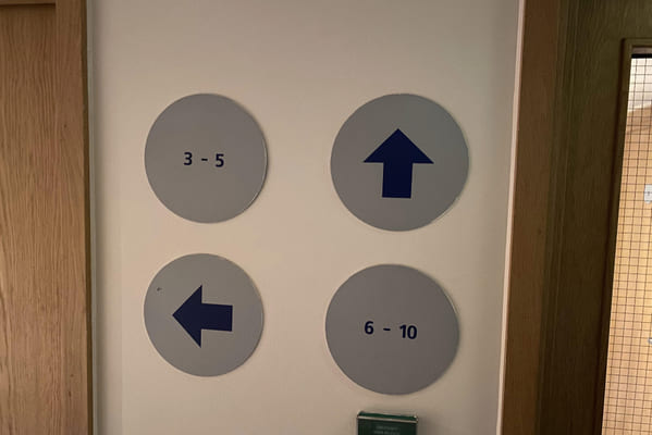
25. “So which way is room 10?”