Data Is Beautiful (21 Charts & Graphs)
I love a good graph or chart. It’s truly fascinating to see someone break down a ton of data and fit it efficiently into an infographic I, an idiot, can understand.
Keep kicking ass, nerds.
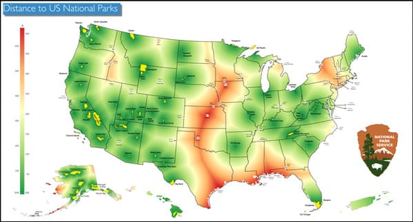
1. Farthest US Towns from a National Park.
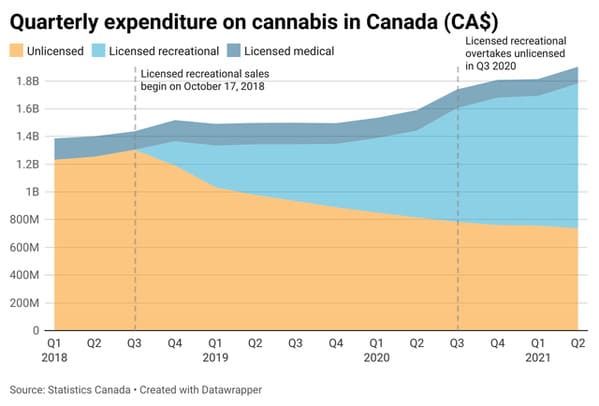
2. Quarterly expenditure on cannabis in Canada.
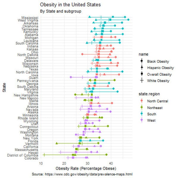
3. Obesity rate by state.
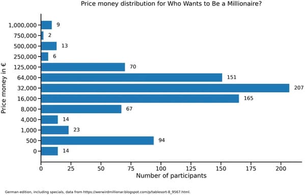
4. Price money distribution for Who Wants To Be A Millionaire (German edition).
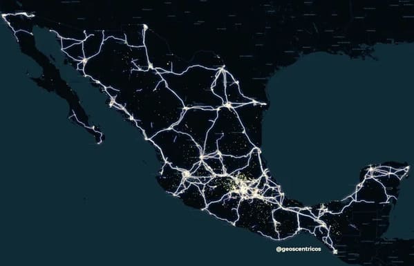
5. Power Transmission Lines in Mexico.
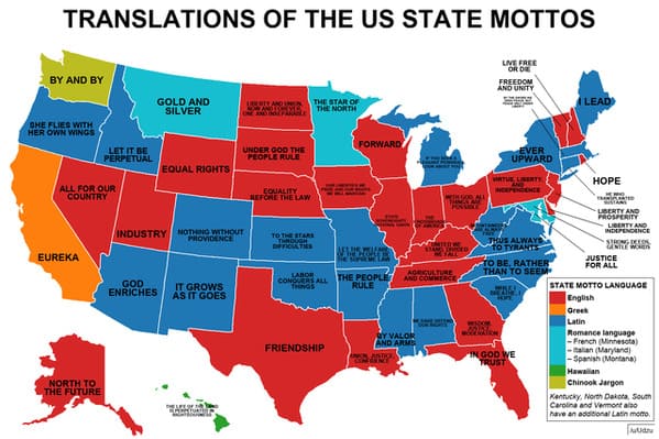
6. US state mottos.
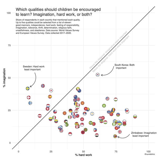
7. How important is it that children learn ‘imagination’ and ‘hard work’? Results from the World Values Survey.
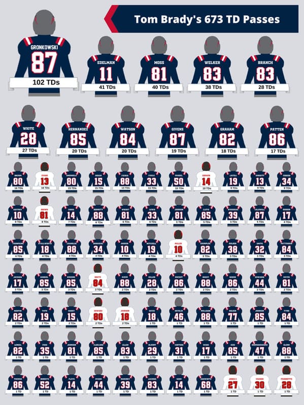
8. Tom Brady has thrown 102 TDs to Rob Gronkowski. He’s also thrown at least 1 TD to 87 other players. Here’s what that looks like.
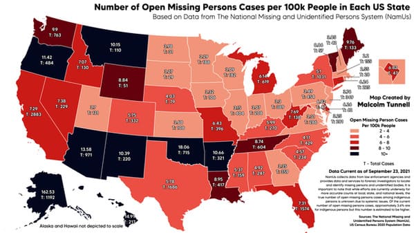
9. Number of Open Missing Persons Cases per 100k People in Each US State.
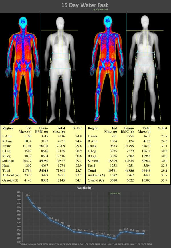
10. I didn’t eat food for 15 days and tracked data.
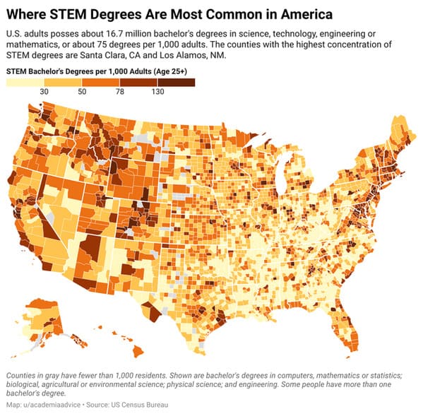
11. Where STEM Degrees Are Most Common in America.
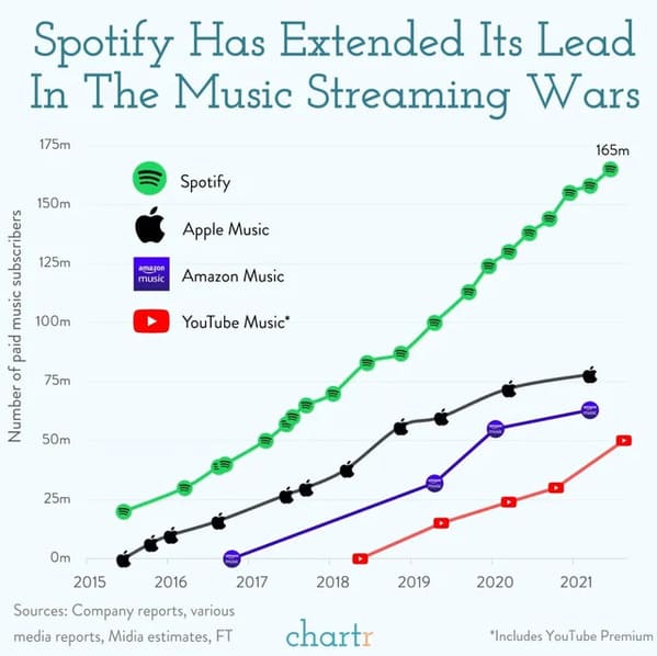
12. The Music Streaming Wars.
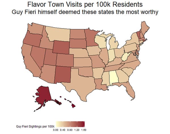
13. Diners, Drive-Ins, and Dives Visits per 100k Residents.
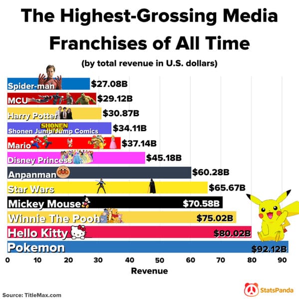
14. The Highest-Grossing Media Franchises Of All Time.
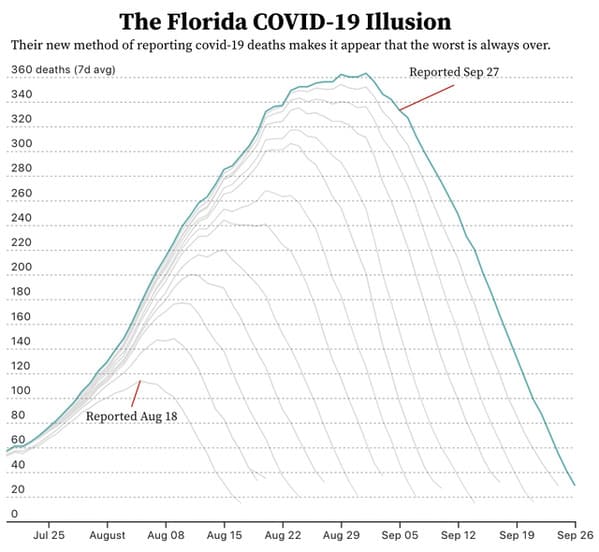
15. Florida’s covid illusion: the worst is always just behind us.
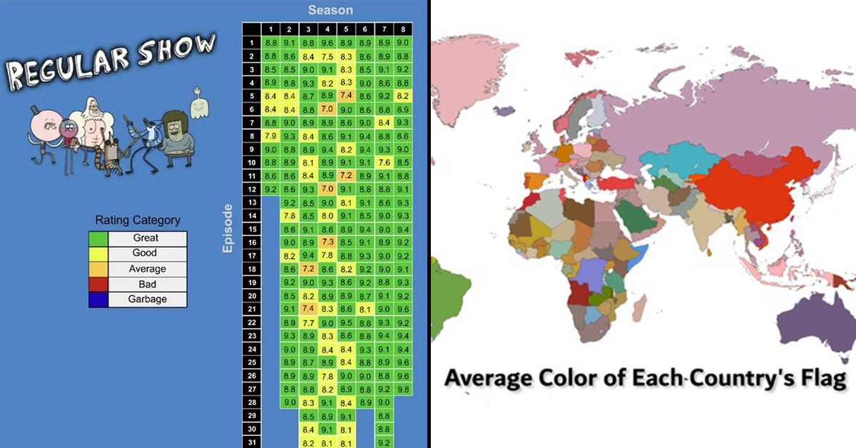
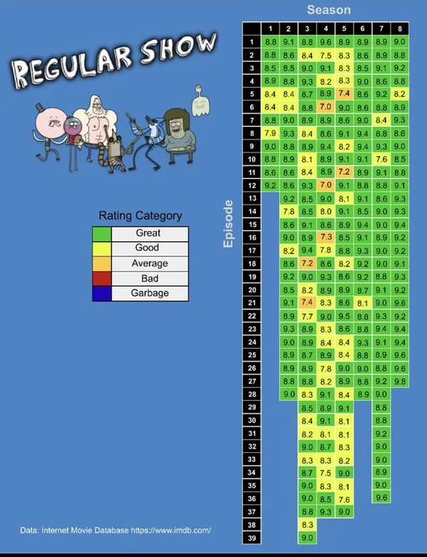
16. All Regular Show Episode’s IMDB ratings.
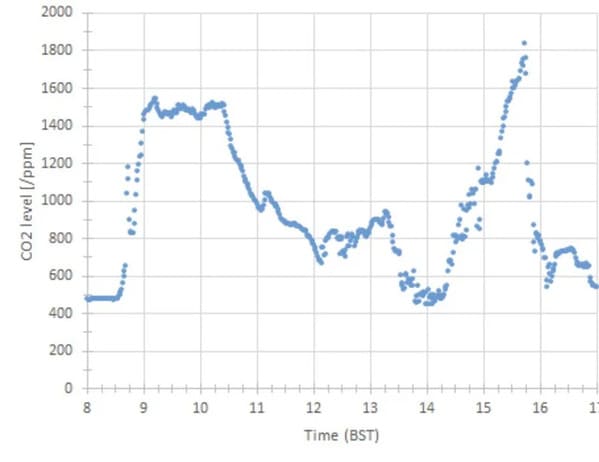
17. Levels of CO2 in my classroom over a school day.
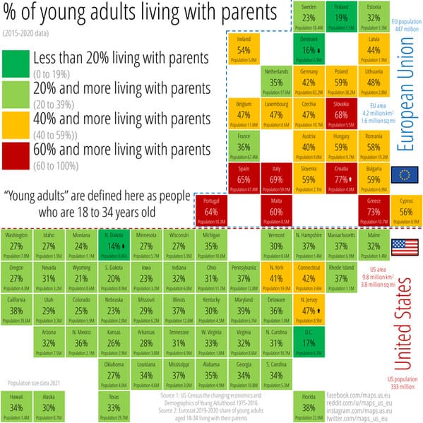
18. Percent of young adults living with their parents across the US and the EU. “Young adults” are defined here as people who are 18 to 34 years old. 2015-2020 data.
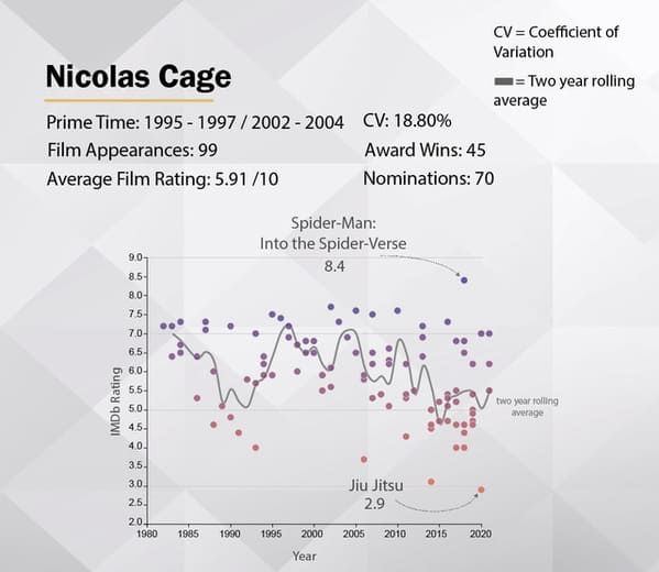
19. Nicolas Cage’s Movie Career Visualized.
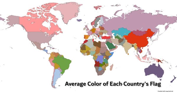
20. Average Color of Each Country’s Flag.
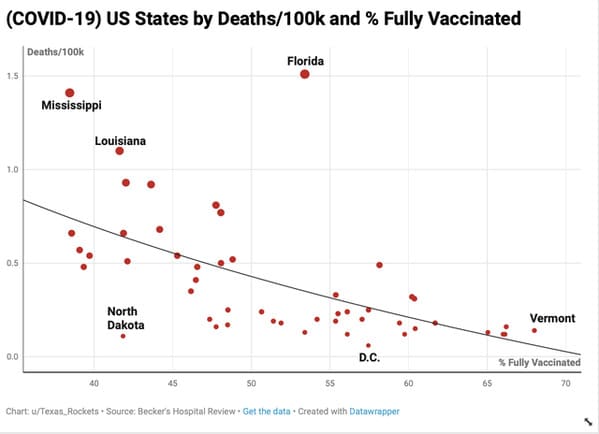
21. US States by Deaths/100k and % Fully Vaccinated.
h/t Reddit: r/DataIsBeautiful