There’s A Map For That (25 Interesting Pics)
If you love the charts and graphs post we do, then you’ll get a kick out of this. The only time we use maps these days is on our phones. And even then we don’t really study them…we just go where they tell us to. There are still plenty of beautiful nerds out there who love maps, and they keep making them for us. Here are some of the best ones.
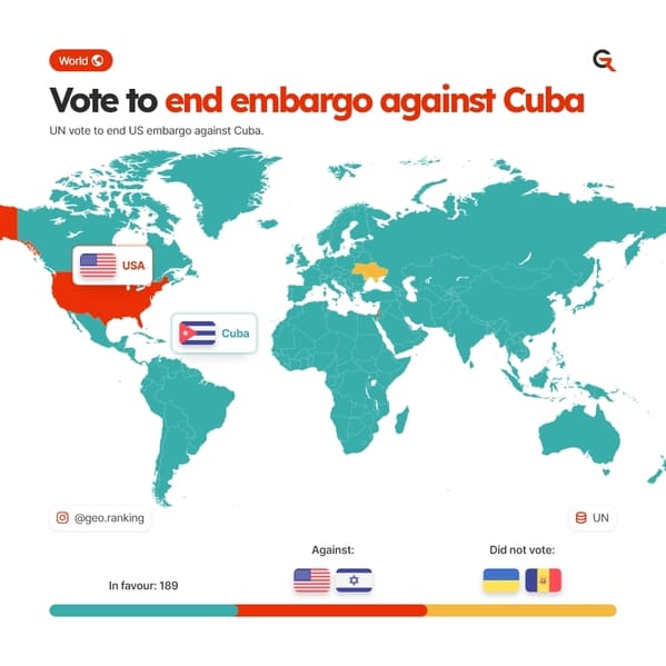
1. “UN vote to end US embargo against Cuba.”
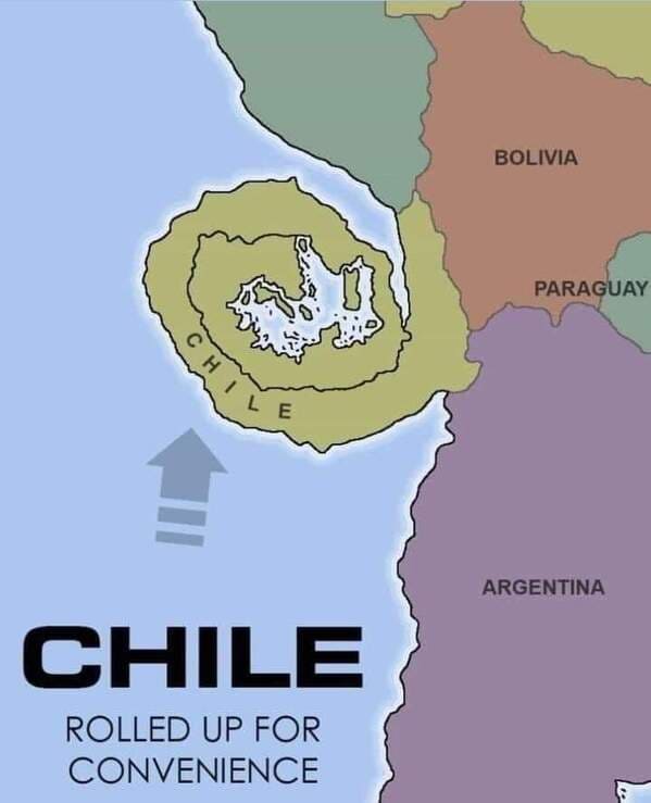
2. “Chile coiled for convenience”
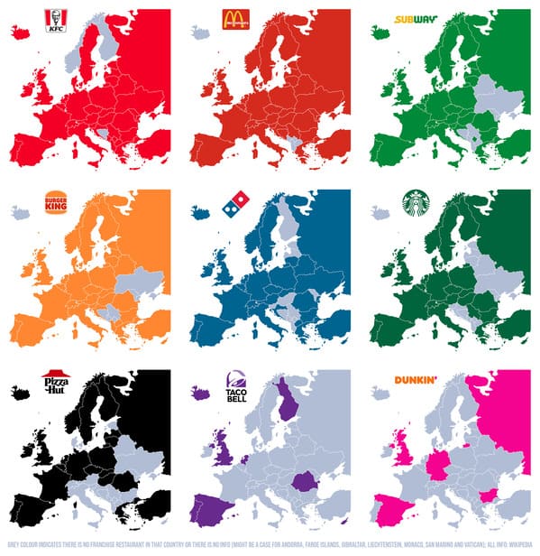
3. “American fast food chains in Europe”
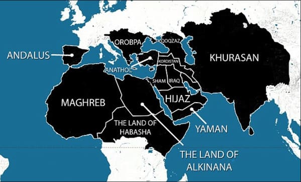
4. “Areas ISIS wanted to capture by 2020”
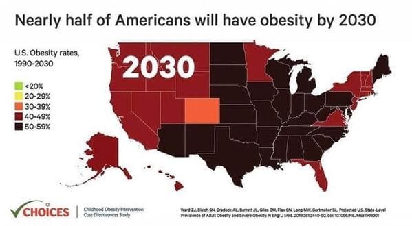
5. “Nearly half of American will have obesity by 2030”
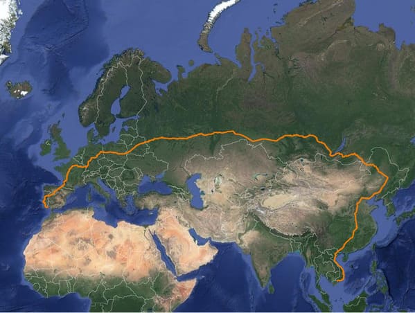
6. “The longest possible train travel in the world”
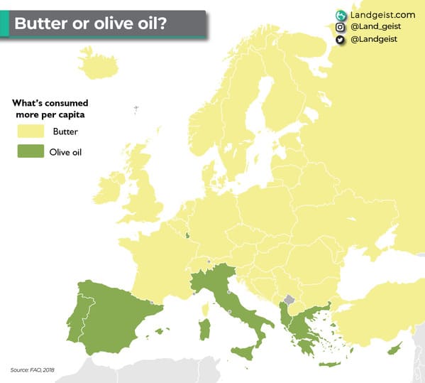
7. “Butter or olive oil? Based on actual per capita consumption.”
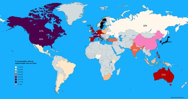
8. “Percentage of population with unfavourable views of China (2019 survey)”
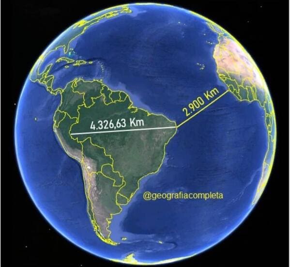
9. “The easternmost point of Brazil is closer to Africa than to its westernmost point”
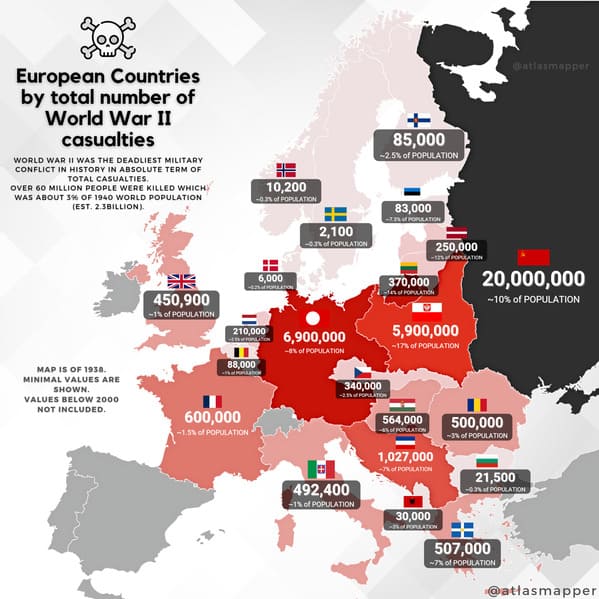
10. “European Countries by WWII casualties [OC] (2160×2160)”
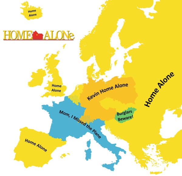
11. “What the movie Home Alone is called in different countries translated to English”
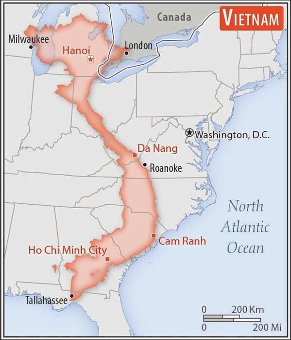
12. “Size comparison of Vietnam with the eastern United States”
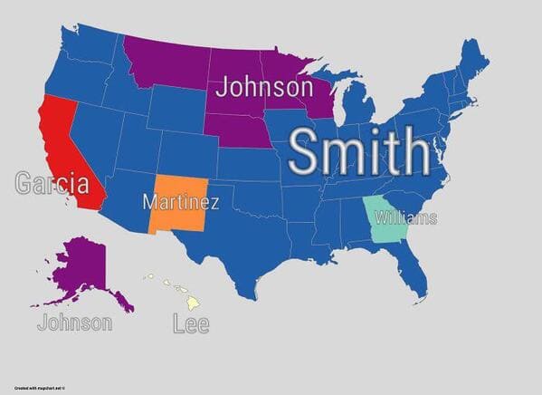
13. “The Most Common Surname In Each State”
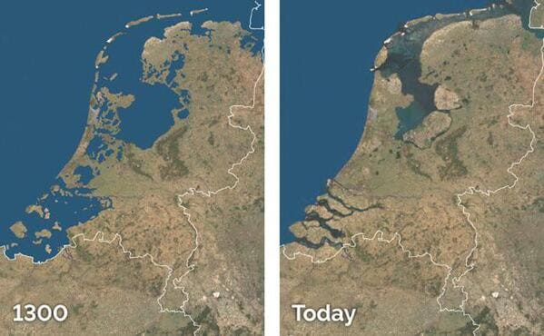
14. “Land reclamation in the Netherlands.”
15. “States Resized To Be The Same As California’s Population Density”
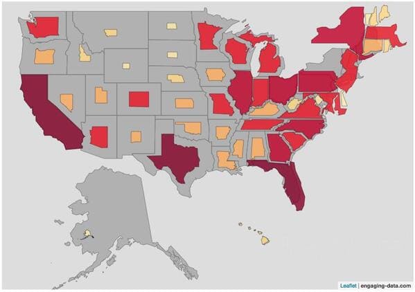
16. “Other ways of saying you have to take a poop”
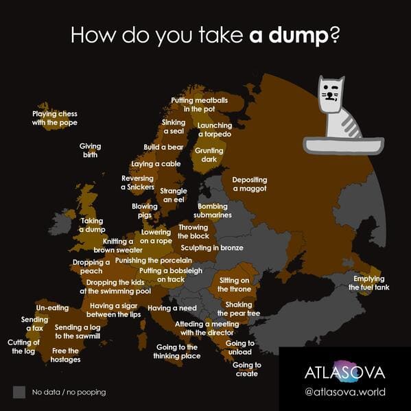
17. “Which city embarrasses you the most?”
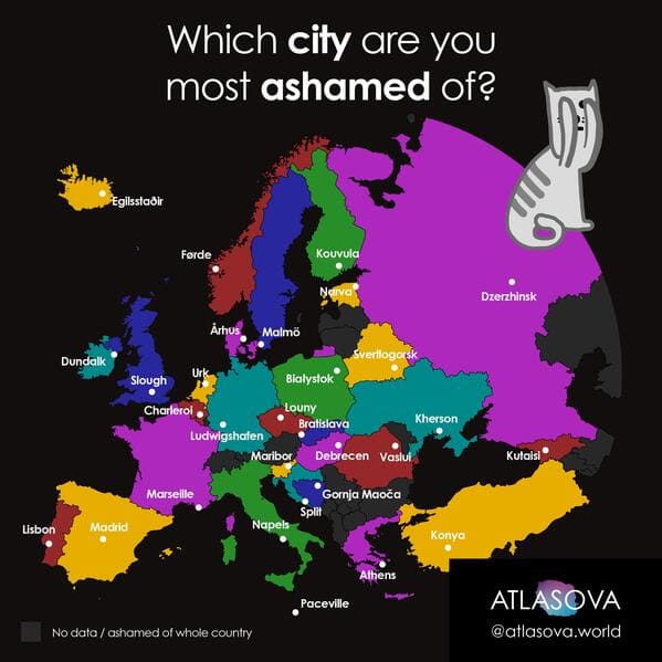
18. “France population density map”
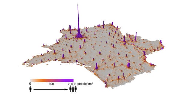
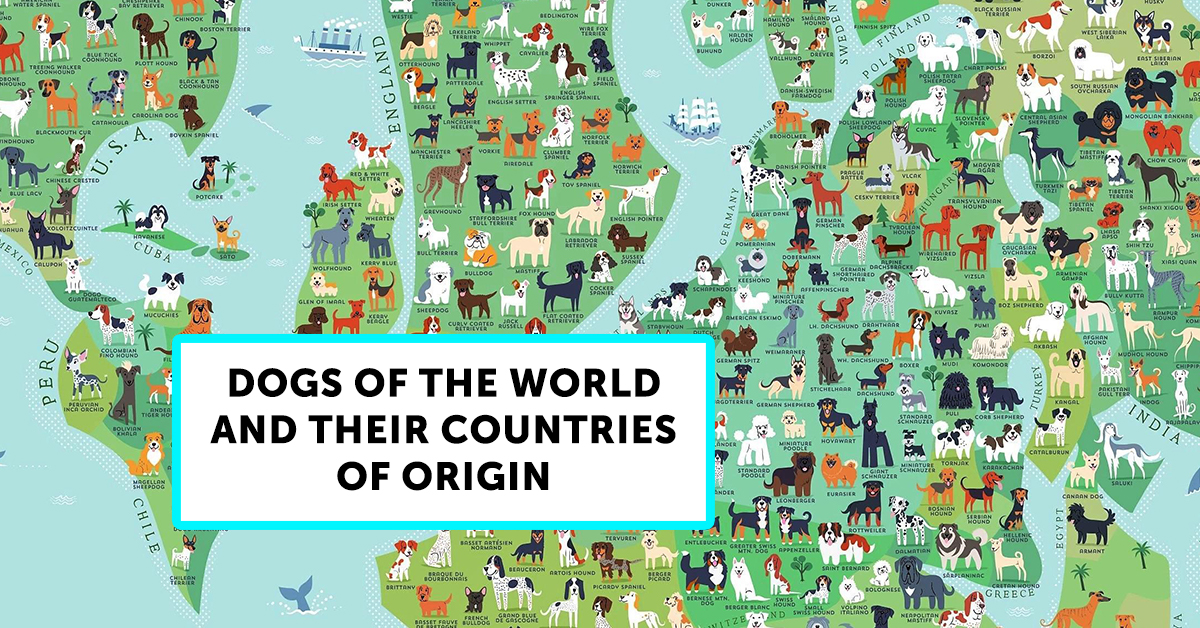
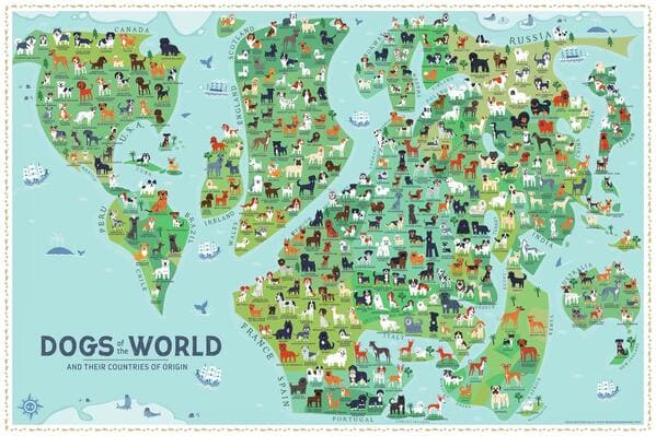
19. “Dogs of the World (and their countries of origin)”
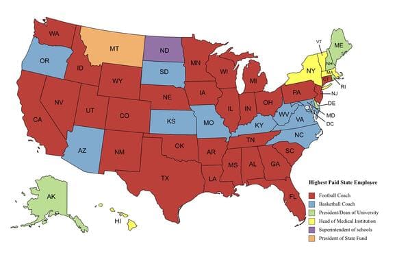
20. “Highest Paid State Employee in 2019”
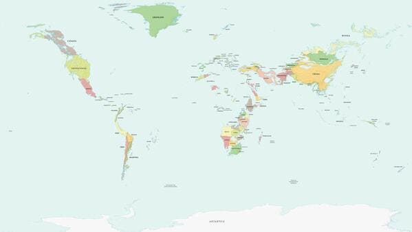
21. “Political Map Of Earth With A 1 km Sea Level Rise”
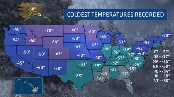
22. “The Lowest Temperature Recorded In Each State”
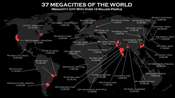
23. “All Megacities of the World as of 2020 [OC]”
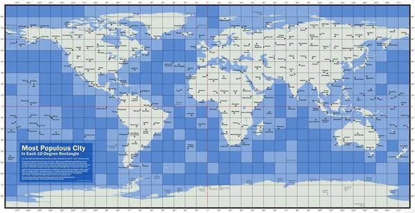
24. “The Largest City Within a 10 x 10 Degree Box”
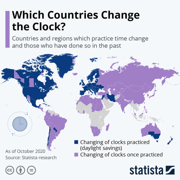
25. “Map showing participation in daylight savings time. 2020.”
h/t: MapPorn

