This Online Group Shares Helpful And Interesting Infographics (21 Pics)
I love a good graph or chart. It’s truly fascinating to see someone break down a ton of data and fit it efficiently into an infographic I, an idiot, can understand.
Keep kicking ass, nerds.
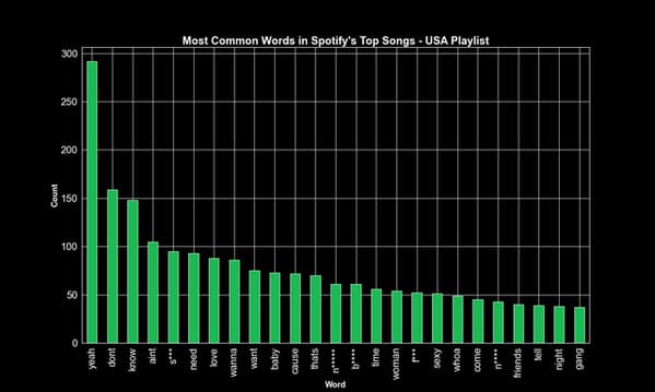
1. Yeah! The Top 25 Words in the Top 50 Songs in the US.
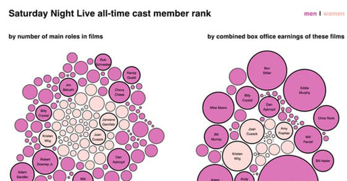
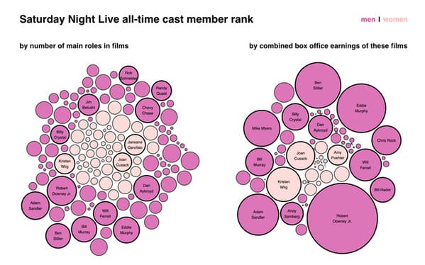
2. Who is the most successful Saturday Night Live cast member ever? It’s Robert Downey Jr.
3. So I ran a maze in the streets of Minneapolis.

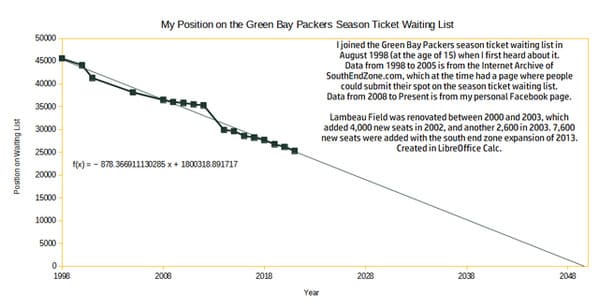
4. My History on the Green Bay Packers Season Ticket Waiting List.
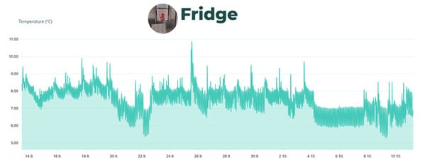
5. One month of what my fridge thinks constitutes +4°C.
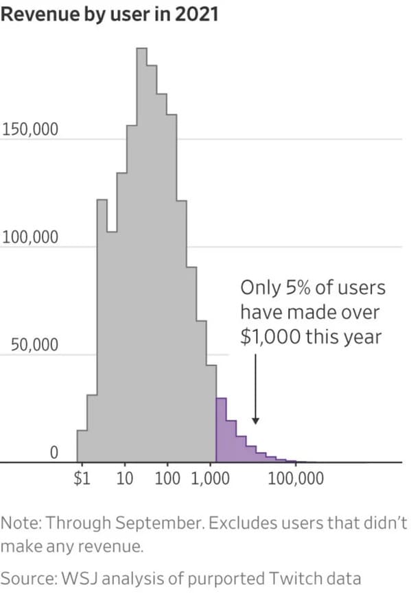
6. Twitch revenue by user.
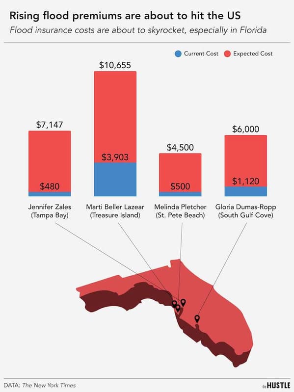
7. Florida flood premiums.
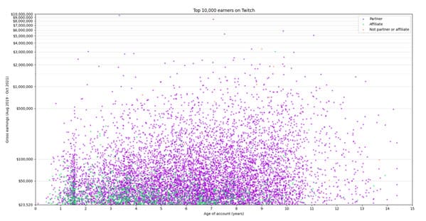
8. Top Twitch streamers’ earnings vs their account age.
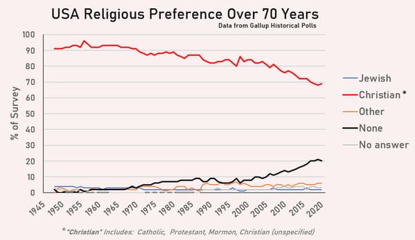
9. USA Religious Preference Trends Over 70 Years.
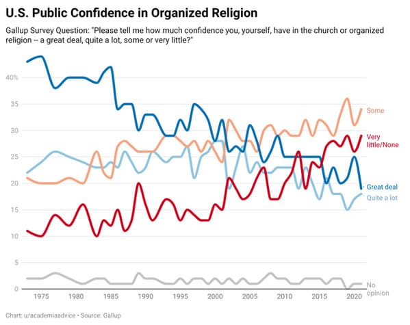
10. U.S. Public Confidence in Organized Religion.
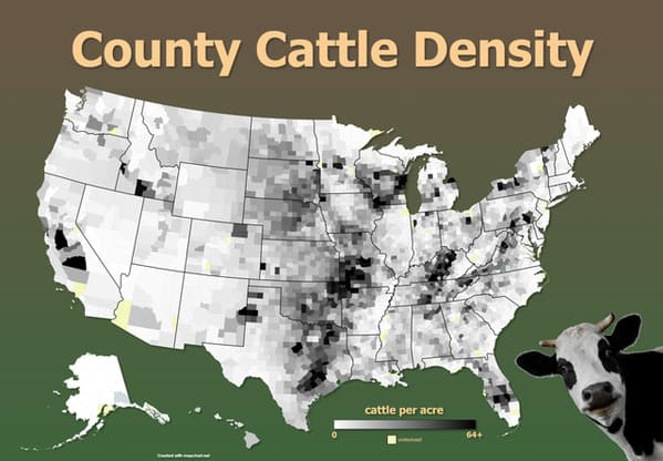
11. Cattle Density of US Counties.
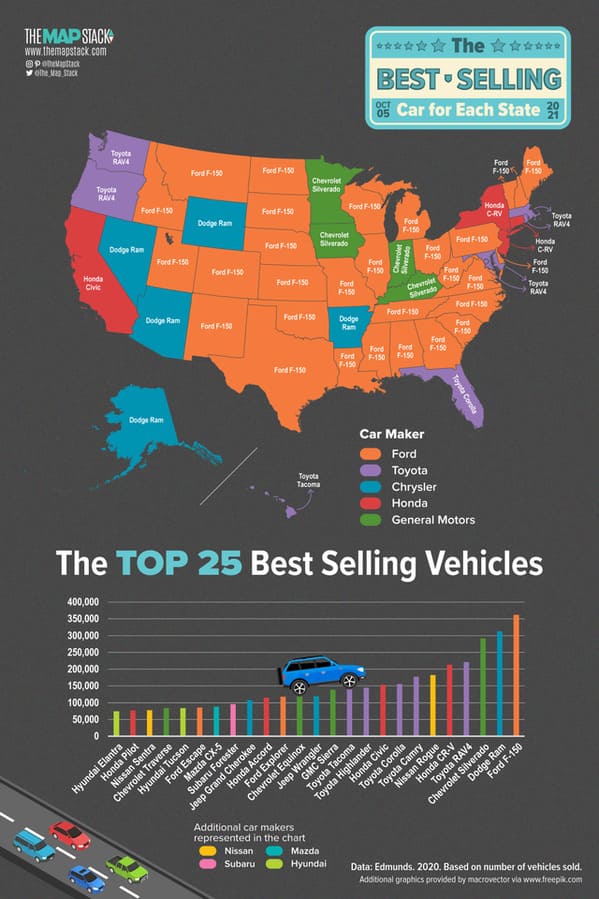
12. The best selling vehicles in the United States.
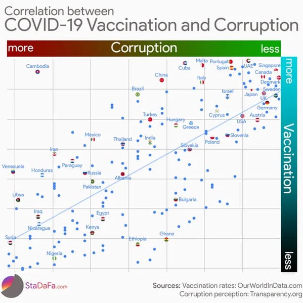
13. Correlation between COVID-19 Vaccination and Corruption.
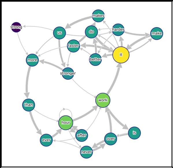
14. Network graph of word transitions in “Daft Punk – Harder, Better, Faster, Stronger.”
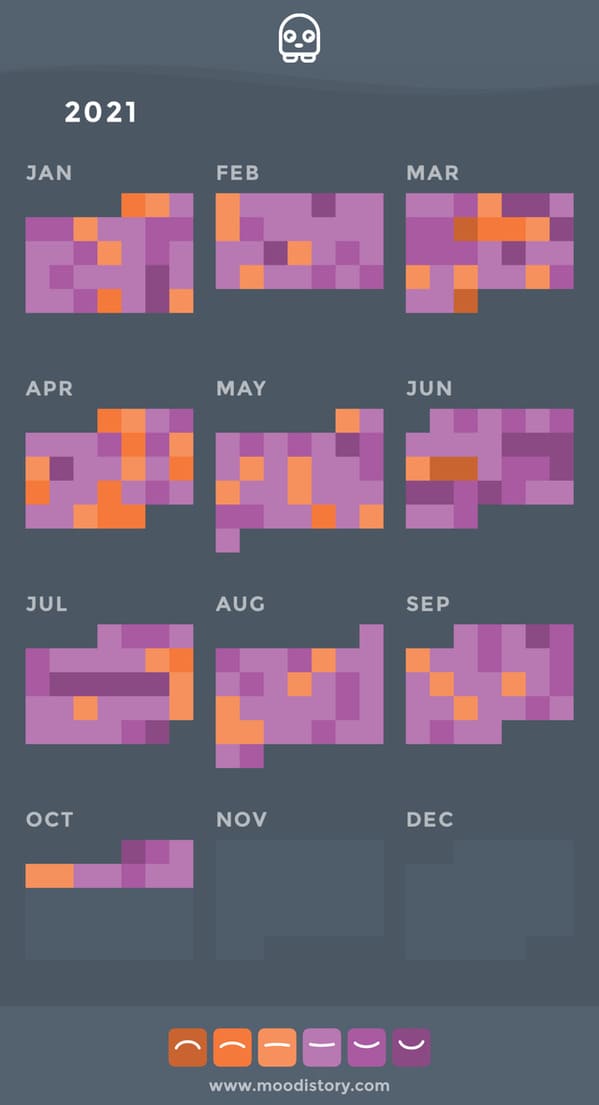
15. Tracking my happiness since the beginning of this year.
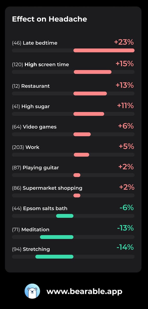
16. What triggers/improves my headaches – I tracked some of my daily factors in addition to headache severity for a year to find correlations.
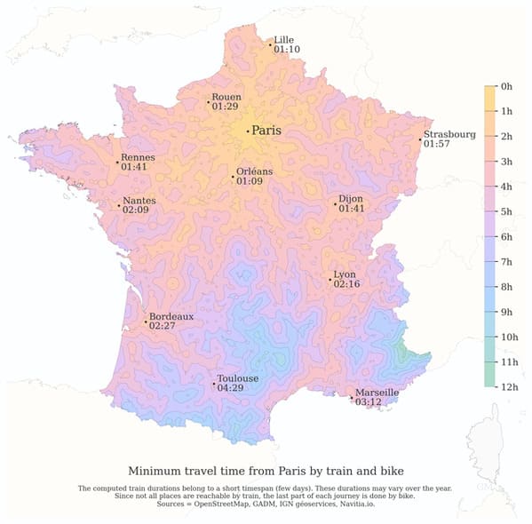
17. Minimum travel time from Paris by train & bike and comparison to car.
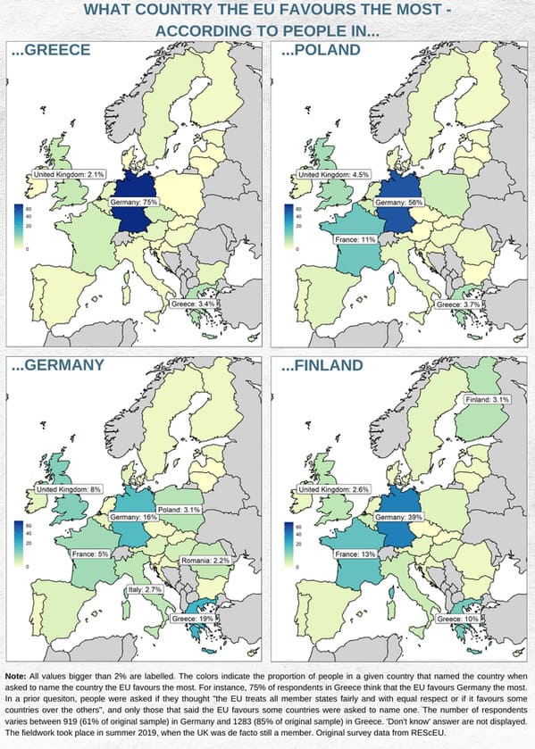
18. What country do people think the EU favours the most? It’s Germany, duh.
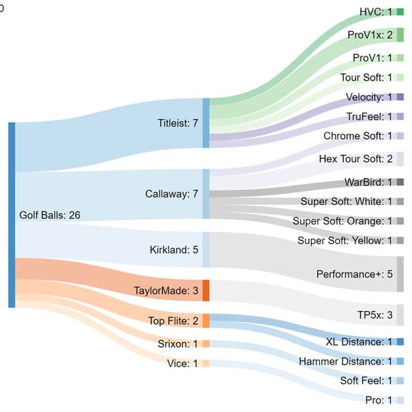
19. Golf balls found in my yard this summer.
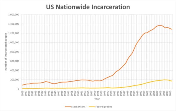
20. US Nationwide Incarceration 1925-2016.
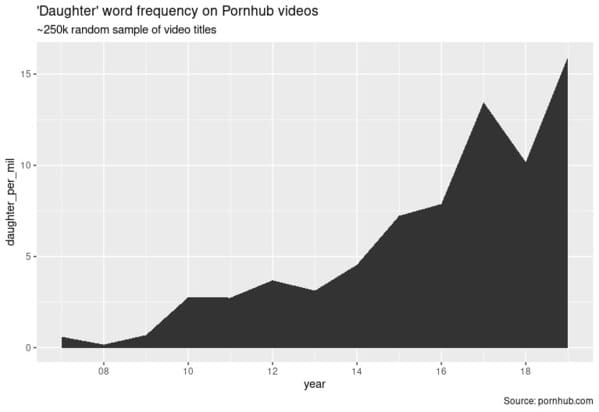
21. ‘Daughter’ word frequency on Pornhub.
h/t Reddit: r/DataIsBeautiful