28 Graphic Designers Who Clearly Didn’t Ask For A Second Opinion (28 Fails)
Graphic design is a skill set like any other. The better they are, the more it costs. So when you hire someone for cheap to design something, you may end up with a crappy design.
It’s often hilarious when design fails occur, and when you encounter one out in the wild you must share it online for all to enjoy.
Here are some of the funniest graphic design fails people have spotted.
1. “neV york”
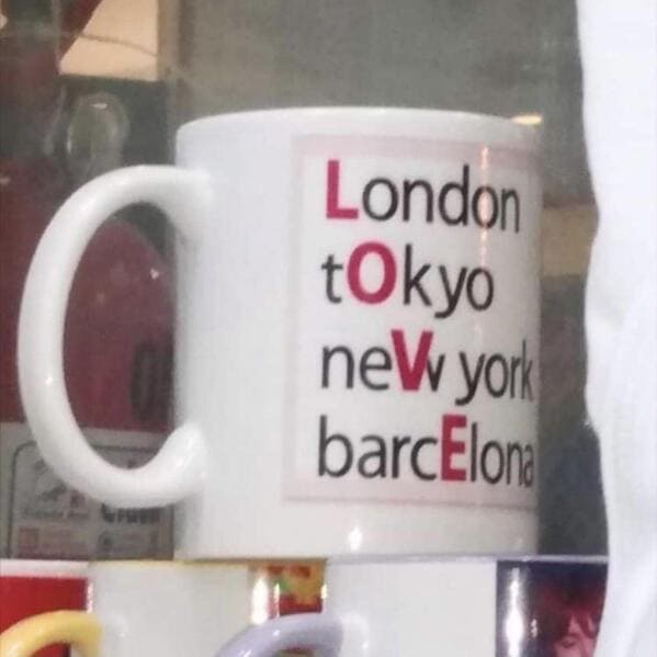
2. “Got this as a gift and honestly I don’t want to throw it away just because it’s terribly funny”
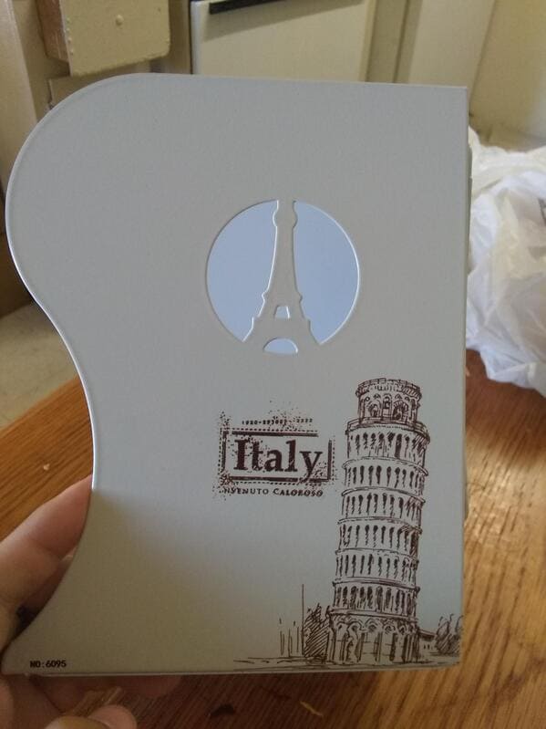
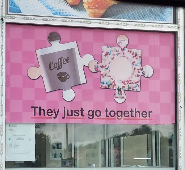
3. “they just don’t go together”
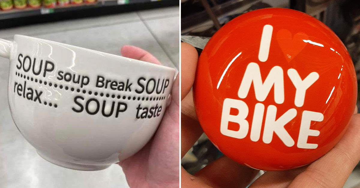
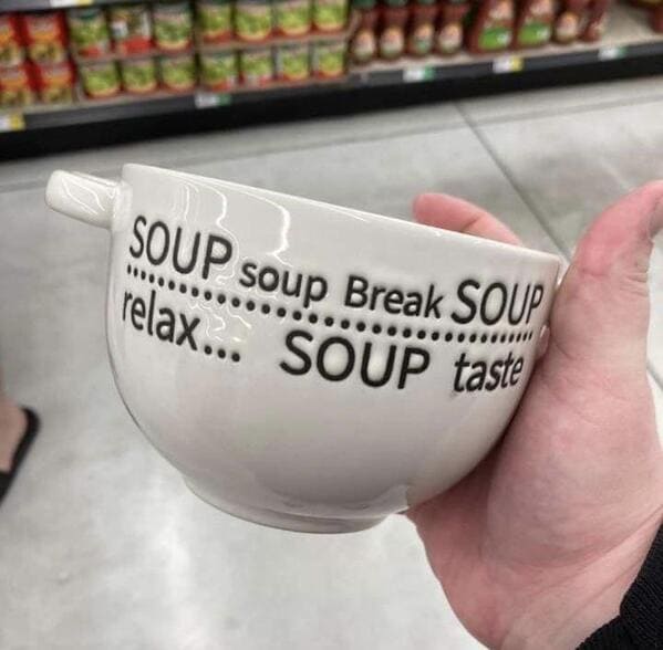
4. “SOUP soup Break SOUP”
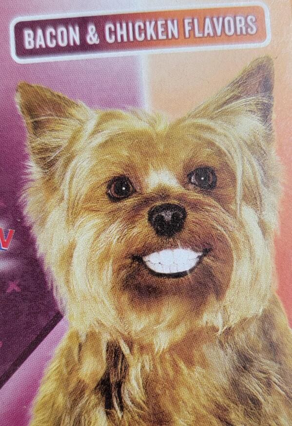
5. “The the actual f is this (at dollar general)”
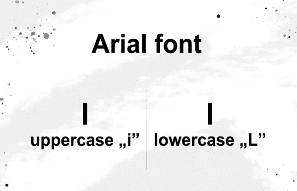
6. “”Arial” may be simple, but it has one significant flaw….”
7. “Not the most welcoming door mat”

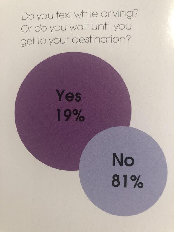
8. “A very easy to read graph about texting while driving? Found in my high school yearbook”
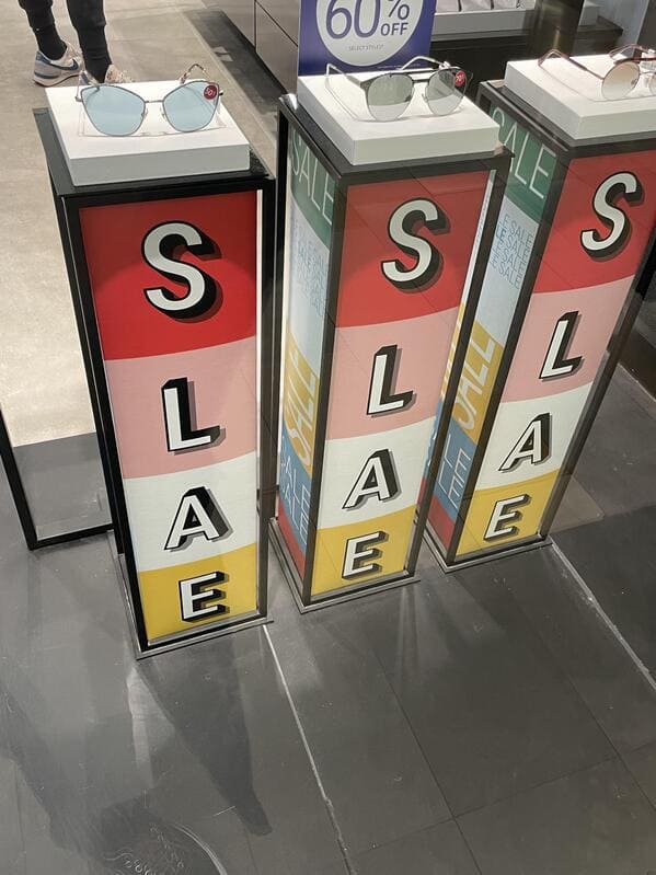
9. “Slae slae”
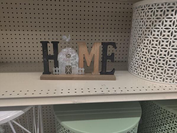
10. “There’s no place like hame”
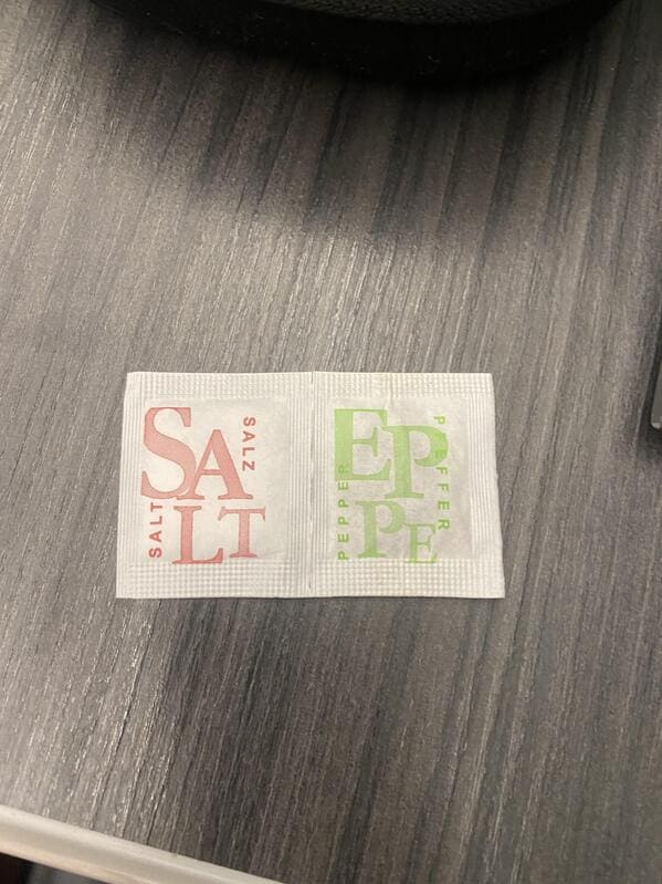
11. “Ah yes, popular condiments Salt & Eppe”
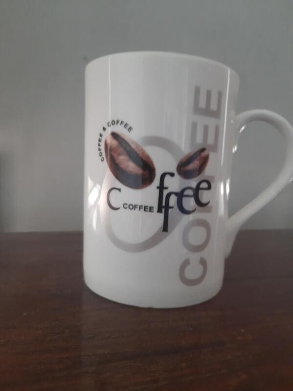
12. “Ah yes, gotta love some Ccoffeeffee”
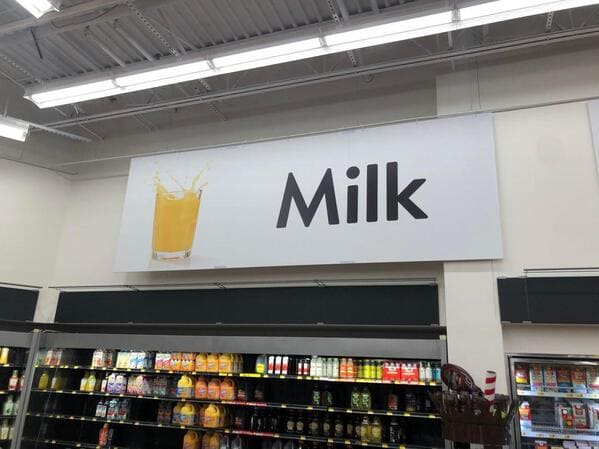
13. “Orange is the new milk.”
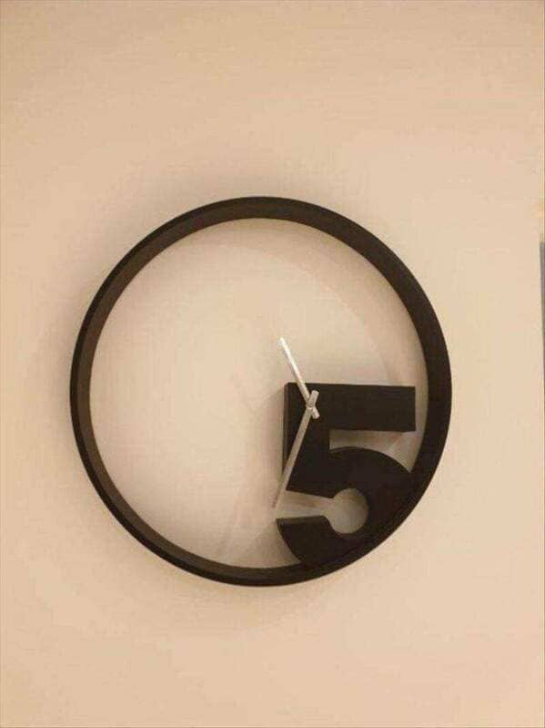
14. “Some poor attempt of a quirky clock”
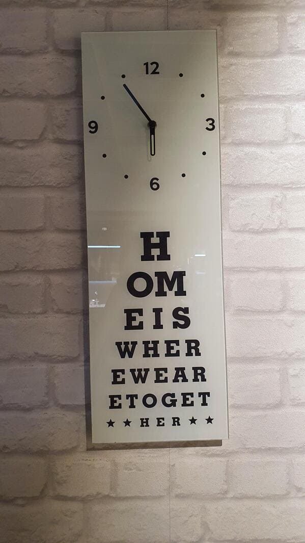
15. “Can u read it properly?”
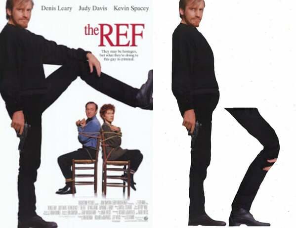
16. “The legs are the exact same length even though one is bent.”
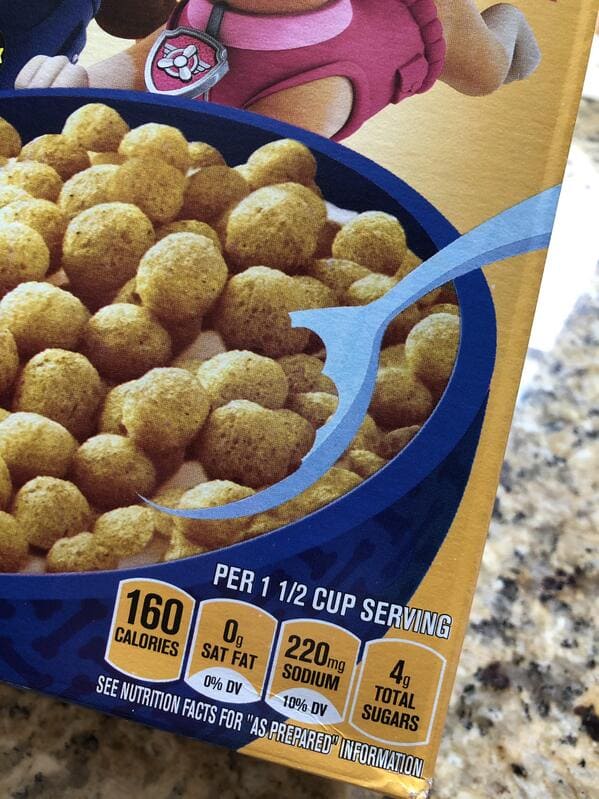
17. “Kix cereal box has a masked out spoon to give the illusion there’s cereal on top.”
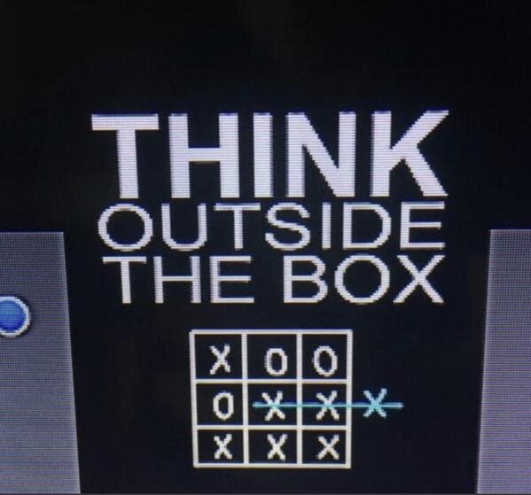
18. “Critical thinking”
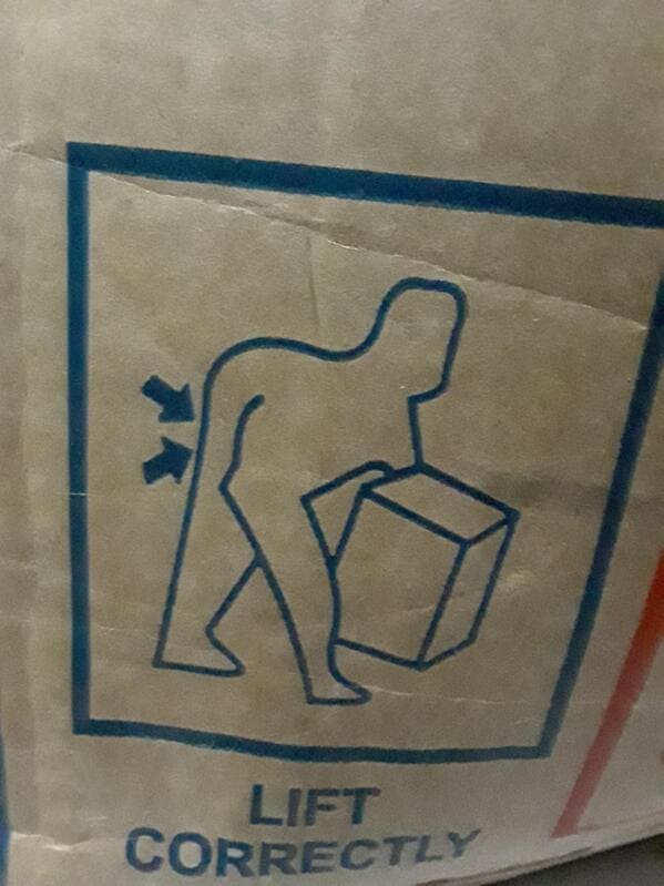
19. “I saw this on a box. I don’t know how to lift it like the picture said”
20. “This woman turning into fish roll”
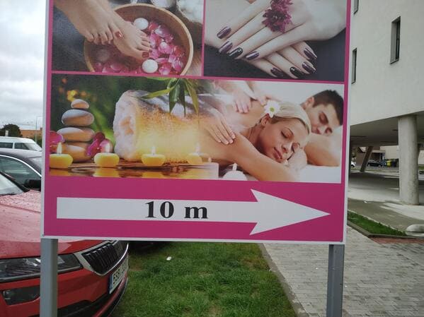
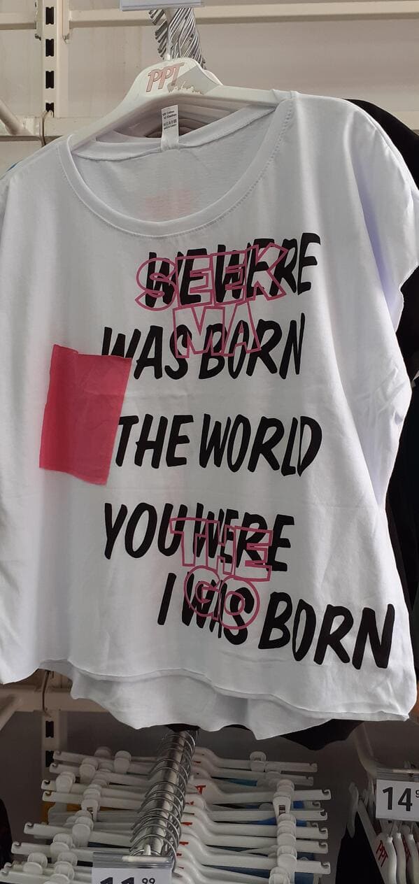
21. “Found in a thrift shop, you are what?”
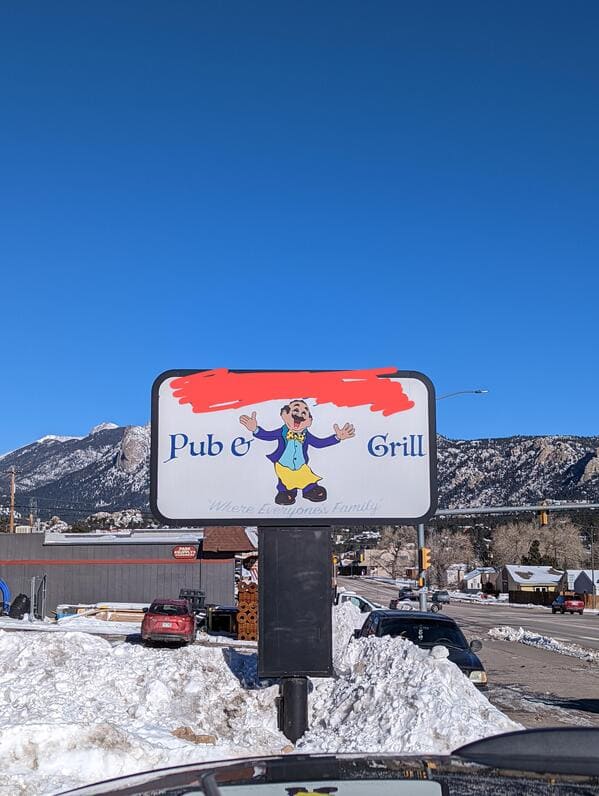
22. “Who wants to go eat at the Pube Grill?”
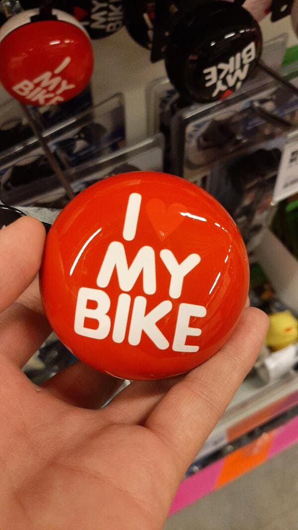
23. “I my bike”
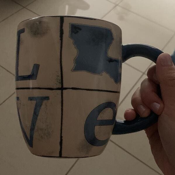
24. “If only Louisiana looked like a letter of the alphabet.”
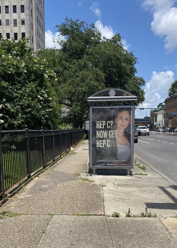
25. “Don’t have hep c? Get some!”
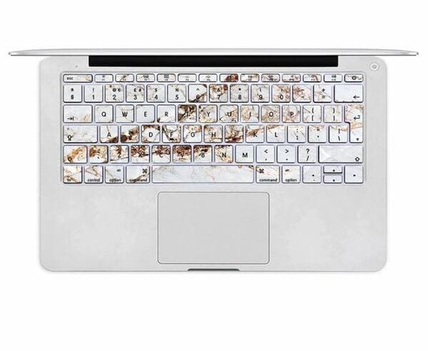
26. “(unintentionally gross) marble looking keyboard”
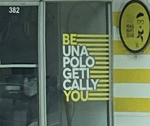
27. “Be… what?”
28. “I don’t think you are supposed to eat it like that”
