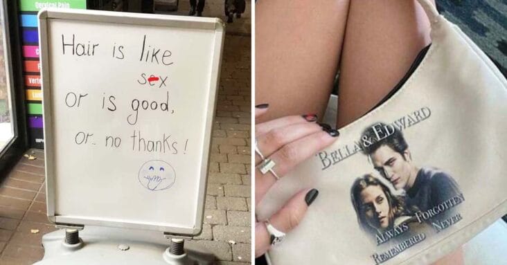
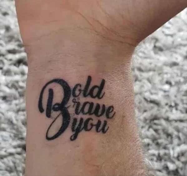
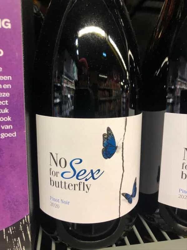
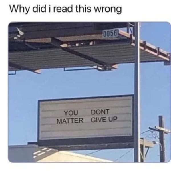
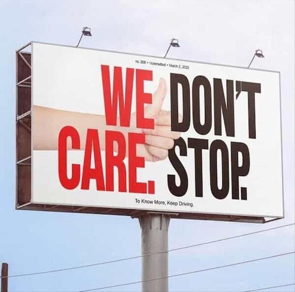
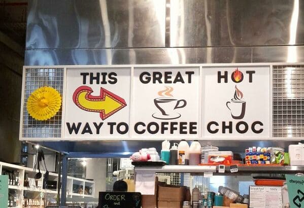
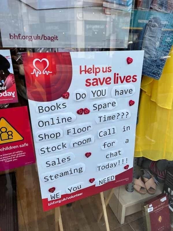
Strap in for a hilarious dive into the chaotic world of word placement gone wild with funny word order fails — inspired by the legendary subreddit DontDeadOpenInside. This collection of funny design fails takes you on a journey through the most amusingly confusing word placement that’ll have you doing a double-take.
From signs that seem to be playing a game of linguistic Twister to product labels that leave you guessing, these epic fails prove that when it comes to funny design disasters, more is definitely merrier.
Prepare to laugh, facepalm, and marvel at how wonderfully wrong word order can turn a simple message into a delightful puzzle.
1.
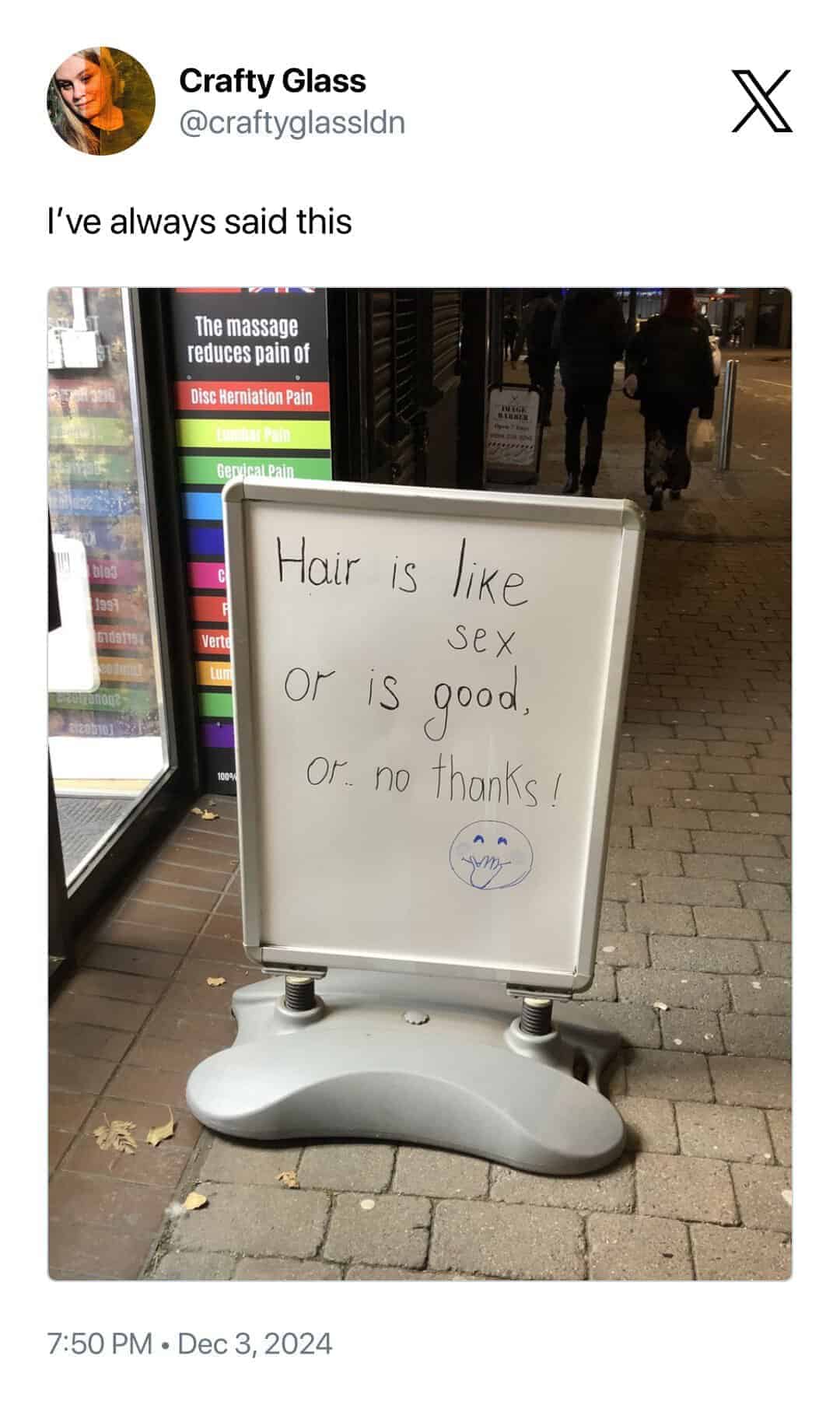
2.
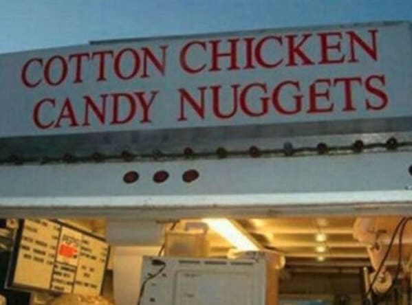
3. life f*ck is your short freinds

4. IANLHE EAXLHE
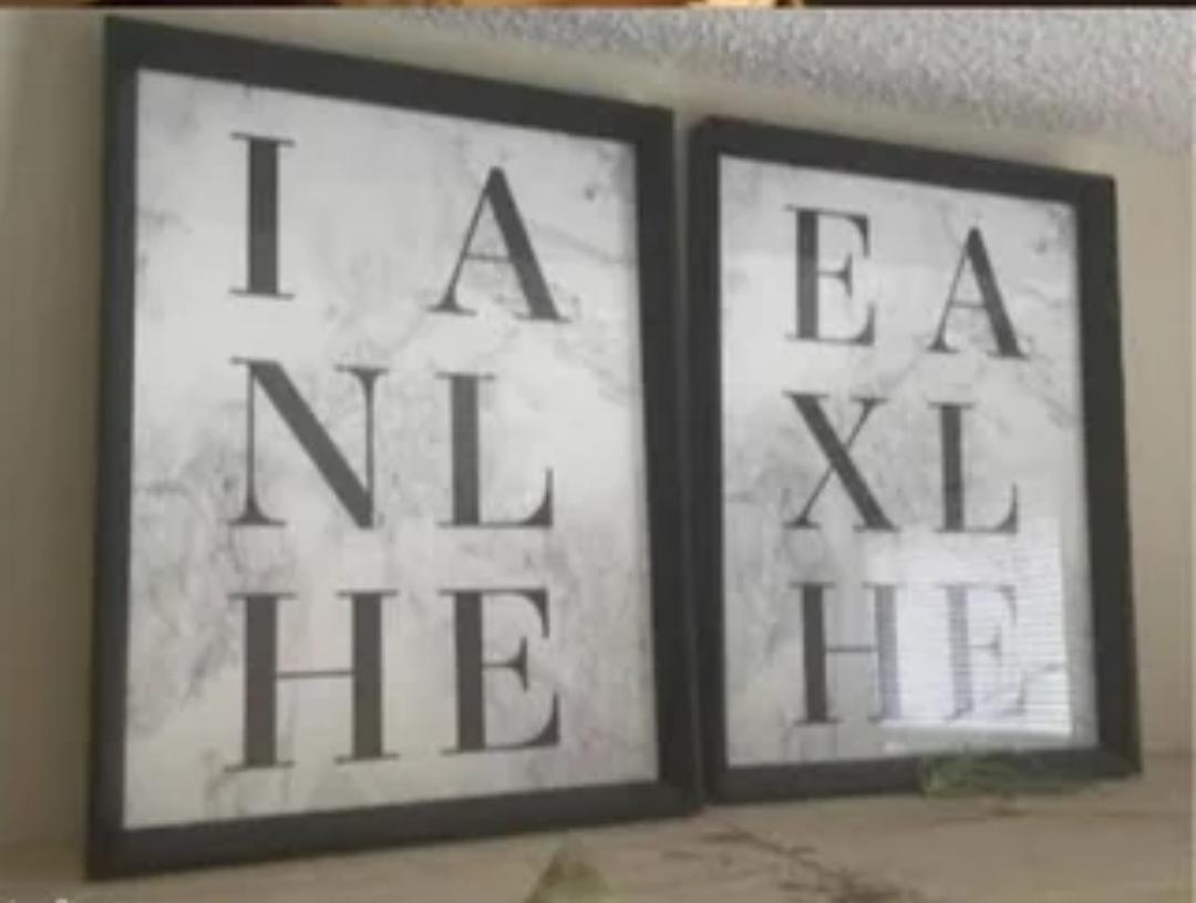
5.
6.

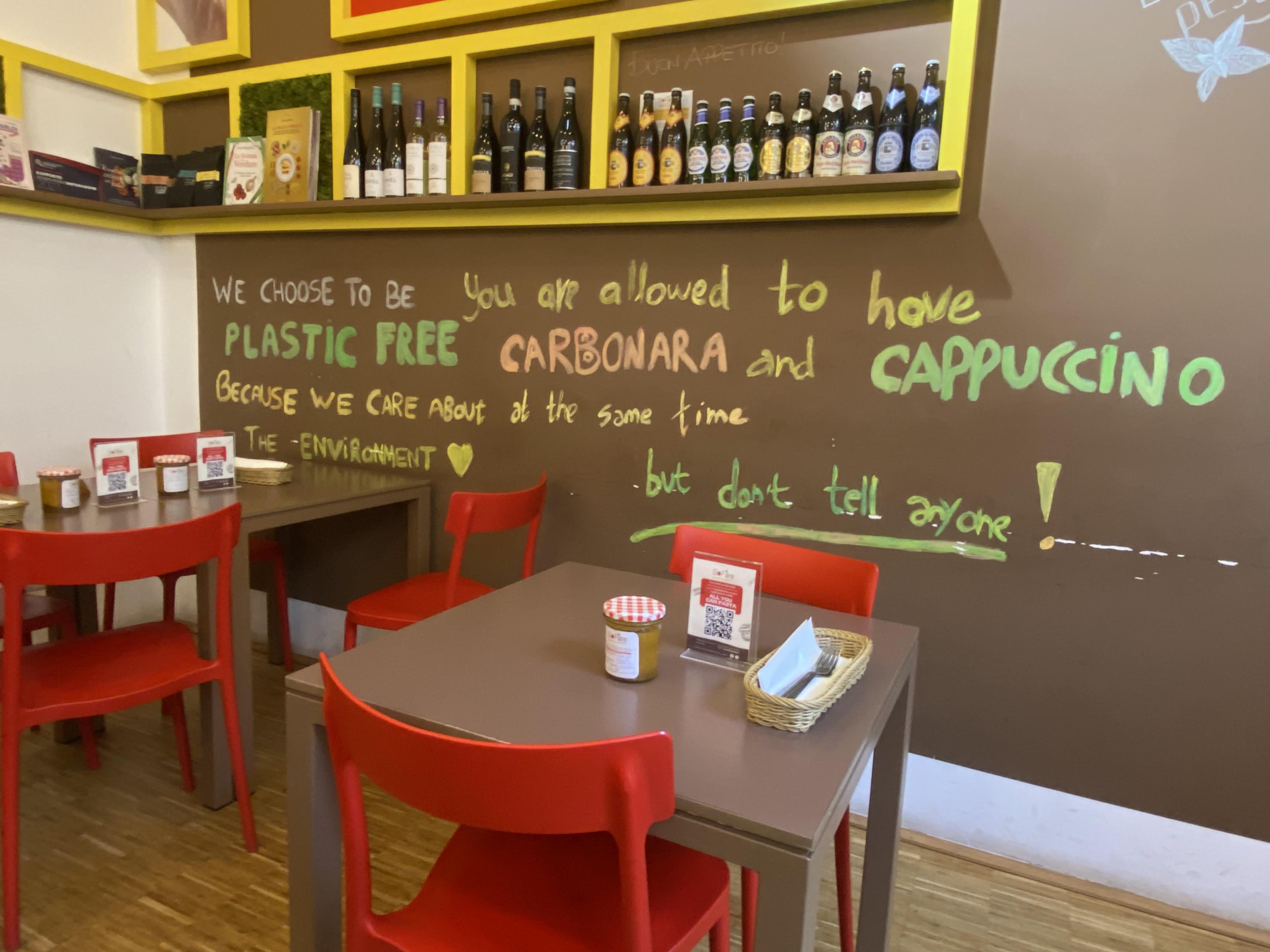
7. Plastic free Carbonara and Cappuccino
8.
9.

10.
11.

12.

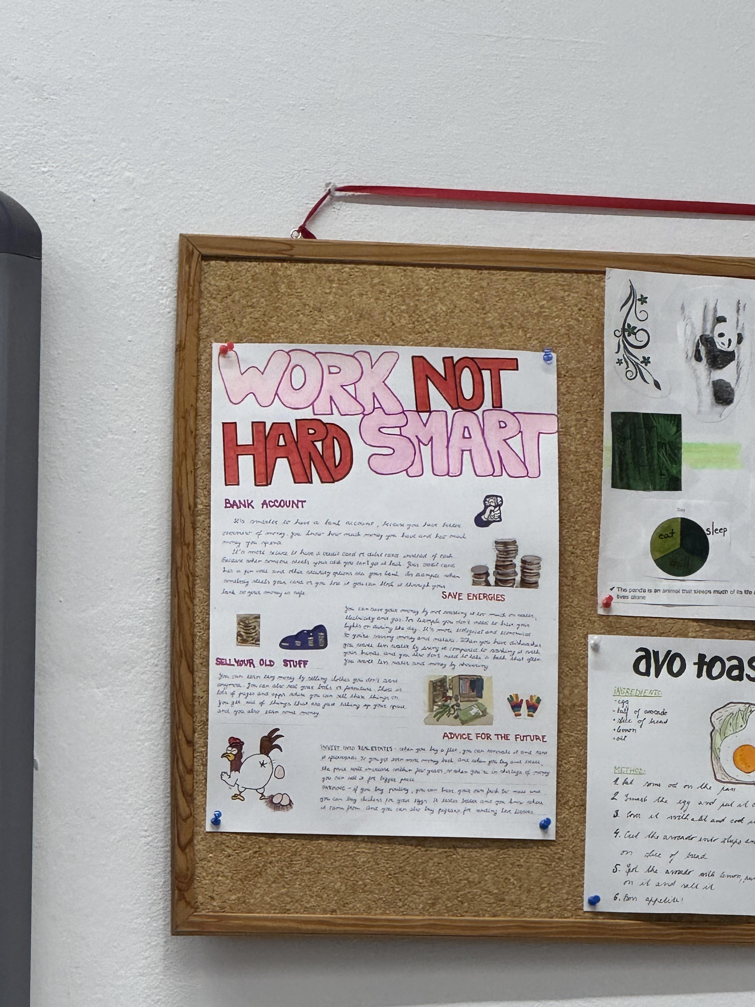
13. Work Not Hard Smart
14.

15.
16.
17.
18.
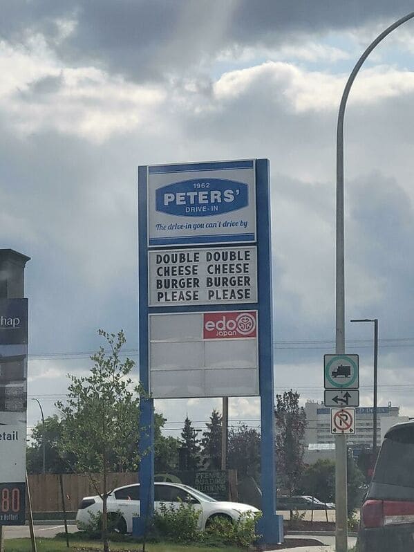
19.

20.

21.

22.

23.

24.

25.

26.

27.

28.

29.

30.

31.

32.

33.

34.

35.

36.

37.
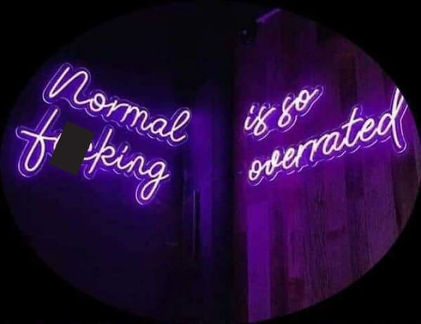
38.
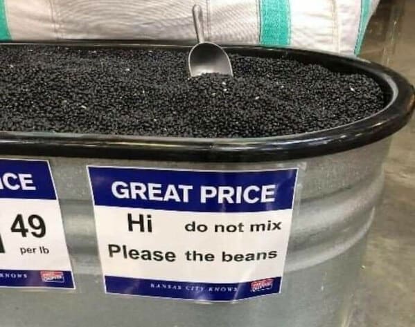
39.
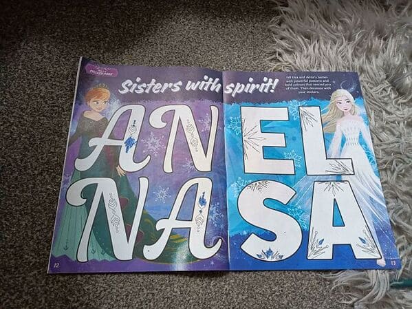
40.
Read More: 30 Funny Fails From People Who Had One Job And Still Blew It This Week (November 23, 2024)


