30 Stunningly Bad Design Fails People Spotted In The Wild (March 12, 2024)
This week, we’ve rounded up these stunningly bad design fails that people stumbled upon in the wild. From signs that lead nowhere to products that miss the mark, these design fails are sure to leave you scratching your head. Get ready to witness a parade of perplexing choices and hilarious mistakes. You won’t believe what some folks thought was a good idea.
1. “these stairs where you have to hug the wall or sprain ur ankle”

2. “My maze has no way out of the center”

3. “Just watched a guy go into the wrong bathroom at Toronto Pearson Airport. He was looking at the top sign.”

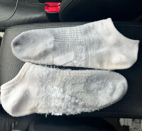
4. “These socks have the logo on the sole of your foot so that you feel it with every step…”
5. “That’s how I broke my leg.”

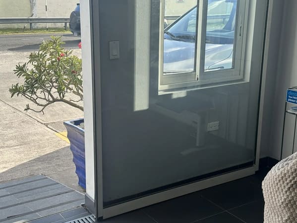
6. “Emergency evacuation plan on clear plastic with dark wall.”

7. “The text doesn’t line up with the lights”
8. “The door card in an Alfa Romeo Giulietta has a sand paper texture. Painful to lean against for any period of time”

9. “New logo of tourism and nature from Castile and Leon”

10. “Sliding door prevents use of outlets”
11. “I followed this bus for 4 blocks to wait for it to pull over to share this beautiful work of art.”

12. “train wreck of a logo”

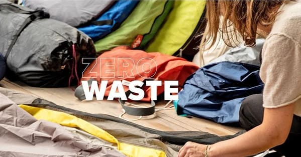
13. “WASTE (At least make the outline wider)”
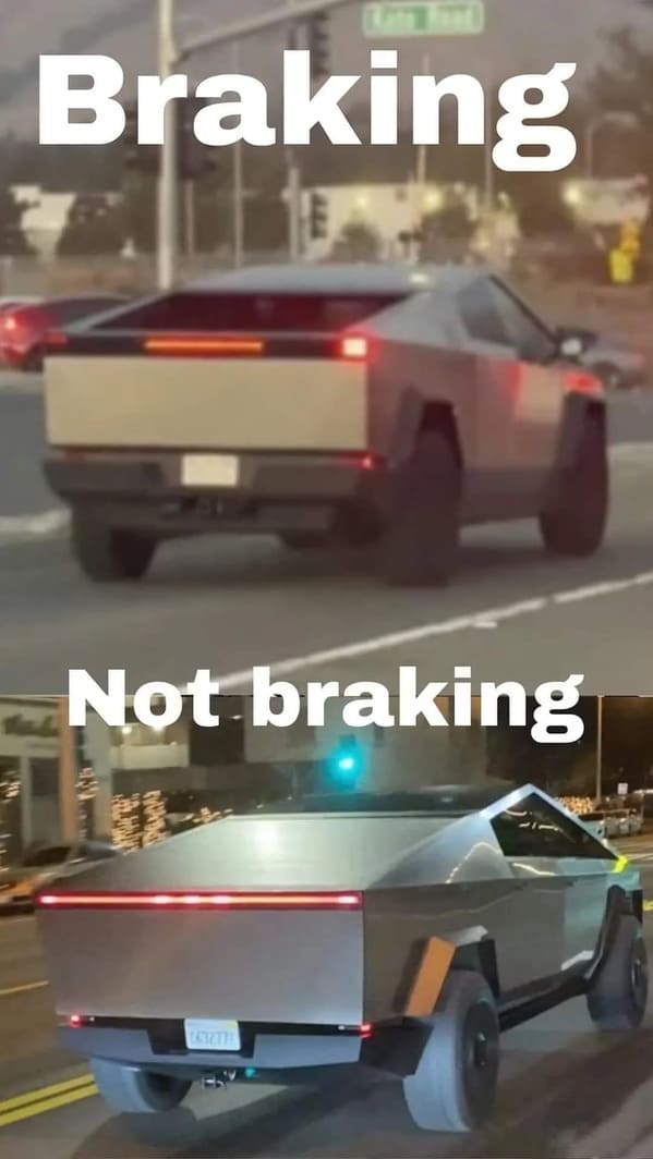
14. “Not sure if it’s braking or not”
15. “Asus put the webcam at the bottom of the screen, in perfect view of the keyboard (unless at a weird angle). Speakers are underneath the laptop too. I actually prefer my sound to be muffled…”

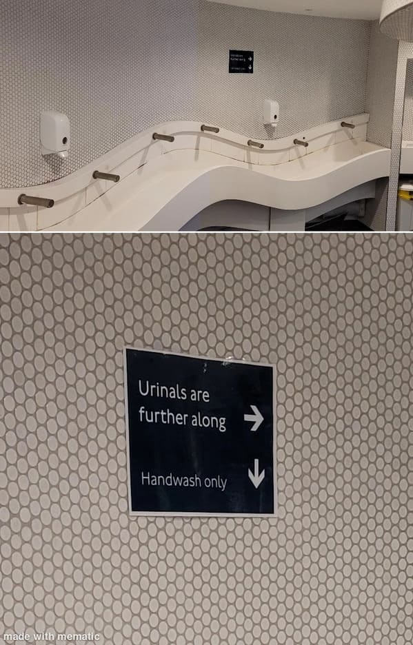
16. “When you have to explain your hand sink is not a urinal”
17. “You can barely see the word ‘with’. No wonder it was on the clearance rack.”

18. “Randomly turning the last letter of every word red for no particular reason.”
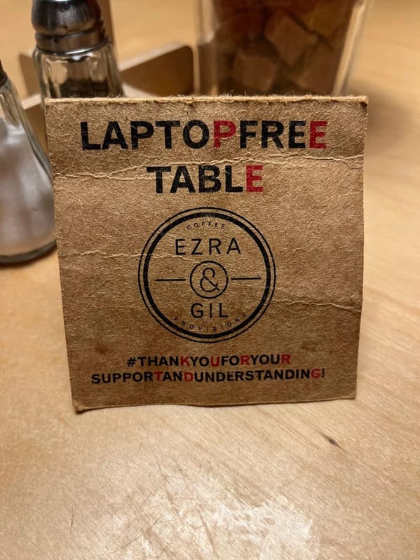
19. “This is How you Poison Childern”
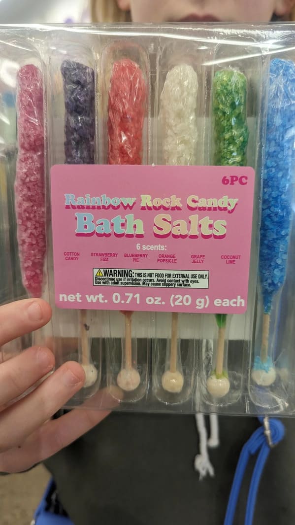
20. “Death stair gap”

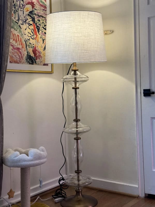
21. “The cord on this lamp instead of running down the center tube it comes out of the top”
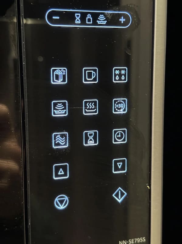
22. “Why do I need an engineering degree (or a degree in symbology maybe?) to reheat my pasta?”
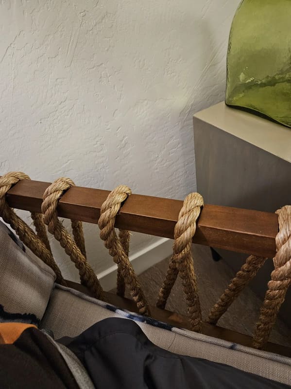
23. “The rustic aesthetic is not worth the incredible discomfort of these arm rests”
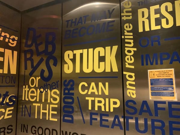
24. “I go to design school. This is the elevator I have to use every day. It’s on every wall.”
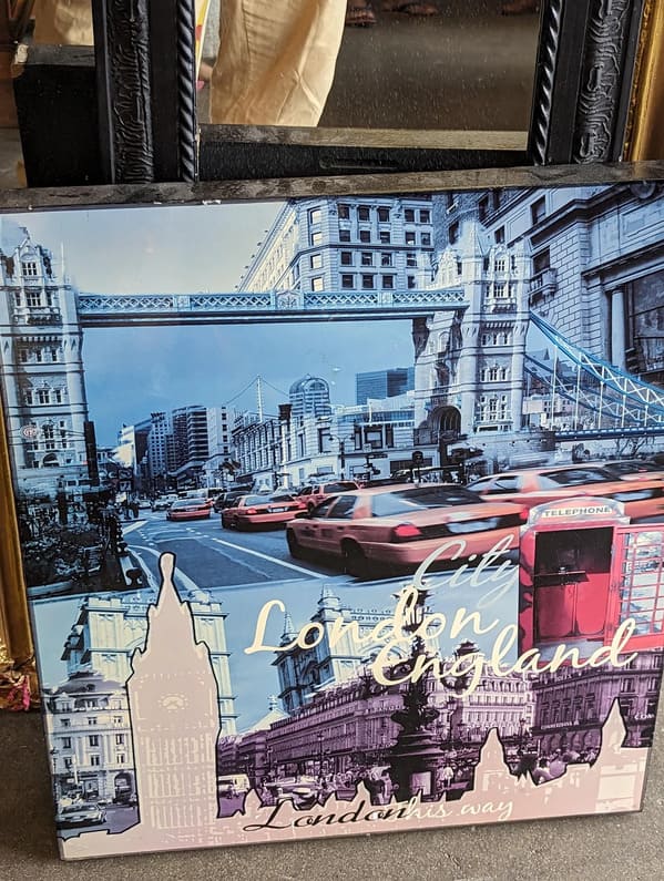
25. “London, England with its famous yellow taxis”
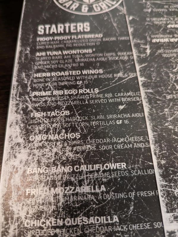
26. “This menu is not really worn out. It’s purposely like this.”
27. “Stunningly bad sink at my new office. Water runs off your hands, collects on the ledge and spills onto the floor. People actually looked at this and said ‘Yup, looks good.'”

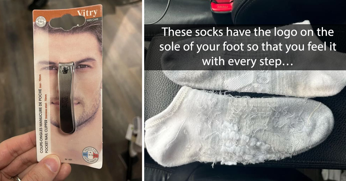
28. “I nose you’re going to love this nail clipper!”

29. “Overhang pours rainwater directly on center of sidewalk”

30. “The most frustrating interface for entering or extending cooking duration.”

h/t: r/CrappyDesign

