30+ Interior Design “Icks” People Need To Stop Doing
Interior design is all about creating a space that feels like home, but let’s be real – we’ve all made a few questionable choices along the way.
From those once-trendy chevron prints to the dreaded popcorn ceilings, our decorating missteps are as unique as our personalities. TikTokers Ethan Gaskill and Robert Gigliotti recently shared their interior design icks, and others were quick to chime in with their own.
@ethancgaskill go to @robertgigs page for part 2! PSA we all did these things at one point so absolutely no ill will intended 🖤 #homedecor #interiordecor #icks
Whether it’s overdoing that beach theme or using outdoor furniture indoors, these interior design icks scream “Pinterest fail.”
Let’s explore some of these hilarious design faux pas that prove no one is safe from a little decorating disaster now and then.
1.
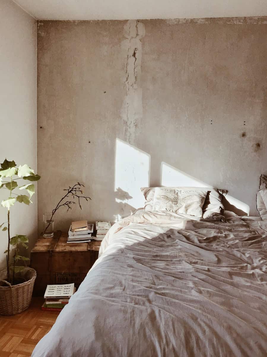
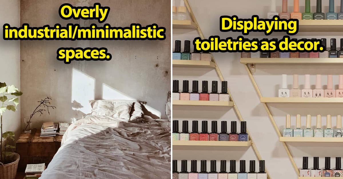
Overly industrial/minimalistic spaces. This got really popular with the Kanye and Kim house, everything was concrete or plain metal. It feels so cold and detached, it’s not comfortable.
2.
Overdoing the theme. I love a beach house, but people get too literal. You don’t need a ‘beach’ sign to prove that you like the beach.
3.
Following the home decor bandwagon. I feel like social media said white kitchens are horrible, I still think a white kitchen can be so beautiful. Also when shiplap got put into every single home. It’s gorgeous in a beach cottage or in a lake house, I don’t know why it got brought into high rises in like Denver or Los Angeles. Follow trends carefully and ask yourself ‘is this right for my space?’ and ‘am I just getting this because it’s trendy or do I love it?’
4.
Color coded book shelves. A home needs character, needs charm, mix-match looks good, don’t do smallest to largest, just put them in order of weather you’ve read them or not.
5.
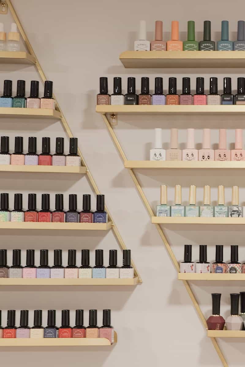
Displaying toiletries as decor. Toiletries, nail polish, makeup if you’re over 14 years old. I don’t need to see your Essie nail polish collection stacked like it’s a spice rack.
6.
Indoor furniture that looks like outdoor furniture. That powder coated black steel silhouette or any furniture that looks too concrete or bulky. They look like they’re meant to be on someone’s back patio with a fire pit between them.
7.
Furniture that has technology built into it (charging ports, recliners, ect.). It has never sat right with me. In theory it seems like such a good idea, having a charging port that close to you is great, but what happens a year later when the fuse burns out on that? Or the plug type changes?
8.
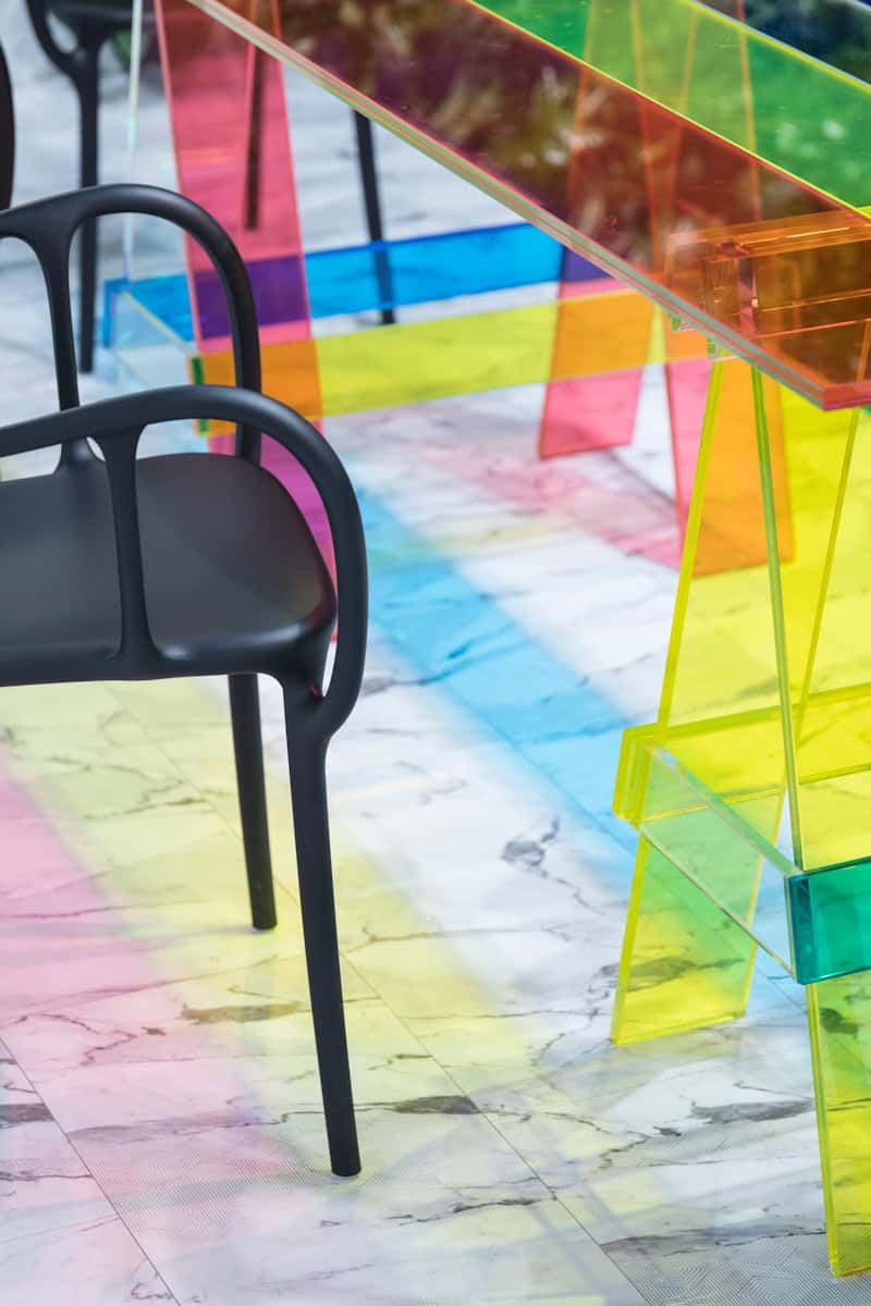
Lucite furniture. I in general don’t like clear furniture or clear surfaces. Lucite is better suited in your bathroom drawers, to help organize your products, not to be used to dine on or as a coffee table.
9.
Faux marble curtains, bedspreads, ect. Anything that is printed in marble. I don’t know why this became such a thing. I fell like marble is the new galaxy print.
10.
Using too many iconic designer pieces. Too many notable pieces. When everything is just a name. This relates to fashion too, if someone’s wearing designer everything it can get tacky.
11.
Jonathan Adler. Specifically the drug pillows or drug coasters and drug jars. Are you showing off that you do pills? Is that funny?
12.
(Bad) vinyl flooring. House flippers are buying the coolest homes and absolutely destroying them, and the flooring is the one that I see most often. These really high contrast, printed looking vinyl wood floors – it’s bad. Your floor doesn’t need to make a statement.
13.
Oversized objects. Those chain link marble things, they can be wood too, oversized glasses, paper clips, even those hand chairs. They bother me for some reason, they’re very tacky.
14.
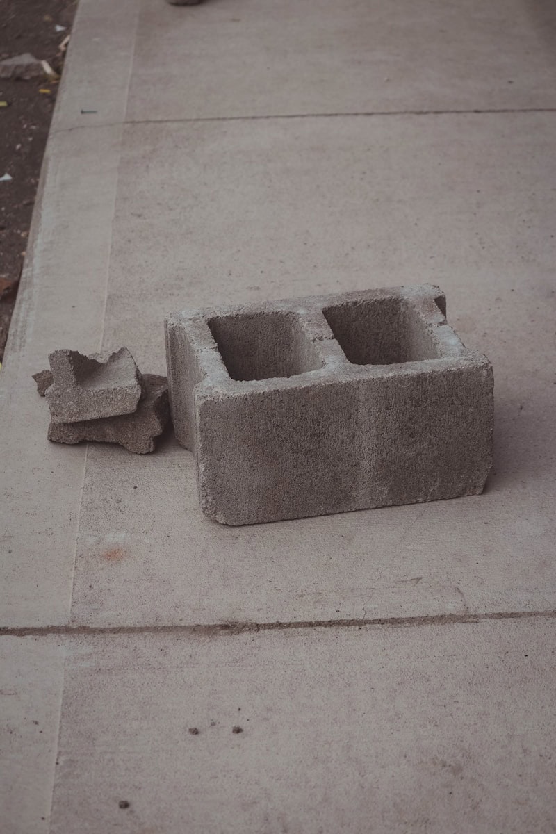
Hardware store supply furniture. That’s the wood pallet coffee tables, using cinder blocks as night stands, or God forbid you take that polyurethane and make that foam cloud mirror. I don’t want my home to look like that, leave it to the bars.
15.
Mass produced quirky art prints. These are the new ‘Live, Laugh, Love’ signs. They’re always a food pun or a cowboy hat. An art print of 12 pickle jars? You can do better.
16.
White/cream boucle. It never looks good, it collects dust, it does not hold up over time. It looks like it always has clumps of hair in it.
17.
‘Quirky’ candles. Specifically these cube-ball candles or the squiggle candles in general. I feel like they’re always collecting dust, no one ever lights them.
18.
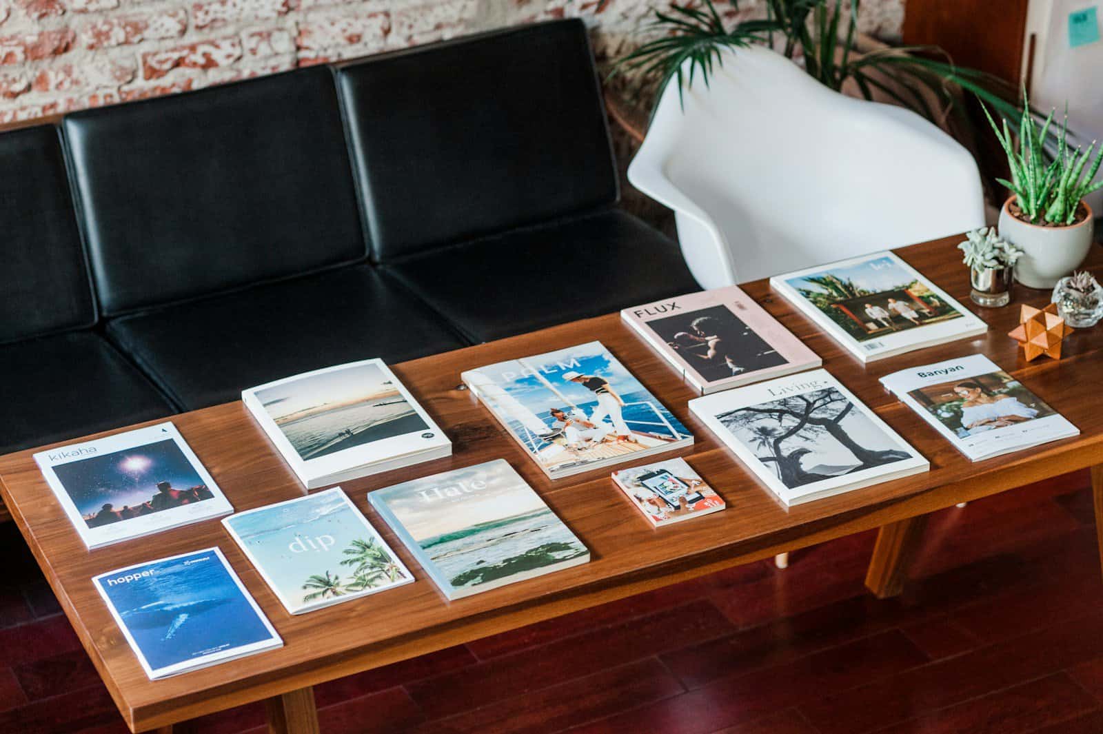
Uninspired coffee table books. There are so many coffee table books, and I see only this Tom Ford coffee table book. There are so many, I think I thrift 10 a week with the coolest imagery in it and they’re inspiring.
19.
Peel and stick / amateur DIY project. Overly DIY’ed spaces. I don’t want to have the edges of my countertops peeling. It just feels so temporary.
20.
Making everything a moment. Your appliances don’t need to be a moment. Now I’m seeing squiggle light switch covers, your light switch doesn’t need to be a moment. Some things can just be simple.
21.
A pop of color (in an all white/beige/grey space). I’m talking about those all neutral rooms with three teal pillows. Color intertwined throughout your space is way better.
22.
Using dining room chairs as accent chairs. Using the chairs as a wrong function. You can’t tell if it’s a dinning room chair or a living room chair, they’re a little to flimsy to be either or.
23.
Washable rugs. In theory this is a good idea, but you end up with a very weird piece of fabric on the floor that looks wrinkly.
24.
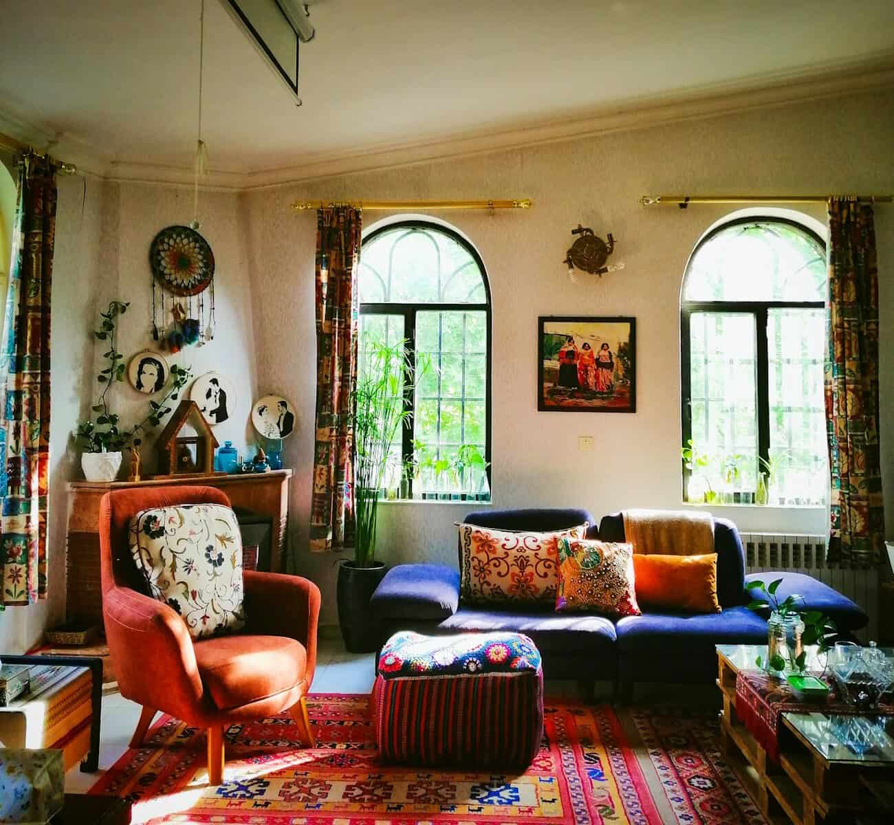
‘Boho chic aesthetic.’ It’s so trying too hard. The whole aspect of bohemian style is going with the wind, travelling, eclectic and this is too much. It looks like a lot of nail salons. Just go more simple, you don’t need to nail a basket to your wall.
25.
Waterfall edges on a kitchen island or a countertop. To me this just reads cold and heavy. Even worse – when they do it only on one side.
26.
Grommet curtains. Curtains with those really thick, metal or plastic circles at the top. It’s like you have a shower curtain hanging in your living room.
27.
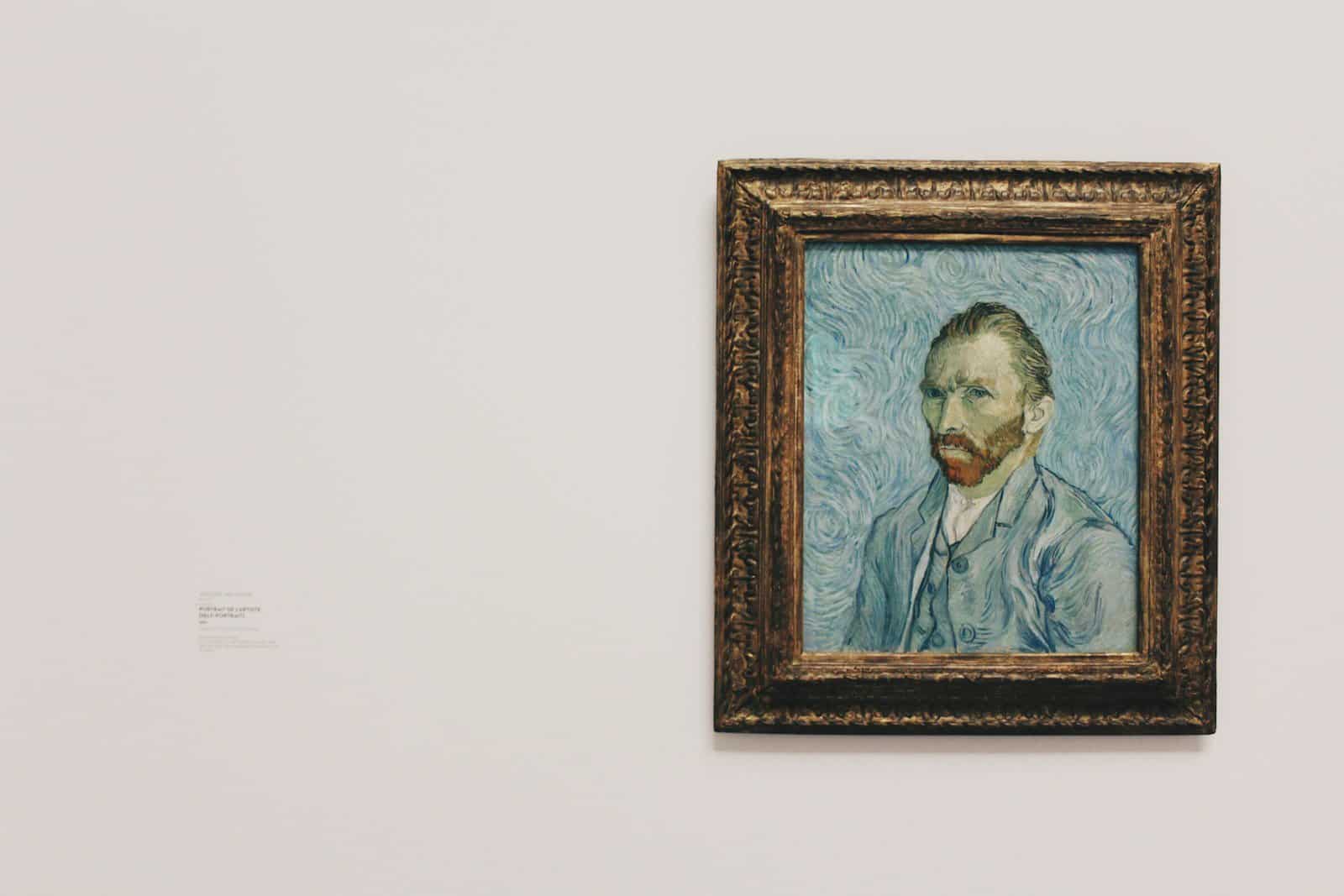
Big box store / mass produced art. The fake Van Gogh paintings, the Banksy prints. It’s like home staging. We know that those aren’t original, you know that, you’re not trying to fool anyone into believing that, but there’s just such better artwork. Support local artists, print a piece of art from your travels.
28.
Fake food decor. Croissant and baguette lamps, egg shaped pillows or cheese block candles. Every food object has become a pillow.
29.
Letting your personal interests be your interior design ‘style’. You don’t need too much of one particular thing or style in a space. Your home can speak to your interests in more subtle or timeless ways. You can love fashion, but you don’t need to display your Gucci and Hermes boxes as decor.
30.
Bedroom sets (all from the same exact collection). In theory it seems like the obvious solution having a very cohesive space, they all go together, but it feels way less unique and is so much more expensive.
Read More: 45 Instagram Reality Pictures Full Of Photoshop Fails And Filter Fumbles

