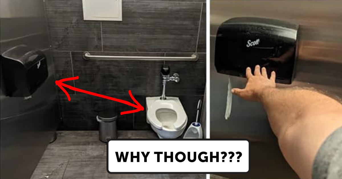
30 Funniest Crappy Design Fails That Almost Seem Made To Anger People
Look, I’m not saying I want anyone to lose their job. However, a few of the designers below should probably look for a different line of work.
Honestly, I’ve had a number of jobs I wasn’t the right fit for. Was that my fault? Yes. Did I change and grow as a person after getting fired? Absolutely not.
But, I know my limitations. In fairness, the people who made these crappy designs did a better job than I would have had I been in their shoes.
Sadly, I still think it’s funny to laugh at design fails. Whether someone tried hard or didn’t try at all, each of the following photos tells an important story.
That story? “Oops.”
Here are the funniest crappy design fails I had time to find today:
1. This is how Yoda speaks so nerds might like it.

2. I already poop weird without this kind of help.
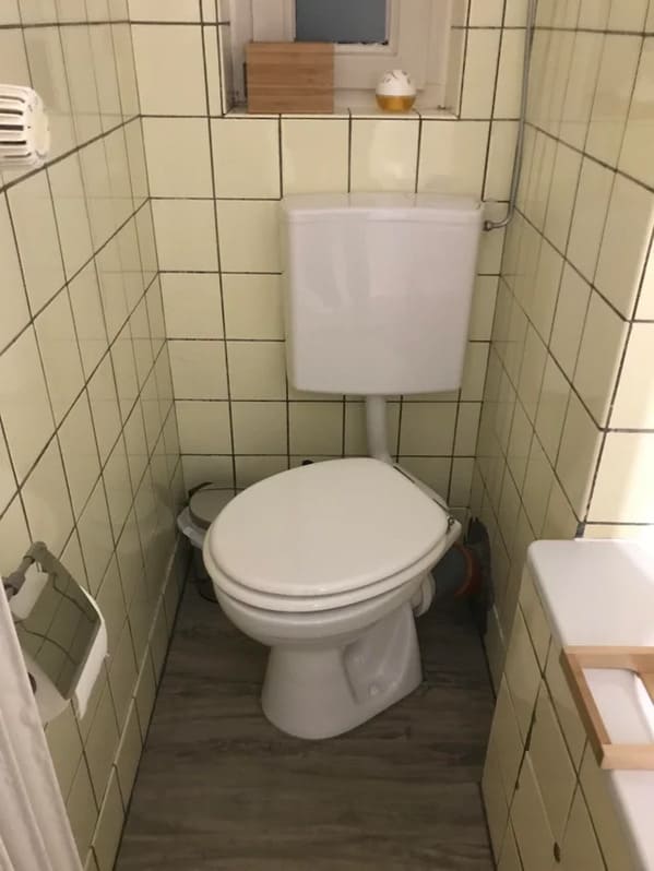
3. Someone didn’t think through how windows work.

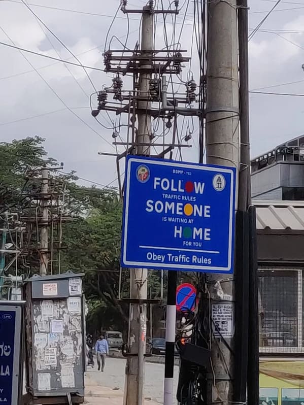
4. If you don’t read the fine print, you end up making a sign that says “Follow Someone Home.”
5. The treadmill was designed for a giant.

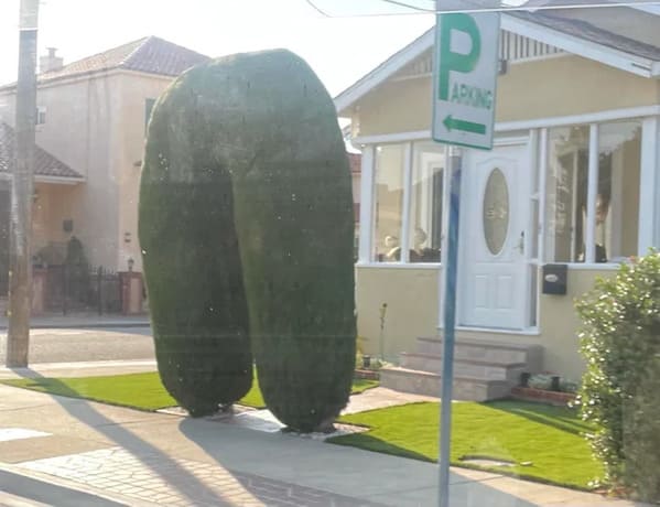
6. Fire the gardener.
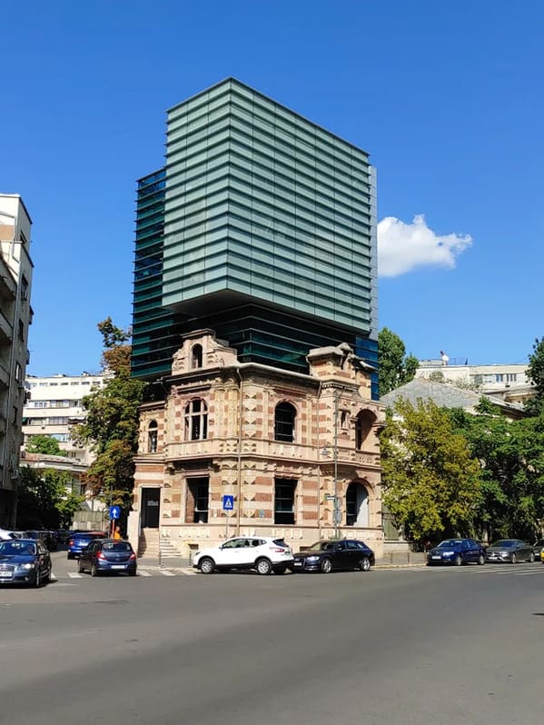
7. Perfect addition to this building that’s been around for 100 years.
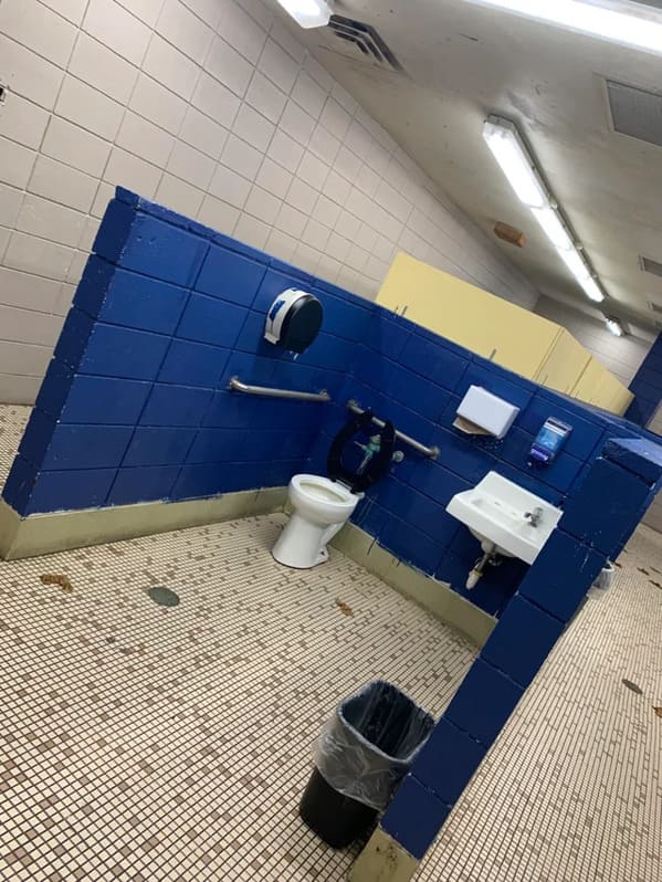
8. High school bathrooms were bad before this.
9. Excuse me?

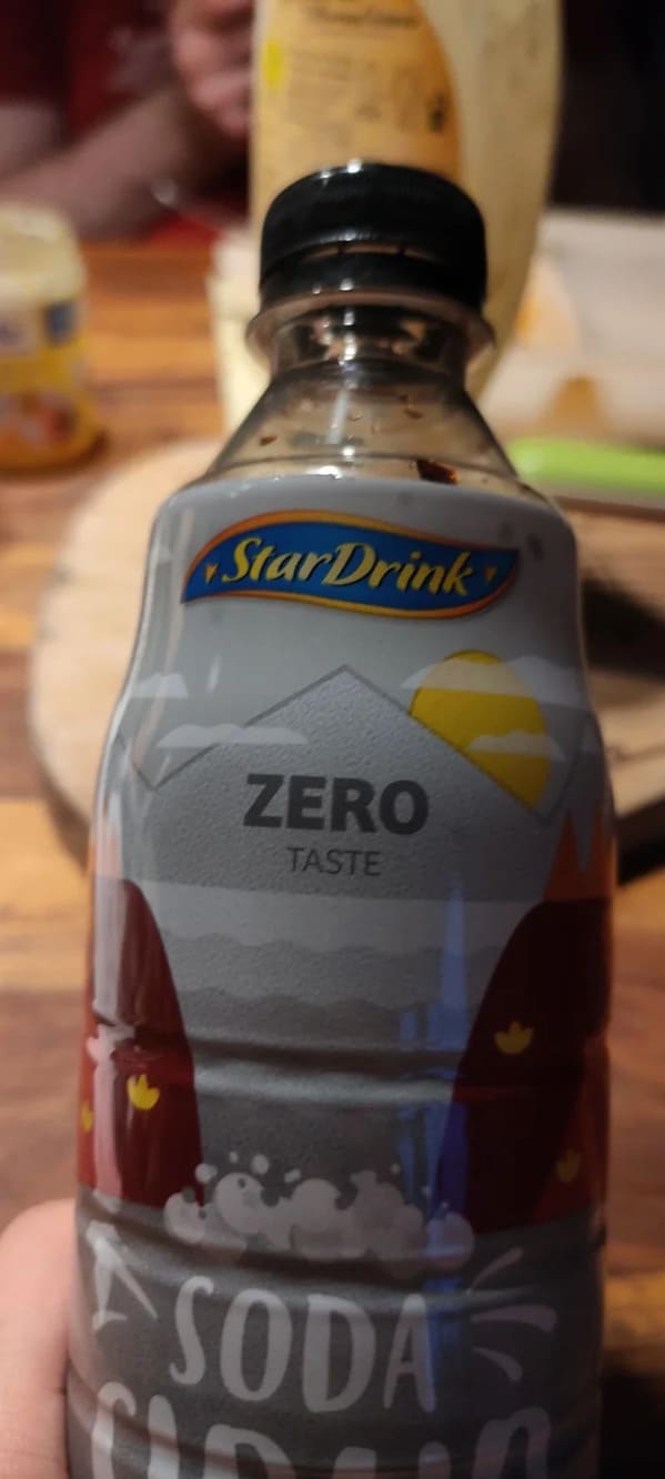
10. No taste.
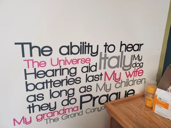
11. My head hurts after reading this sign.

12. A little too much going on here.
13. Don’t never do it.

14. What?
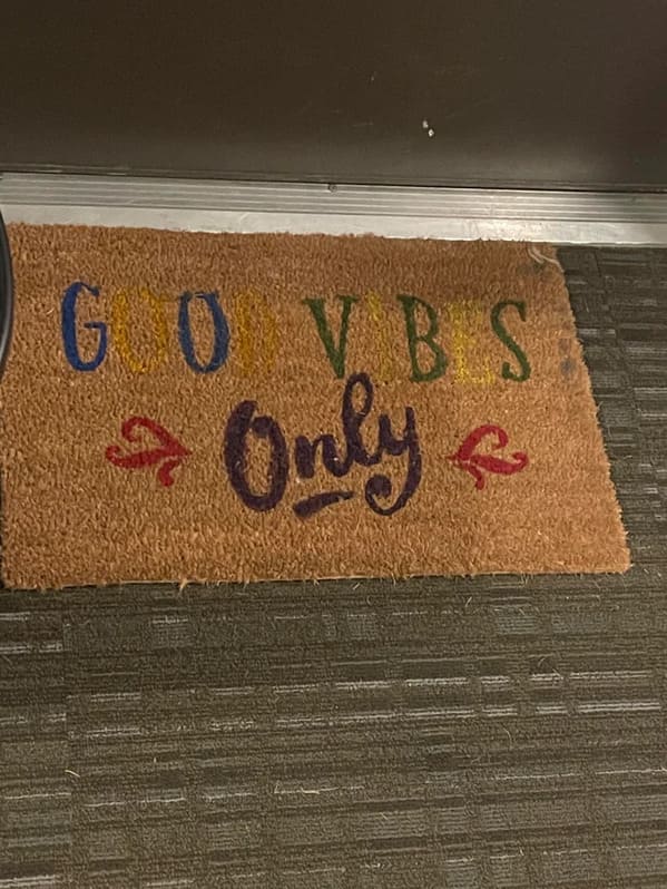
15. Wrong bear but still cute.

16. I still am unsure what this says. Yellow?
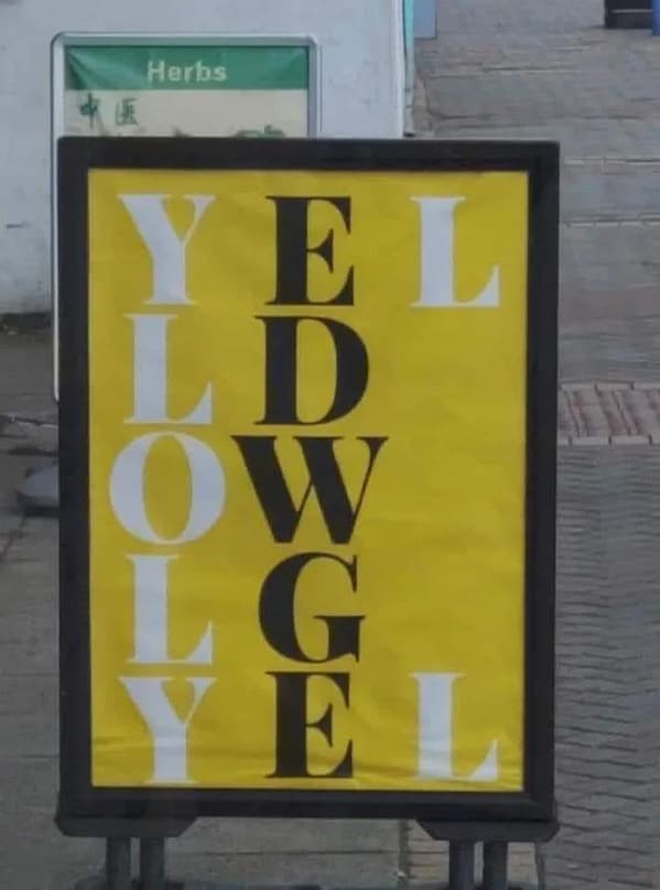
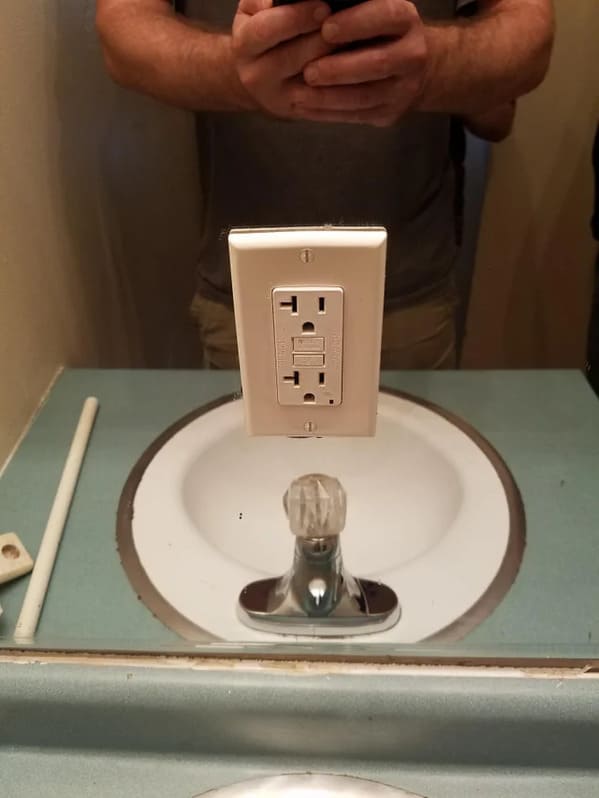
17. Not the best spot.
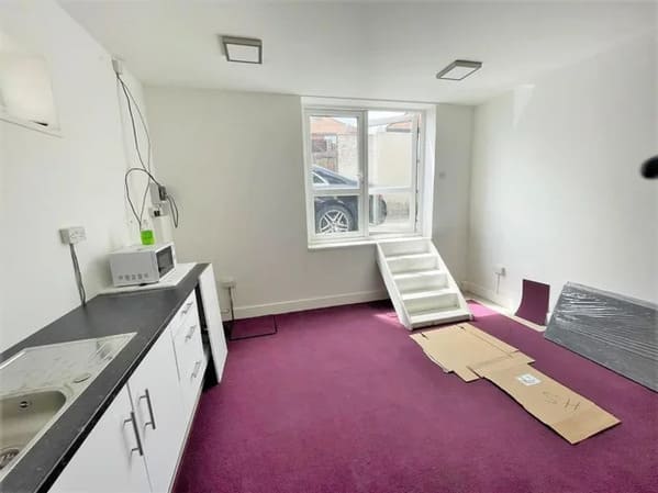
18. New apartment doesn’t have a door but does have a window.
19. Just out of reach.
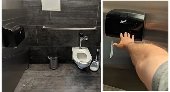
20. The placement made this image weird.

21. I quit trying to read this.
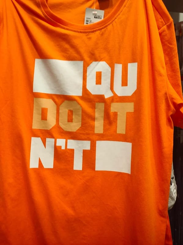
22. Good thing we can all read that while driving.
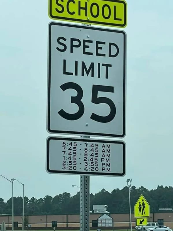
23. You do what here?

24. The color scheme on the salt and pepper.
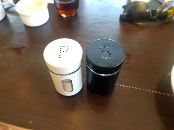
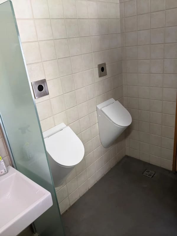
25. Urinals you have to touch to open.
26. He pooped it.

27. Is that supposed to be The Sun or a health class lesson.

28. Why lose weight when you can squish a photo of yourself.

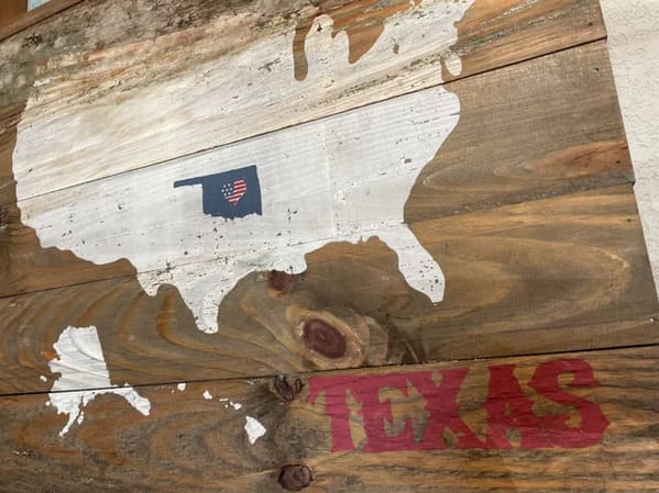
29. That’s not Texas.
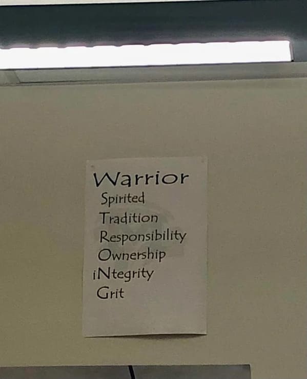
30. Nailed it.
h/t Reddit: r/CrappyDesign

