50 Famous Brand Logo Designs Then And Now
In a world constantly chasing the new, it’s fascinating to look back at the origins of what we now consider iconic.
The logos we recognize in an instant—those simple yet powerful symbols—have stories to tell, tales of a time when they were just taking their first visual breath. They reflect the zeitgeist of their era, crafted with the tools and trends of their day.
1. Ford

2.

3. Pepsi

4. Starbuck’s

5.
Read also: 30+ Examples Of ‘Good Design’ That Outshine Even The Funniest Design Fails
6. Baskin-Robbins

7. Lego

8.

9. Microsoft

10. Playboy

11.

12.

13.

14.

15.

16.

17.

18.
19.

20.

21.

22.

23.

24.

25.

26.

27.
28.

29.

30.
31.
32.

33.

34.

35.

36.

37. Gmail
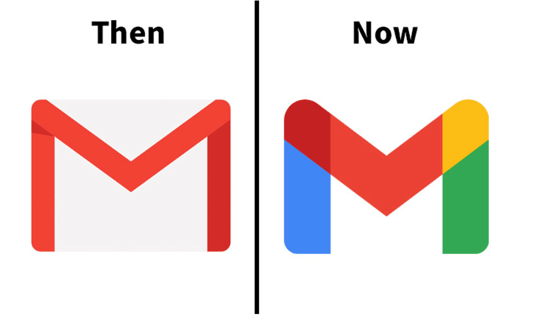
38.

39. Twitter (X logo doesn’t count)

40.

41.

42.

43.

44.
45.
46.

47.
48.

49.

50.


