30 Crappy Restaurant Design Fails Guaranteed To Ruin Your Appetite
It seems like some restaurants have a secret menu item: design fails. From hilariously misplaced artwork to seating arrangements that defy logic, these eateries have served up some of the funniest fails in restaurant design history.
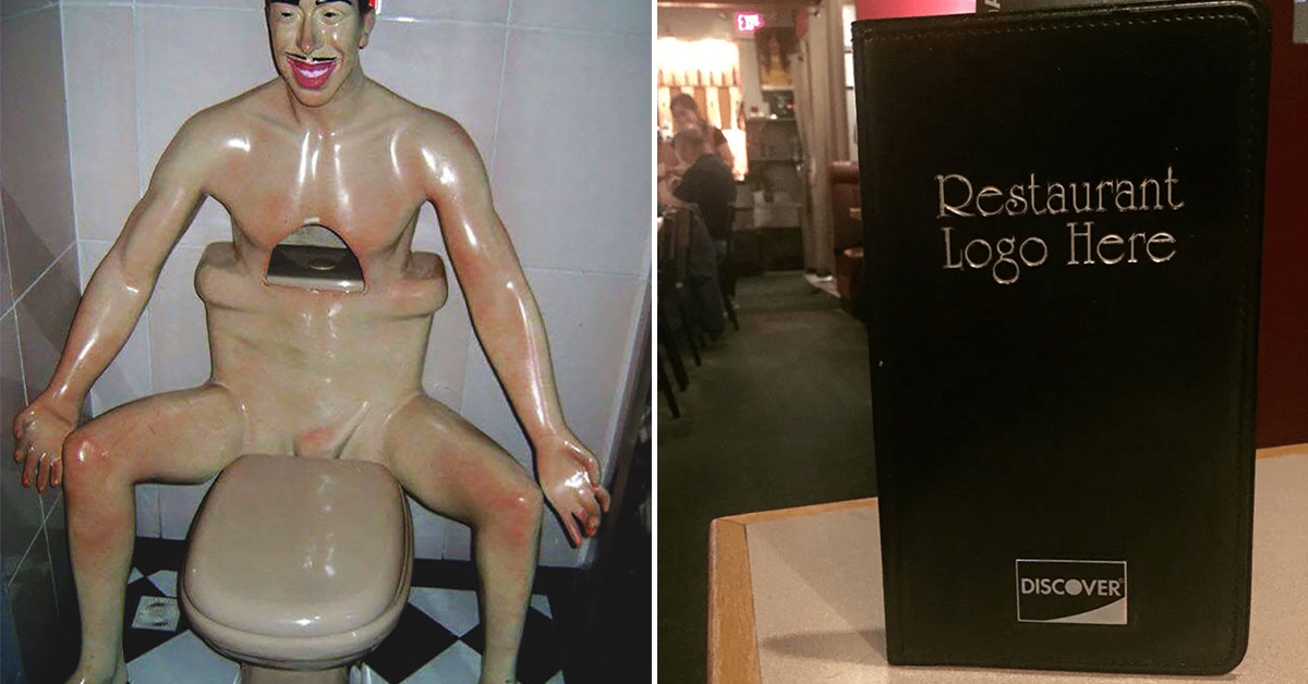
Imagine walking into a restaurant and finding a toilet shaped like a man sitting or a bowl that has holes in it or a questionable sign placement—yes, these are real examples. It’s a dining experience you won’t forget but for all the wrong reasons.
So, grab a seat (hopefully, a properly placed one.) and get ready to laugh at these 30 times restaurants accidentally became comedy gold with their quirky design choices.
1.
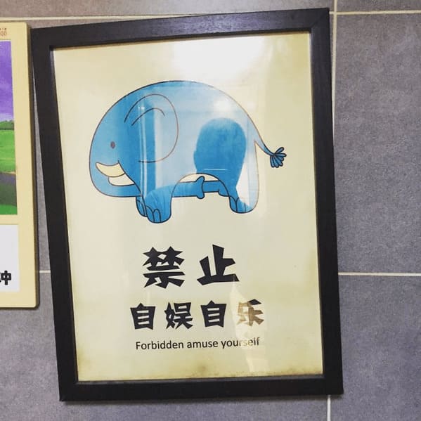
2. “This Was Hanging In The Bathroom In The Restaurant I Ate At Tonight. Only In China…:”
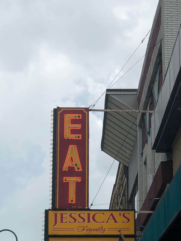
3.
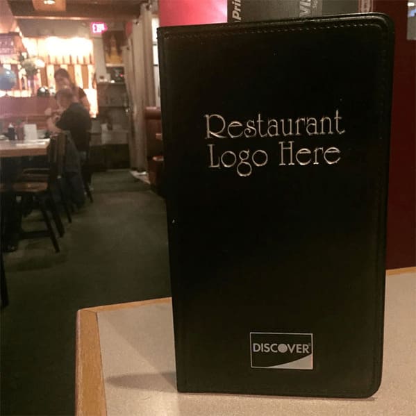
4. “Two Different Restaurants. No Affiliation. Located Just Up Ahead”
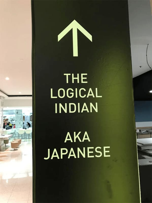
5. “The Wendy’s Restaurant In Beaver, Utah Got A New Sign”
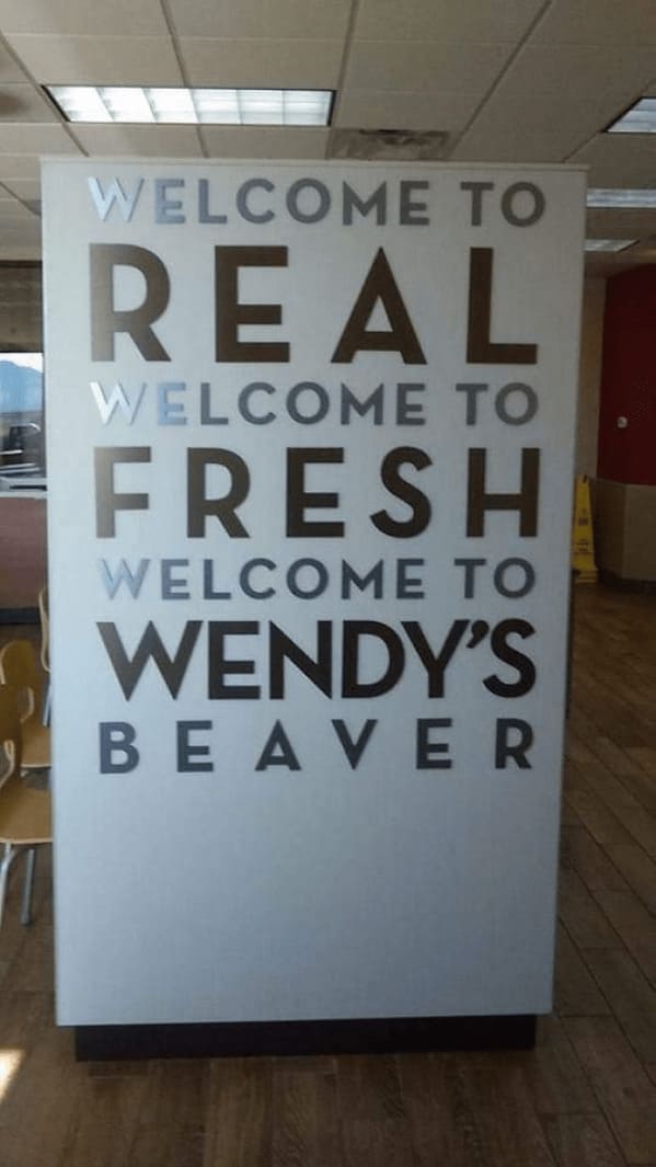
6.
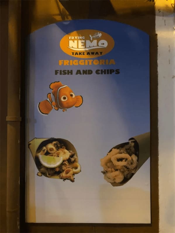
7.
8.
9.
10.
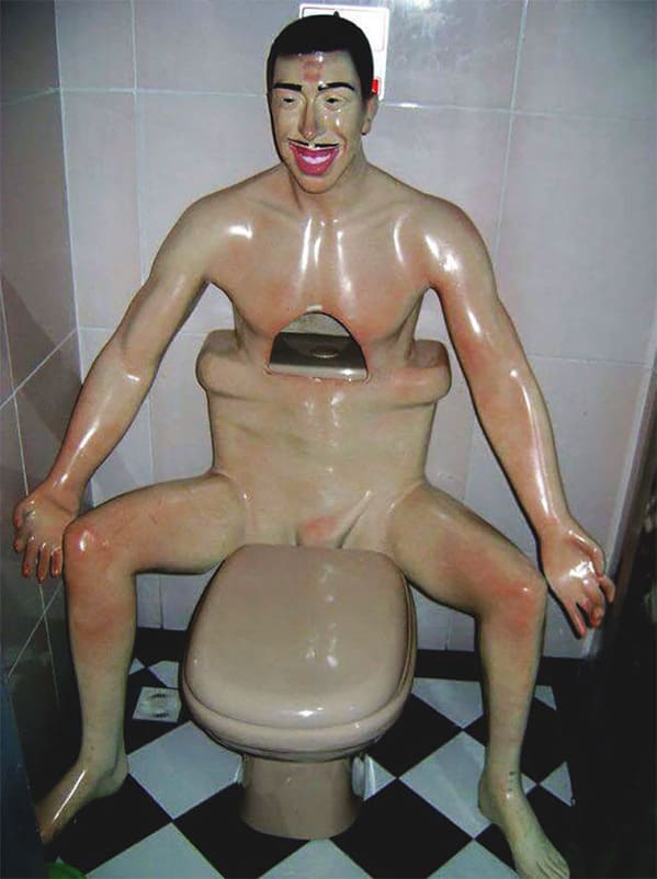
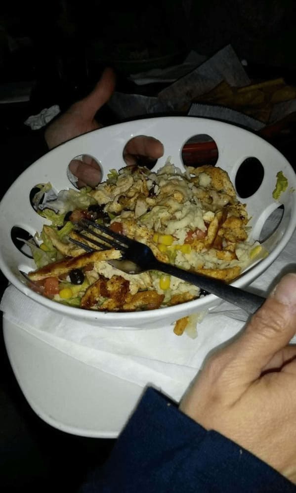
11. “This Bowl My Friend’s Dinner Came In”
12.
13.
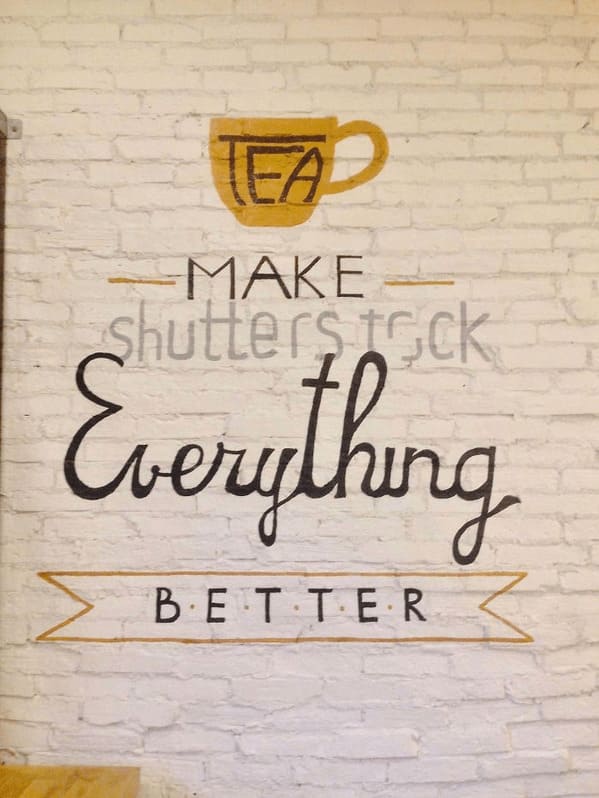
14. “Wall Painting, That Included Shutterstock Watermark”
15.
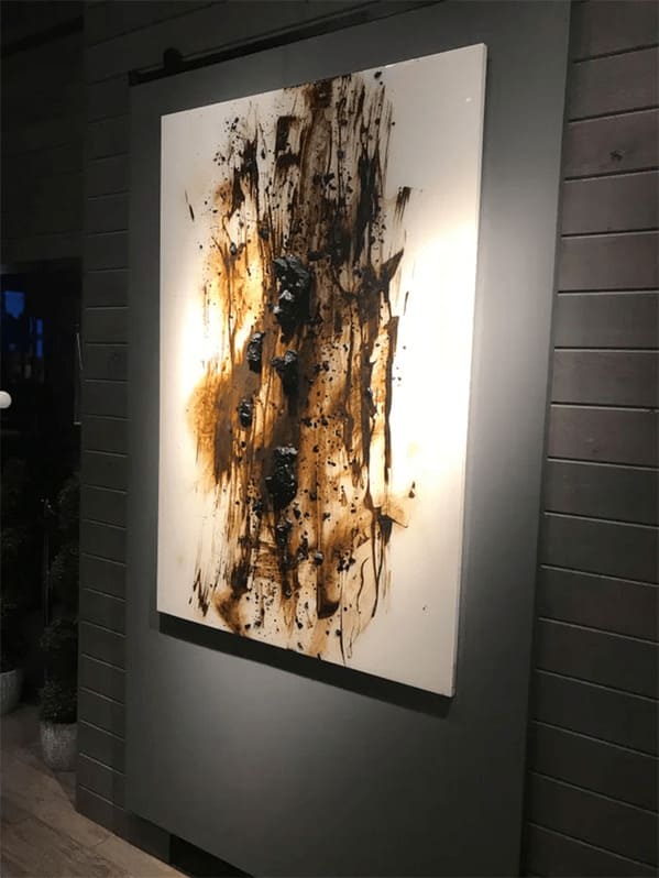
16.

17.
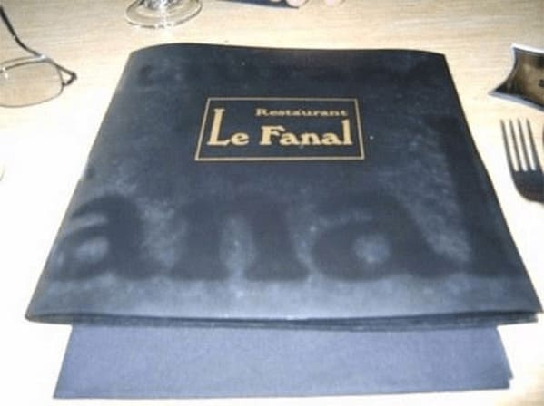
18.
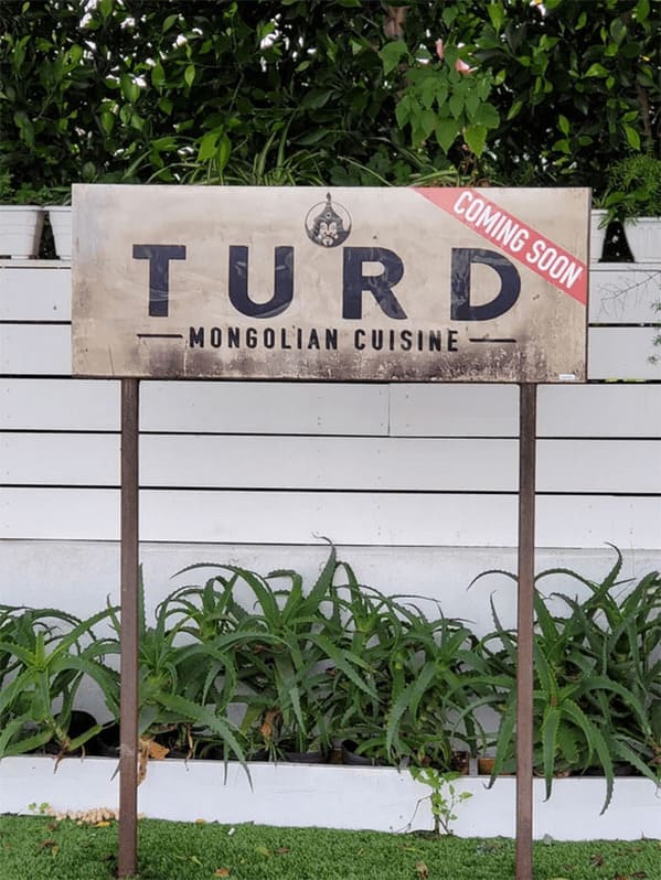
19. “A Bar I Go To Never Cleans The Dripped Candle Wax”
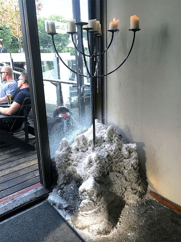
20. “The Restaurant Is Called Let’s Do Greek!”
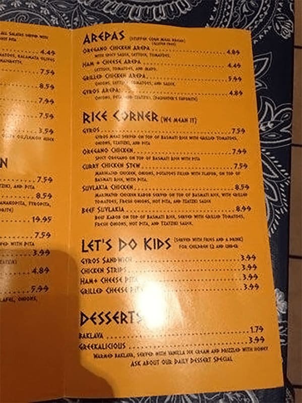
21.
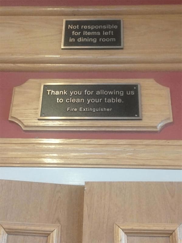
22. “Lets Just Make Our Plates Look Like They Haven’t Been Washed In 4 Years”
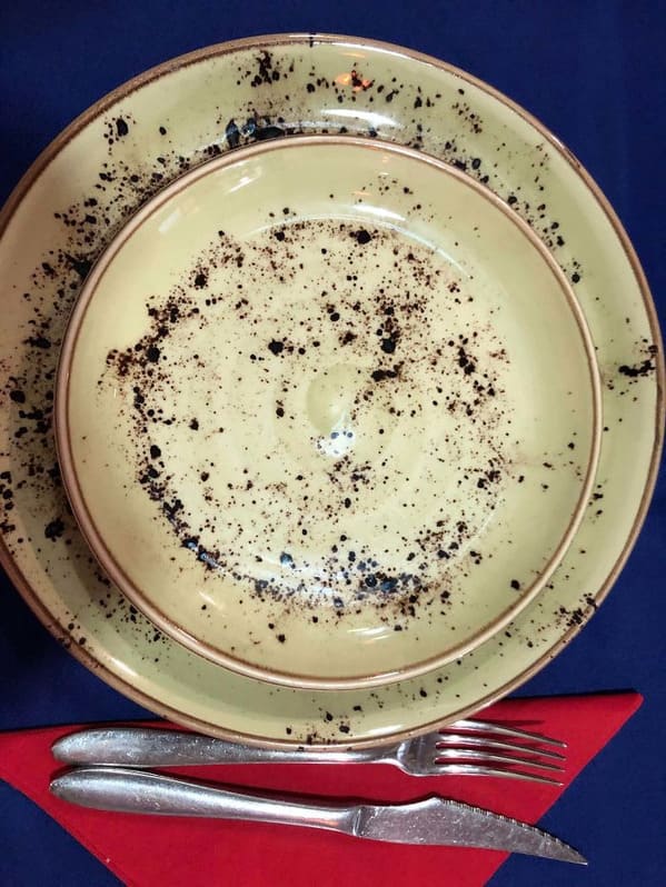
23. “The Restaurant Is Called Let’s Do Greek!”
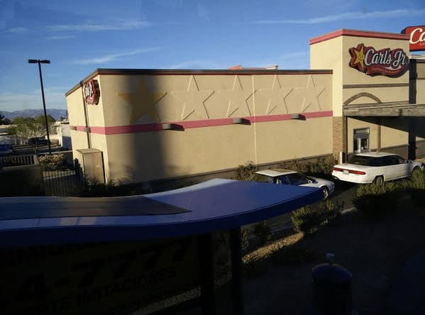
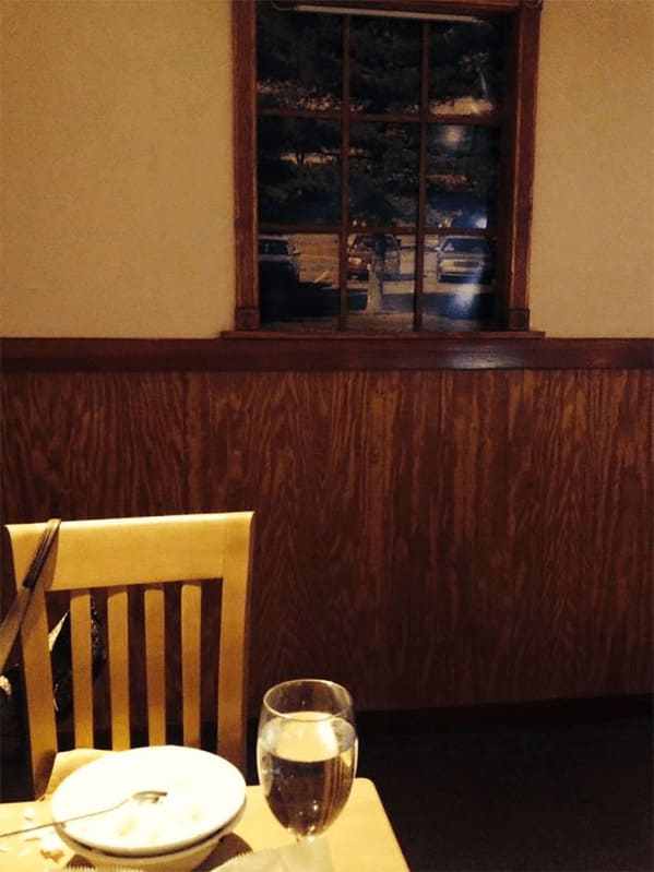
24. “Fake Windows Looking Out Into Pictures Of A Parking Lot”
25.
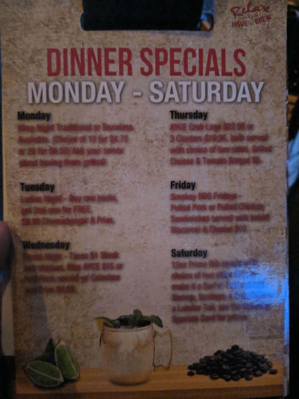
26. “No, This Picture Isn’t Blurry… The Menu Is”
27.
28.
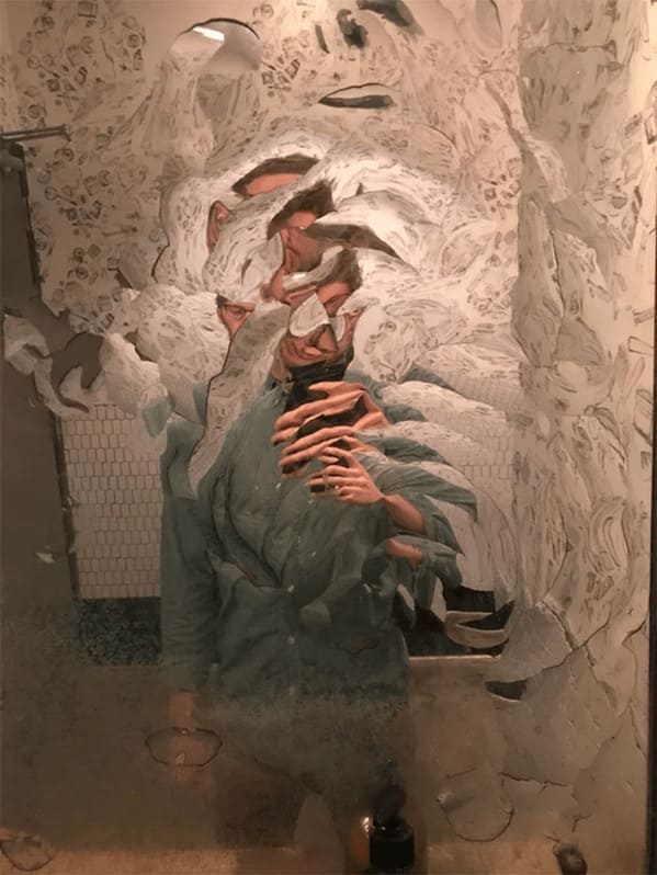
29.
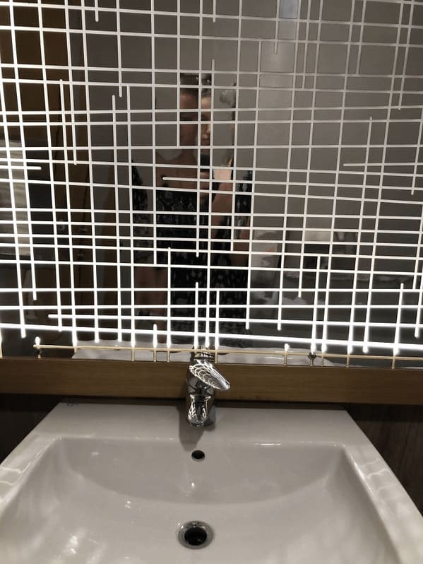
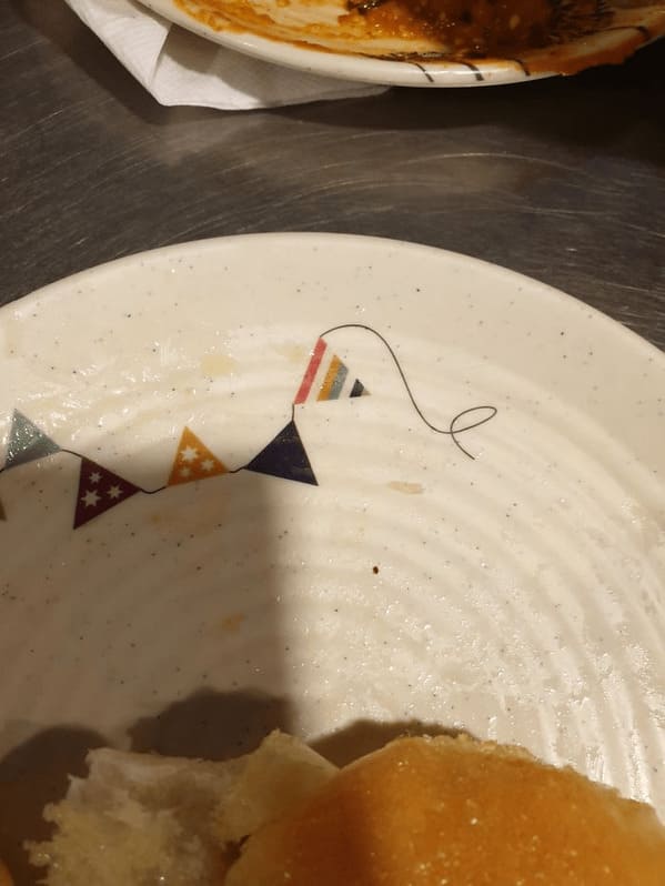
30. “This Pattern That Resembles A Single Human Hair Stuck At The Edge”
