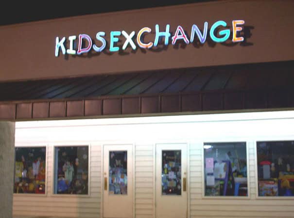
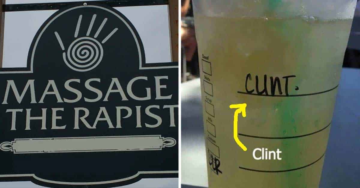
45 Funny Text Design Fails Where Poor Letter Spacing Spelled Disaster
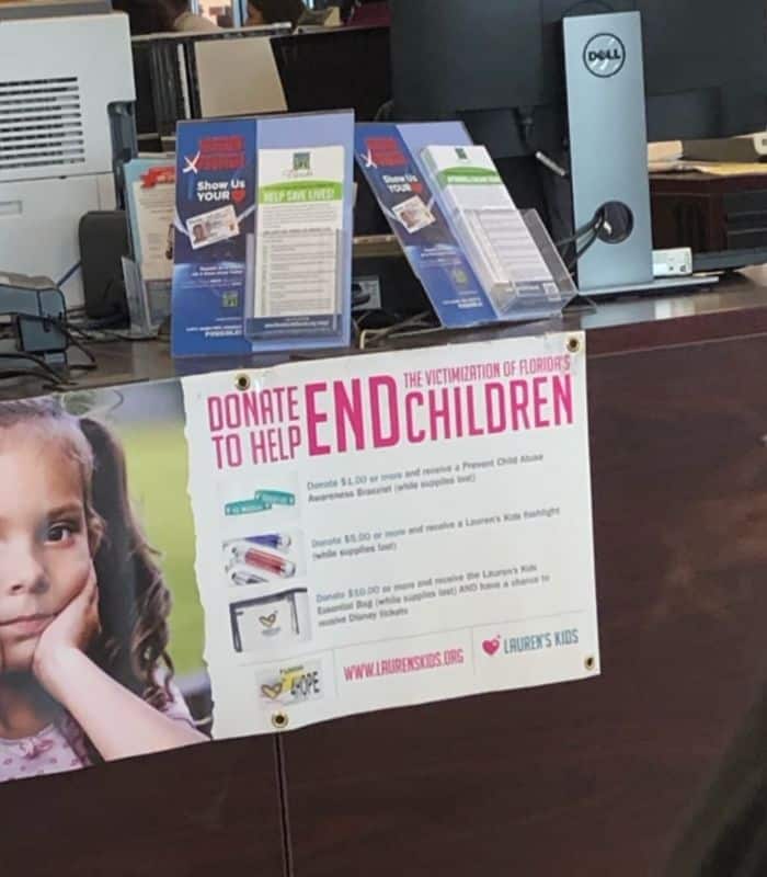
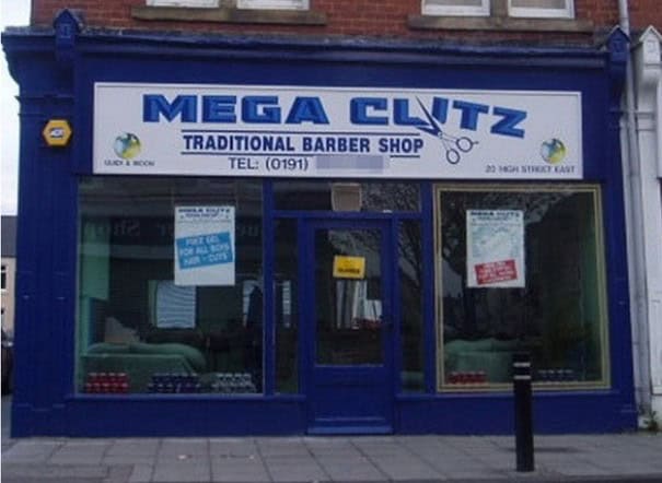
As someone who went to design school and sat through enough typography classes to know better, I can confidently say that font choice can make or break a design.
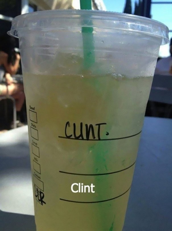
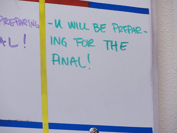
And trust me, these design fails are a perfect example of fonts gone horribly wrong.
From signs that accidentally spell something ridiculous to ones you can’t even read without squinting, it’s clear that someone should’ve paid more attention in Typography 101.
1.

2.

3.

4.
5.
Read More: 40 Shamefully Bad Designs Doing The Bare Minimum To Get Their Point Across (April 2, 2025)
6.

7.

8.

9.

10.

11.

12.

13.

14.

15.

16.

17.

18.
19.

20.

Read More: 40 Shamefully Bad Designs Doing The Bare Minimum To Get Their Point Across (April 2, 2025)
21.

22.

23.

24.

25.

26.

27.

28.

29.

30.

31.

32.

33.

34.

35.

36.

37.

38.
Read More: 40 Shamefully Bad Designs Doing The Bare Minimum To Get Their Point Across (April 2, 2025)
39.

40.

41.

42.

43.

44.

45.
