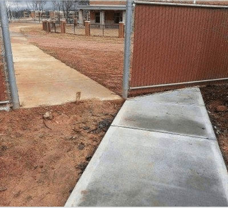
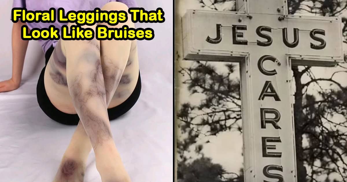
28 Funny Design Fails That Should Come With A Public Apology
Some design fails are so spectacularly bad, they feel less like accidents and more like personal attacks. You look at them and think, “Surely this had to be a joke,” but nope. Someone got paid to do that.
From signs that accidentally say the worst possible thing to products that look like a sleep-deprived raccoon designed them, these are the kinds of choices that make you question the entire creative process.
If you’ve ever felt like you were bad at your job, just remember: at least you’re not the person who thought that any of these were a good idea.
Let’s take a walk through the world of design disasters that deserve a formal apology and maybe a few revoked licenses.
1. Yikes

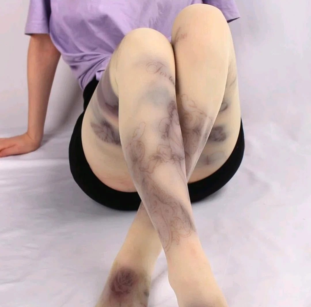
2. It’s supposed to be a floral pattern but looks like bruises
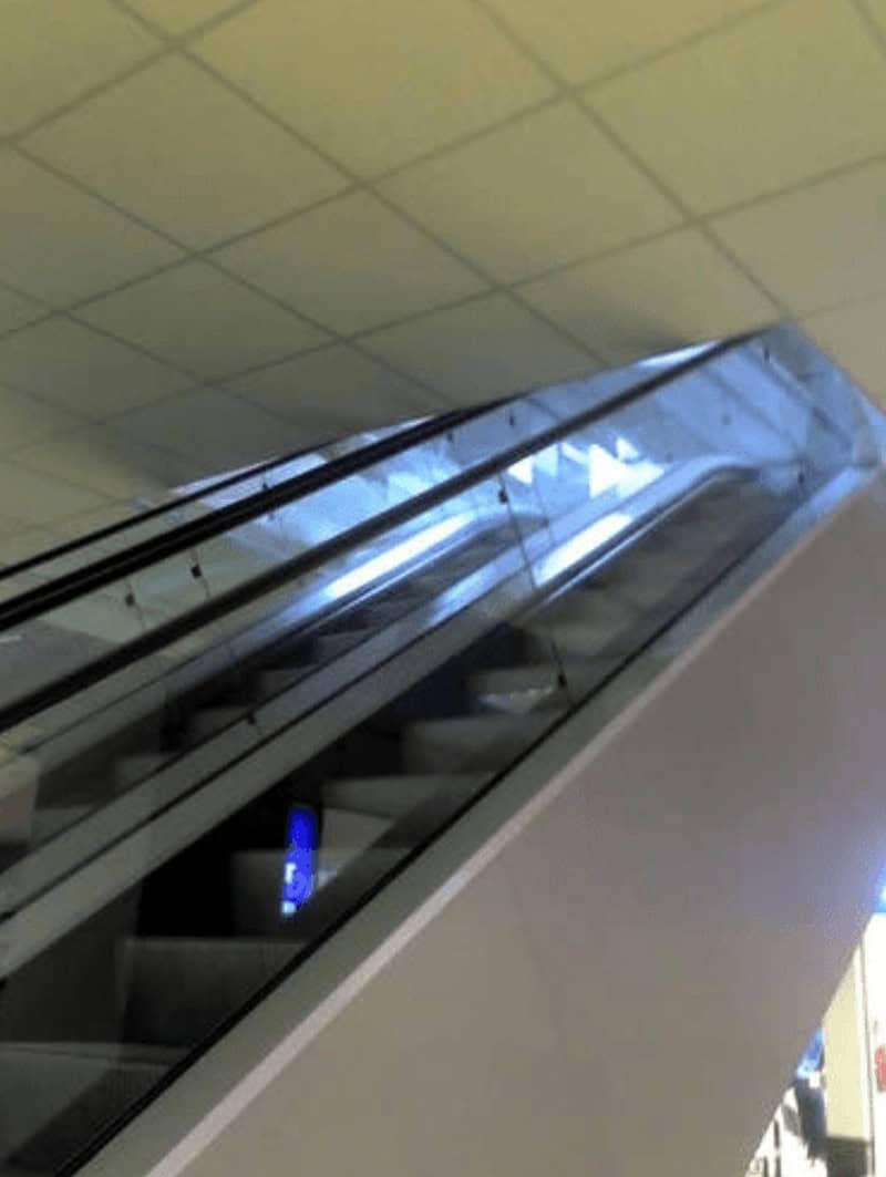
3. Escalator to the ceiling?
4. Might want to look at that again
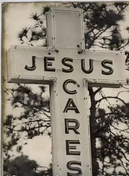
5. Are you asking for injury here?
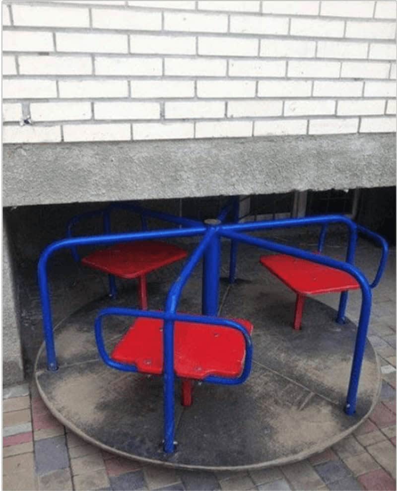
6. Door to nowhere
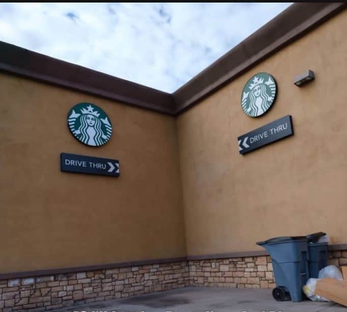
7. Efficient use of space I guess
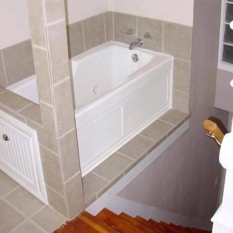
8. Wait… no
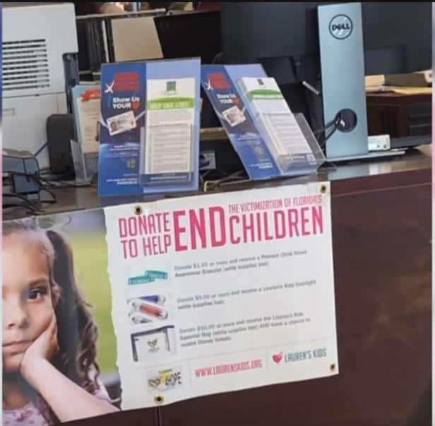
9. America runs from this Dunkin
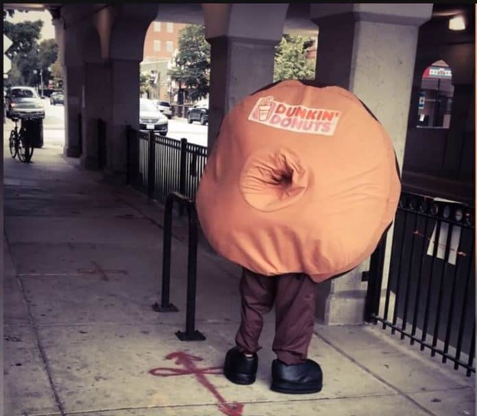
10. A bit too close for comfort!
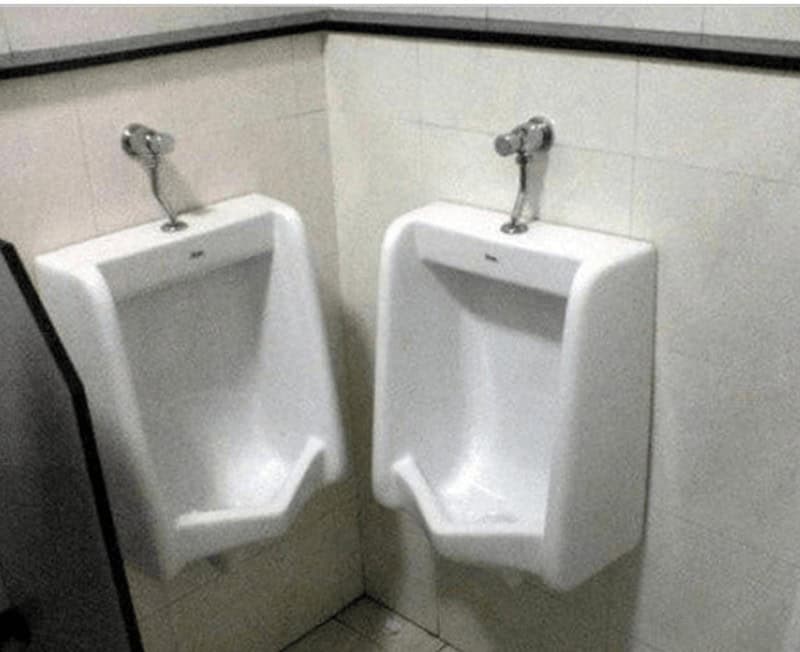
11. Bet that doesn’t get used often…
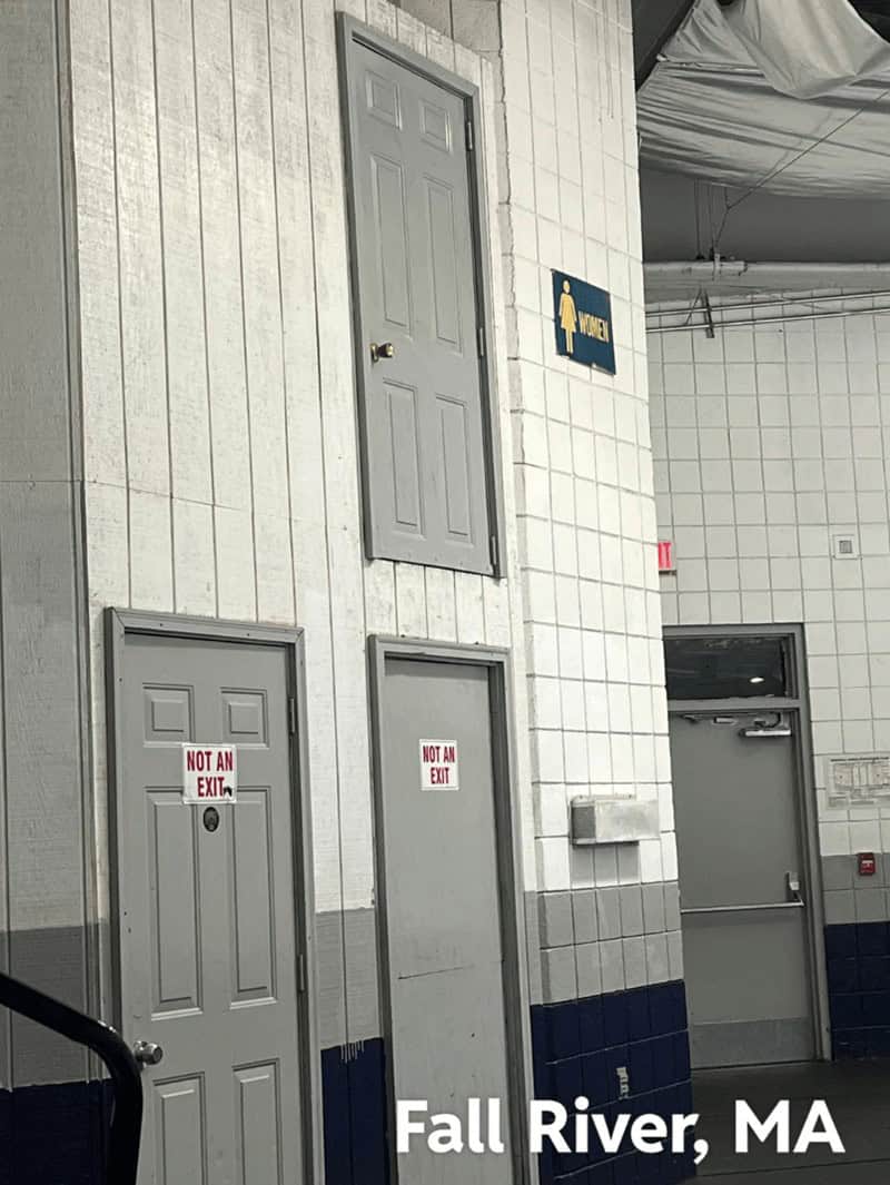
12. Guaranteed Reduced!

13. Where do they go then?
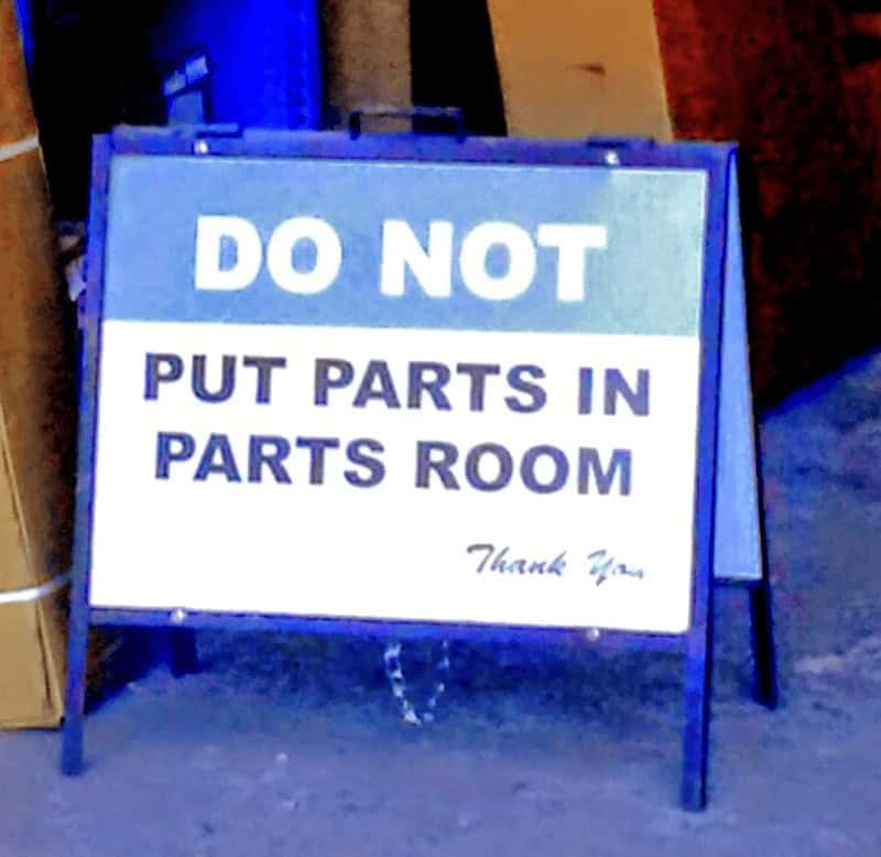
14. What exactly is the purpose of this?
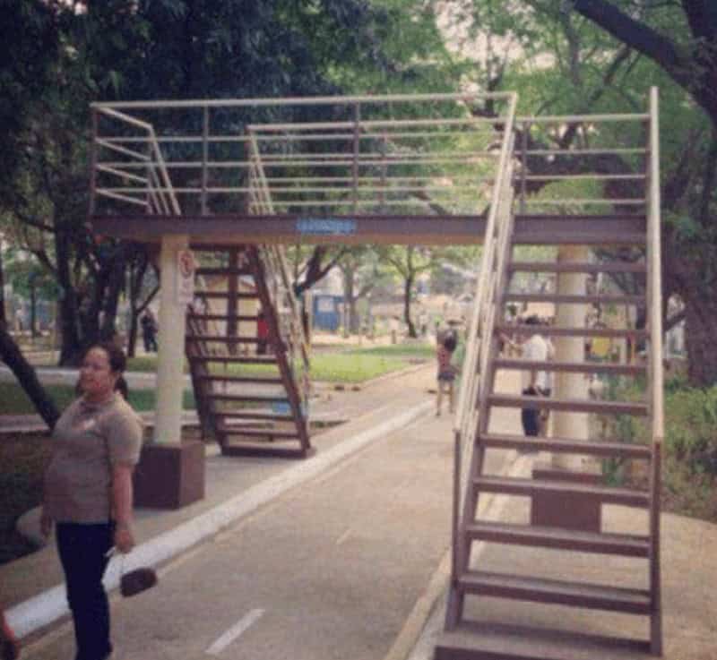
15. Catch all
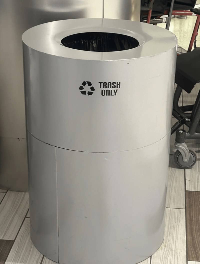
16. Something isn’t lining up here
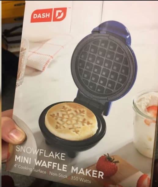
17. Zero stars for this design

18. In the eye of the beholder…
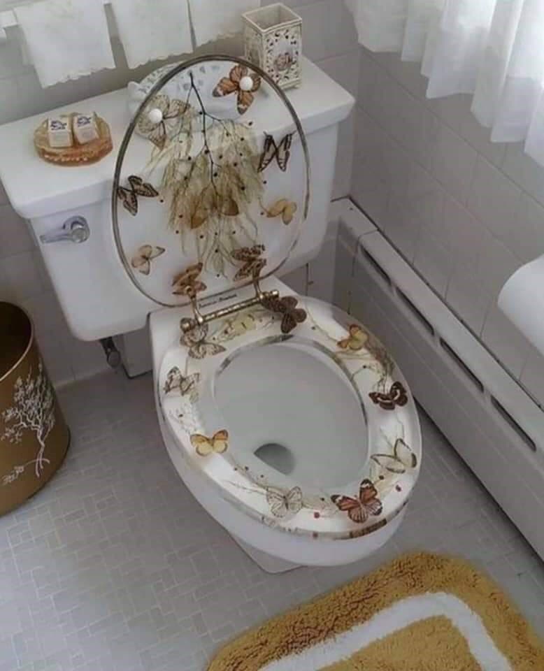
19. Okay?
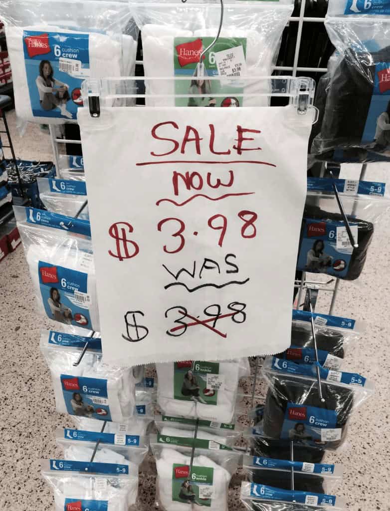
20. This had to have been on purpose, right?
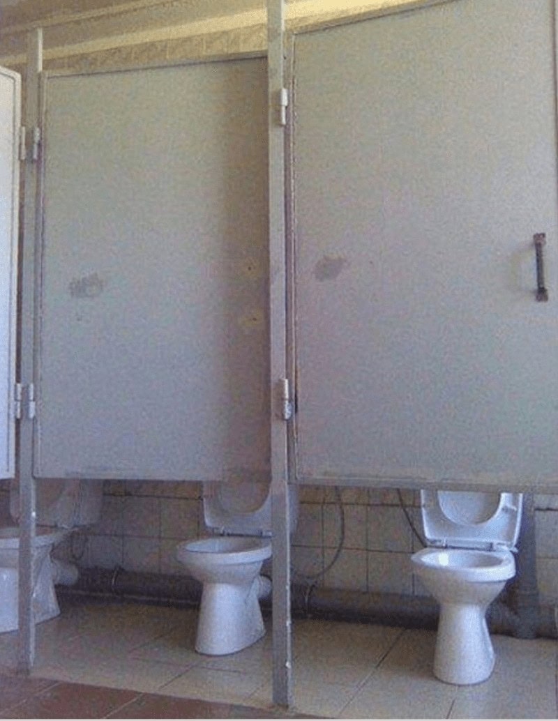
21. How does this happen?
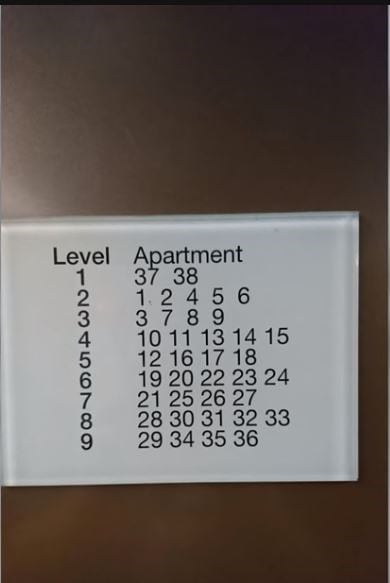
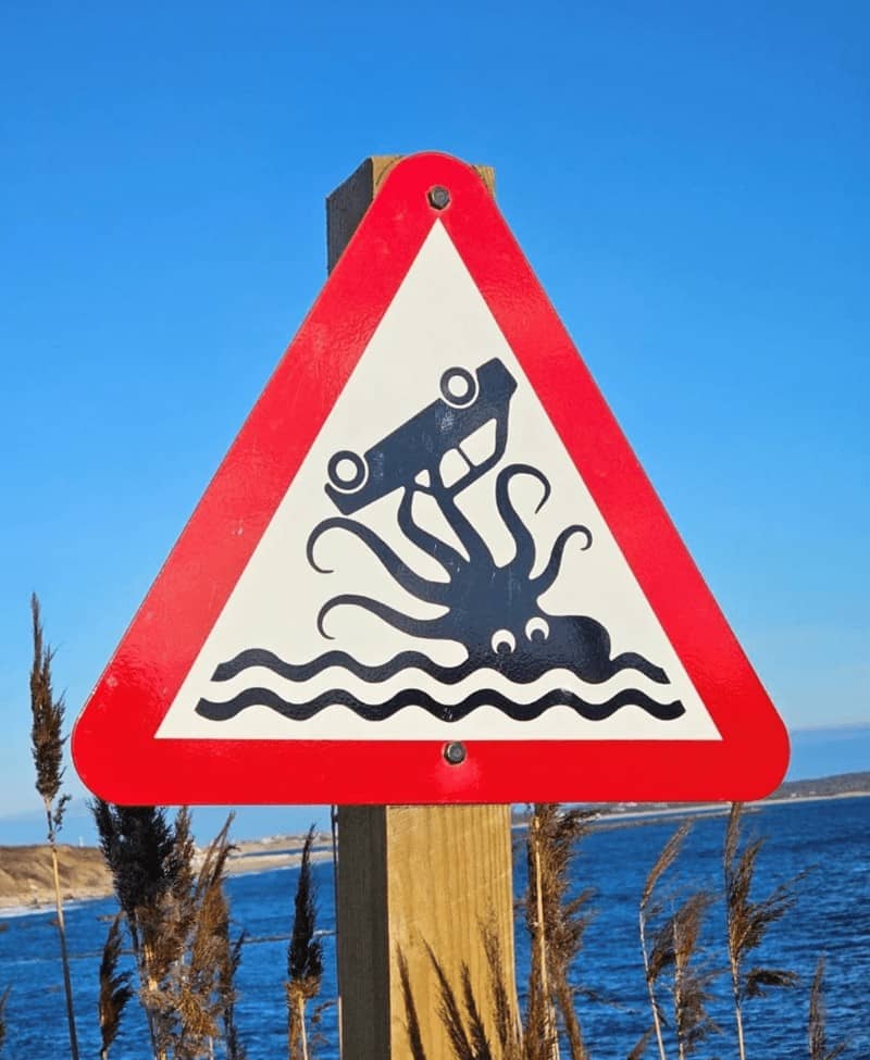
22. Thanks for the Kraken warning
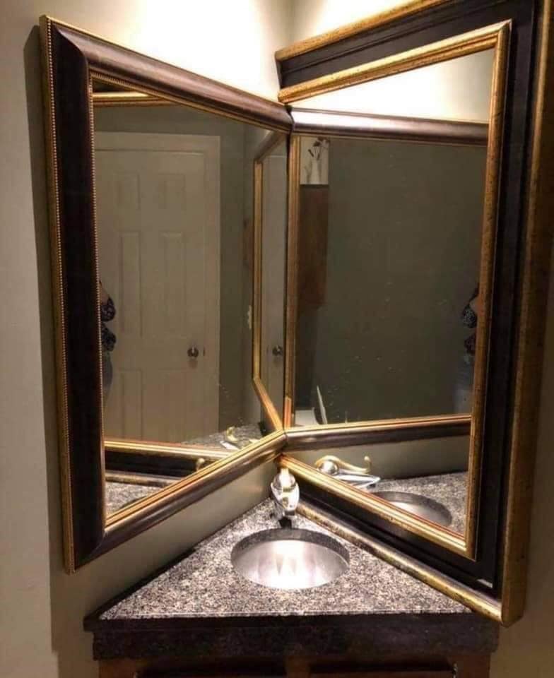
23. This designer really needs to take a look in the mirror
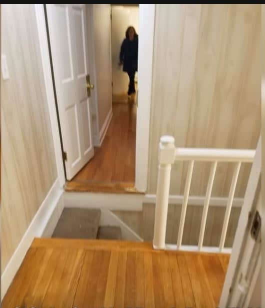
24. Watch your steps
25. Who wants a heavier boulder?
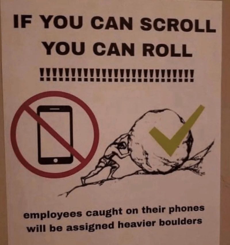
26.
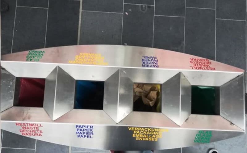
27. Whoever designed this clearly does not cook…
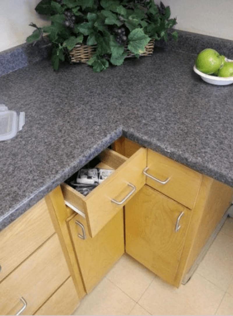
28. This feels poetic somehow…
