Why Brand Logos All Look So Boring These Days
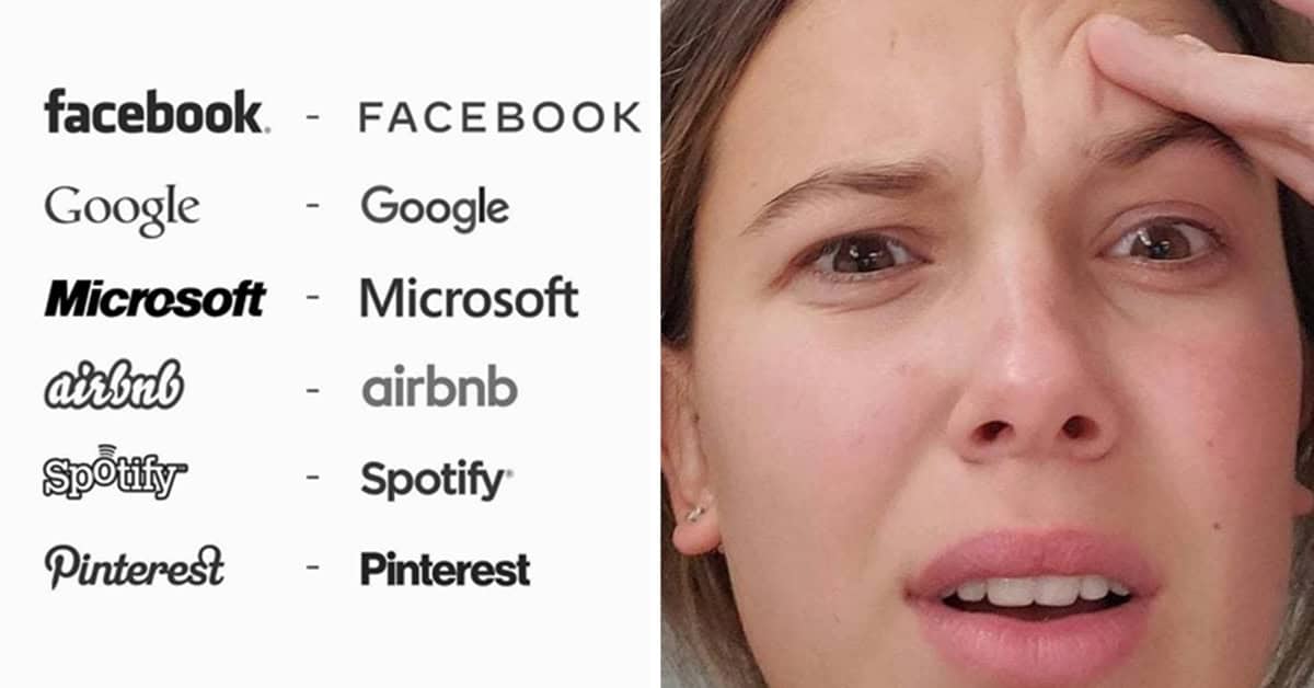
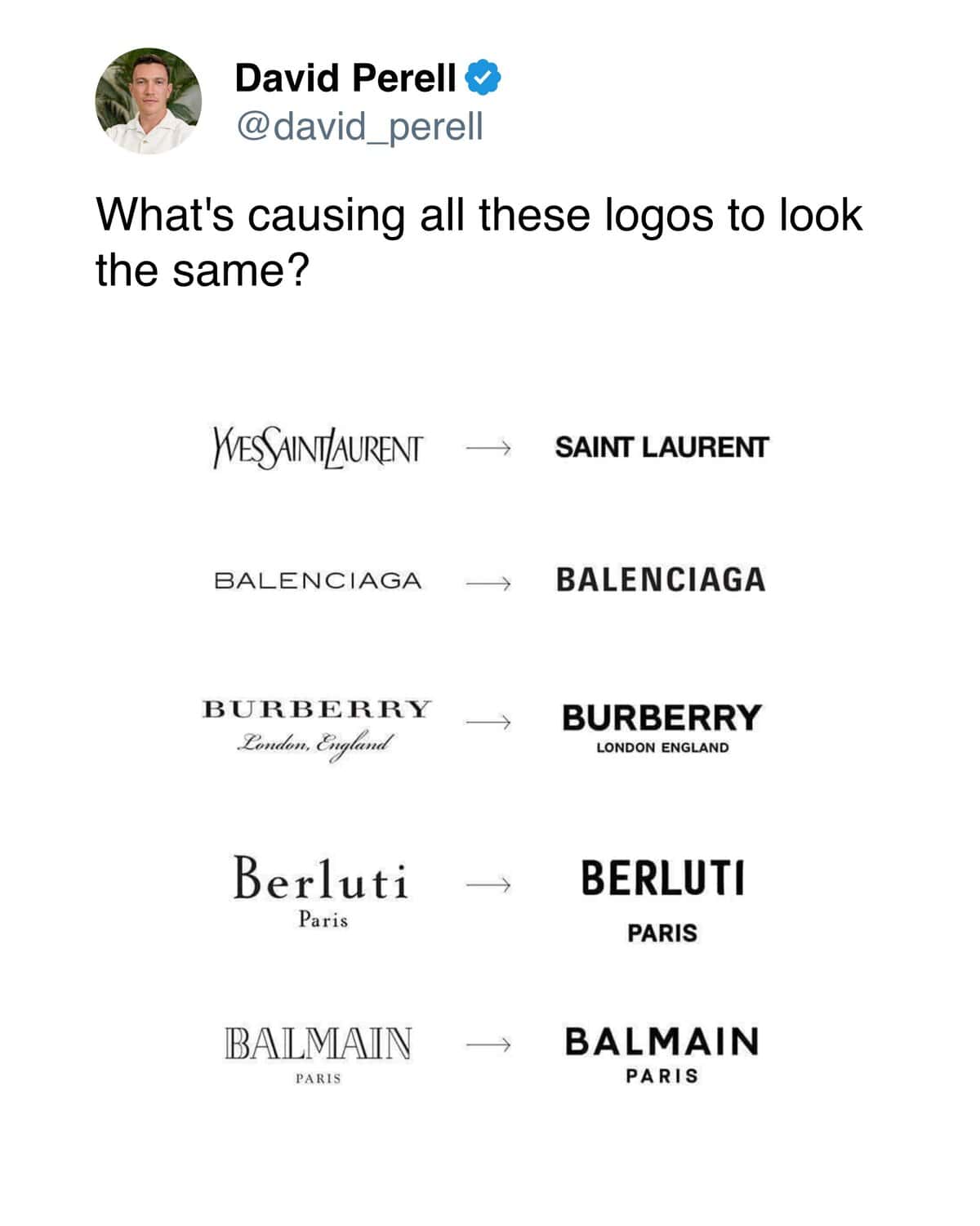
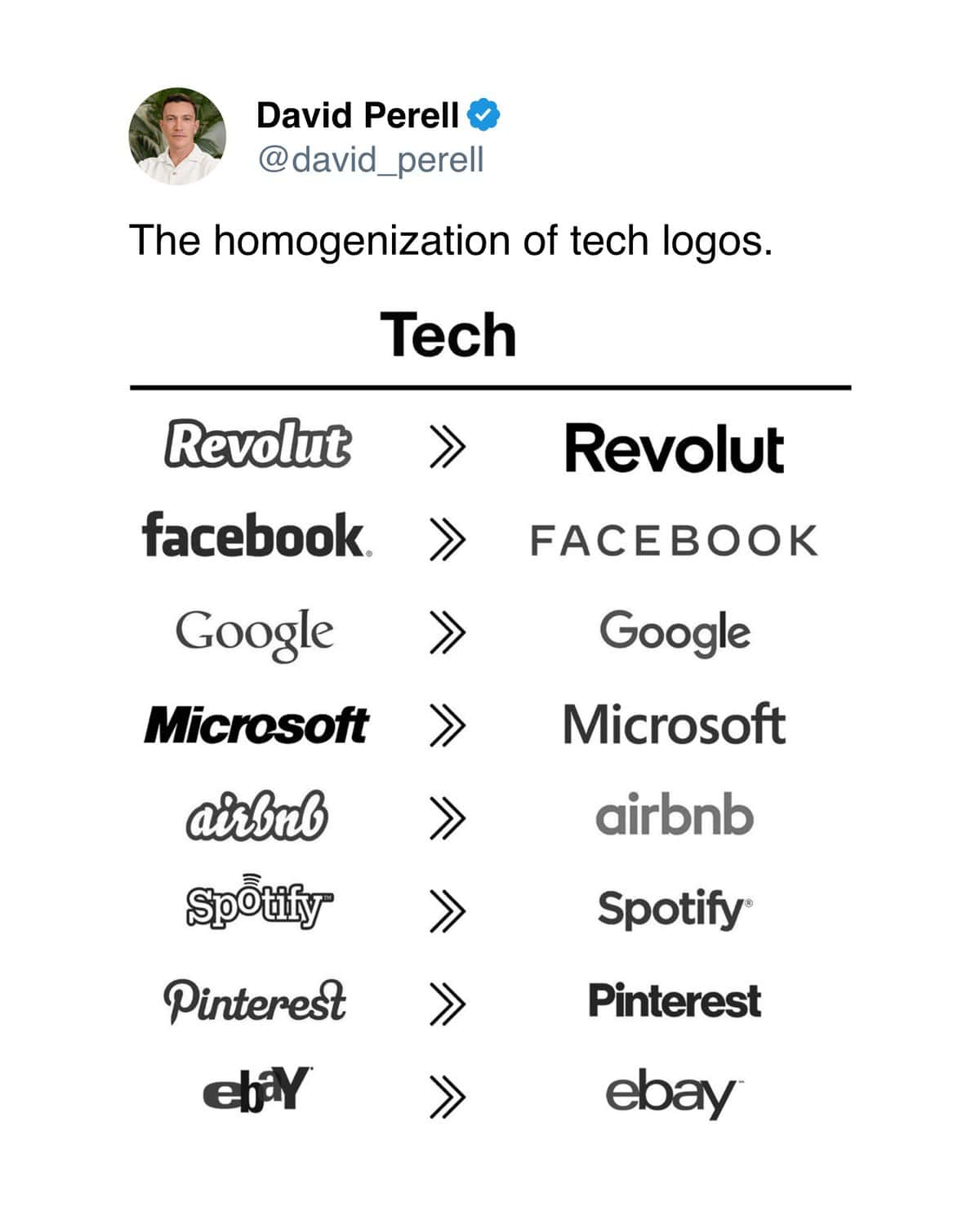
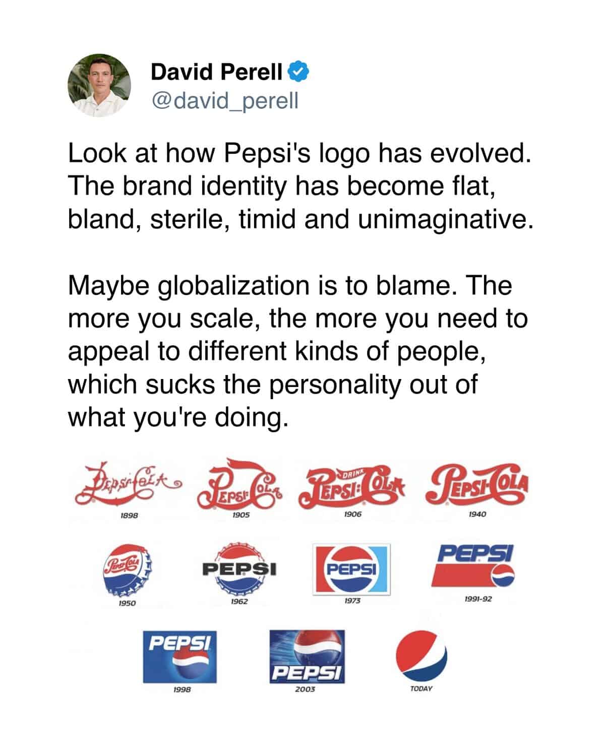
Writer and thinker David Perell pointed out that every brand logo looks the same now, and once you see it, you can’t unsee it.
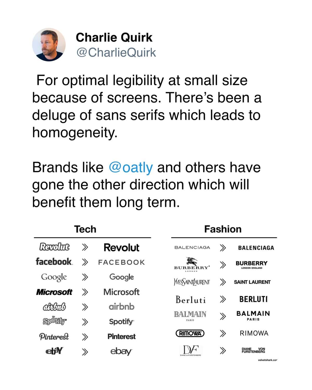
Minimalist sans serif font, maybe all lowercase, definitely no personality. Doesn’t matter if it’s a bank or a yogurt company or a startup that sells mattresses—they all use the same tricks.
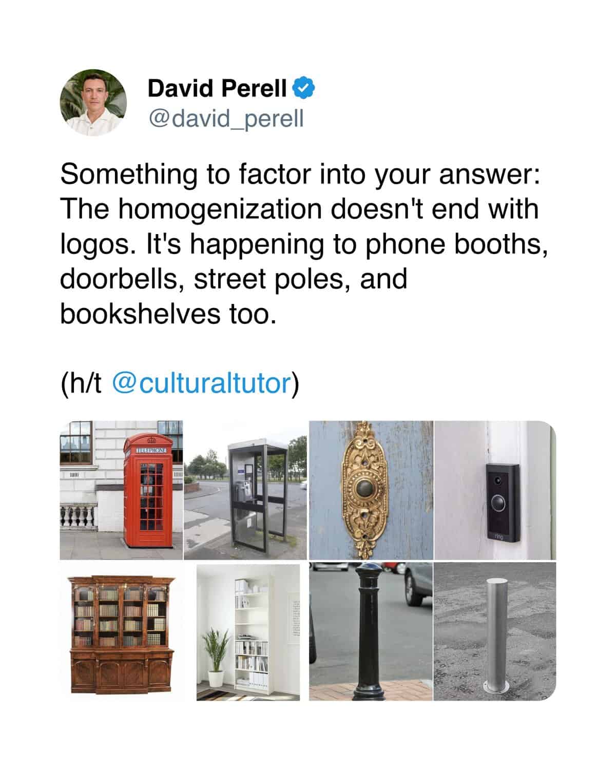
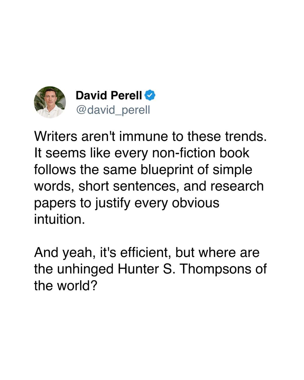
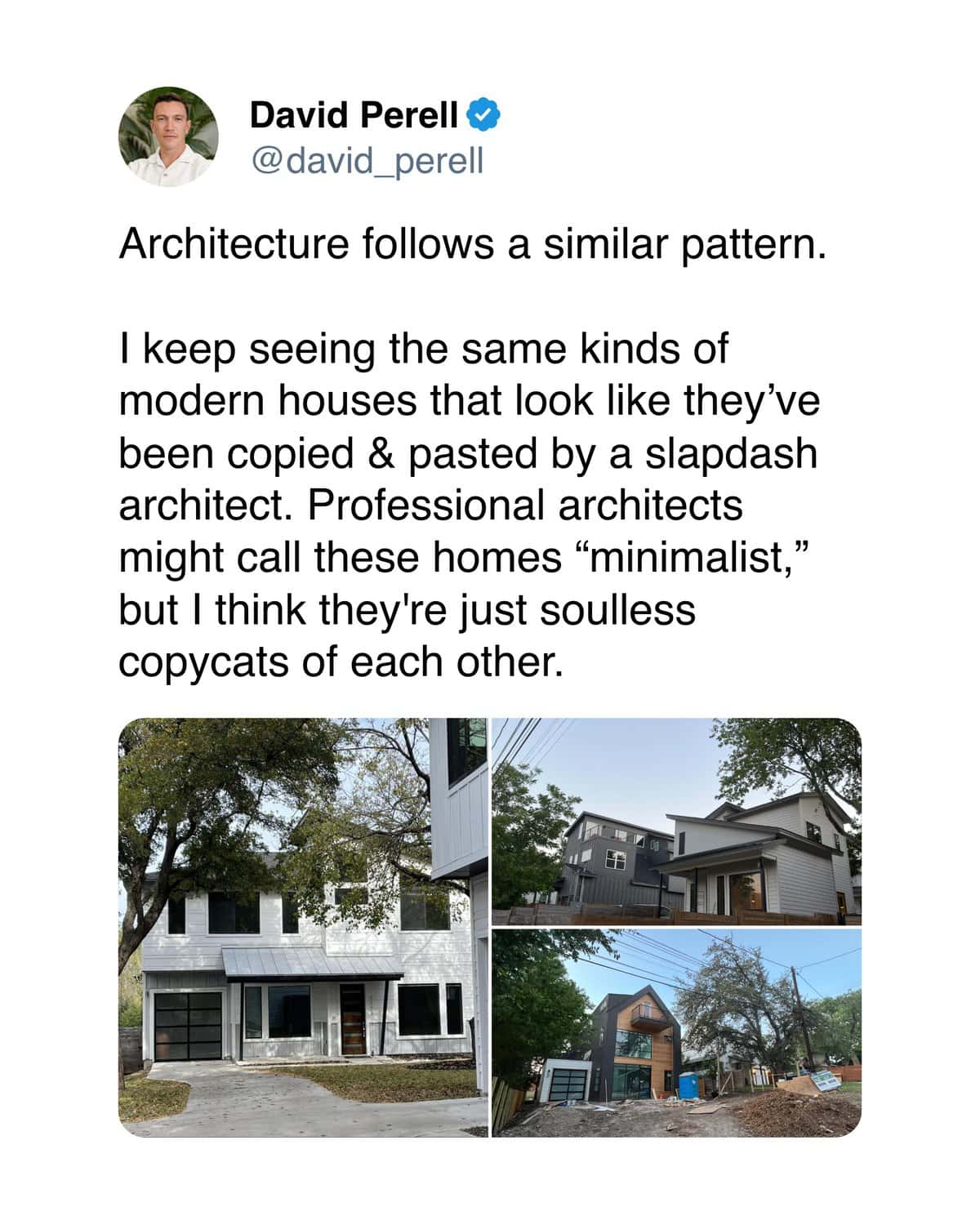
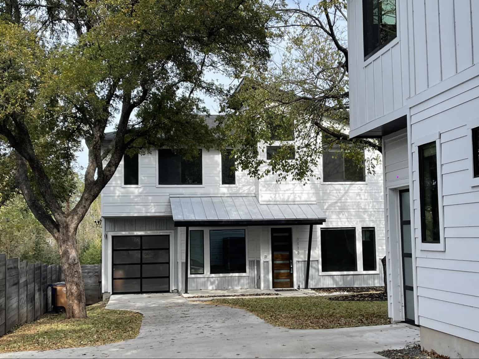
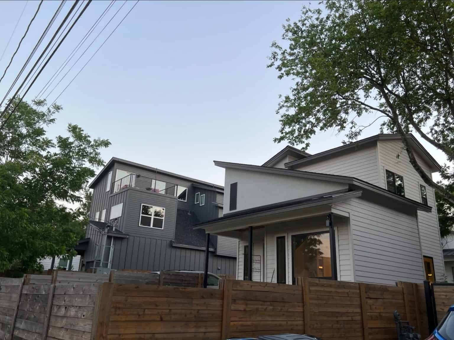
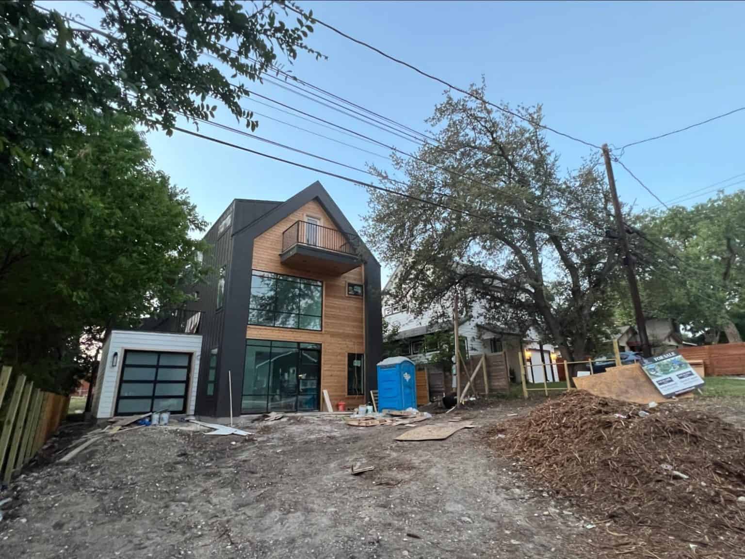
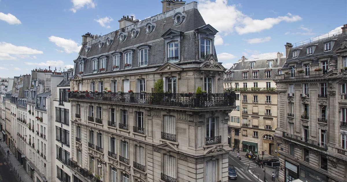
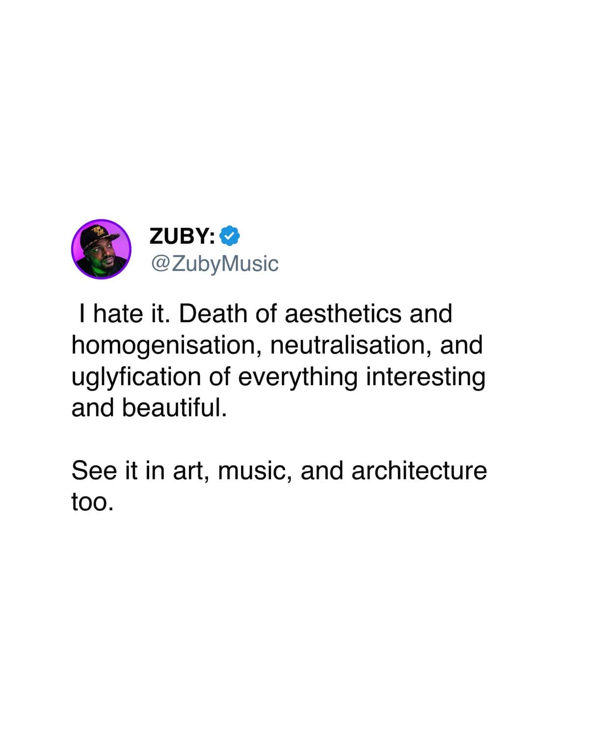
But it’s not just logos. Architecture is doing it too—every new apartment building looks like the same glass box, every coffee shop has the same exposed brick and Edison bulbs. Even writing online has flattened out into the same voice, the same structure, the same safe tone that doesn’t offend anyone or say anything interesting.
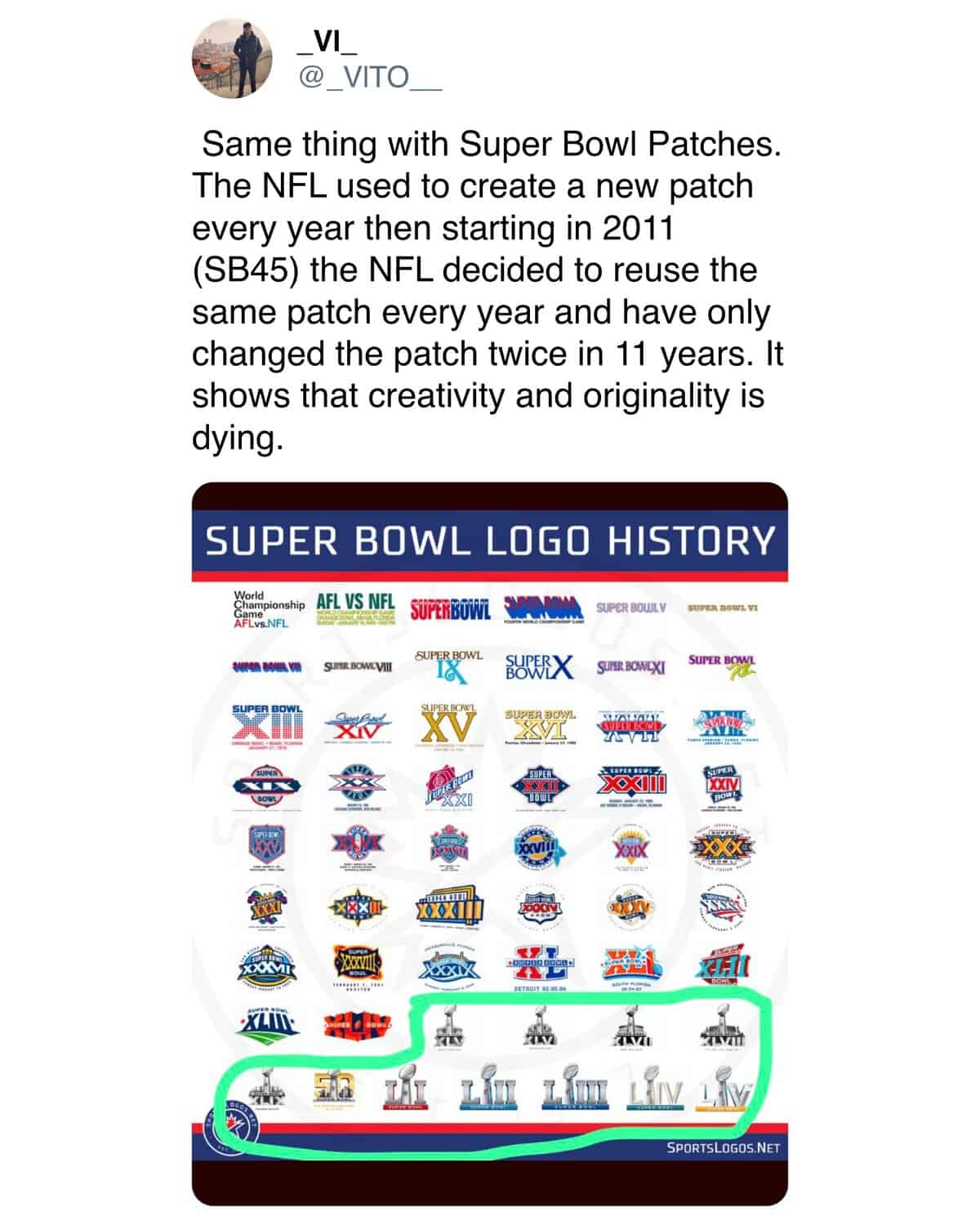
Everything’s smoothing itself into the same shape, and nobody seems to know how it happened or how to stop it.
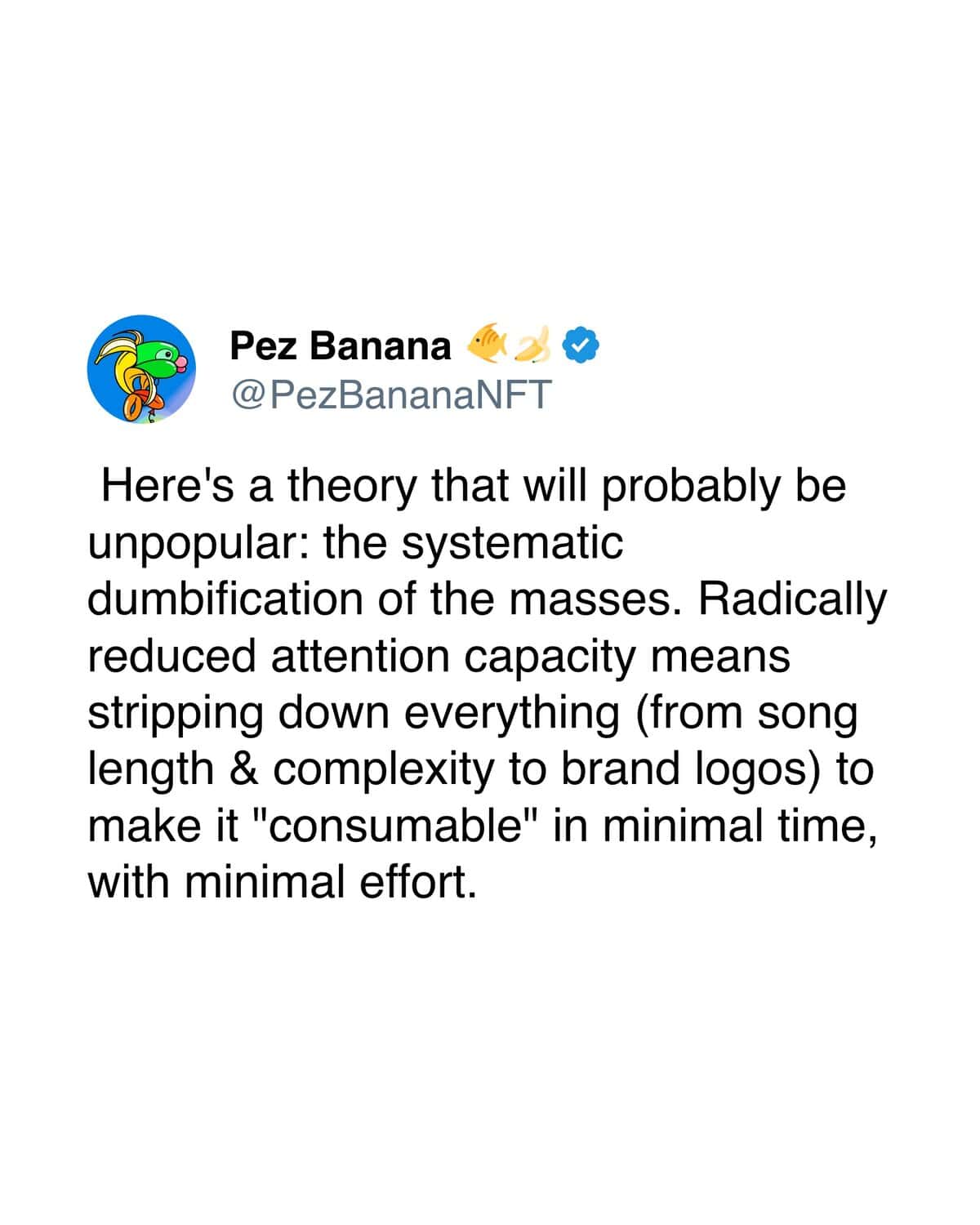
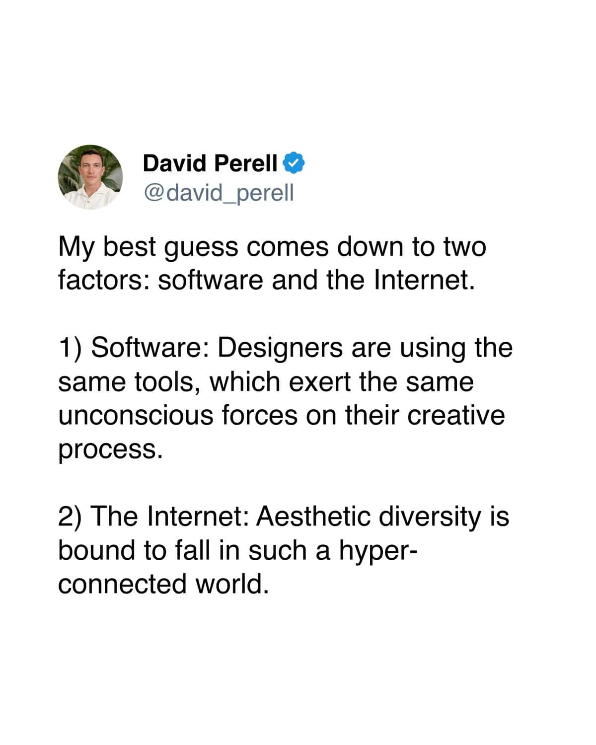
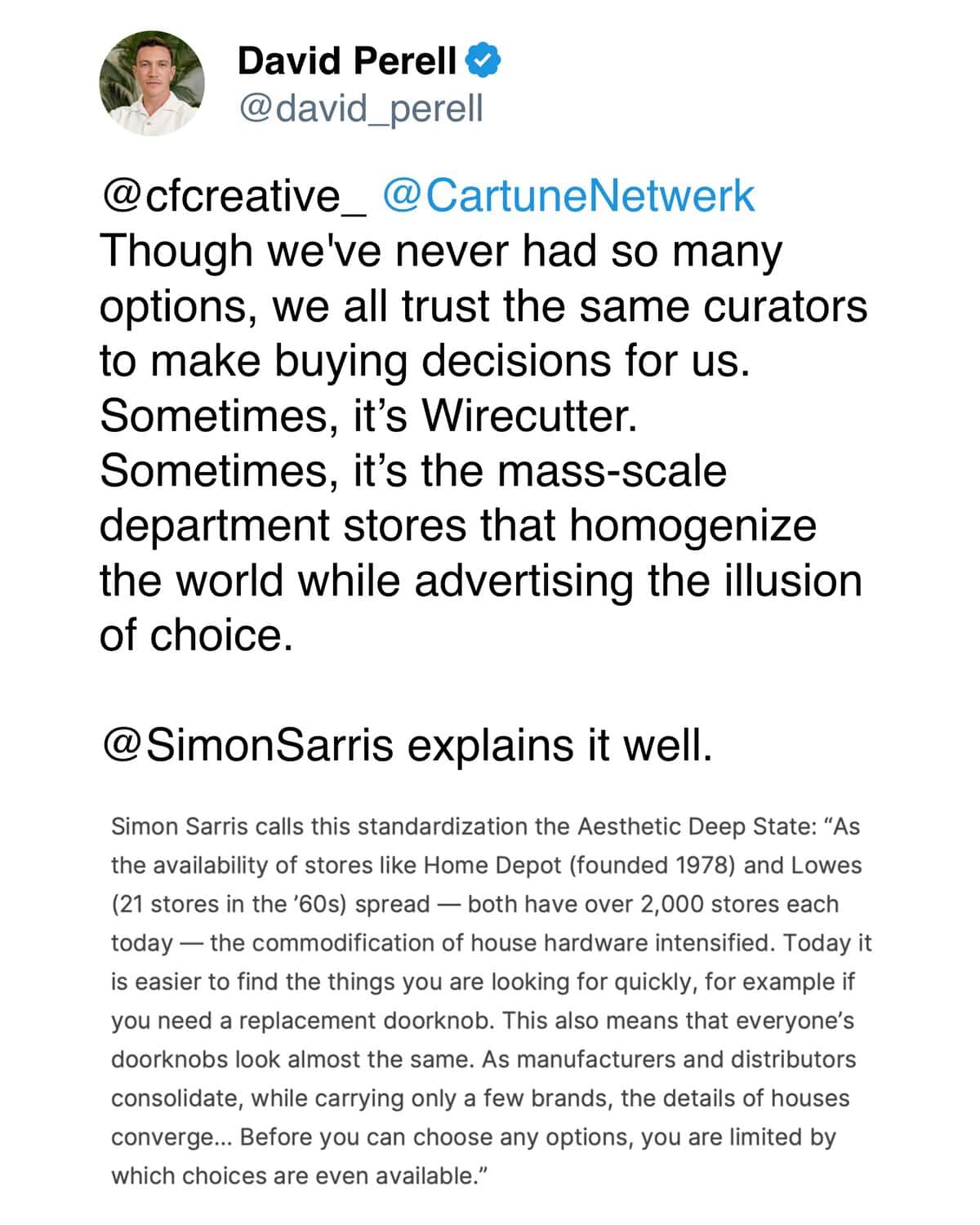
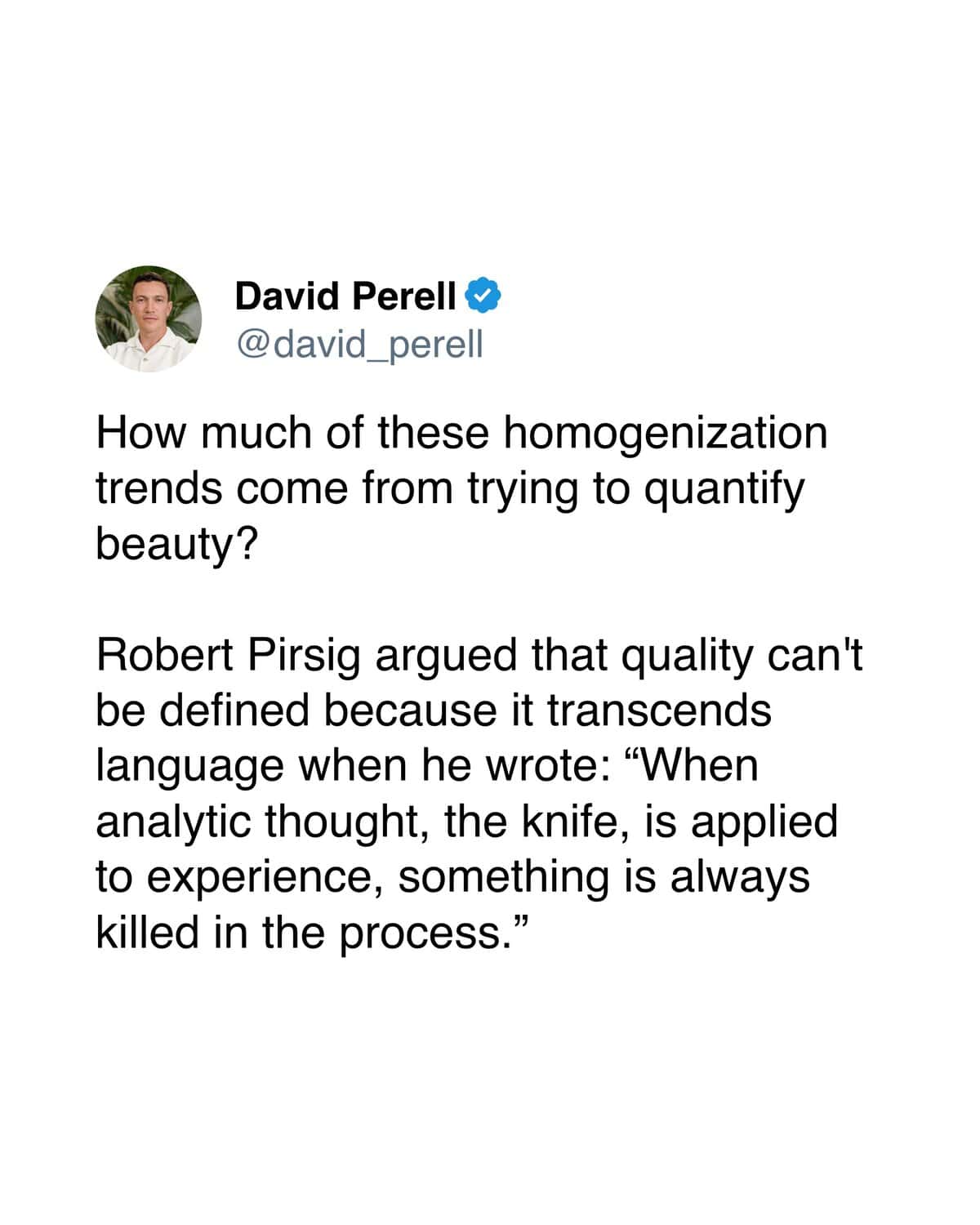
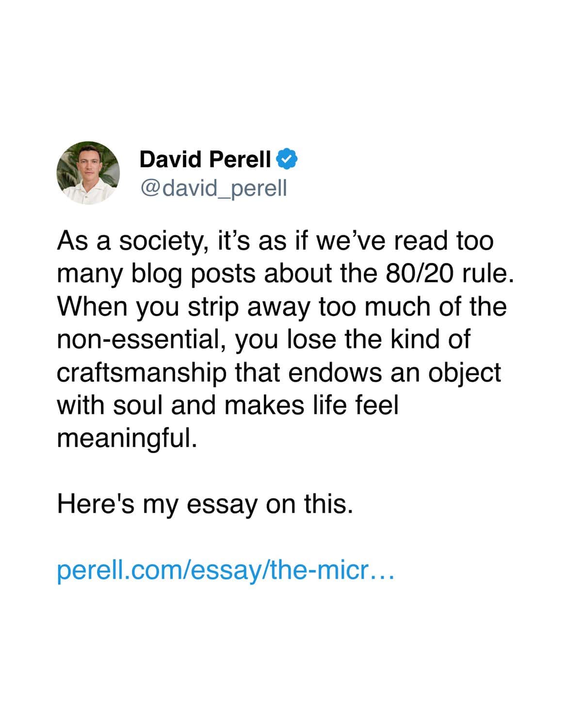
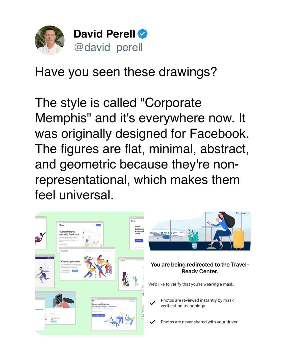
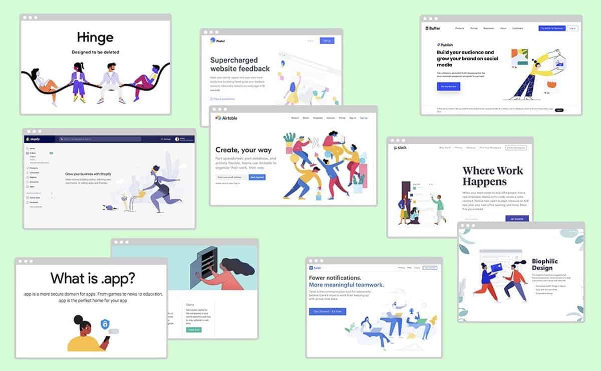
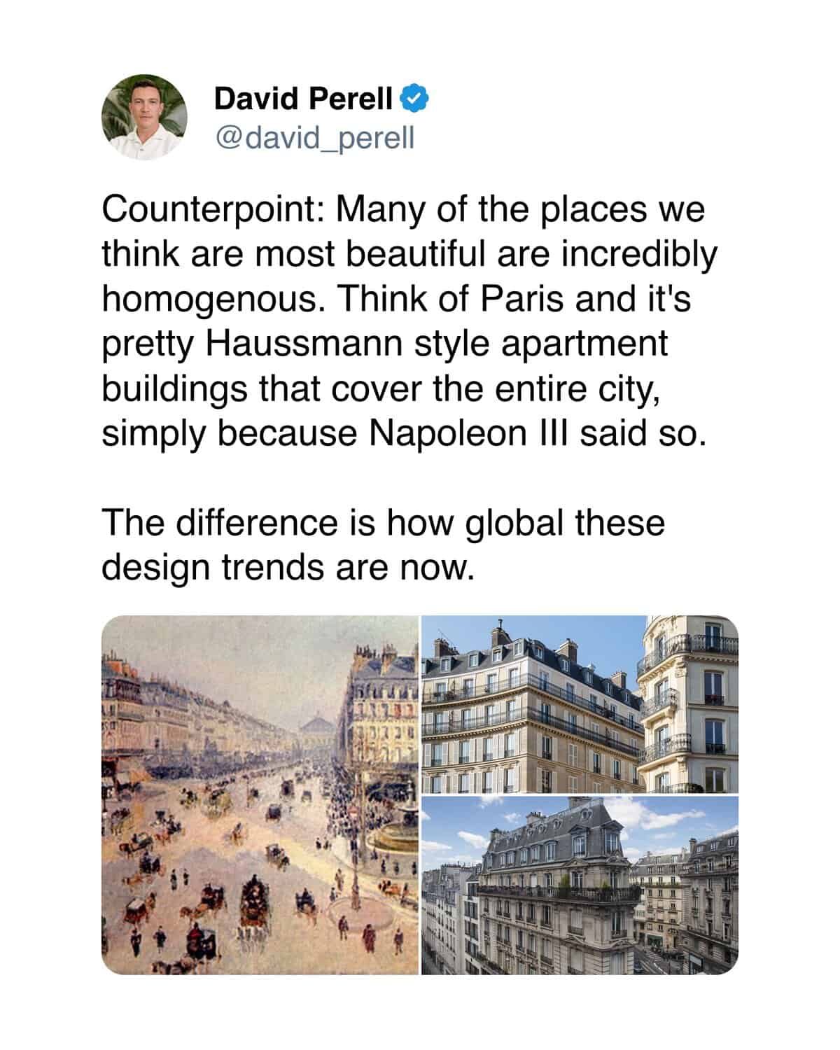
Perell’s thread breaks down why brand logos all look identical now, and it applies to way more than just graphic design.
1.
2.
3.
4.
5.
6.
7.
8.
9.
10.
11.
12.
13.

14.

15.
16.
17.
18.
19.
20.
21.
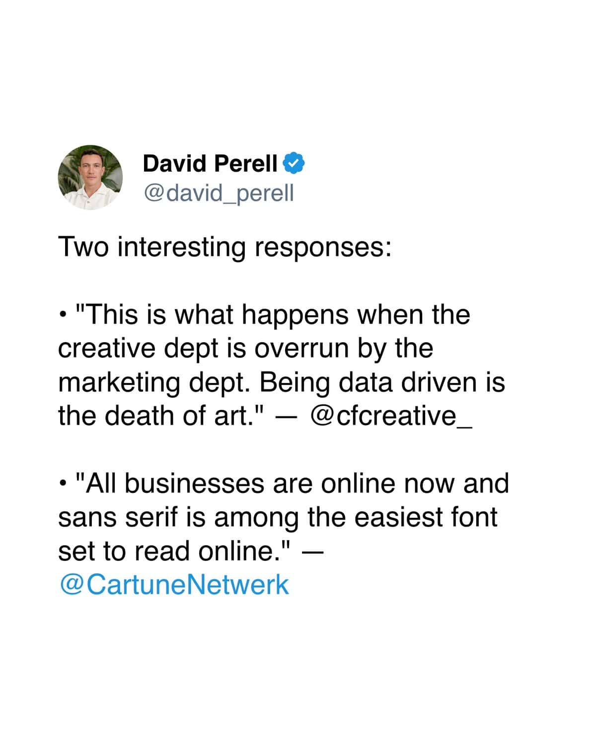
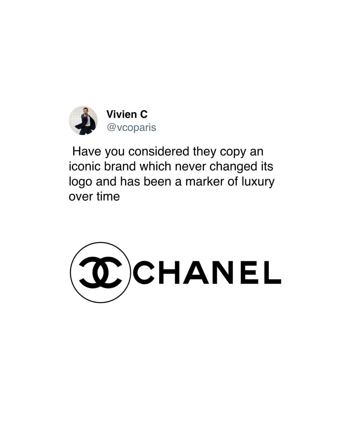
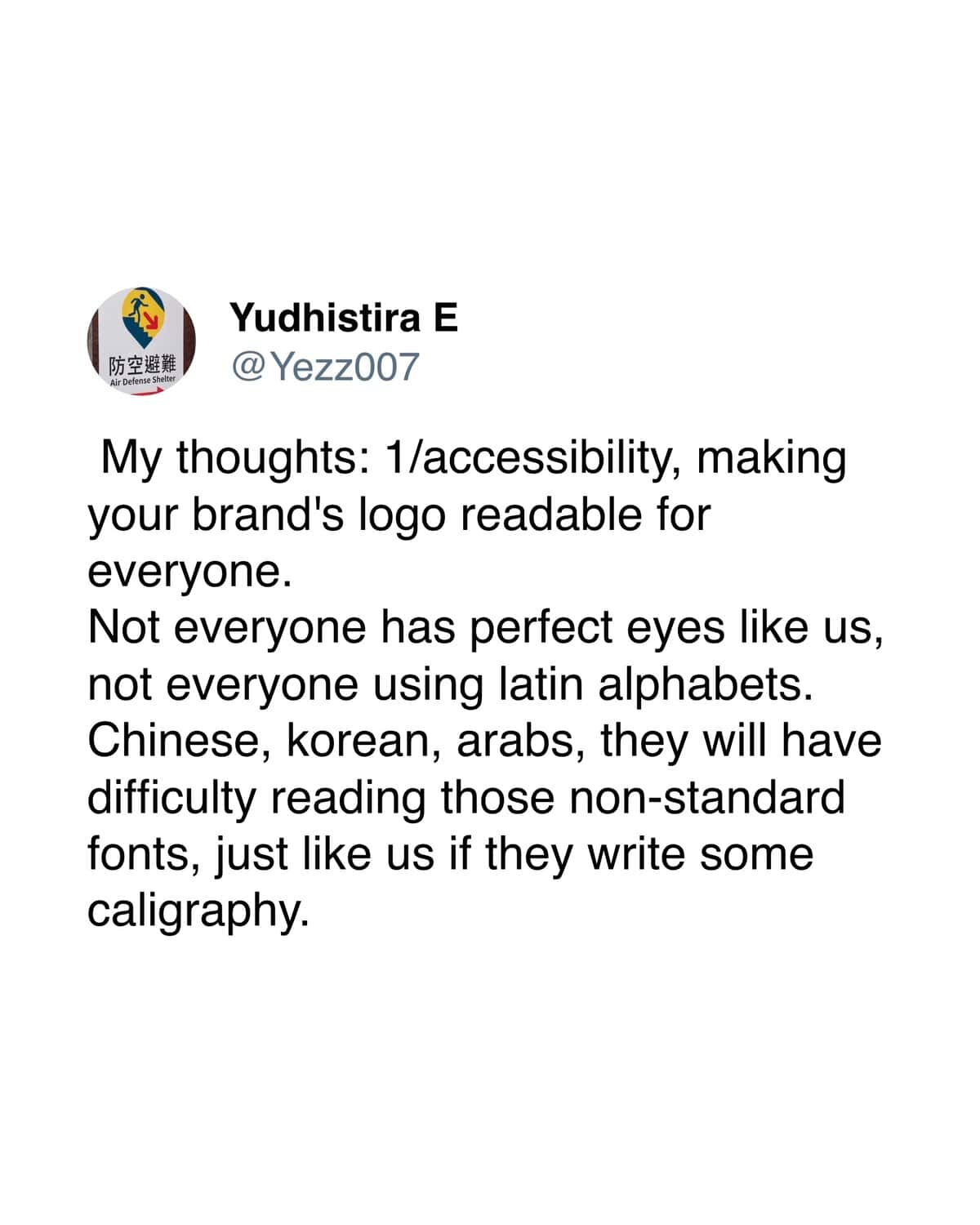
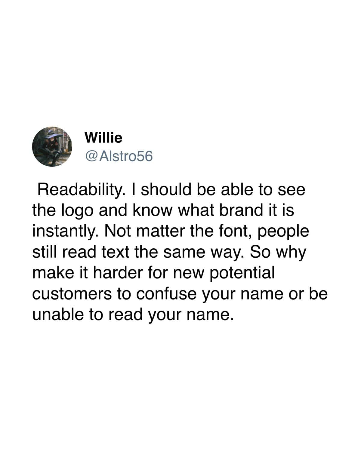
22. Most replies agree that design is becoming increasingly flat and uninspired, though some defend the highly-accessible modern aesthetic.
23.
24.
25.
26.

27.
28.
29.
