
35 Ridiculously Bad Design Fails That Somehow Got Approved
I went to design school, so I had it drilled into my brain that good design should always balance style and function. Every project, every critique, it was the same lesson over and over again.
That’s probably why these design fails hit me so hard. Somewhere along the way, someone approved these ideas, and I have so many questions about how that happened.
Some of them look great but are completely useless, others barely function at all, and a few somehow miss the mark on both fronts.
They’re confusing, hilarious, and honestly a little painful to look at, especially if you’ve ever sat through a design critique.
1. My Soul Just Fell Down These Stairs

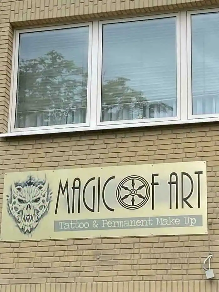
2. When You Skip The Typography Section Of Your Groupon Graphic Design Course
3. Those Are Five Steps Or More
4. Stairway To Heck

5. This Building’s Billboard Lights Point Straight To My Bedroom

6. Which Way Do I Walk?

7. Long Invisible Steps

8. It’s Like A Fun Maze For Blind People!

9. Coasters From A Local Designer, But The Sand Is Elevated So The Cups Fall Off

10. The Place I’m Staying Has Running Water On Top Of A Cabinet That Doesn’t Have A Sink

11. I Know It Is Sold By Weight, And Contents May Settle … But Maybe It’s Not The Best Idea To Put The Clear Window In The Middle Of The Package?

12. Transparent Sticker With Writing On Mirror

13. Grocery Store Barcode Scanner Was Scanning Its Own Advertised Barcode, So They Had To Cover It With Permanent Marker

14. Instruction Manual References Parts By Diagram Number, But Diagram Isn’t Labeled

15. This Mailbox Speaks For Itself

16. Watched A Dozen People Try To Push This Door Open Today During Brunch

17. Which Way To Temple 38? Or Group F? Took Me Half A Day To Figure Out That These Signs Are Both Pointing Straight Ahead

18. Eye Drop Bottle Does Not Note That It Is Eye Drops

19. Record Label Sumerian Records Uses An Image Of The Sphinx

20. Bathroom And Kitchen Combined

21. This Promotional Shot Makes It Look Like The Pump Is Malfunctioning And Causing Major Leakage

22. The Button For The Third Floor Is Located At The Very Top Of The Elevator Panel

23. Record Label Sumerian Records Uses An Image Of The Sphinx
24. Half Of The Dosage Instructions For Persil Washing Powder Are Printed On The Strip You Tear Off To Open The Box

25. No Room To Store The Wrench That Comes Outside The Plastic Container As Demo

26. The Words On The Display Of The Marzipan Museum In Germany

27. The Buttons To Change Temp On My Fridge

28. The 5 Popo

29. My Local Park Benches Made Of Stainless Steel. Too Cold To Sit On In Winter, Too Hot To Sit On In Summer

30. The Woman Was A Man. And The Girl Was An Adult

31. Austrian Elevators Are Hard To Understand

32. This Was Not A Fun Experience

33. This TV That Is Way Too Far From The Bed And Obscured By The Wardrobe @ A Scotland Hotel

34. This Birthday Plate Where The Balloon Strings Just Look Like Hair

35. Apparently This Is A Promo For A Writer’s Festival
