Data Is Beautiful (21 Charts & Graphs)
I love a good graph or chart. It’s truly fascinating to see someone break down a ton of data and fit it efficiently into an infographic I, an idiot, can understand. Keep kicking ass, nerds.
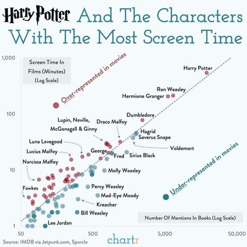
1. Harry Potter Characters: Screen time vs. Mentions In The Books
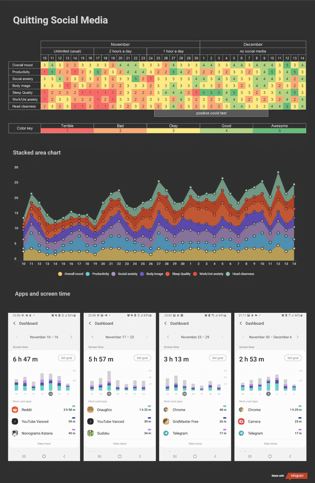
2. Quitting Social Media as a 22-year-old
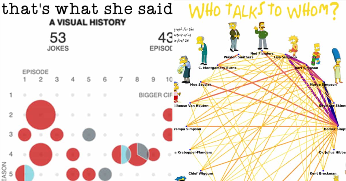
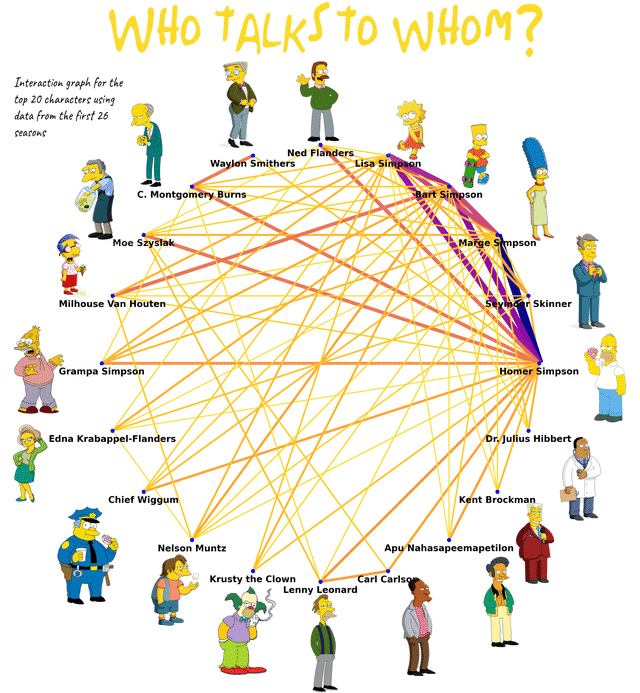
3. Interaction Intensity in the Simpsons
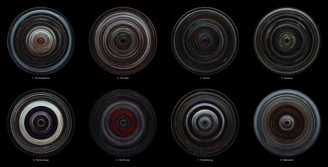
4. The Mandalorian Season 1 episodes displayed as disks, the first frame is the border of the disk, the ending credits at the center.
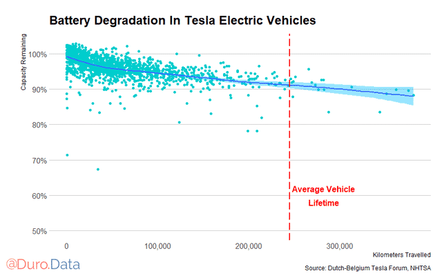
5. Tesla’s show relatively little battery degradation even after high usage.
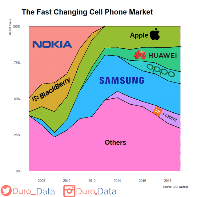
6. In 2007, the smartphone market was dominated by Nokia and Blackberry
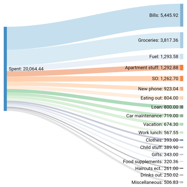
7. I tracked every € I spent in 2020.
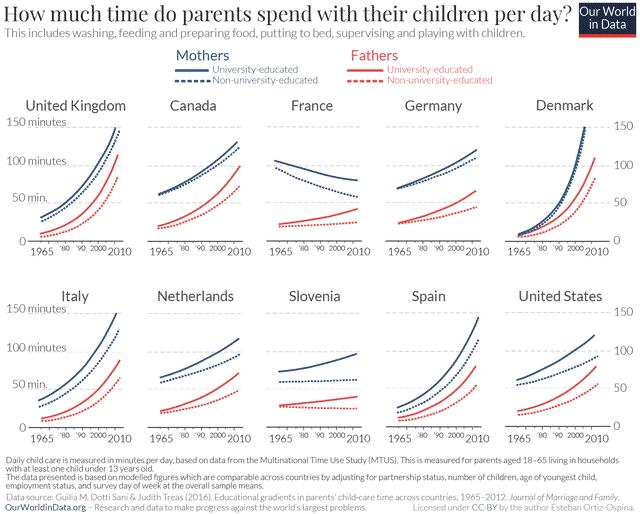
8. Time that fathers and mothers spend with their children (1965-2010)
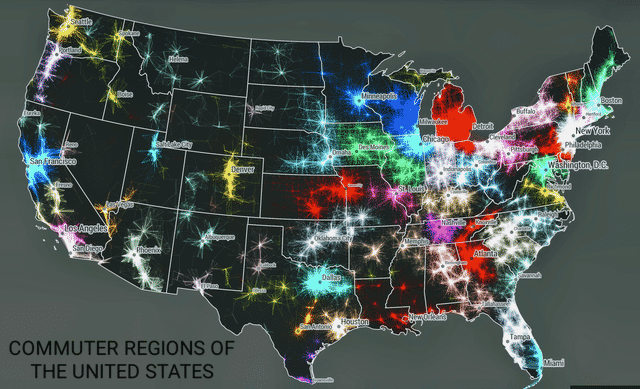
9. Commuter Regions of the United States
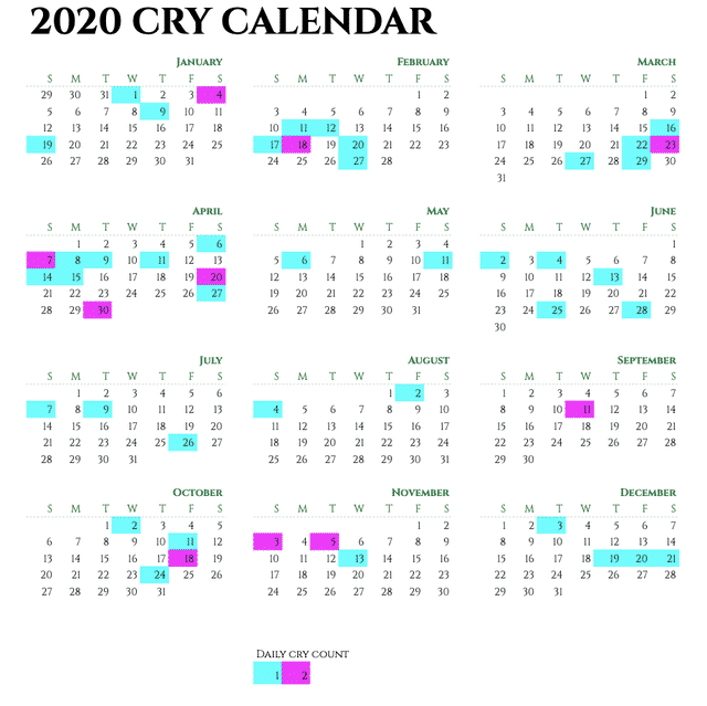
10. I tracked how many times I cried in 2020.
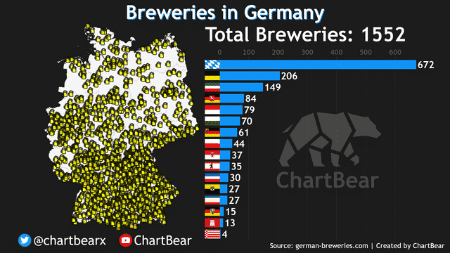
11. Beer Breweries in Germany
12. The most dangerous jobs in America

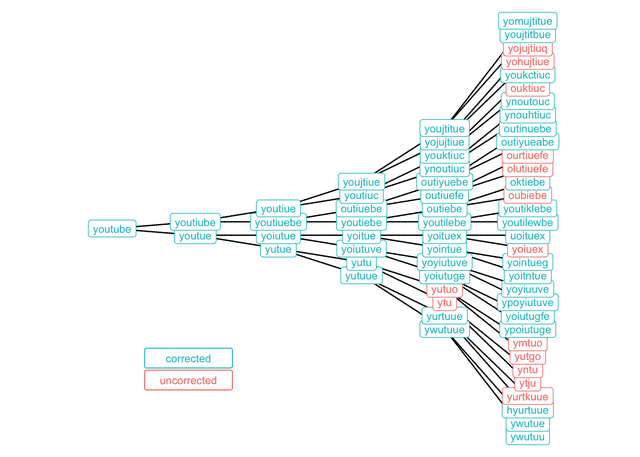
13. Some of the ways you can misspell “YouTube” and still have Google Search auto-correct you.
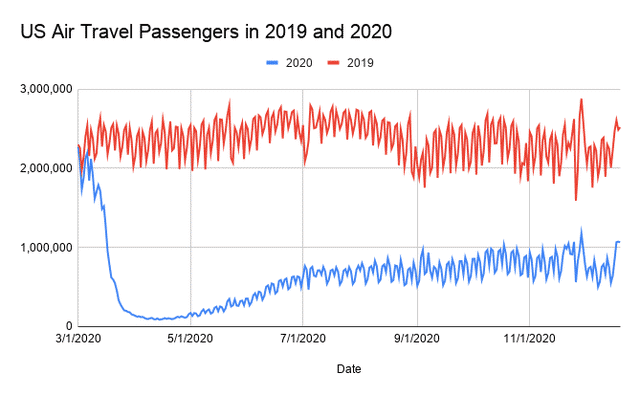
14. US Air Travel Passengers in 2019 and 2020
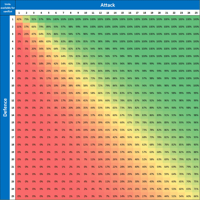
15. Probabilities of winning an attack in Risk
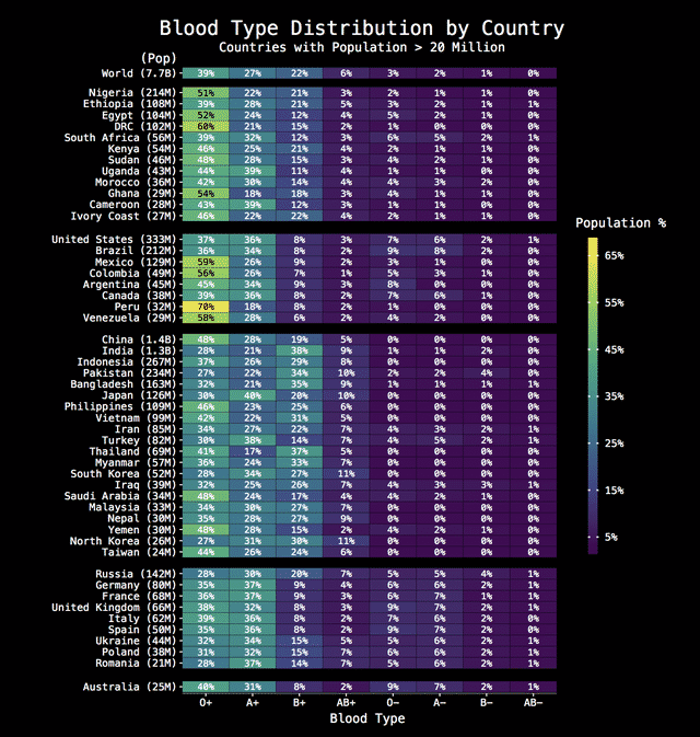
16. Blood Type Distribution by Country
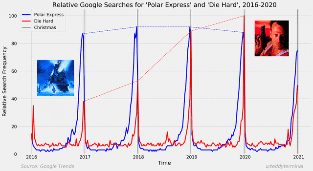
17. The True Christmas Movie: Comparison of Google Search Trends from 2016-2020 for “Die Hard” and “Polar Express”
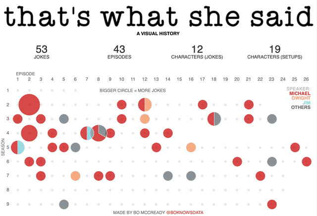
18. That’s What She Said: A Visual History (The Office)
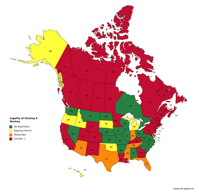
19. Legality of Owning a Monkey in the U.S. and Canada
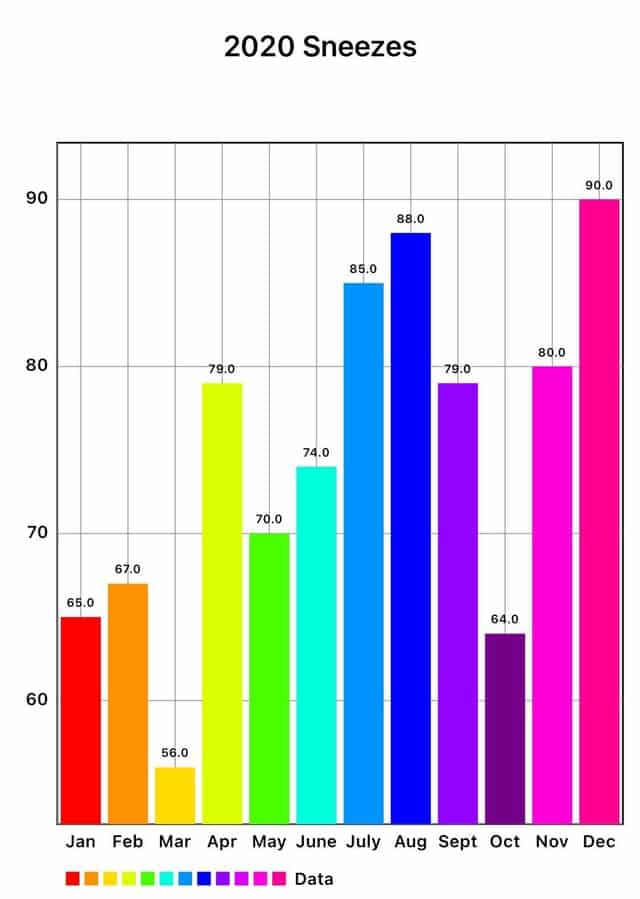
20. Every year, I decide to document something trivial. For 2020, I recorded every single time I sneezed. The total number came out to be 897 sneezes!
21. My evolution of 3 months doing push-ups regularly.
