30+ Terrible Redesigns Being Shamed By Appalled Folks Online
I’ll never understand why some redesigns happen. Maybe they did some test groups and decided to make a change, but the choices in those changes are suspect at best.
These posts are examples of Crappy Redesigns that people straight up hated.
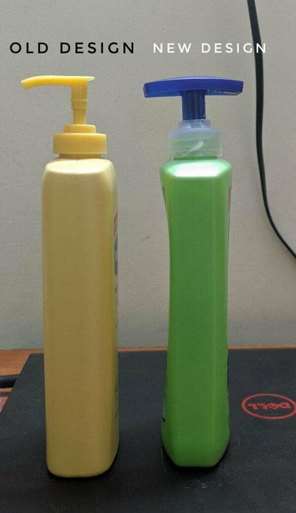
1. A pointless redesign
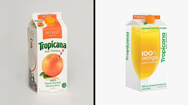
2. Well this is lame

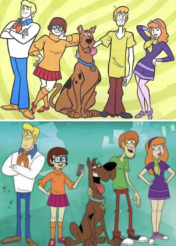
3. Ruh-roh!
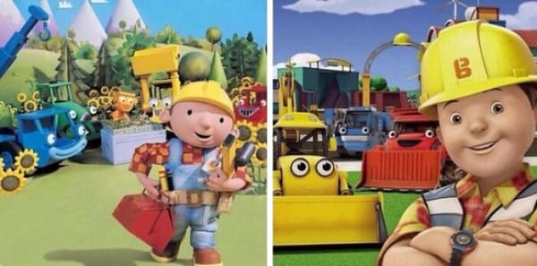
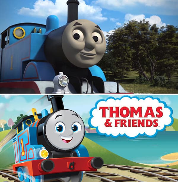
4. Virgin CGI Bob vs Chad Clay-mation Bob
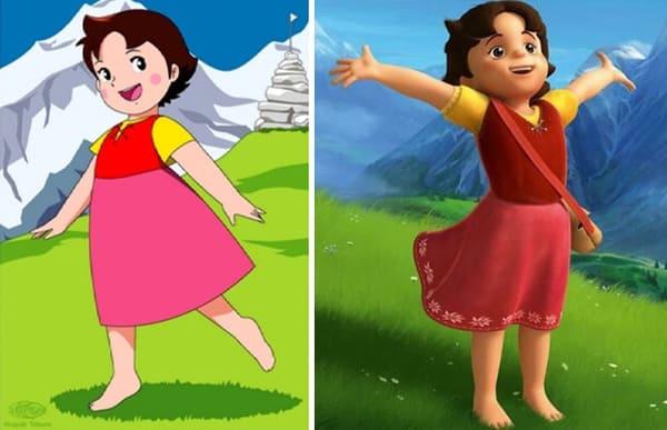
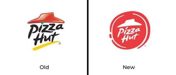
5. What the actual fawk??
6. Heroes in the half-shell to whatever this is.

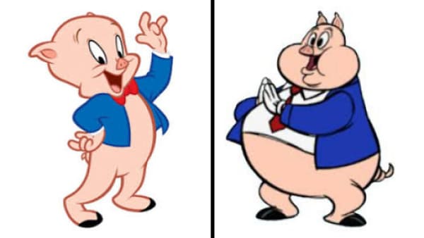
7. just why ? (porky pig)
8. They removed the Native American, but kept the land. Classic.

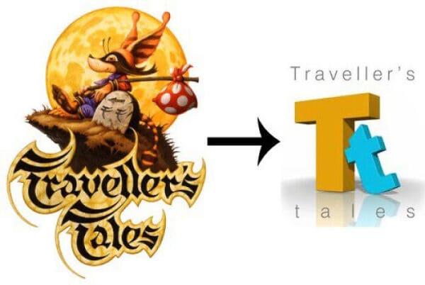
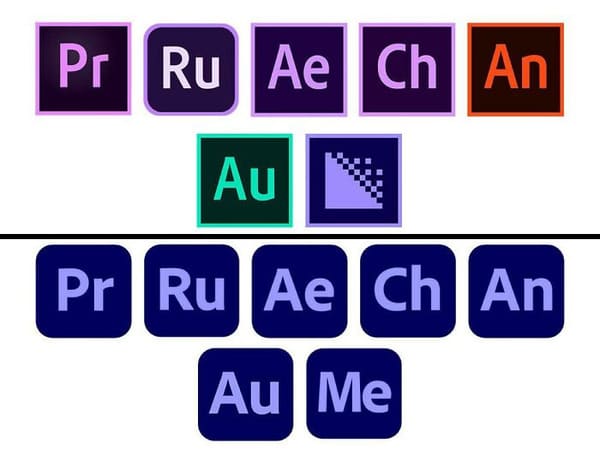
9. developer downgrade
10. Take a design that you can use correctly even in the dark and replace it with an abomination that you can get wrong even in broad daylight
11. This is by far the worst redesign I’ve ever seen

12.

13. Modern ≠ Good

14.
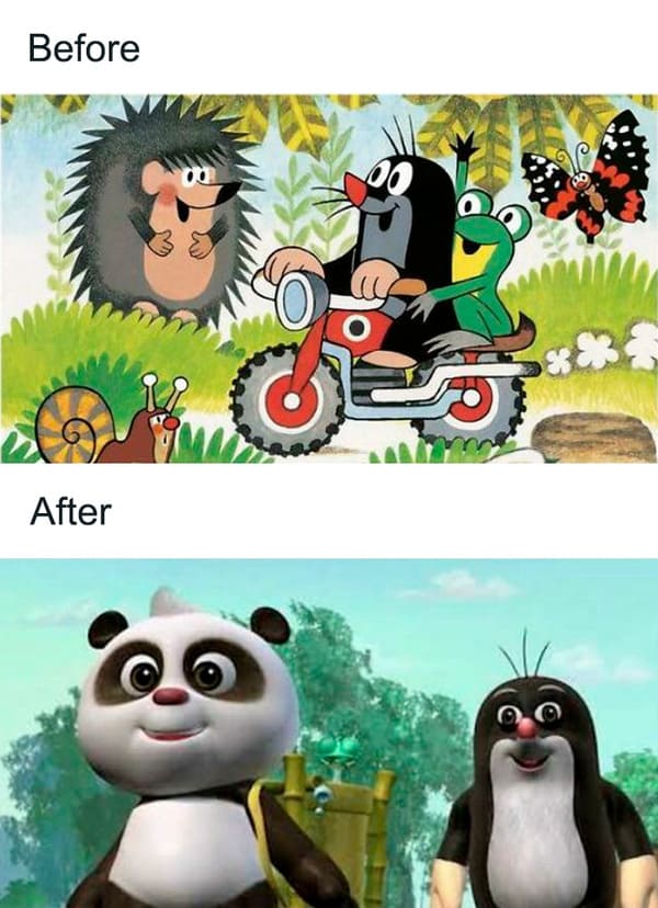
15. This is just awful…
16. I can’t believe they just did that
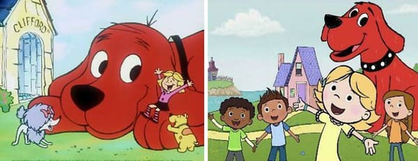
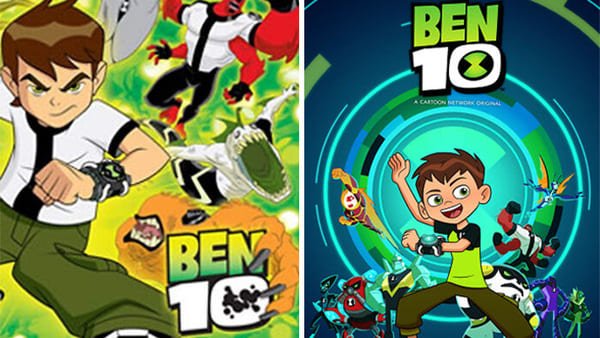
17. From my favourite Childhood anime to another bland 3D animated show
18. why
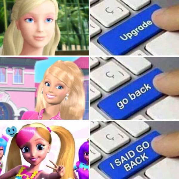
19. Barbie Redesign
20.
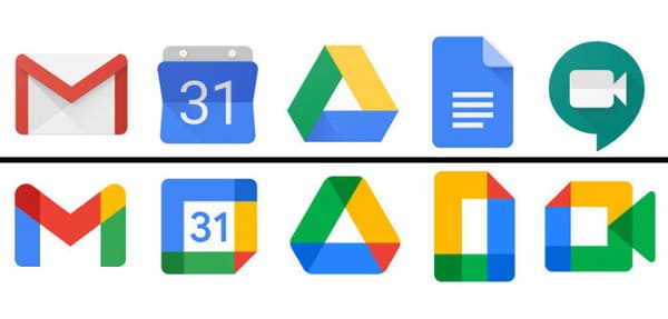
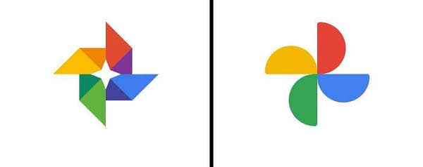
21. Look how they massacred the Google Photos icon
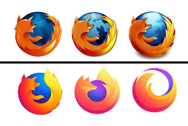
22. What will be next ? It’ll finish the circle ? Nothing is going right with the new logo.
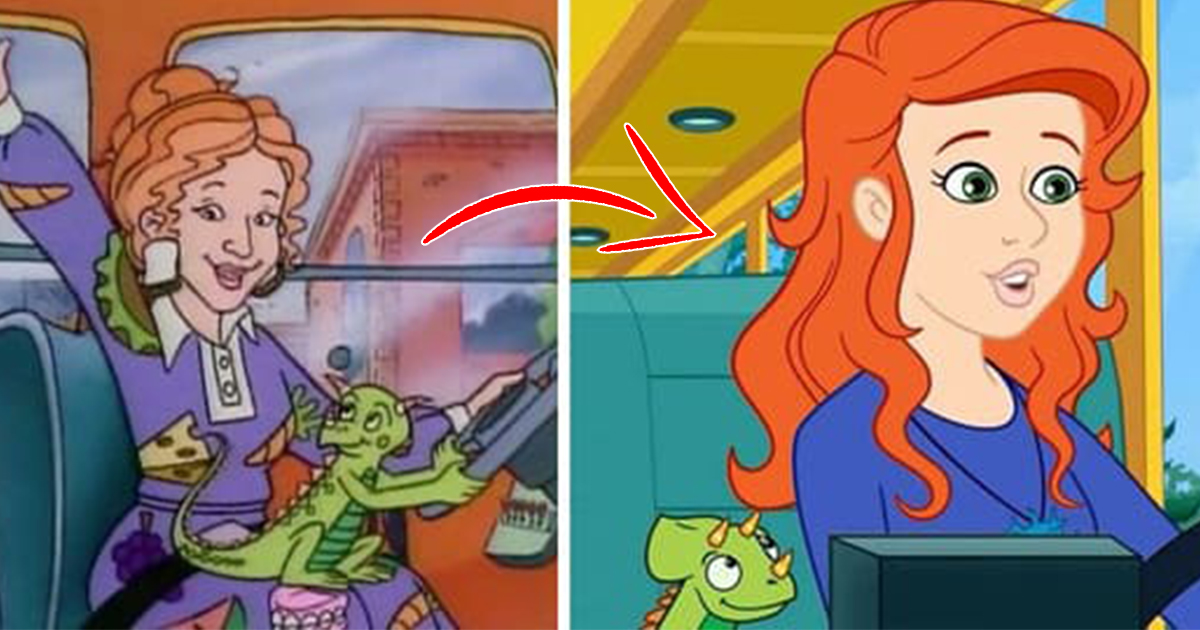
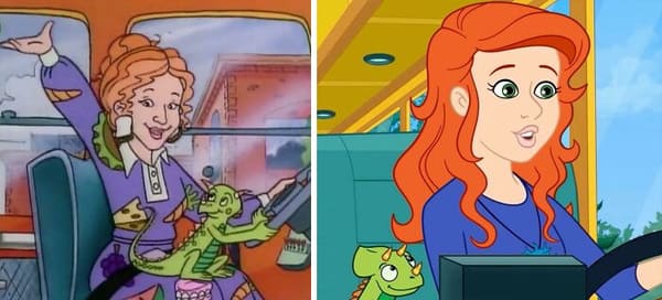
23. What did they do to Ms.Frizzle?
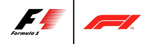
24. the new intel logo is so boring

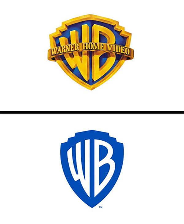
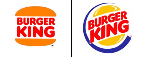
25. So will the films get more simplified?
26. Formula 1. I understand why they changed it, but dammit, the old logo was iconic!
27. Burger King was another victim of the 90s redesigns.
28. Thousands of CGI assets wasted in one fell swoop.
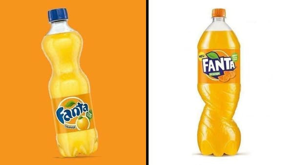
29. I don’t like the new Fanta redesign
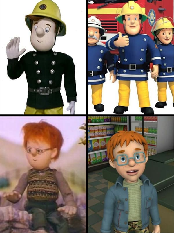
30. How the mighty have fallen
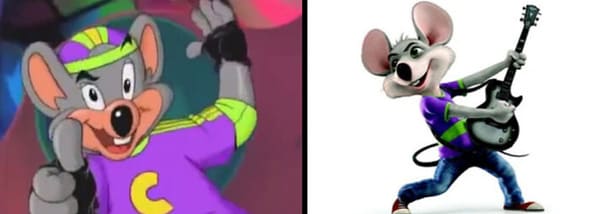
31. He looks cursed now
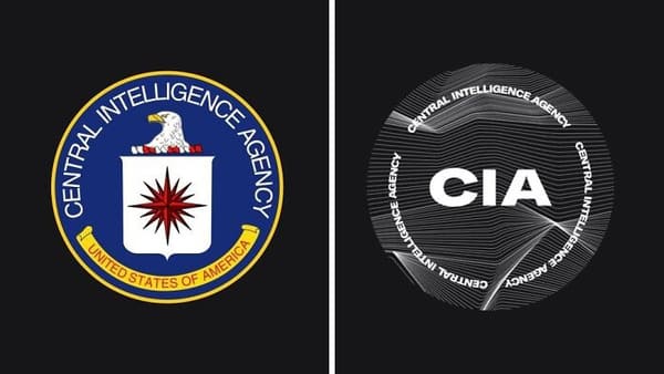
32. Fireman Sam. Norman Price looks like he works for a lipstick company
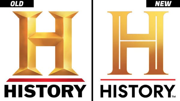
33. death of “Avenger Chuck” never forget
34. It’s soulless, fits CIA perfectly
35. History logo
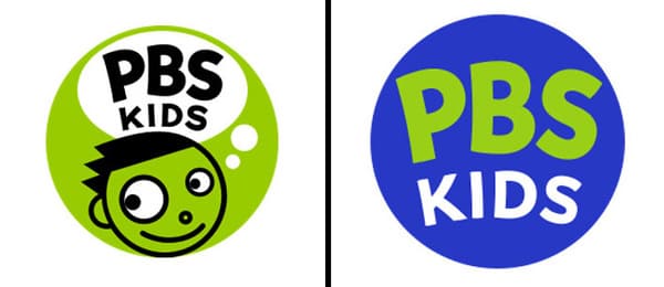
36. did they really have to add a bird?
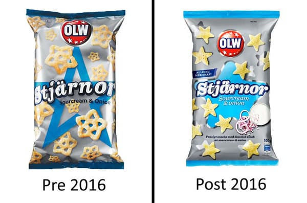
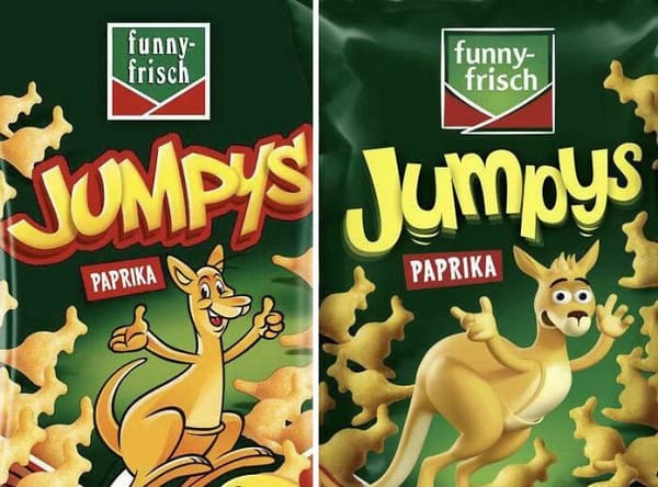
37. rip dash
38. Why change it? The old one was just fine
39. The redesign of these swedish star snacks taste a lot worse than the originals