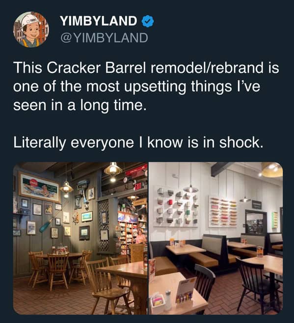
Cracker Barrel Changed Its Logo And People Are Losing Their Biscuits (20 Tweets)
Some changes in life are small, like switching your shampoo brand. Others feel huge, like when a restaurant you grew up with suddenly looks different. Logos are one of those things we don’t think about until they change, and then suddenly everyone has an opinion.
Cracker Barrel Changed Its Logo And The Internet Is Not Happy About It
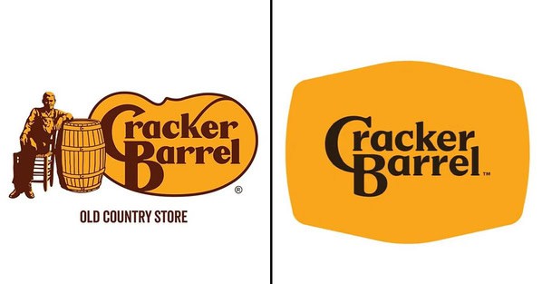
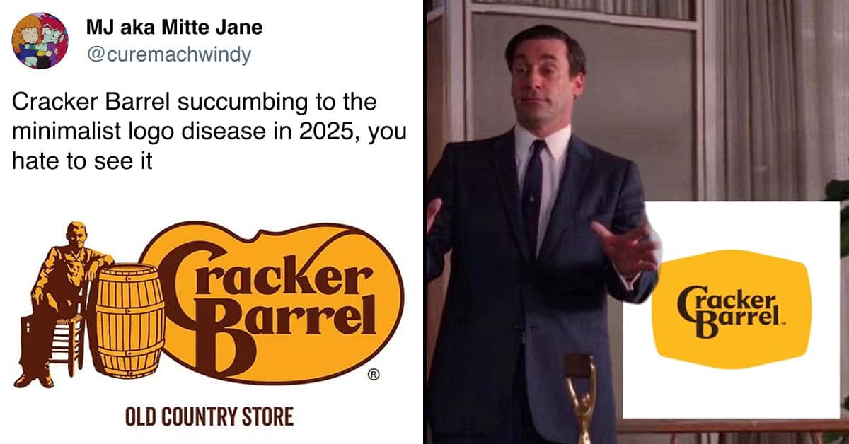
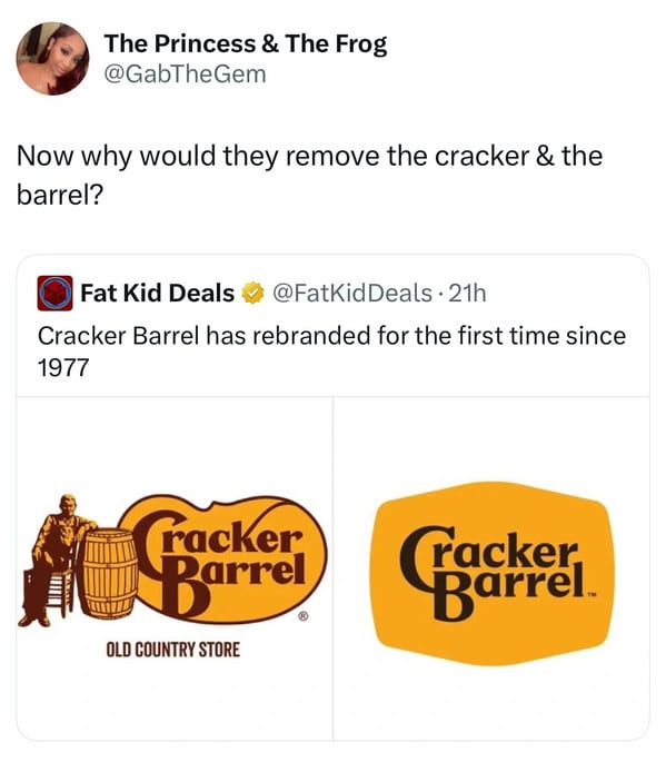
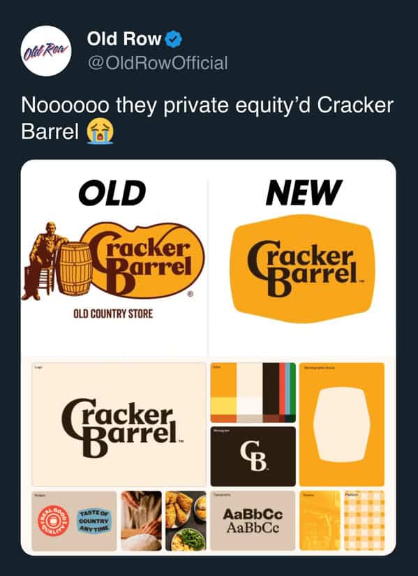
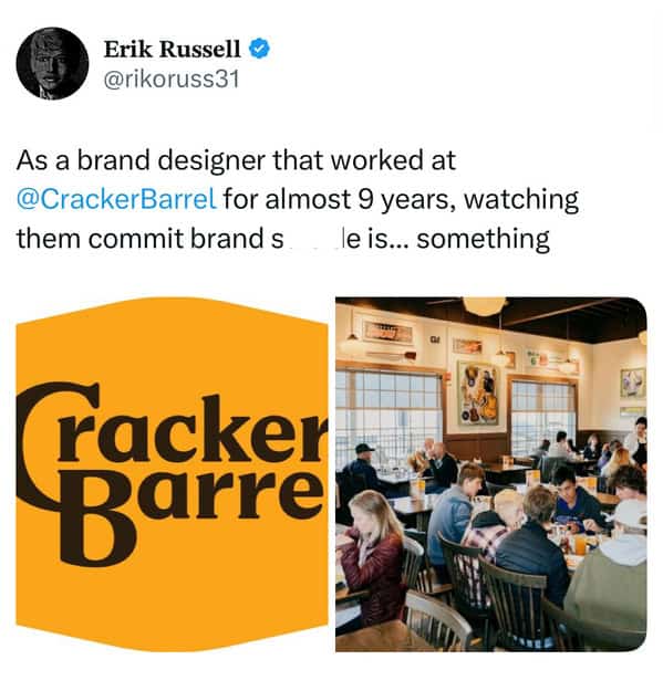
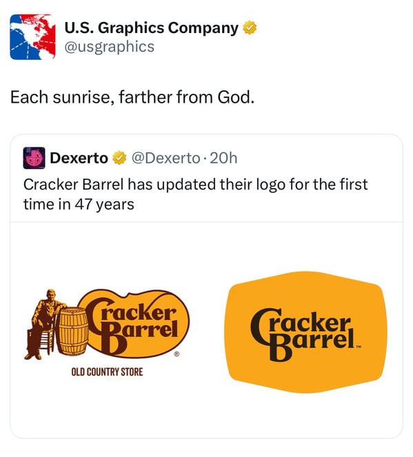
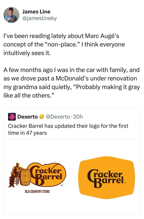
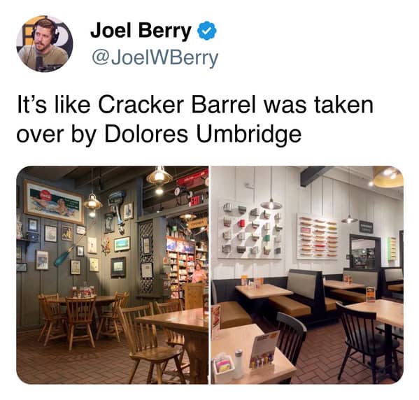
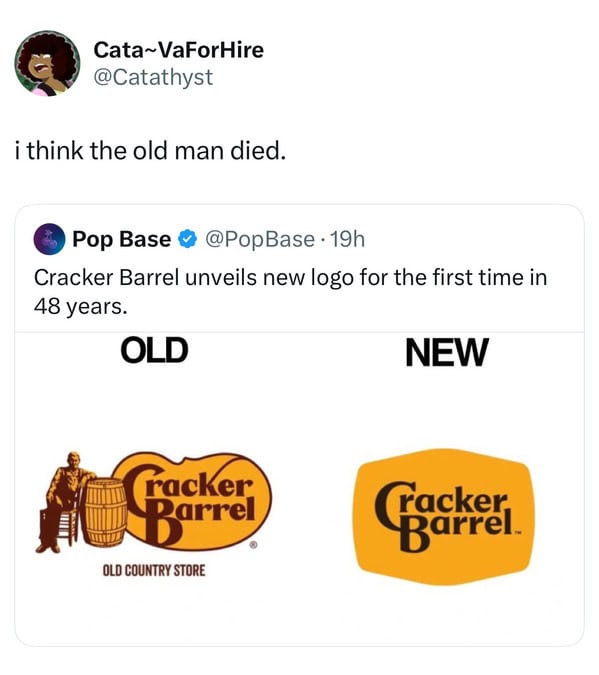
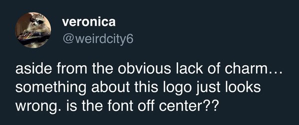
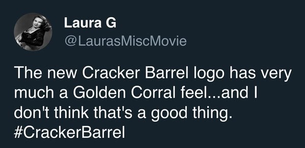
Cracker Barrel just retired the old man with a barrel, the logo they used since the 70s, and replaced it with a sleek text-only design. The colors stayed the same, but now it looks less like a country store and more like a startup coffee shop. It is part of a bigger rebrand with new menu items and brighter, modern spaces.
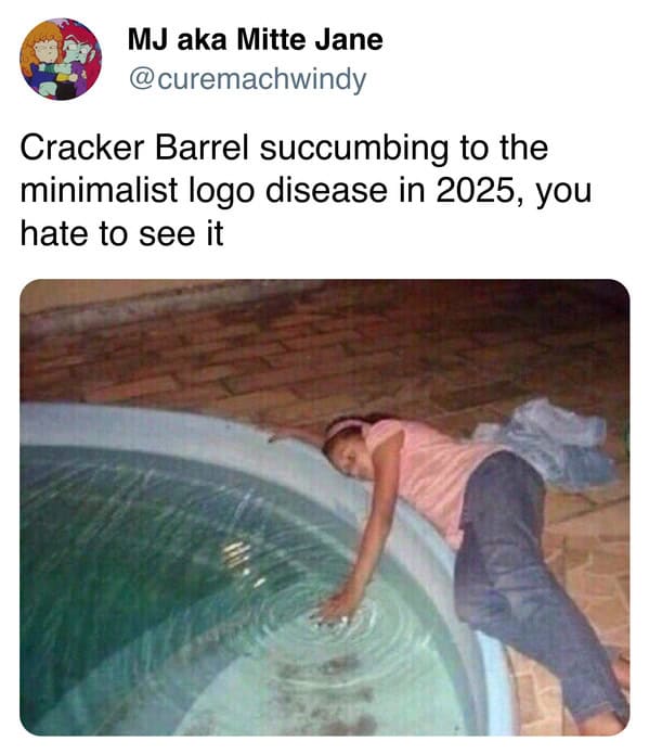
People usually hate when brands go minimalist. Every time a company swaps a quirky mascot for clean lines, the internet calls it soulless. Think Gap in 2010 or when Tropicana got rid of the orange with a straw.
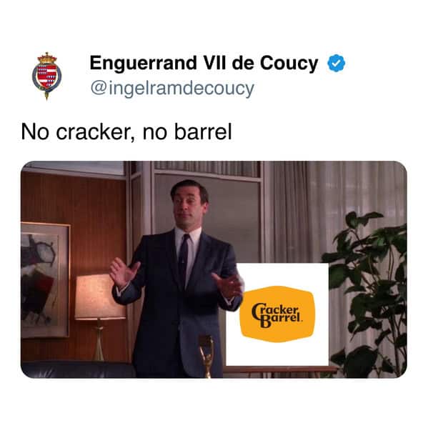
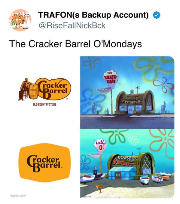
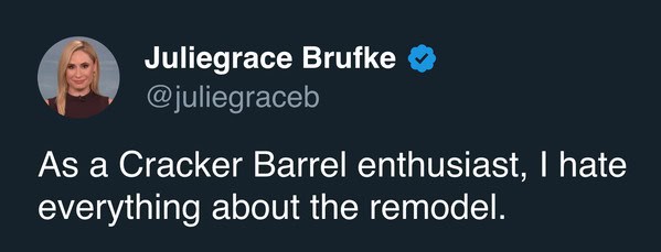
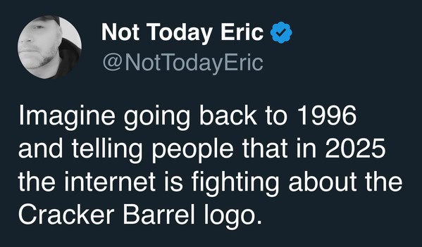
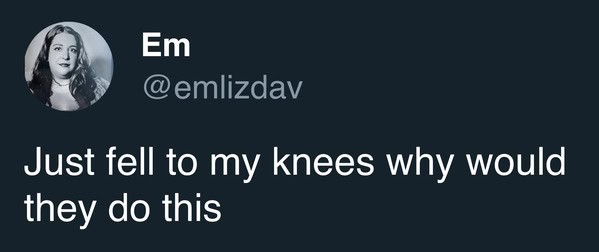
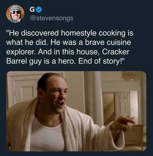
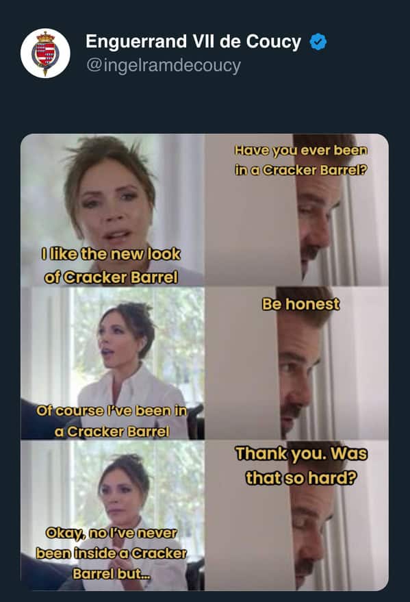
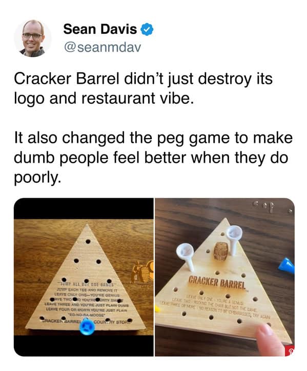
Cracker Barrel’s new look hit that same nerve, and the reactions have sparked outrage and plenty of memes.
1.
2.
3.
4.
5.
6.
7.
8.
9.
10.
11.
12.
13.
14.
15.
16.
17.
18.
19.
20.
