Data Is Beautiful (21 Charts & Graphs)
I love a good graph or chart. It’s truly fascinating to see someone break down a ton of data and fit it efficiently into something I, an idiot, can understand. Keep kicking ass, nerds.
1.
2.
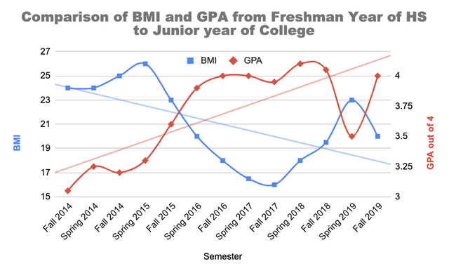
3.
4.
Relative rotation rates of the planets cast to a single sphere (with apologies to Mercury/Neptune) [OC] from r/dataisbeautiful
5.
US States ordered by life-expectancy – Animation [OC] from r/dataisbeautiful
6.
7.
Scale & Composition of Earth’s surface: crust, water and atmosphere [OC] from r/dataisbeautiful
8.
9.
10.
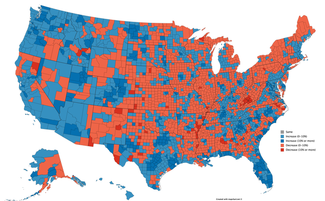
11. Percent population change in the US from 2010 to 2018 by county.
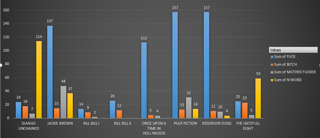
12. Swear words in Tarantino movies.
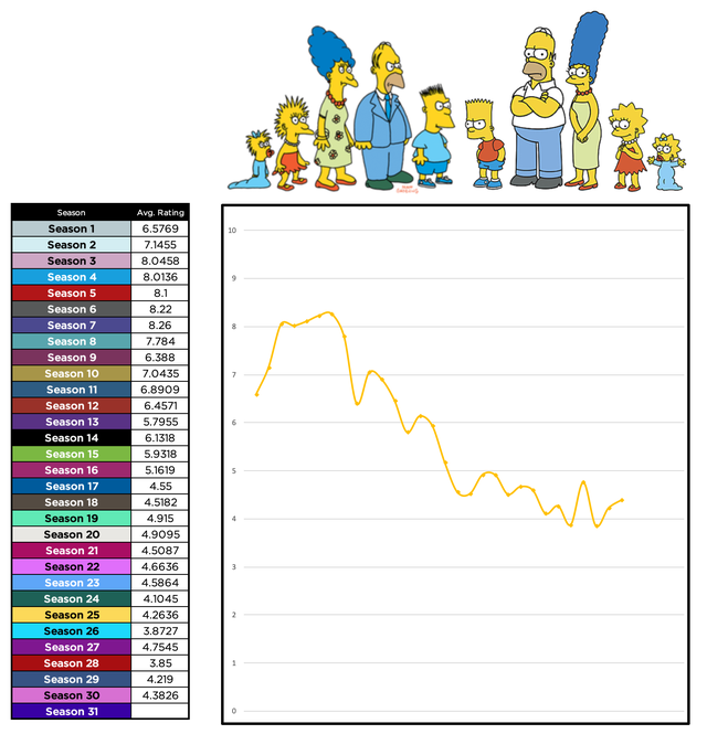
13. This year, I watched 672 episodes of the Simpsons. I tracked my personal ratings of the episodes.
14.
[OC] I got inspired by the sunrise and sunset post from yesterday and made an own quick version for Stockholm. from r/dataisbeautiful
15.
Relative orbital velocities – planet motions, rotations and tilts to scale. Happy New Year (whichever planet you’re on) [OC] from r/dataisbeautiful
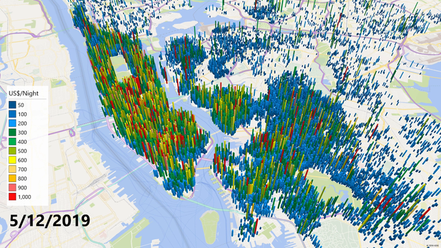
16. Airbnb Listings in New York – December 2019
17.
Sunrise and sunset times in London as the year progresses [OC] from r/dataisbeautiful
18.
Summary of daily global mean temperature in 2019 [OC] from r/dataisbeautiful
19.
20.
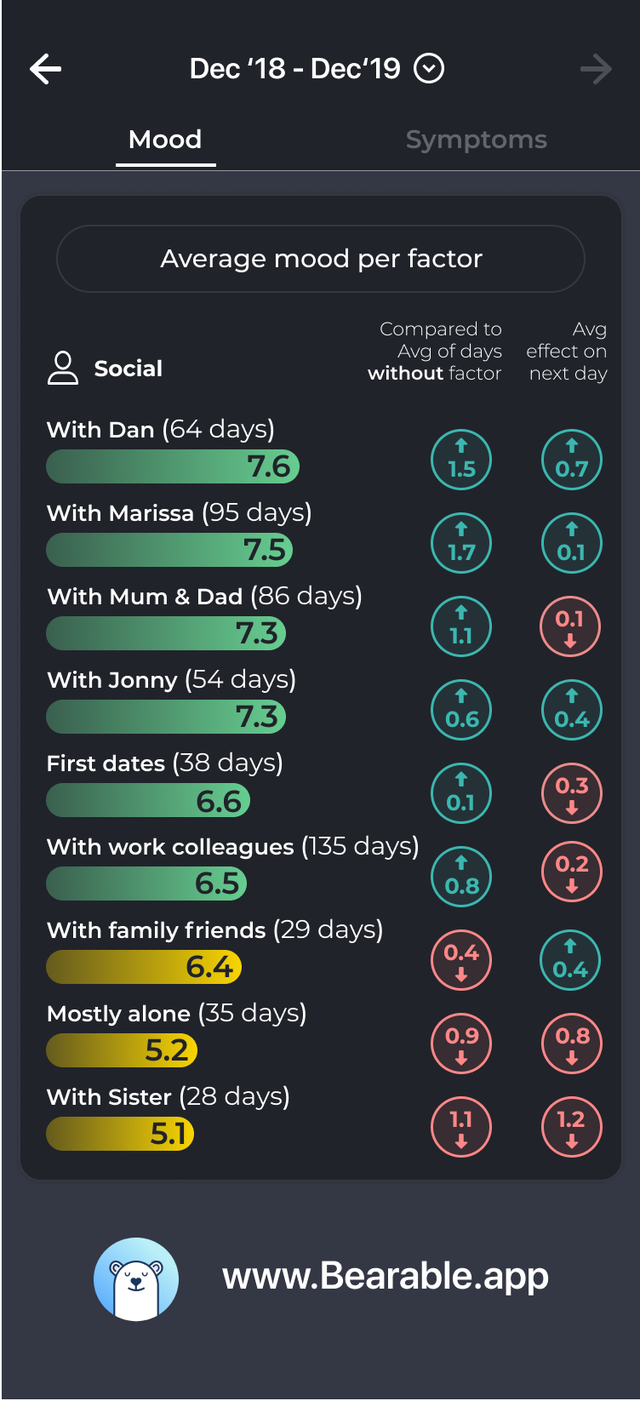
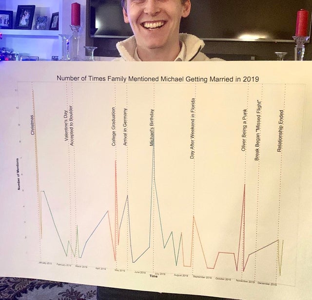
21. Tracked my social life and mood for a year to see who actually makes me happiest.