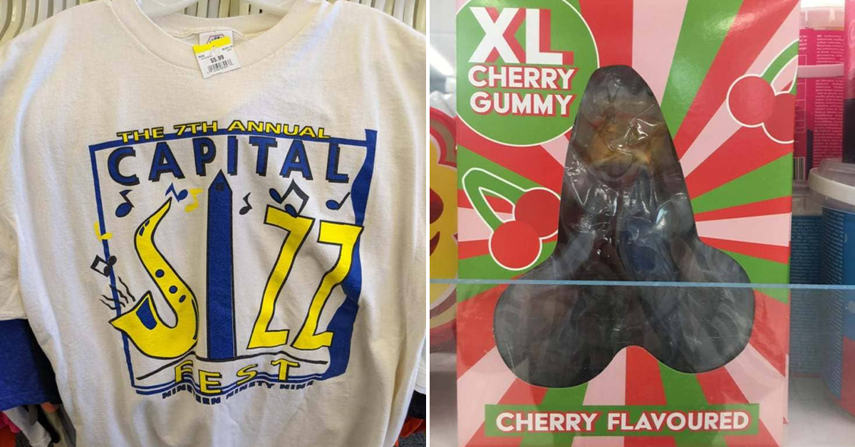
Design Fails So Crappy They’re Almost Impressive (17 Pics)
Crappy design fails are all around us and I’m glad people take the time to share them with the world. These designers are pretty bad at their job. It’s almost like they knew exactly what they’re doing. These crappy design fails are so crappy they’re almost impressive.
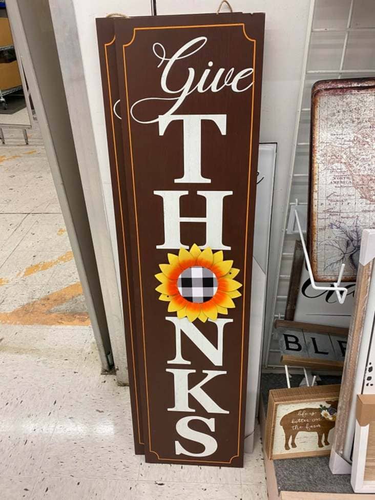
1. “Give Thonks”
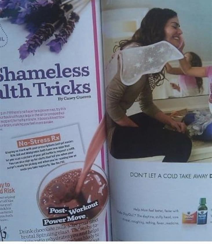
2. “Kind of a crappy design if you ask me”
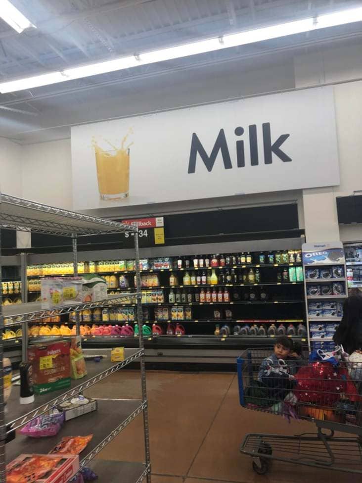
3. “Yess milk”
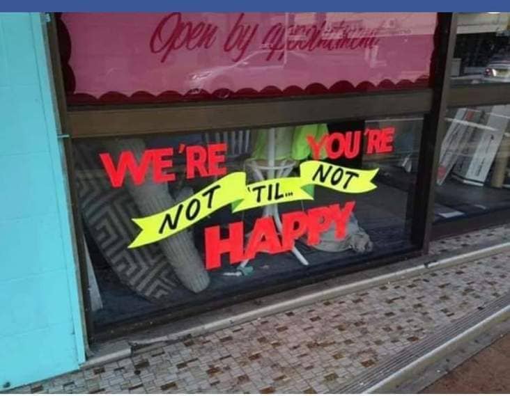
4. “We’re You’re Not ‘Til Not Happy?”
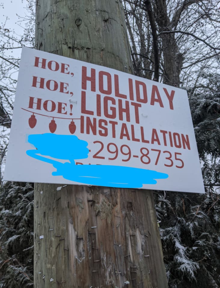
5. “Something isn’t right here”
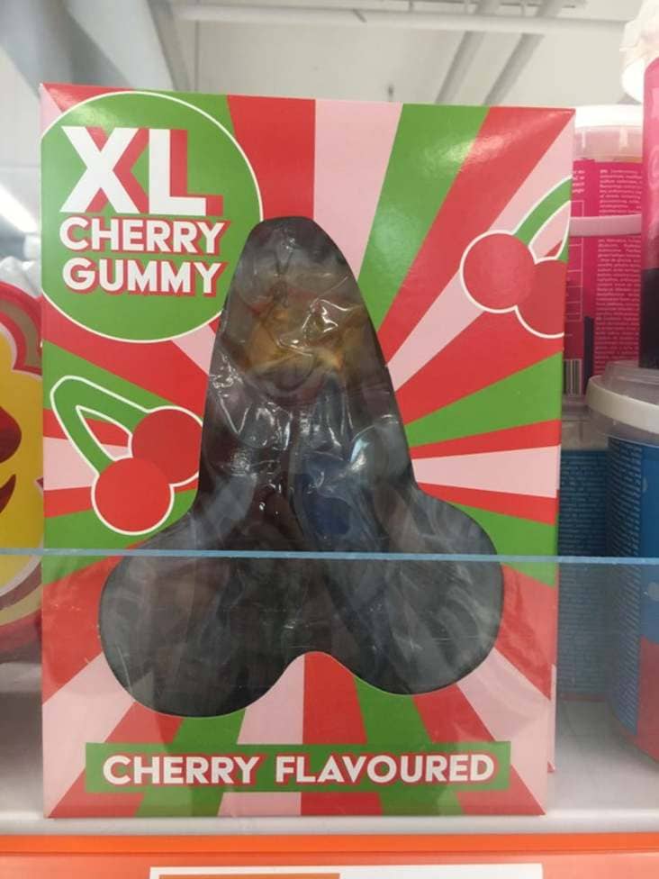
6. “Ah yes the cherry gum”
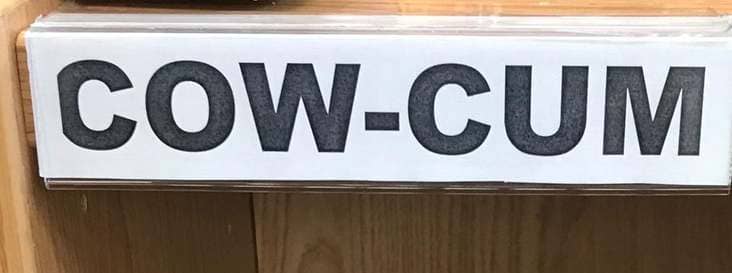
7. “My local library uses the three last letters of authors names”
8. “Didn’t think about the doors being open did they?”
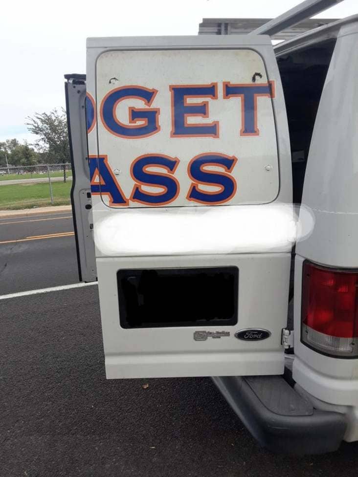
9. “Yes, Ew.”

10. “Would you like your chips with or without chips?”

11. “Click here on a newspaper”

12. “Why??”
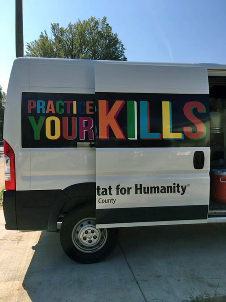
13. “Feel like this should be here”
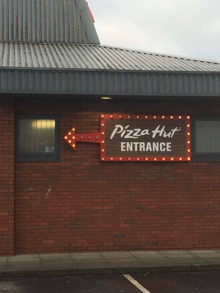
14. “The New Hello Kitty Water Cooler Is…..Interesting.”
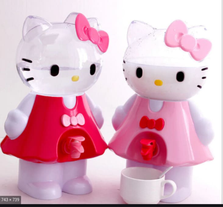
15. “too cheeky”
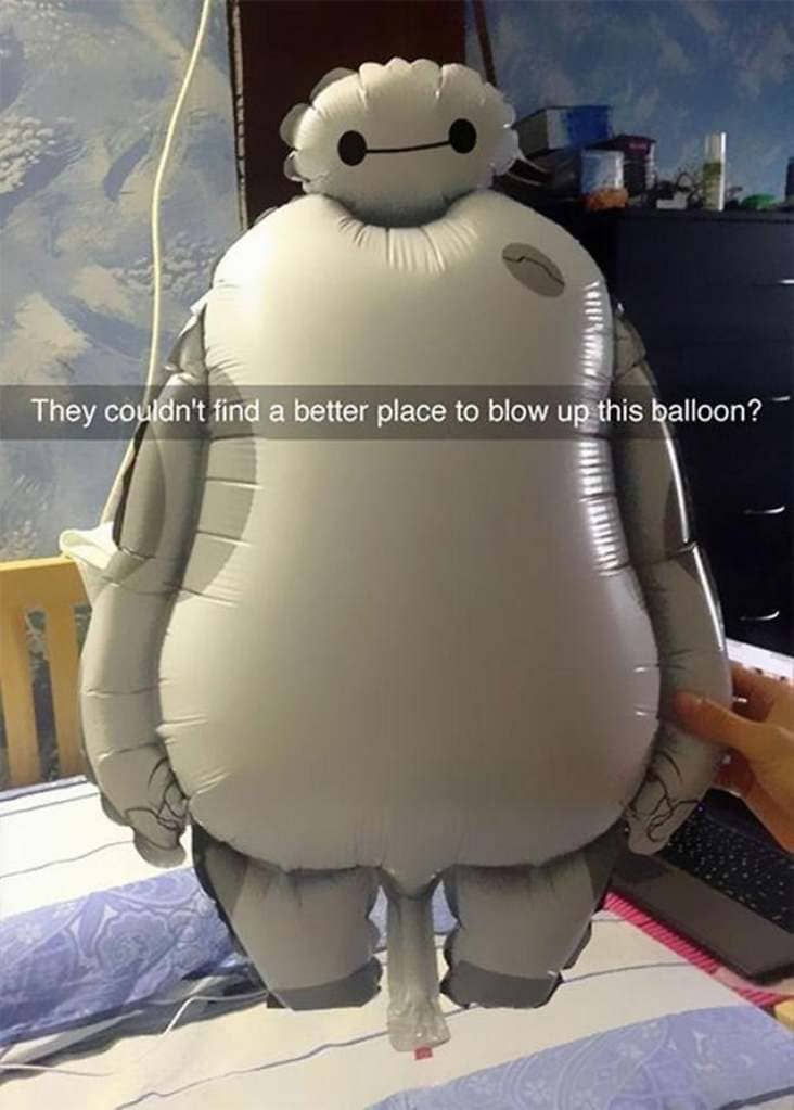
16. “Hmm yes, the floor here is made out of floor”

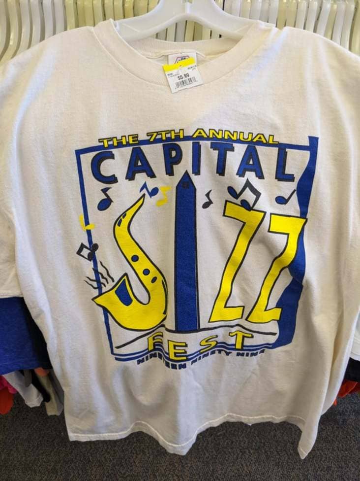
17. “Ohhhhh, you mean Capital JAzz Fest”
More Pics & Fails:
- 21 Times People Asked The Internet “What Is This Thing?” And The Internet Delivered
- Well, That Sucks (25 Fails)
- This Is Some “Just Put In My 2 Weeks’ Notice” Kind Of Effort (21 Pics)
- People Share Embarrassing Zoom Fails After Student Accidentally Logs In With NSFW Name
- I’m Not One To Judge Trashy People, But I’m Judging These Trashy People (30 pics)

