Logo Designs That Could’ve Used A Second Pair Of Eyes (24 Unintentionally Dirty Logos)
There is something so special about seeing a company release a new logo or marketing campaign without realizing it looks kinda like a penis. These accidentally dirty logos somehow slipped through the cracks of these corporate headquarters and made it far enough for us to enjoy. This is a great lesson in getting what you pay for when it comes to graphic designers. Maybe next time ask a 12-year-old boy what he thinks of your new logo first.
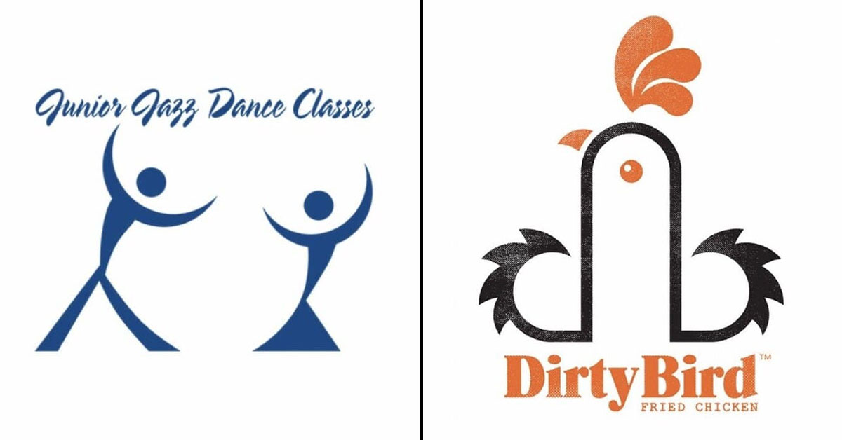
1.
2.

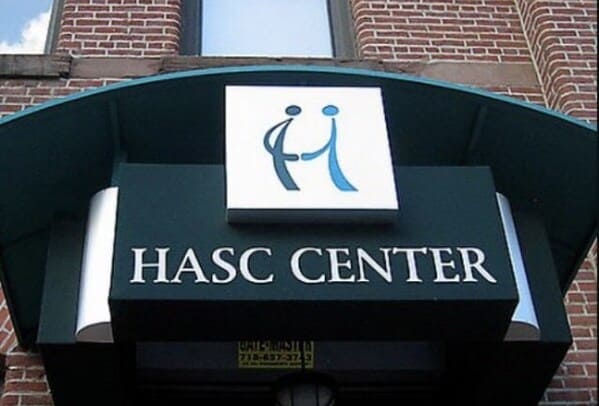
3.

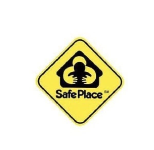
4.
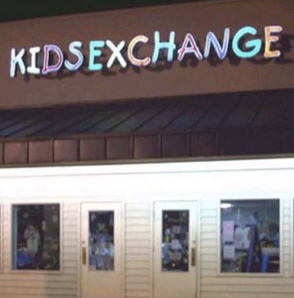
5.

6.
7.
8.

9.

10.
11.

12.

13.
14.
15.

16.
17.
18.
19.
20.
21.
22.

23.
24.
You may or may not also enjoy these high-quality links:
- True Crime Memes For True Crime Lovers (22 Pics)
- Dad Jokes Are For Everyone (17 Knee-Slappers)
- They Really Wrote These And Thought, “Yep, Send Message!” (16 Tweets)
- 24 Inappropriate Children’s Books That Actually Exist
- Inoculate Yourself From Boredom With Some Jokes About The COVID Vaccine (21 Tweets)