Product Design That Makes An Effort (24 Pics)
Product design can really suck. With some products, it seems like the last thing they thought about. I get that function is more important than form, but not by a lot. People want both. Just look at these great examples.
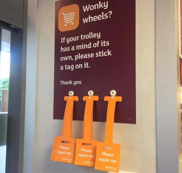
1. Imagine a place that actually fixed the carts.
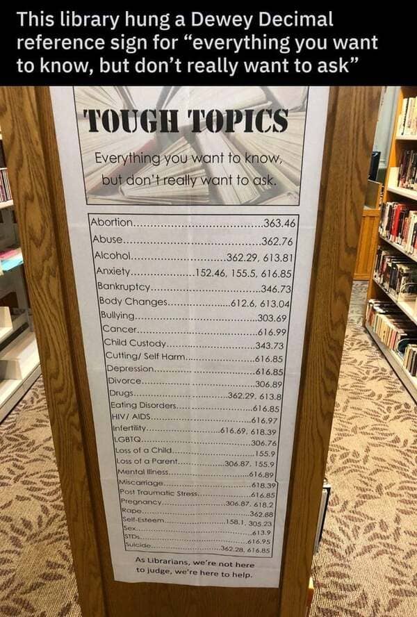
2. Not internet? No problem.
3. Brilliant.

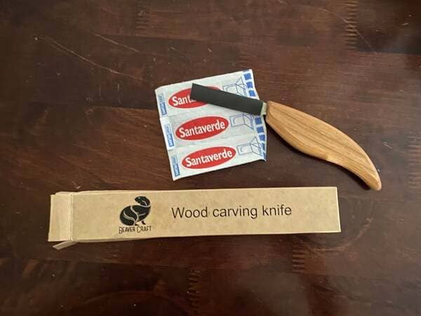
4. Wood carving knife that comes with bandages.
5. Could save a job.

6. Who would click no???

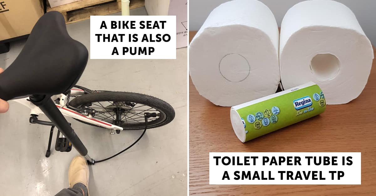
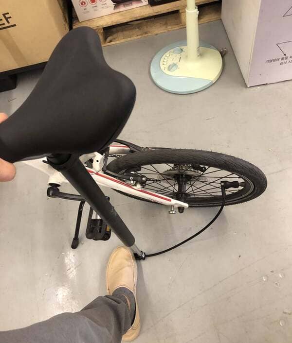
7. Bike seat that is also a pump.
8. So no one has to dig through the trash to collect bottles.

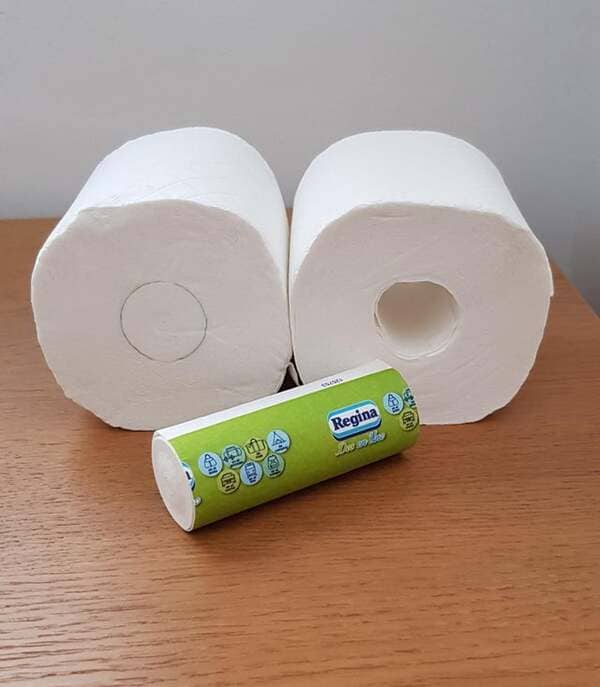
9. The TP tube is a small travel roll.
10. An actual LARGE unsubscribe button.

11. So smart.
12. Thanks, LEGO.

13. So you know when your\’re out of milk.
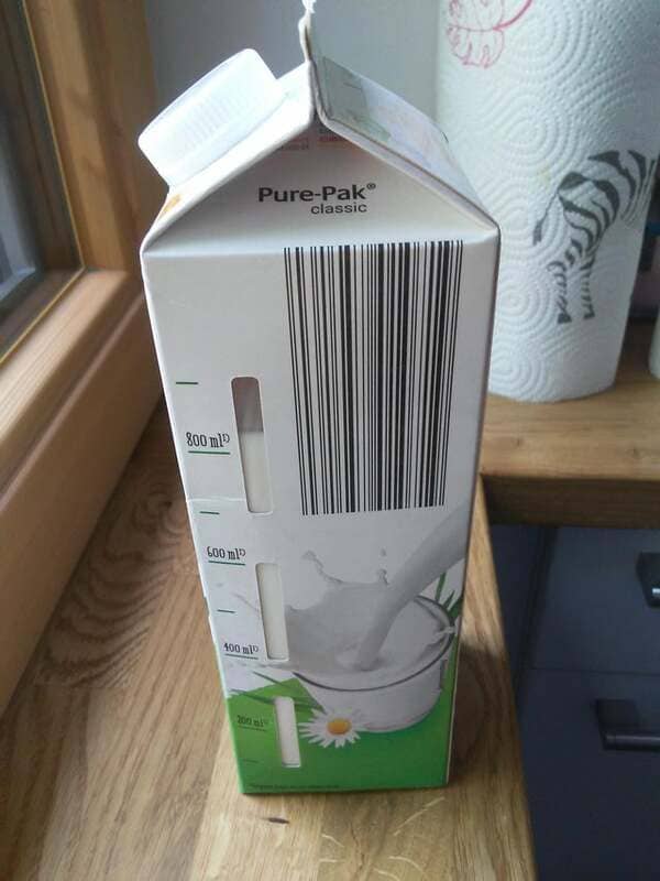
14. A much simpler captcha.

15. Thoughtful.

16. That’s one cool cat.

17. Bathroom stall lock is also a try for your things.
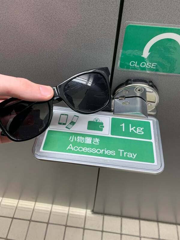
18. Subway turtles helped by the Japanese? Sounds familiar.

19. Still kind of passive-aggressive but ok.

20. A garlic knot instead of the plastic Barbie table.

21. Very cool.
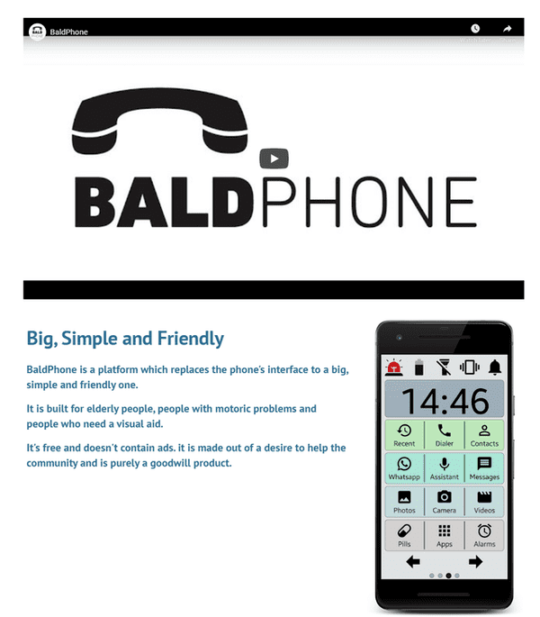
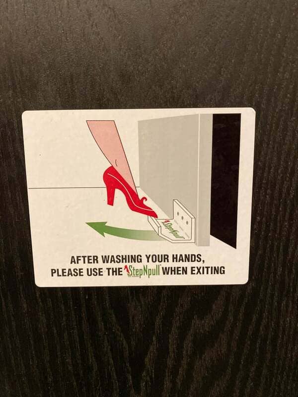
22. Been doing this to door handles for years.
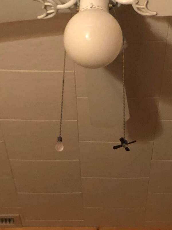
23. Strings show what they do.
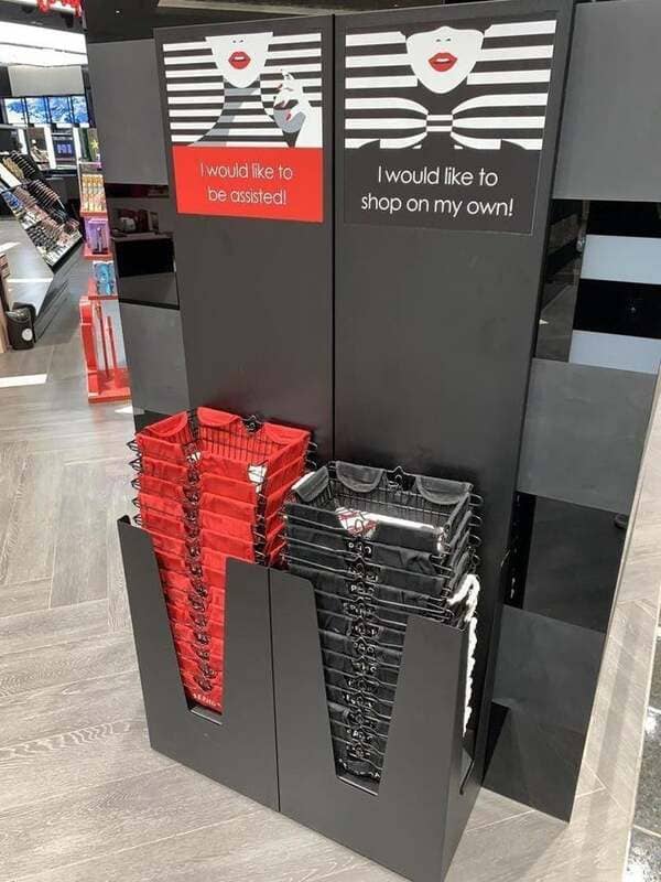
24. I have a feeling they run out of black baskets all the time.
