35 Charts And Graphs That Reveal The Beautiful Side Of Data
Data is beautiful, as it has the ability to captivate and inspire through its visual representation, highlighting the elegance and insights that can be derived from information.
It’s seriously mind-blowing to see someone break down a boatload of data and squeeze it into a chart or graph that even a clueless person like me can grasp.
1.
2.

3.
4.
5.
6.
7.
8.
9.
10.

11.
12.

13.

14.
15.
16.

17.

18.
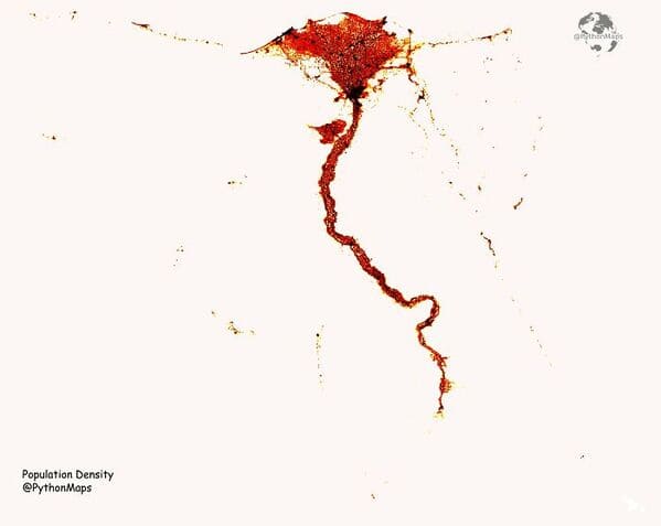
19. Population Density Of Egypt
20.
21.

22.
23.
24.
25.
26.
27.

28.
29.
30.
31.
32.
33.
34.
35.

h/t: r/dataisbeautiful