‘Data Art’ Turns Data In Jaw-Dropping Visual Masterpieces (35 Pics)
When you visualize data, not only does it become easier to grasp, but it also becomes visually captivating and cool to look at. Step into the vibrant world of “Data Art,” a popular subreddit where art meets information. This lively community of over 65 thousand members is all about creating stunning visuals that not only look amazing but also teach you something cool.
From exploring piano notes’ impact on water reverberation to a bear-filled map showcasing Finland’s bear population, these eye-catching charts and graphs will blow your mind. Prepare to be mesmerized as you scroll through the subreddit and discover the beauty of data transformed into art.
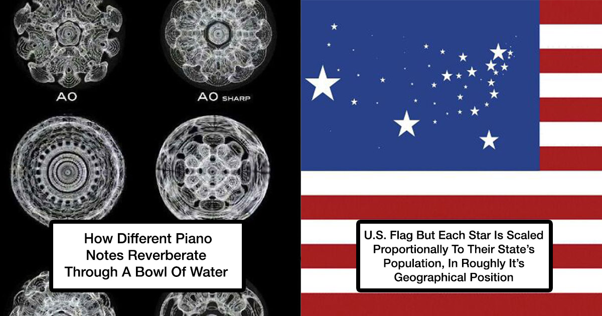
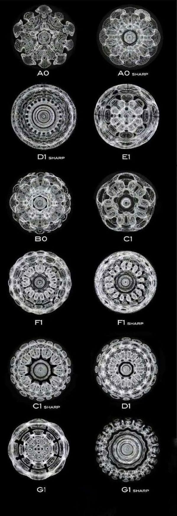
1. “How Different Piano Notes Reverberate Through A Bowl Of Water”
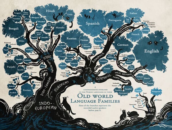
2. “Language Family Tree”
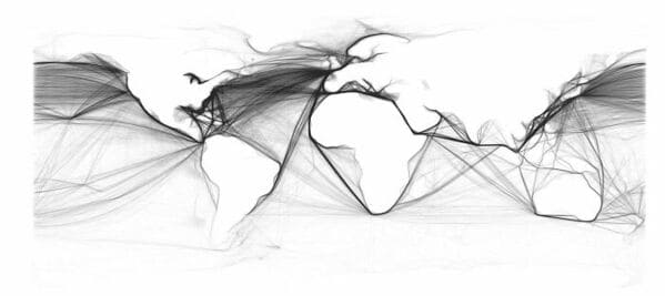
3. “This Map Is Drawn Entirely From Shipping Logs From 1945”
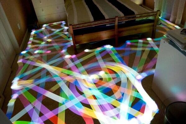
4. “Long Exposure Of A Roomba Vacuum With A Color Changing Light On Top”
5. “Paths Of 800 Unmanned Bicycles Being Pushed Until They Fall Over”

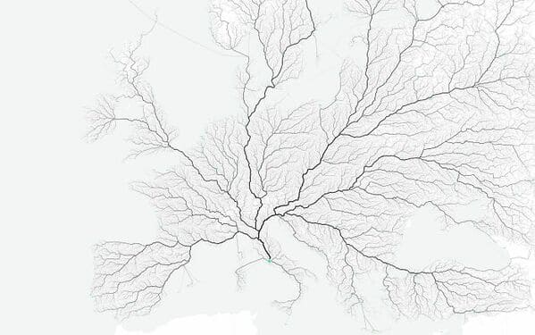
6. “European Roads To Rome”
7. “U.S. Flag But Each Star Is Scaled Proportionally To Their State’s Population, In Roughly It’s Geographical Position”

8. “Literal Art!”
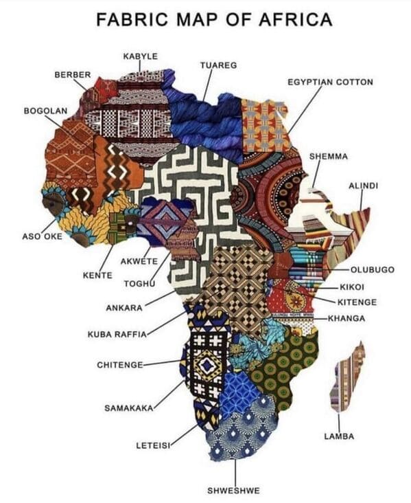
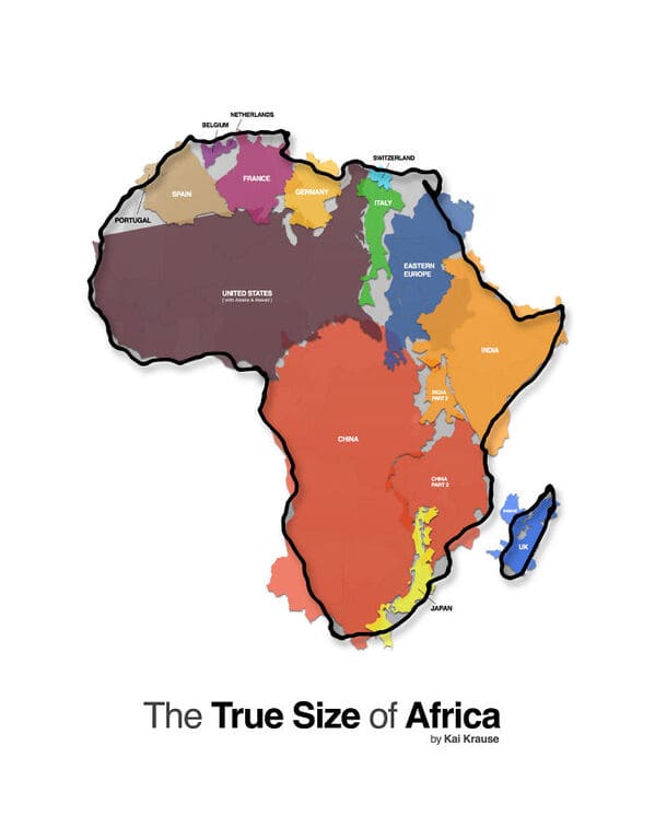
9. “All These Countries Fit Inside Africa”
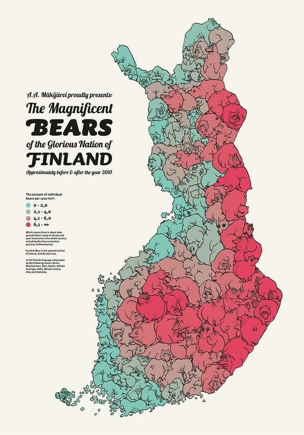
10. “A Map Of Finland’s Bear Population, Made Up Of Bears”
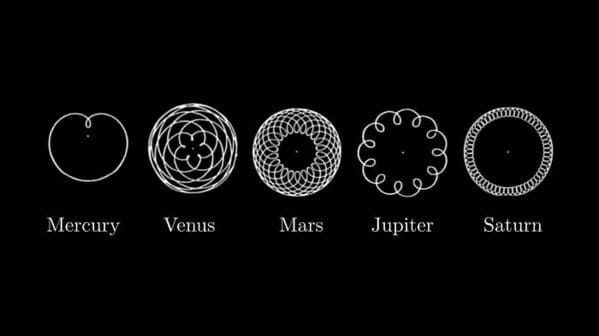
11. “These Diagrams Show The Paths Traced By Mercury, Venus, Mars, Jupiter And Saturn As Seen From Earth”
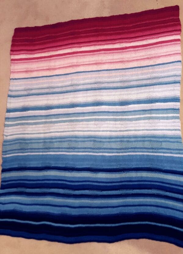
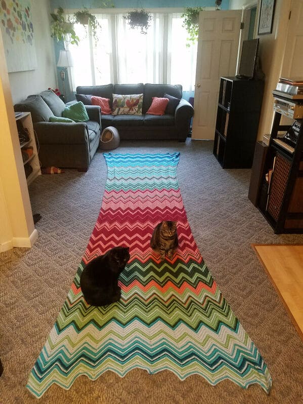
12. “My Wife Made This Blanket That Indicates A Certain Temperature For Every Day Of The Year. 2016 Pennsylvania”
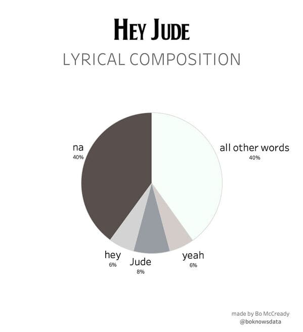
13. “Hey Jude Lyrical Composition”
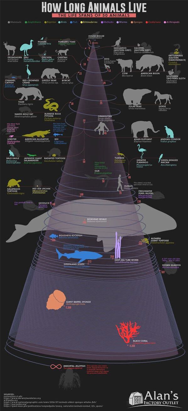
14. “How Long Animals Live – The Lifespan Of 50 Animals Visualized On A Spiral”
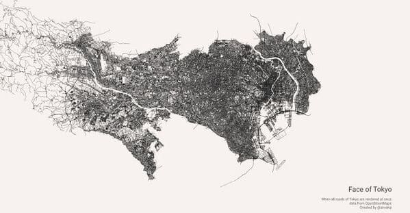
15. “I Rendered Every Single Road In Tokyo Area On One Map. Love The Results”
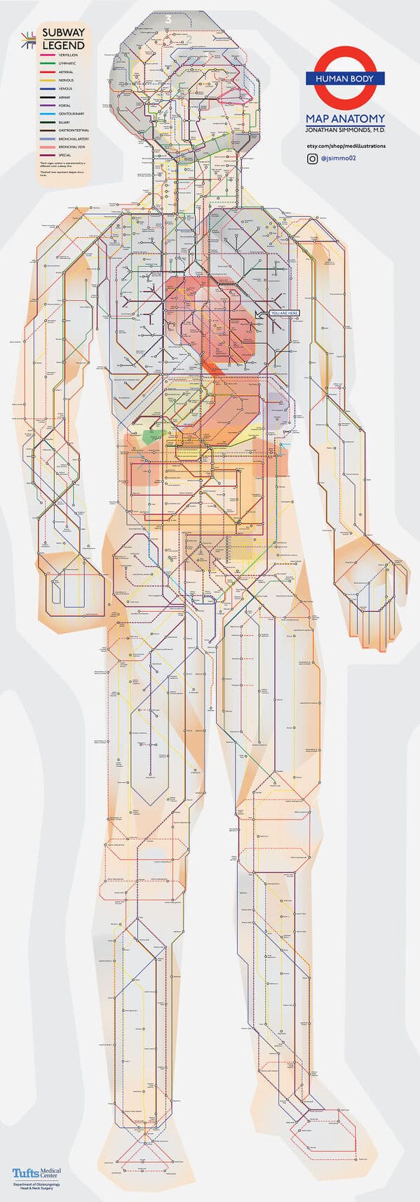
16. “Anatomy Of The Human Body, In The Style Of The London Underground Map”
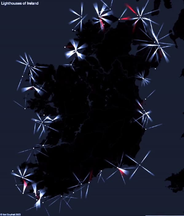
17. “Every Lighthouse In Ireland, With Accurate Timings, Flash Patterns And Colours”
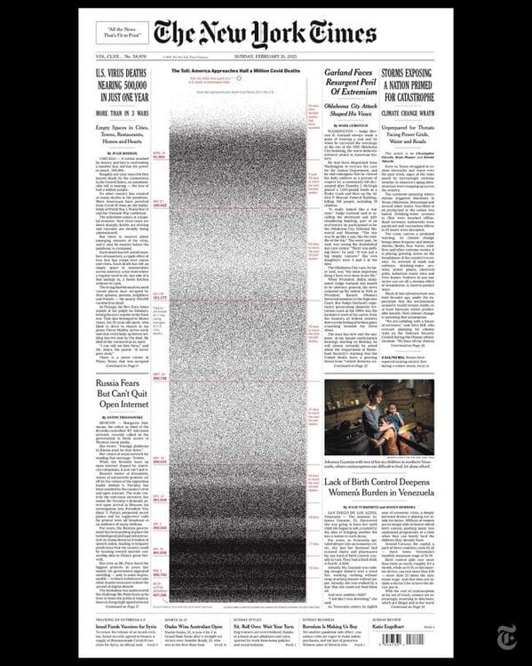
18. “NYT’s Front Page For 21 Feb. Each Dot Represents A Life Lost To Covid-19 In The US”
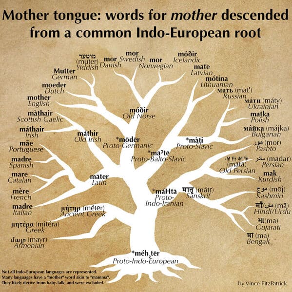
19. “Words For ‘Mother’ Descended From A Common Proto-Indo-European Root”
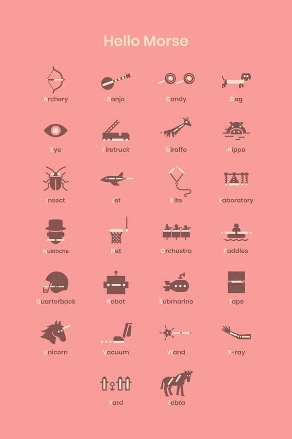
20. “Morse Code Guide By Google”
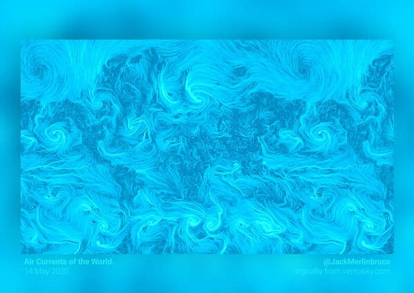
21. “This World Map Is Made Of Only Air Currents. If You Look Closely, You’ll See Country Outlines”
22. “Wow!!!”
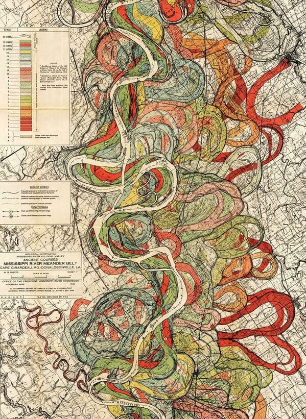
23. “History Of The Mississippi River, As Drawn In 1944”
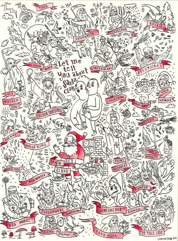
24. “I Made This Poster After Researching The Origins Of Santa Claus”
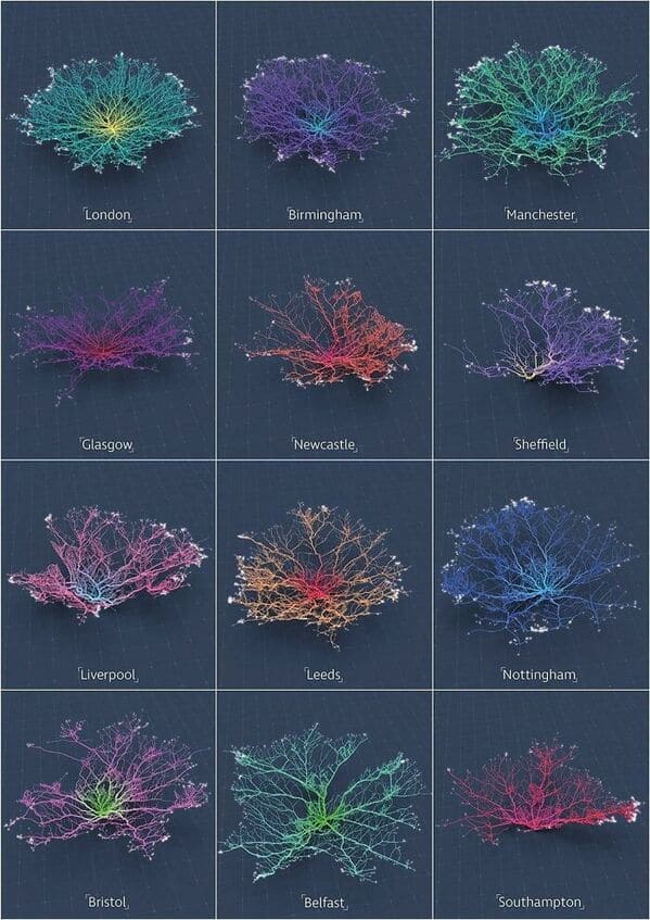
25. “From Flowing Data. Coral-Like Cities To Show Road Networks”
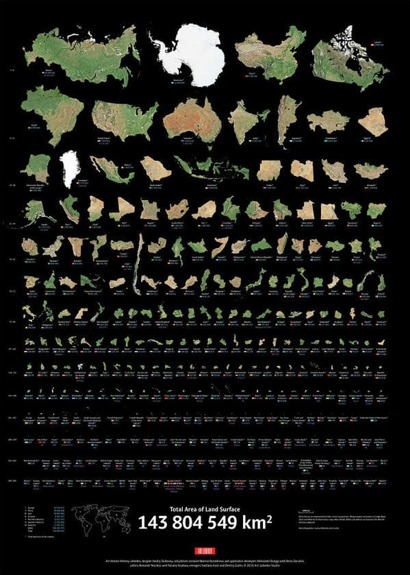
26. “Real Proportions Of All Land Masses Revealing Actual Areas Of Countries, Territories And Major Islands Without Any Distortions (By Art.lebedev)”
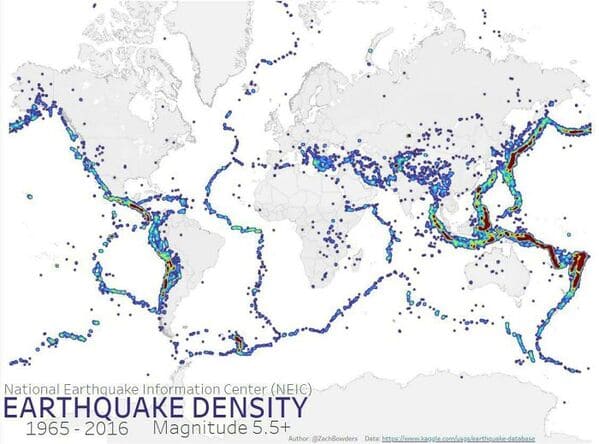
27. “Worldwide Earthquake Density 1965-2006”
28. “Smarties Colour Distribution”

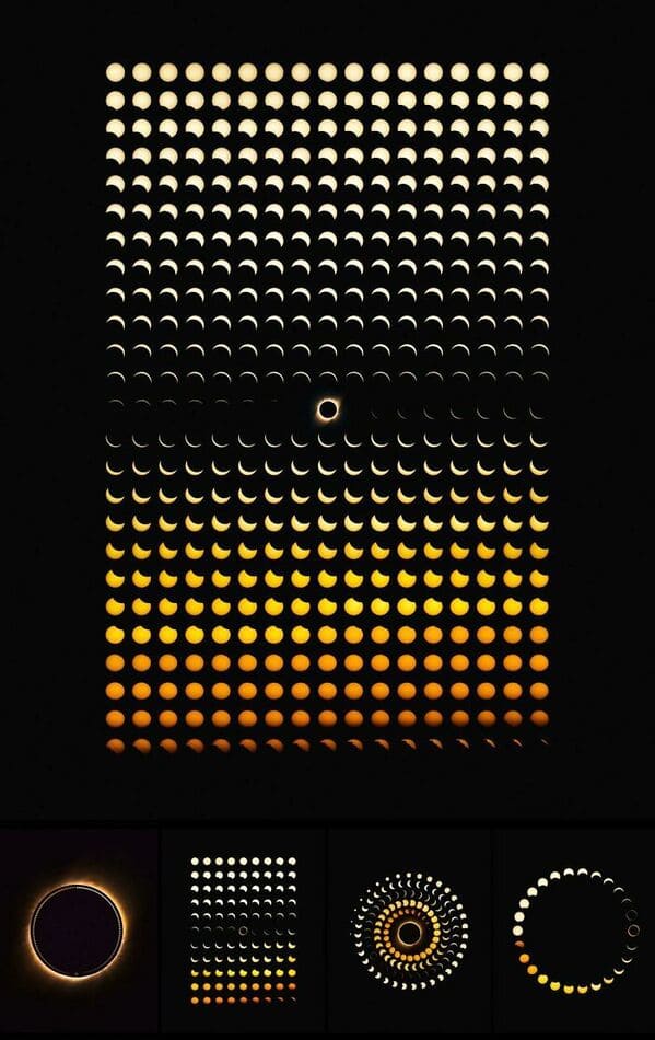
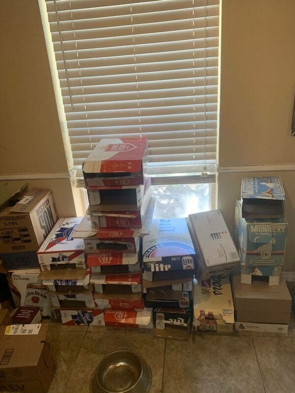
29. “I Made A Bar Graph Of My Favorite Quarantine Beers”
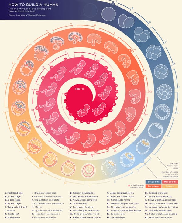
30. “How To Build A Human”
31. “This “Photo” Of The Sun Uses Neutrinos Instead Of Light, And Is Taken At Night By Looking Through The Earth”

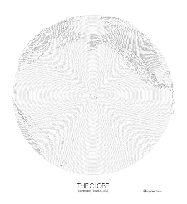
32. “The Globe Centred On Honolulu – Topographic Map From A Single Spiral Line”
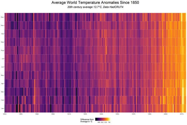
33. “World Temperature Anomalies”
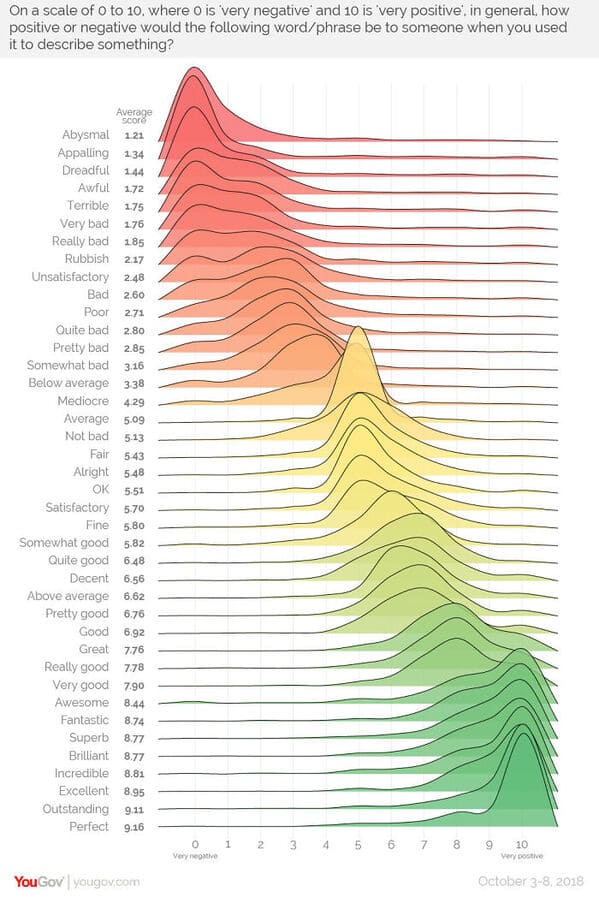
34. “The Sentiment Scale: How Positive Or Negative A Word Sounds”
35. “139 Years Of Global Temperatures Knit Into A Baby Blanket”