35 Annoying Home Design Trends People Are Tired Of Seeing
In recent years, the world of home design has been flooded with a slew of trends that, while initially embraced with enthusiasm, have now left many of us rolling our eyes.
As someone deeply passionate about creating spaces that feel both personal and timeless, I’ve been keeping a keen eye on what homeowners and designers alike are saying “enough is enough” to.
From barn doors in urban apartments to the overuse of grey in every conceivable space, it seems there’s a growing desire for authentic and thoughtful design. While trends can offer fresh inspiration, it’s essential to remember that our homes should be a reflection of our personal stories, not just the latest fad that will soon fade.
Join us as we delve into these 35 annoying home design trends, spotlighted by a popular r/AskReddit thread, that have worn out their welcome.
#1
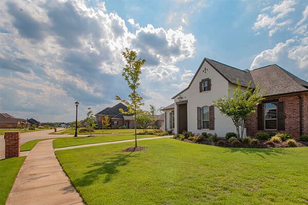
I live in an older subdivision in a suburb with a ton of development. Mostly McMansion-type subdivisions are going up everywhere. There are two things about these areas that drive me nuts.
First off, why do these developers hate straight roads so damn much? Trying to navigate through a newer subdivision is the biggest pain in the a*s because roads always seem to turn back on themselves. That s**t is dumb.
Second: why cut down every single goddamn tree you see and then plop down a bunch of big, ugly-a*s houses with zero personality and THEN plant a bunch of little baby trees? Why would anyone want to live in a house with no trees anywhere? If they spent any amount of time planning what they’re actually trying to build they could very easily leave large trees and patches of nature in yards or between houses. Instead they treat the development like a kid playing The Sims.
I effing hate new housing developments. They all look horrible and since most of them have HOAs it’s probably a bigger pain in the a*s to live in one.

#3
#4

I love smart tech in a home, but most of it is horribly implemented and just bad. You shouldn’t need touch screens everywhere to control your lights, or have to pull out your phone.
Pulling out your phone to change the colour of your lights isn’t “smart” that’s just making your lights dependent on your phone. Having your lights auto dim when you start a movie; that’s smart.
Also; my refrigerator doesn’t need to connect to the internet, ever.

#6
#7

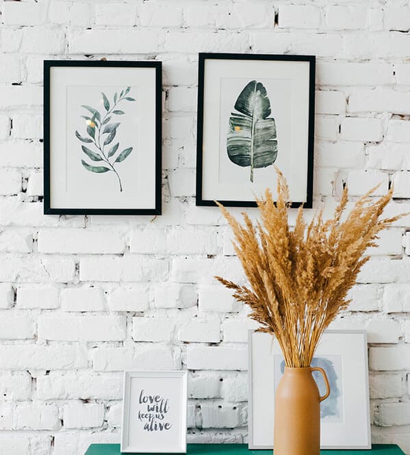
I hate words in my house, in basically any form, hate the f*****g live laugh love signs, hate it even more when people do it like my mom and plaster everything in a combination of bible quotes, motivational quotes, and the worst of all the names of our family members.
Also hate anything that is clearly supposed to have a practical use that is only around for decoration, pillows, chairs, tables, if it’s something that anyone has to be told not to use because their first instinct is to treat it like any other thing of it’s kind then it’s stupid and I hate it.
#8

Buddha heads. Buddha heads became fashionable because American soldiers decapitated many statues in Laos and Thailand during the Vietnam War and smuggled them out. They were sold to museums across the world and people copied them to stick in their living rooms/bedrooms because “it’s so peaceful /I’m open to Buddhism”
Now when you go to Thailand you’ll see decapitated statues all over the country, statues that had remained intact until recent history.
#9
#10
#11
All white everything. I have so many friends (20-25ish) doing the all-white furniture in an already white room with white or silver accents and I just don’t get it. Any little bit of dust shows up and it’s so stark that it’s borderline painful to look at if the room is sunny.
It’s totally personal, though. My partner and I do all black everything in white rooms. A lot of people absolutely hate it.
#12

I’ve been an interior designer part time for multiple years and I could go on for hours about all the design choices many people make that just deserve to be kissed by a sledgehammer.
But if I had to narrow it down, I’d say these three things:
1. Tile Countertops. The look is massively dated and it’s impractical. You’d have to scrub the cracks a lot to get water stains and other substances that will be trapped inside. And when the tiles get damaged and loose your counter will be a pain in the a*s.
2. Popcorn ceilings. I was working with a crew to renovate a house and the ducking bathrooms had popcorn ceilings. The steam from the shower was making it fall to the floor. Ridiculously tacky. Avoid popcorn ceilings and just paint it.
3. All white interiors. Just writing that irritated me. An entire white room psychologically bothers me. No color whatsoever. Unappealing to the eye and mind as well as near impossible to maintain from stains. All white is only good for rooms you never use which will never happen.
#13
#14
#15

#16

#17

#18

#19
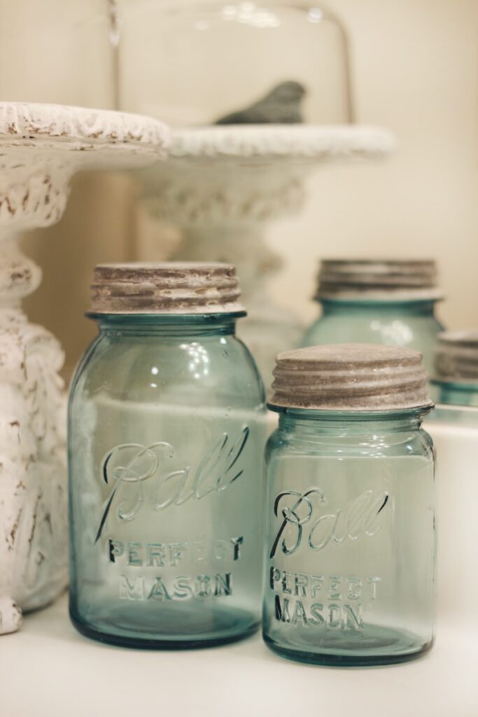
Mason jar decor. Need a new light fixture? Mason jar! A place to store your extra writing utensils? Mason jar! Flower vase? Mason jar! Tealight holder? Mason jar! Porcelain toilet bowl too boring and normal? BIG mason jar!!!
#20

Full open concept – especially when people take all the walls down in an older home with a traditional layout. I like the separation of space and defined rooms. I can handle partial open concept but that’s about it. We actually extended a wall in one of our houses to create a more defined den and living room
Floor-to-ceiling windows in the private rooms of the home like bedrooms and bathrooms. Or giant window at the bathtub. If you in the middle of nowhere and have no neighbors I guess, but in a subdivision or city the curtains or buildings have to be closed most of the time.
#21

Big windows in the front with no curtains or blinds. Who does that? What type of weirdos are like yeah what if all the neighbors and whatever strangers happen to be walking by can see into our living room at all times? I usually see this on homes that have that modern minimalist architecture thing going on, which tends to be ugly anyhow. They’re trying to look futuristic but in the near future, they will be considered lame and out of style.
#22

#23
I hate it when the front facade of a house has like nice siding, expensive stonework or brick, good quality windows with nice trim, windows and door sizes and arrangement are aesthetically pleasing, etc., but then the sides and back of the house are cheap vinyl siding with different, cheaper, uglier windows and trim, and the fenestration layout is hideous chaos. Like…you know people can see your house from angles other than directly in front, right?
#24

#25
#26

Having to pass through the master bath to reach your closet. Or on a similar note, having a door to separate off the toilet, but not the shower.
#27

#28
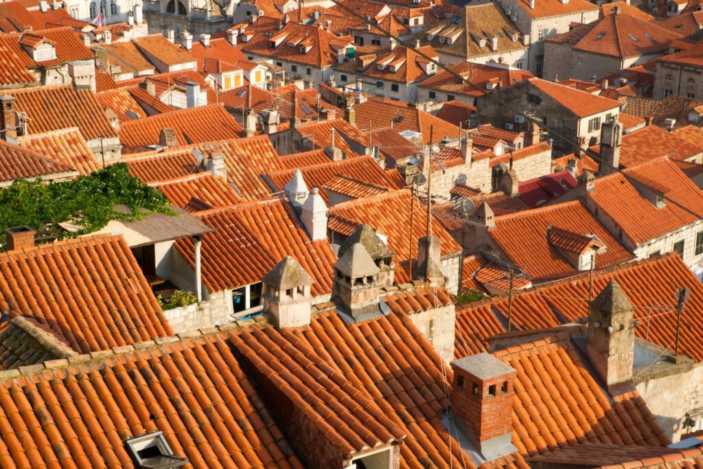
Too many rooflines. This trend has to stop. It’s over-architecting to the degree where there’s nothing of substance anymore.
#29
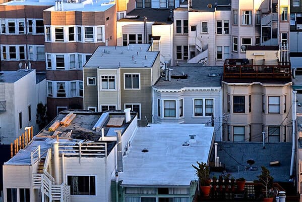
Flat roofs. The buffer area between the roof and the room inside is an absolute breeding ground for mold, and whenever it rains, water pools on top of the roof and leaks in. In some cases, it looks modern, but for some houses built in this style in the 70s or 80s, it looks stupid, and is insanely impractical.
#30
#31
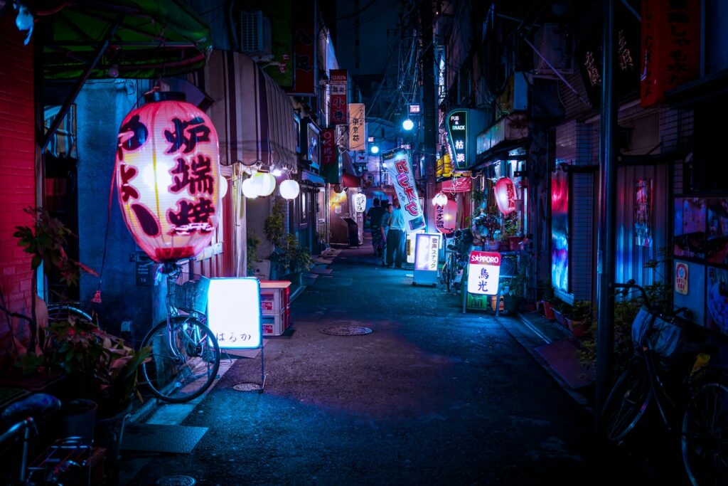
Neon lights, are you trying to make your house look a convenience store.
#32
Any kind of pillars… why? Just why..? It always looks gaudy.
#33
Shiplap