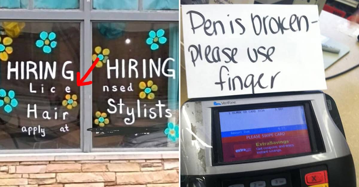
45 Unintentionally Hilarious Kerning Fails That Show Why Font Choice Matters
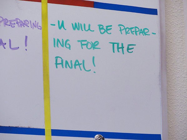
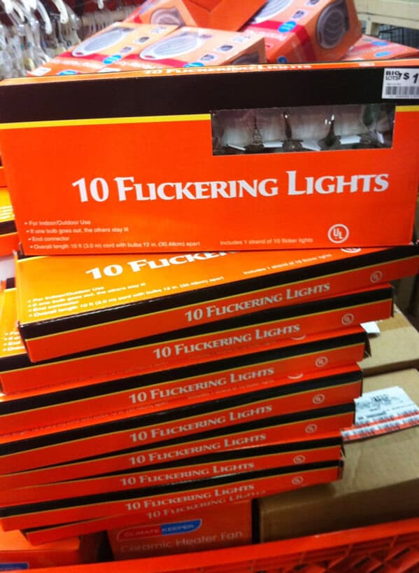
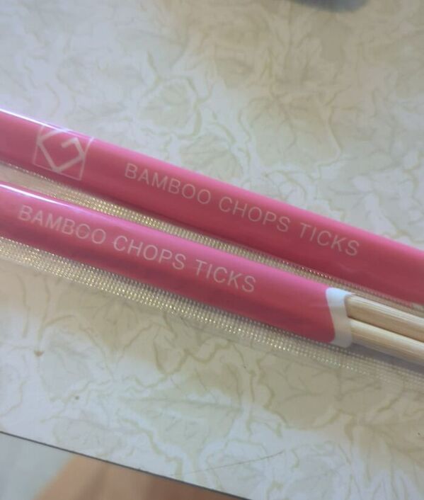
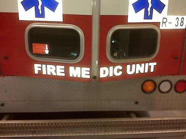
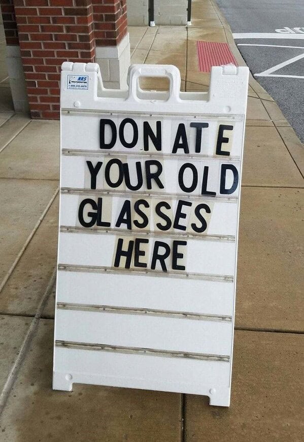
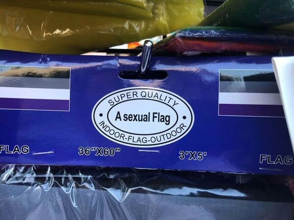
When it comes to design, the devil is in the details, and nothing proves this more than funny kerning and letter spacing fails. These hilarious mishaps show just how crucial font selection can be.
Whether it’s a sign, a logo, or a piece of marketing material, the right or wrong spacing between letters can turn a serious message into an unintended joke. So, next time you’re working on a design project, remember: font selection matters.
1.

2.

3.

4.

5.

6.
7.

8.

9.

10.

11.

12.

13.

14.

15.

16.

17.
18.

19.

20.

21.

22.

23.
24.

25.

26.

27.

28.

29.

30.
31.

32.

33.
34.

35.

36.

37.

38.

39.

40.

41.

42.

43.

44.
45.


