The Instagram page We Have The Data has found a way to make trends and statistics entertaining.
With over 388,000 followers, they share maps that highlight bizarre trends, unexpected statistics, and just straight-up weird observations about the world.
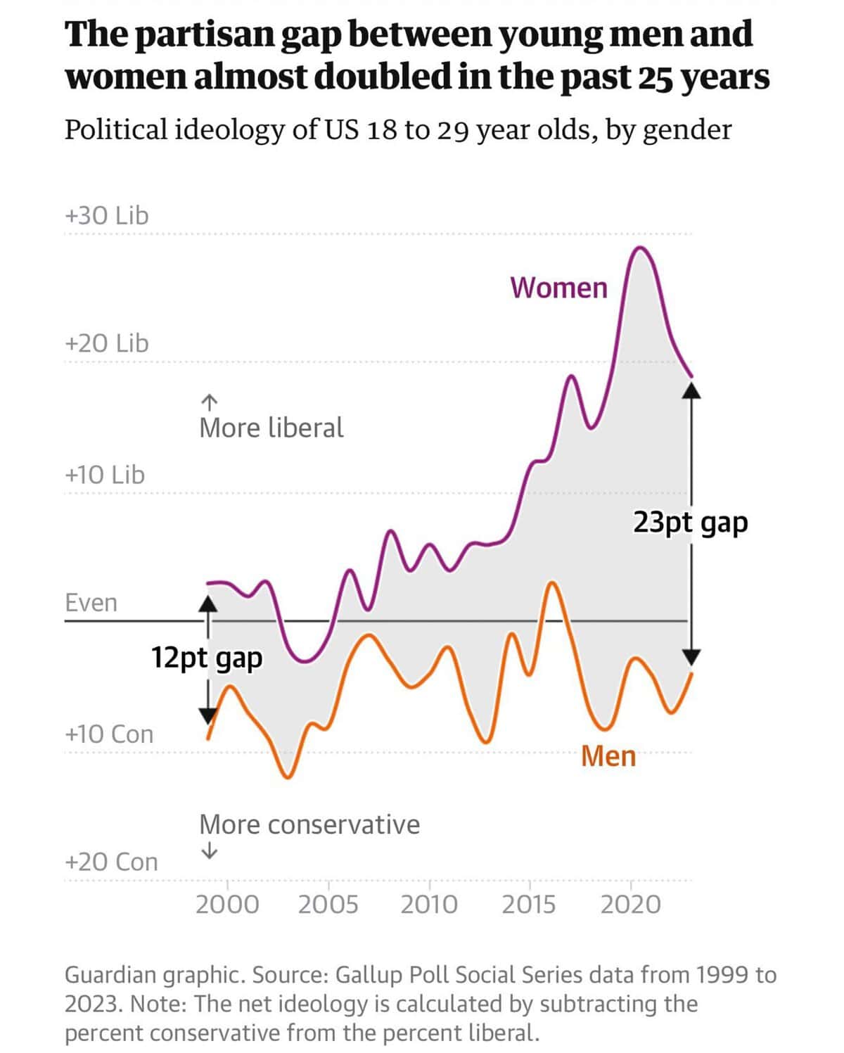
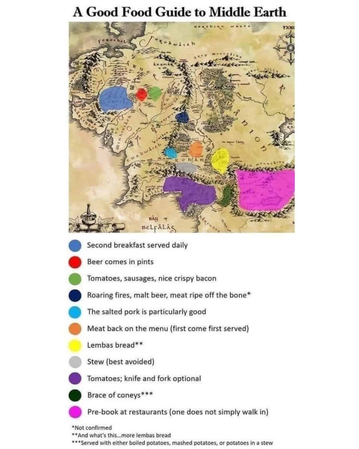
Whether it’s a map of food preferences on Middle Earth or a chart of the political gap between men and women, these posts prove that data visualization doesn’t have to be boring.
Here are some of the most interesting maps they’ve shared.
Follow We Have The Data: Instagram
1.
2.
3.
4.
5.
6.
7.
8.
9.
10.
11.
12.
13.

14.

15.
16.
17.
18.
19.
20.
21.
22.

23.
24.
25.
26.
27.
28.
29.
30.
31.
32.
33.
34.
35.
36.
Read more: 45 Brilliant Reused And Recycled Art Projects That Cleverly Avoid Waste