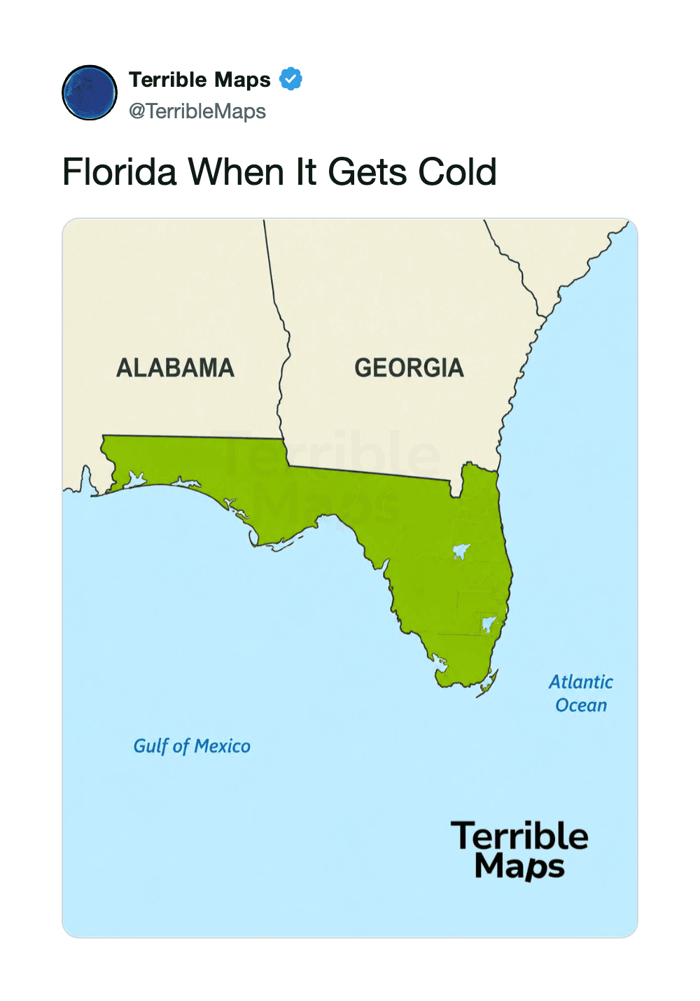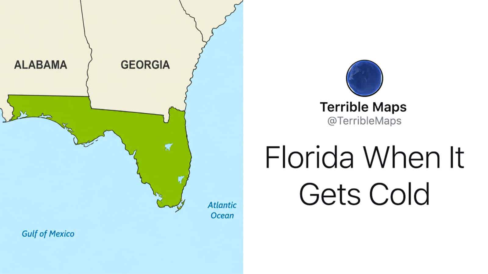
Map of Florida highlighted in green with surrounding states and Gulf of Mexico.

35 Terrible Maps That Are Funnier Than They Have Any Right To Be

Add as a preferred source on Google

For centuries, maps have helped humanity explore unfamiliar places, establish borders, and avoid accidentally driving into large bodies of water. These maps do none of that.

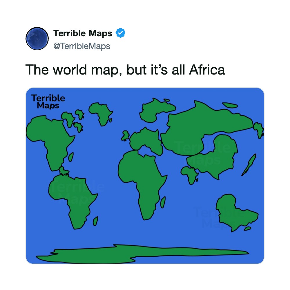
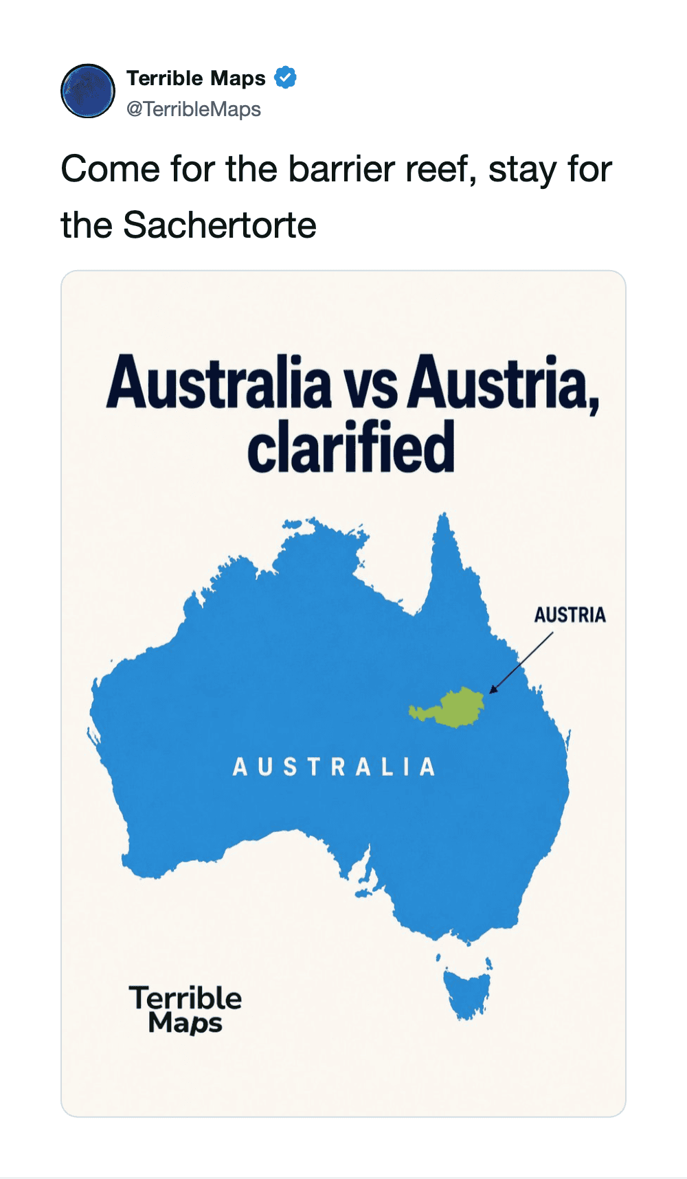
The Terrible Maps account has found a much better use for geography: silly jokes. Instead of showing elevation or population, these maps answer important questions like what the world would look like if every continent were Africa. They also finally explain the complicated difference between Australia and Austria.

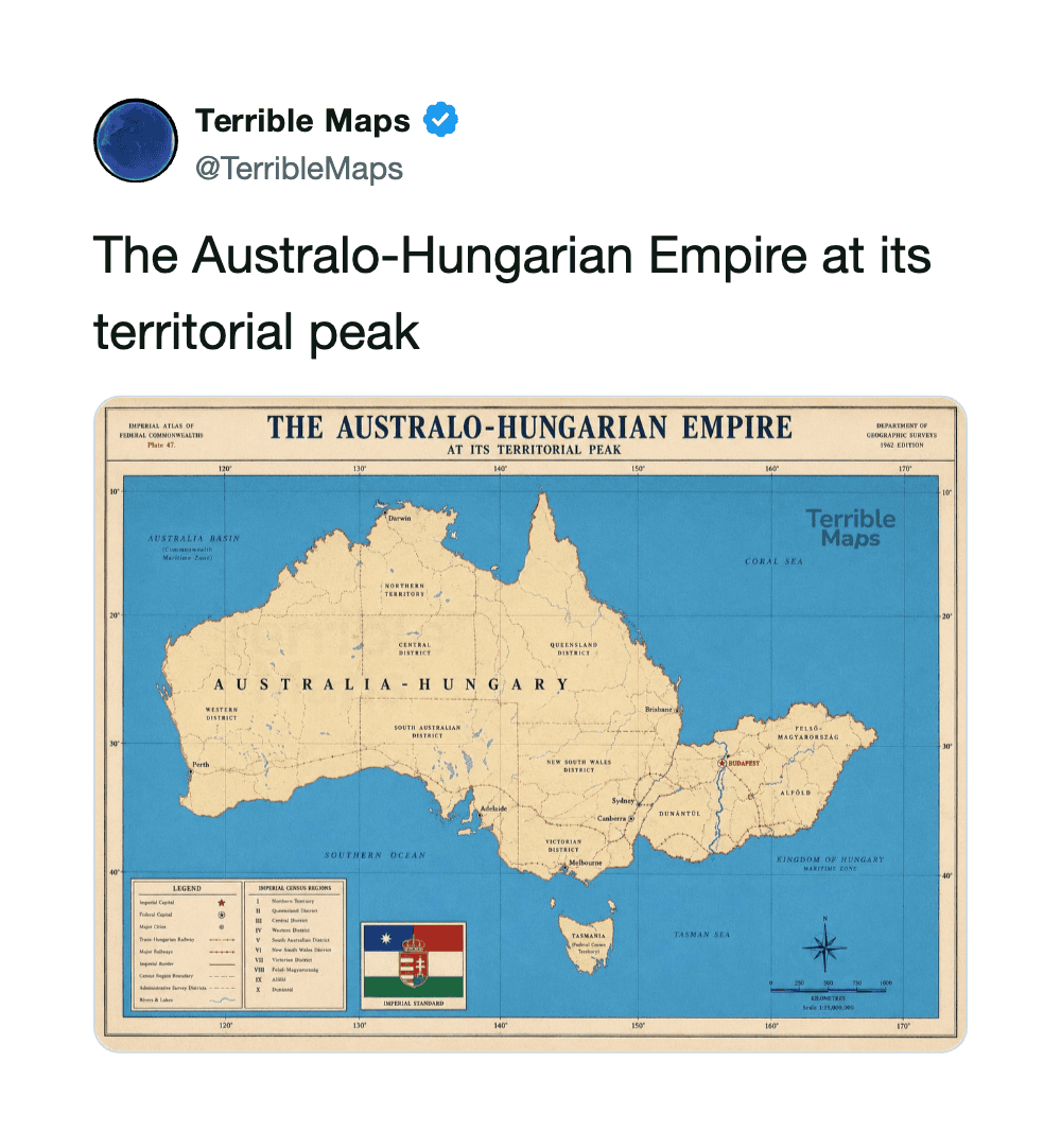
You probably won’t learn anything useful here. However, the next time someone brings up the Austro-Hungarian Empire, you can confidently picture Australia attached to Hungary and ruin the conversation.

1.
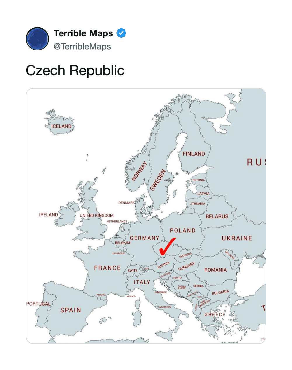
Map of Europe highlighting Czech Republic with a red check mark.
via twitter

2.

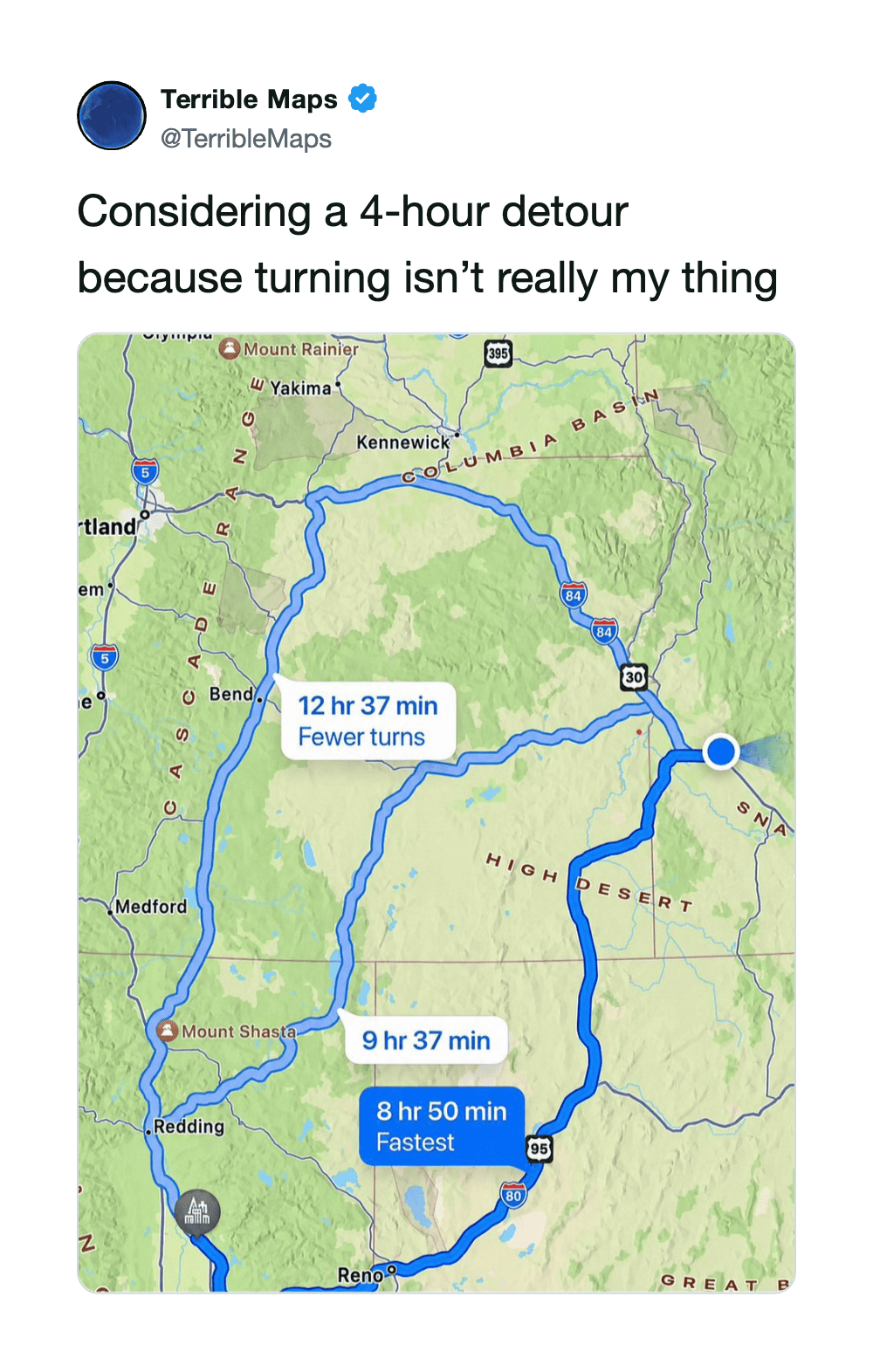
Map showing a 4-hour detour route with three options, including fastest and fewer turns routes.
via twitter

3.

Map of Florida showing the southern part in green, labeled 'Florida When It Gets Cold'.
via twitter

4.

via twitter

5.

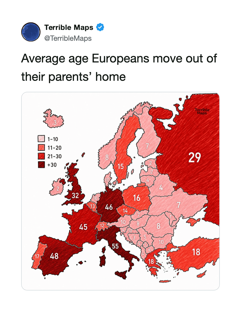
Map of Europe showing average age Europeans move out of their parents' home, with color coding.
via twitter

6.

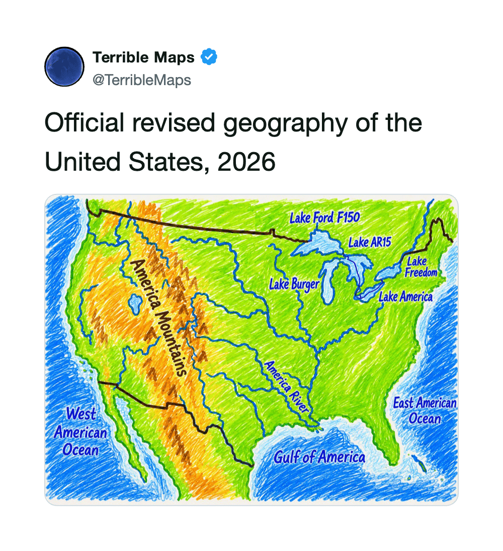
Revised 2026 US geography map showing lakes, mountains, and oceans.
via twitter

7.

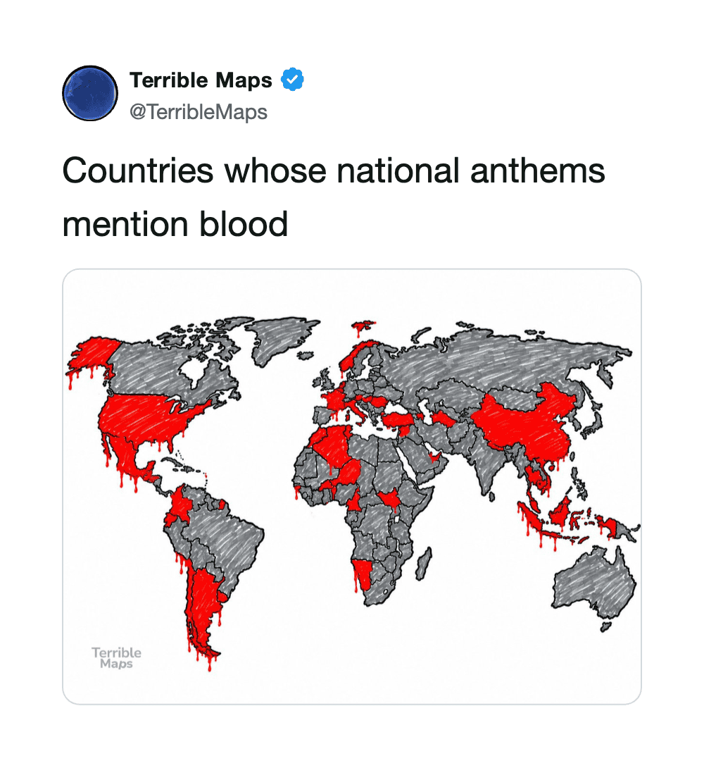
Map showing countries with blood mentions in their national anthems, highlighted in red.
via twitter

8.

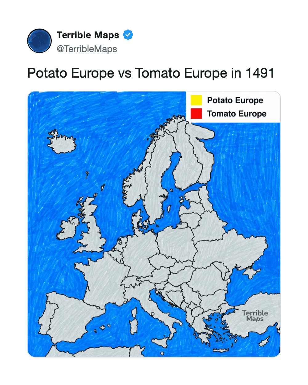
Map of Europe showing Potato Europe in yellow and Tomato Europe in red, 1491.
via twitter

9.

Map of the Austro-Hungarian Empire at its territorial peak with a legend and flag.
via twitter

10.

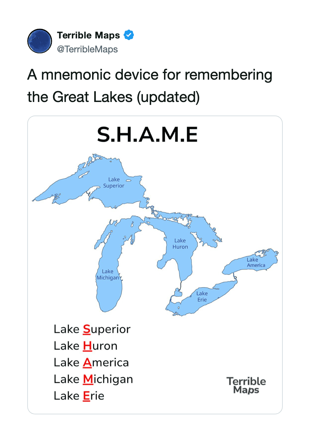
Mnemonic device for Great Lakes: S.H.A.M.E. with lakes labeled.
via twitter

11.

via twitter

12.

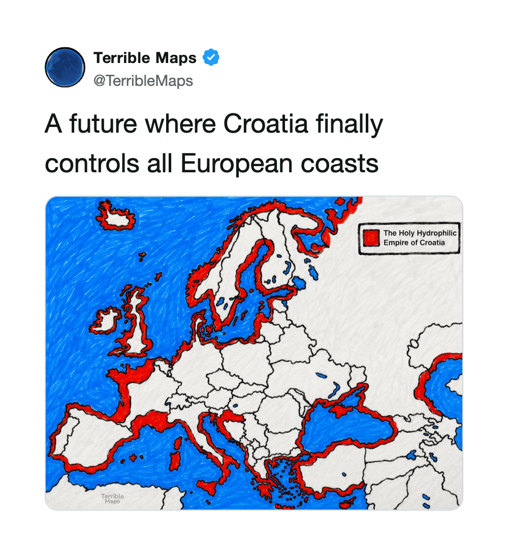
Map showing Croatia controlling all European coasts, marked in red.
via twitter

13.

via twitter

14.

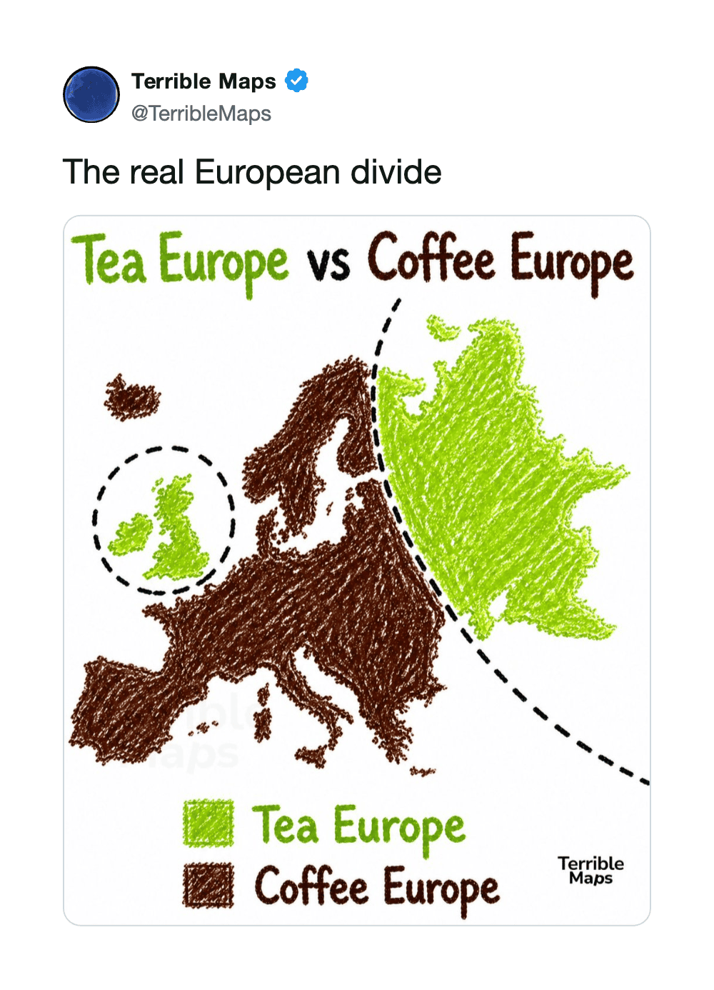
Map showing Tea Europe in green and Coffee Europe in brown with labels and dotted lines.
via twitter

15.

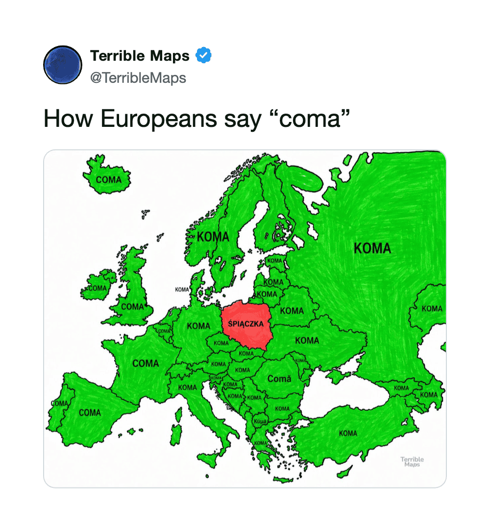
Map of Europe showing 'coma' in green and 'splażka' in red, with 'coma' in many countries.
via twitter

16.

Map of Australia highlighting Austria, with text 'Australia vs Austria, clarified'.
via twitter

17.

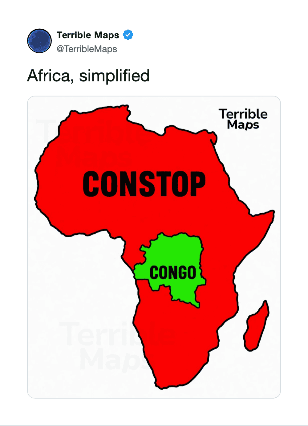
Africa map with Congo in green and the rest in red, labeled 'CONSTOP' and 'Terrible Maps'.
via twitter

18.

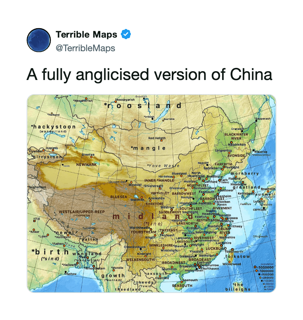
A fully anglicised version of China map with humorous misspellings and labels.
via twitter

19.

via twitter

20.

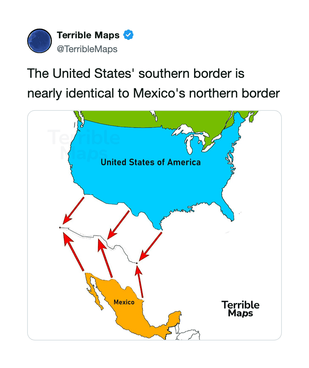
Map showing US southern border nearly identical to Mexico's northern border.
via twitter

21.

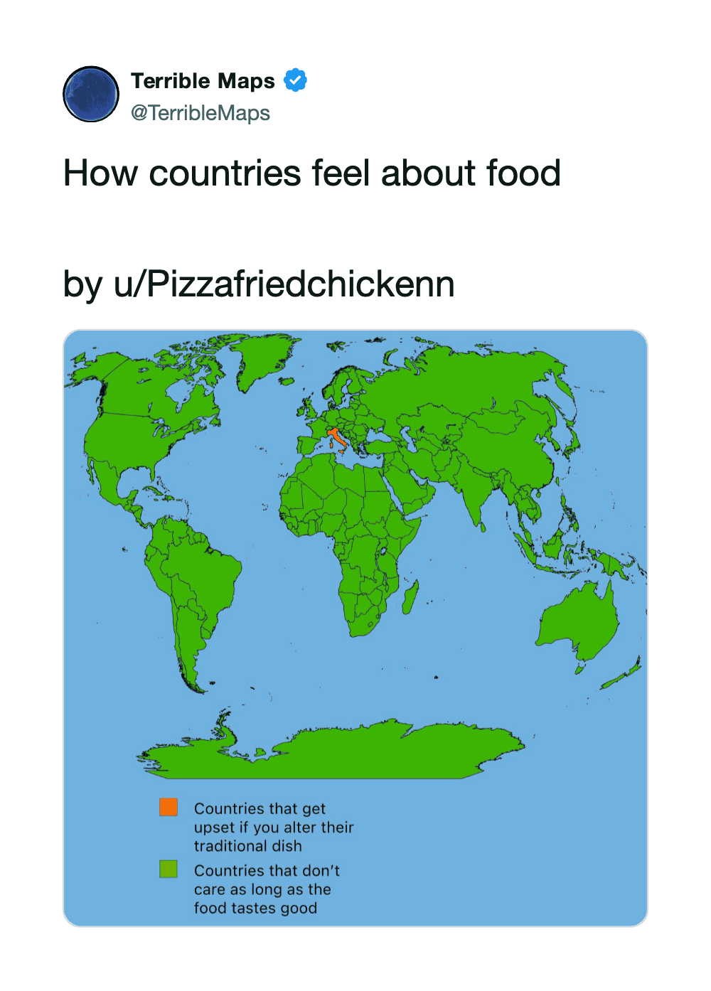
World map showing countries' feelings about food, green for good, orange for upset.
via twitter

22.

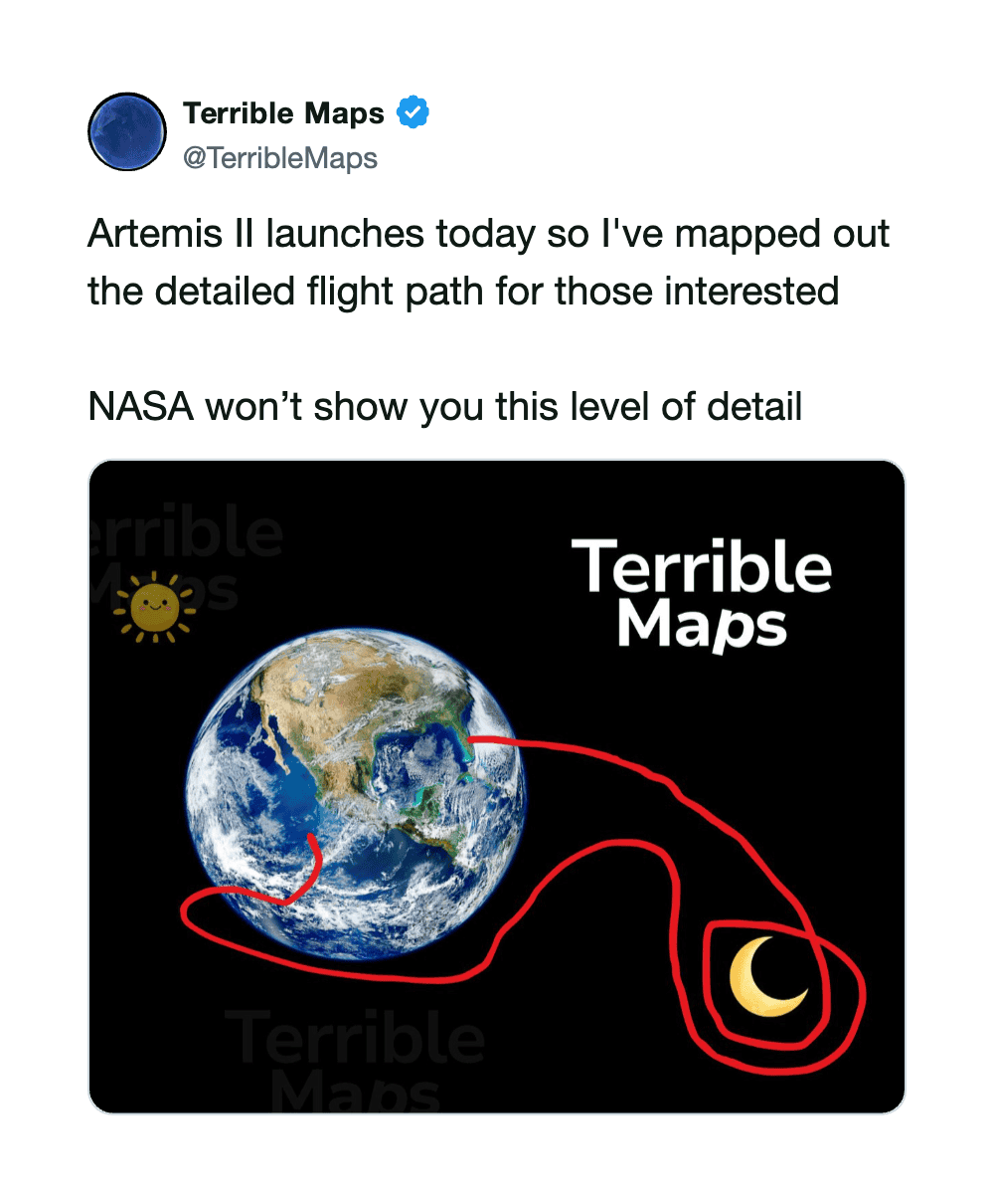
Earth with red flight path lines and a moon, labeled 'Terrible Maps' and 'NASA'.
via twitter

23.

via twitter

24.

via twitter

25.

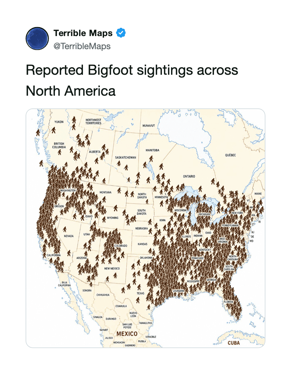
Map of North America with numerous Bigfoot sightings marked across the continent.
via twitter

26.

via twitter

27.

via twitter

28.

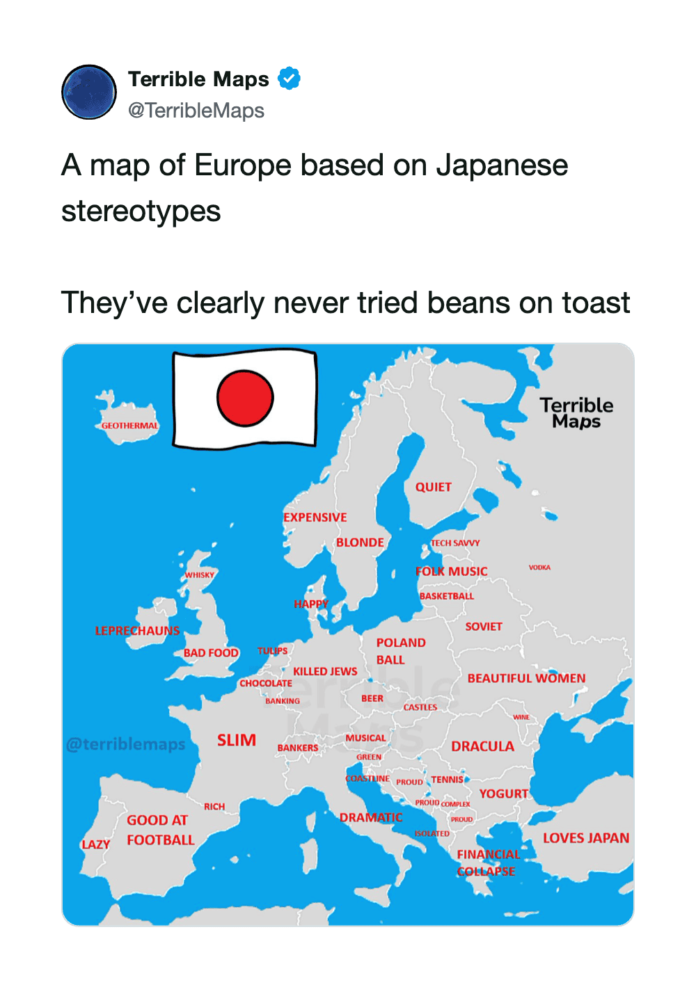
Map of Europe with Japanese stereotypes labels like 'expensive' and 'beautiful women'.
via twitter

29.

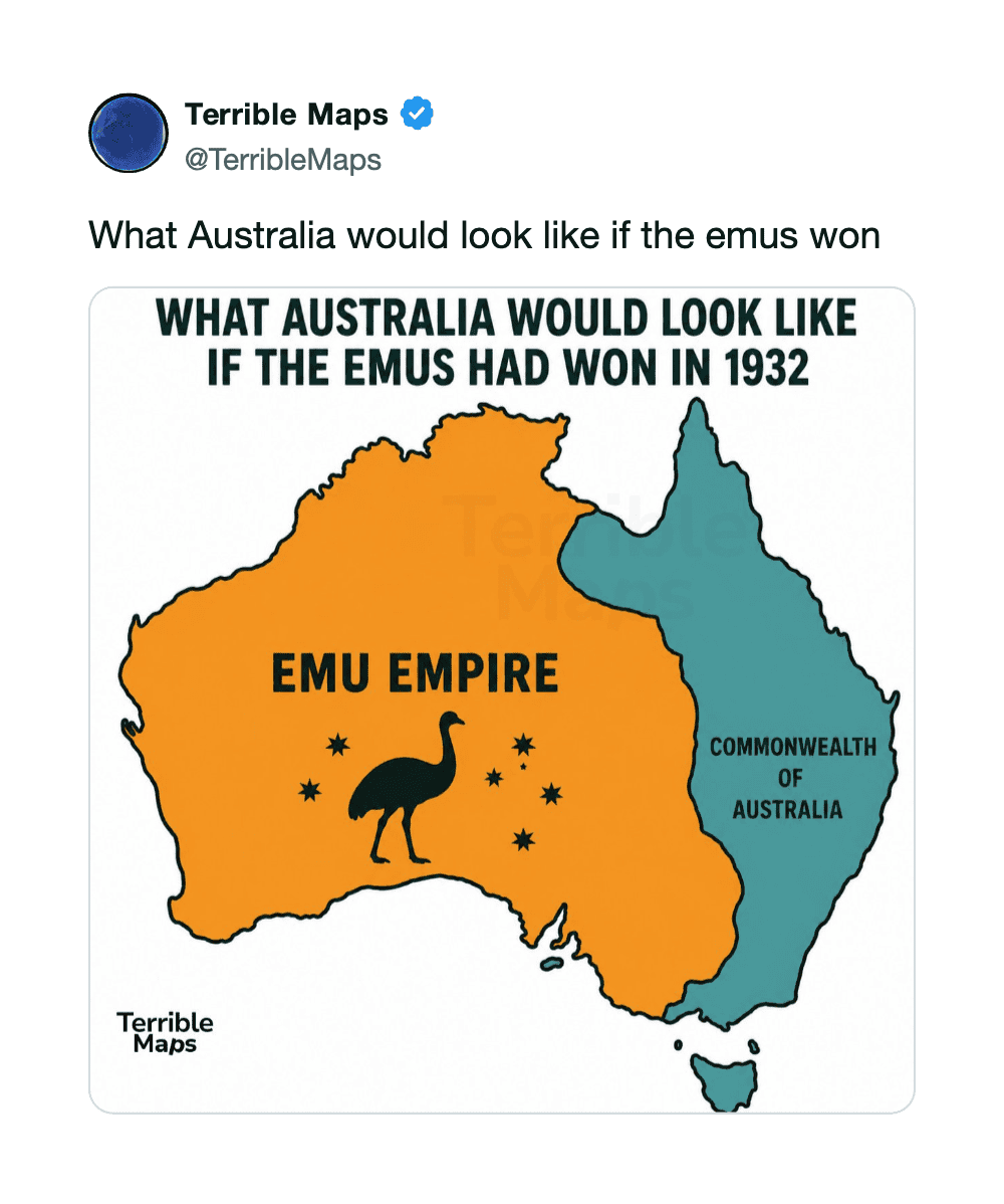
Map of Australia with EMU Empire in orange and Commonwealth of Australia in blue.
via twitter

30.

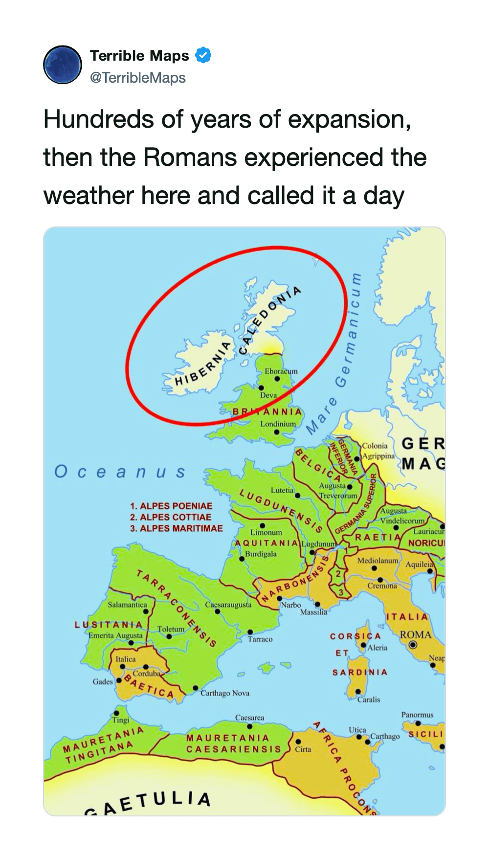
Historical map of Europe showing Roman expansion with a red circle around the area.
via twitter

31.

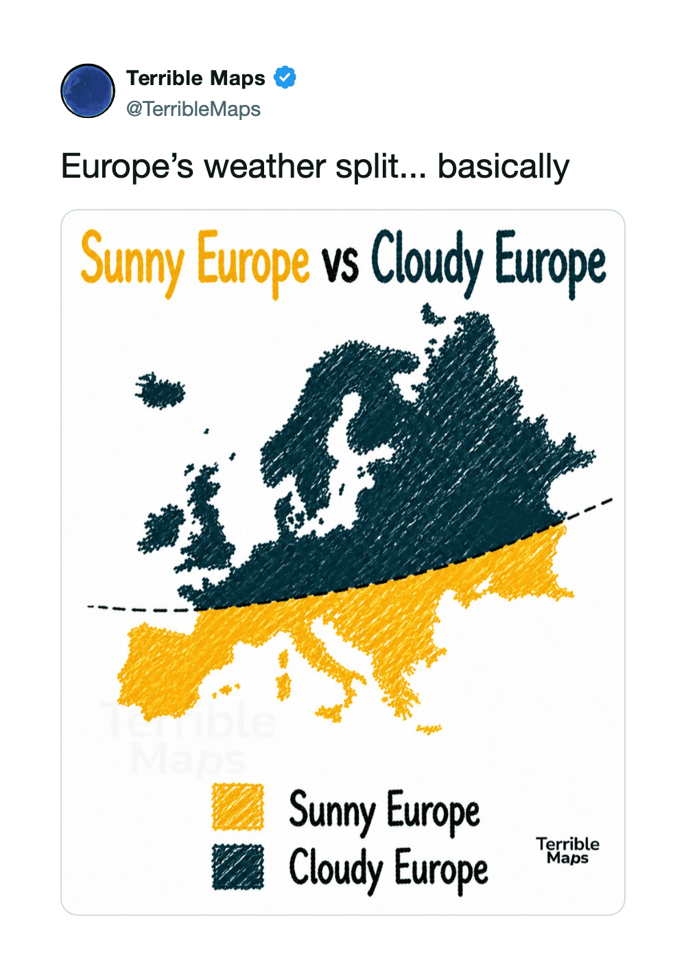
Europe's weather split: Sunny Europe vs Cloudy Europe map with yellow and dark blue regions.
via twitter

32.

via twitter

33.

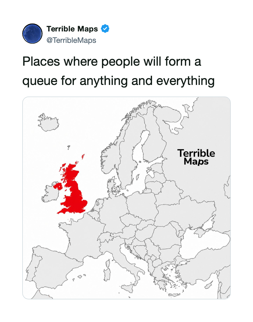
Map of Europe with the UK in red, labeled 'Terrible Maps' and caption about queues.
via twitter

34.

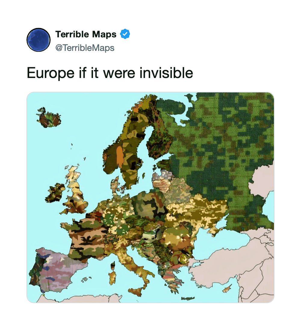
Europe map with regions in camouflage colors, captioned 'Europe if it were invisible'.
via twitter

35.

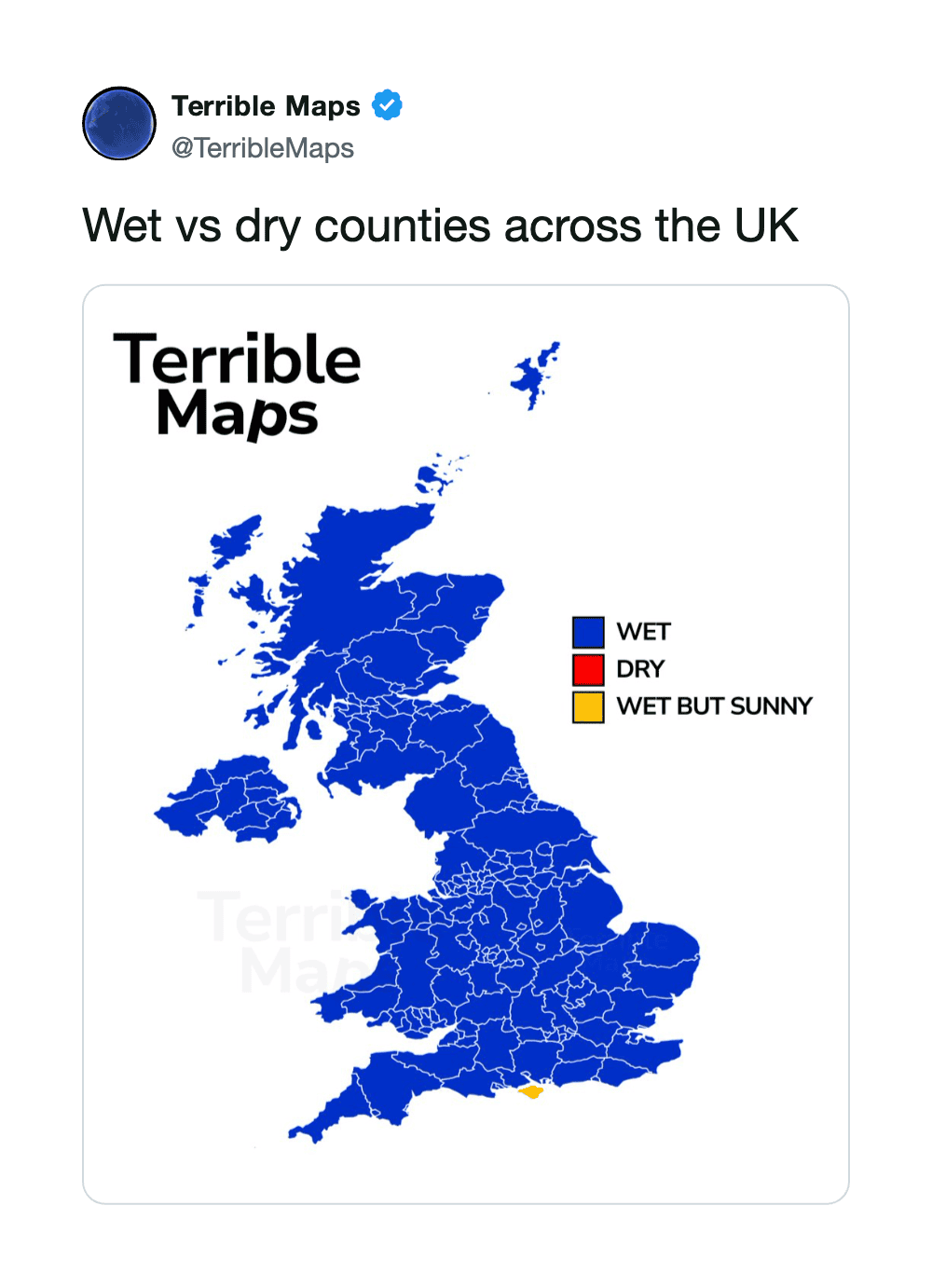
Map of the UK showing wet and dry counties, mostly in blue for wet.
via twitter