Data Is Beautiful (21 Charts & Graphs)
I think I’ve learned more by putting this post together every month than I did in all my years of public school. Not surprising, actually.
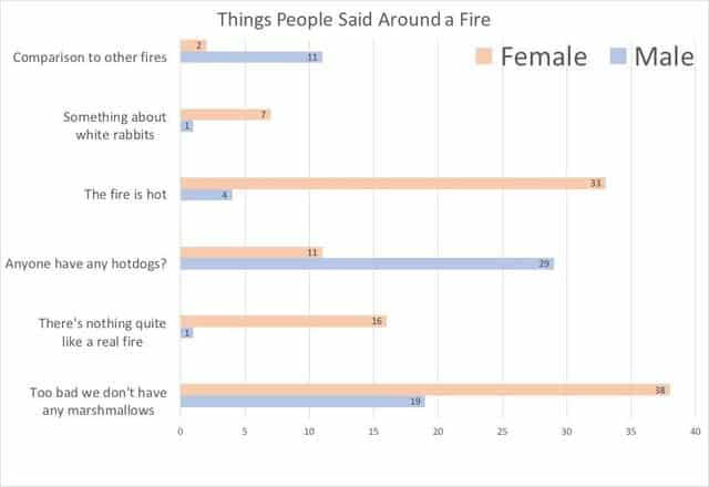
1. I sat by a fire and recorded what people said.
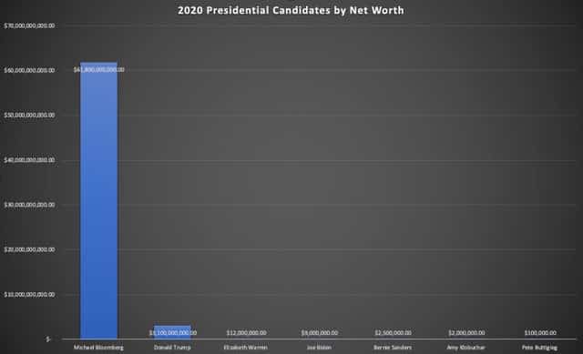
2. 2020 Presidential Candidates by Net Worth.
3. I made this blanket. It’s the daily high/low temperatures for Denver in 1992.

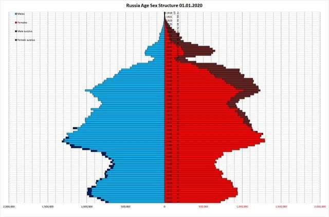
4. WW2 killed 27 million Russians. Every 25 years you see an echo of this loss of population in the form of a lower birth rate.
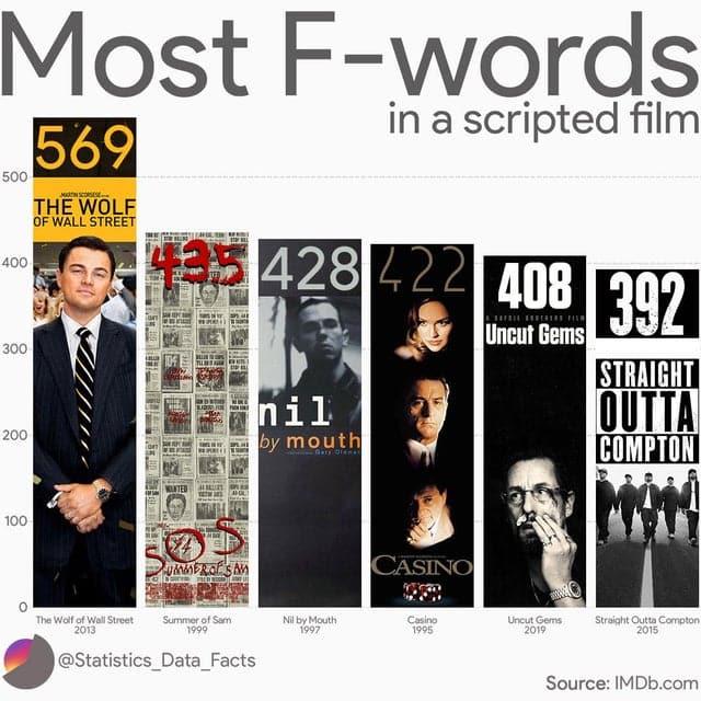
5. The most F-words in a scripted film.
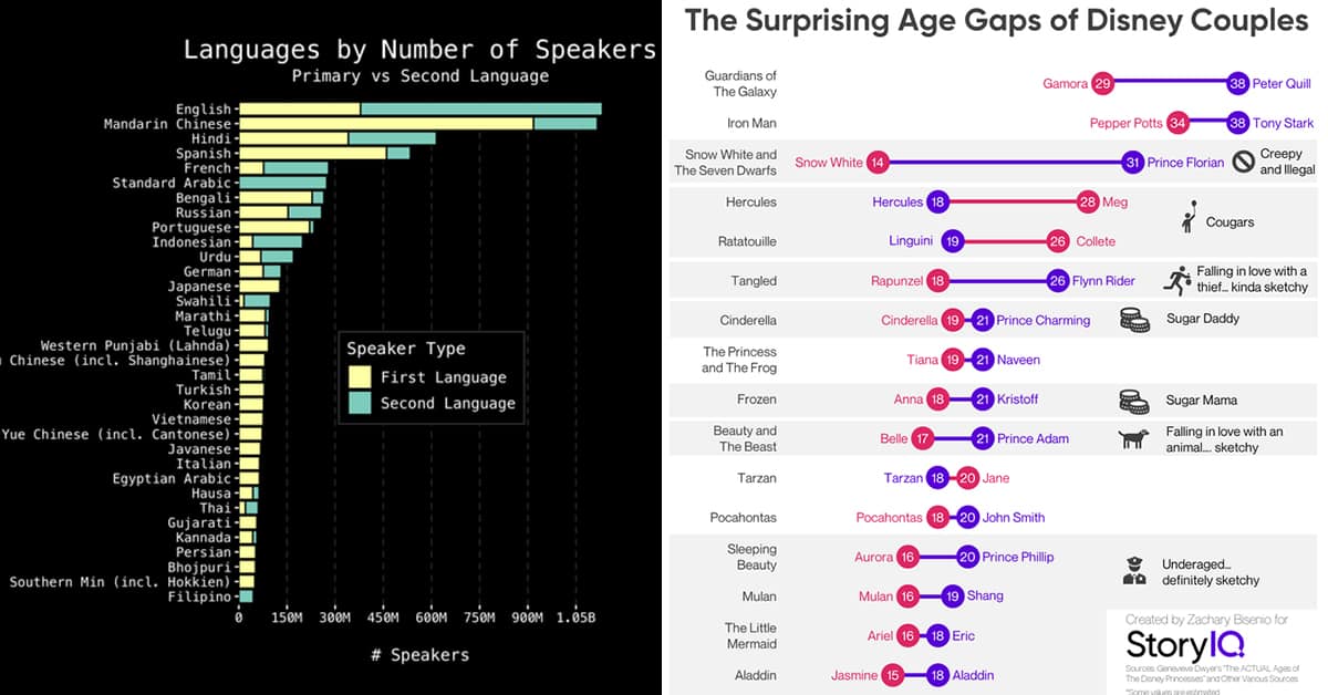
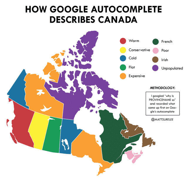
6. How Google describes Canada.
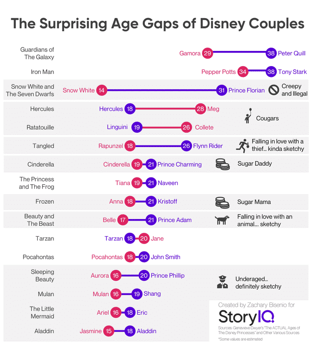
7. The Surprising Age Gaps of Disney Couples.
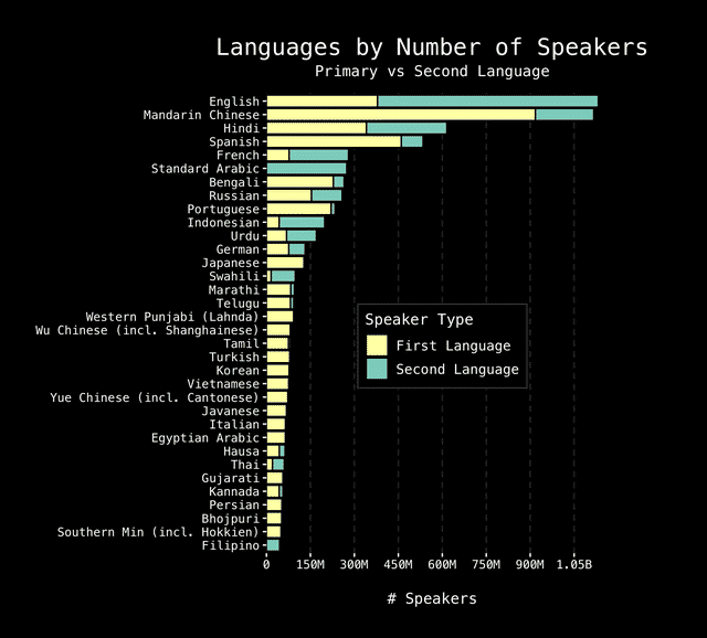
8. Languages by Speaker Count & Type.
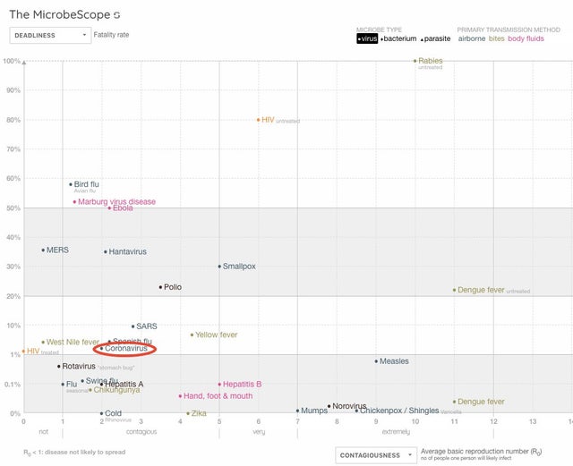
9. Coronavirus in Context – contagiousness and deadliness.
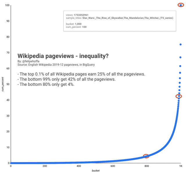
10. Wikipedia: The top 0.1% of pages earn 25% of the views, the bottom 80% only earn 4%
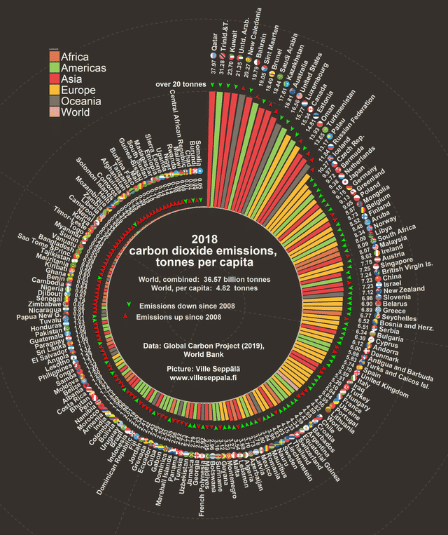
11. Per capita CO2 emissions by country.
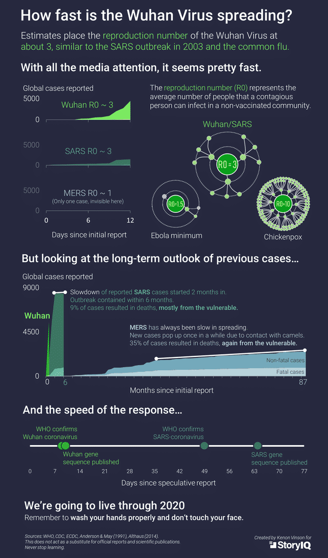
12. How fast is the Wuhan Virus spreading?
13.
[OC] Divvy Rentals in Chicago Over The Course of a Summer Day
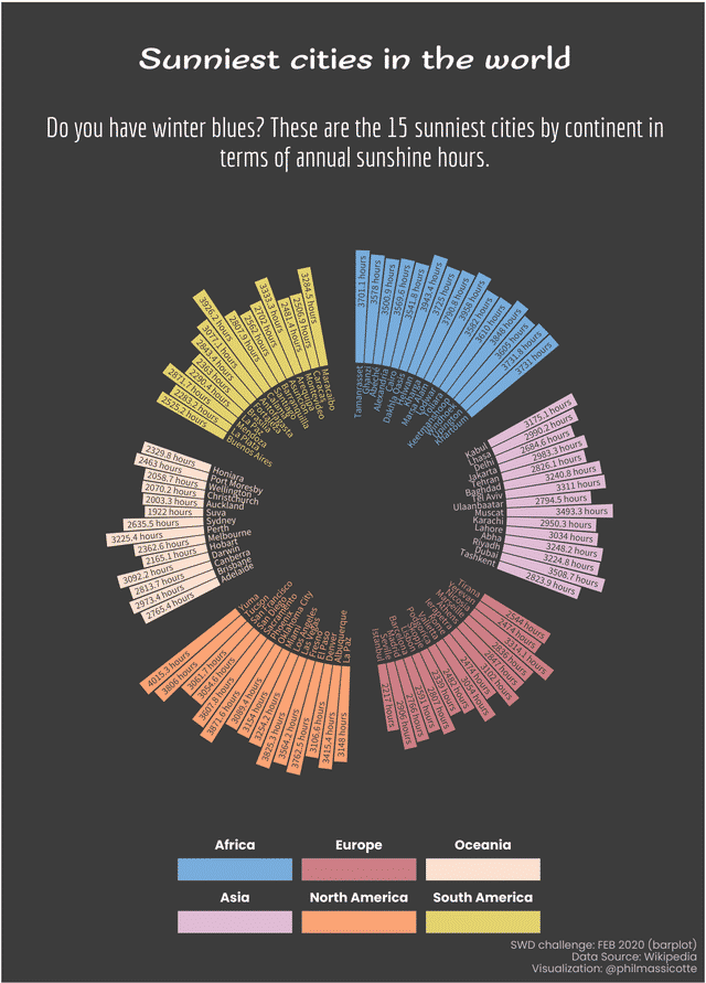
14. Sunniest cities in the world.
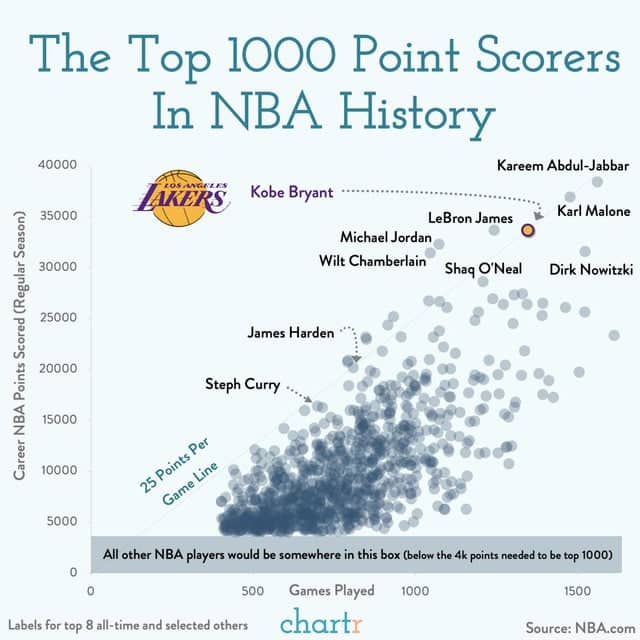
15. Kobe Relative To The Top 1000 NBA Scorers Of All-Time.
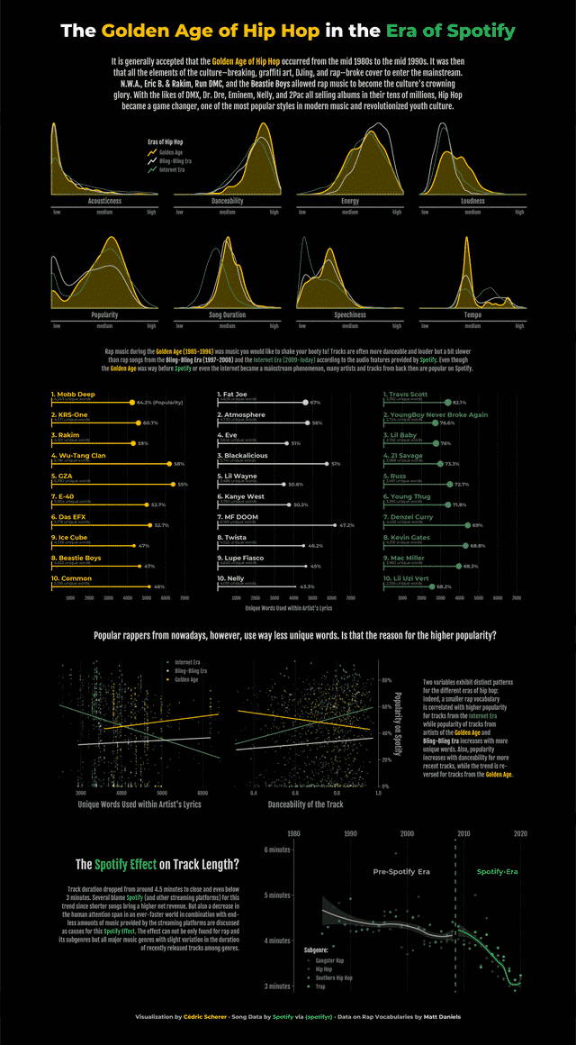
16. The Golden Age of Hip Hop in the Era of Spotify.
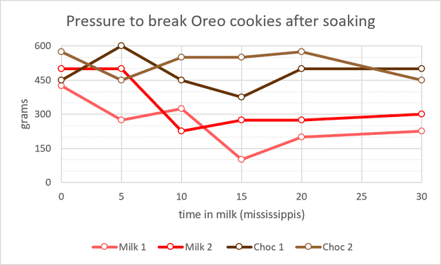
17. Oreos get soggy in milk but not chocolate milk.
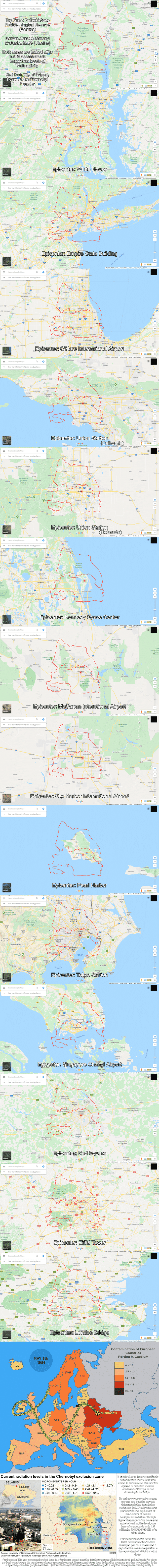
18. I was never able to mentally quantify how large the Chernobyl Exclusion Zone was, so I took the outline and overlayed it over some major cities.
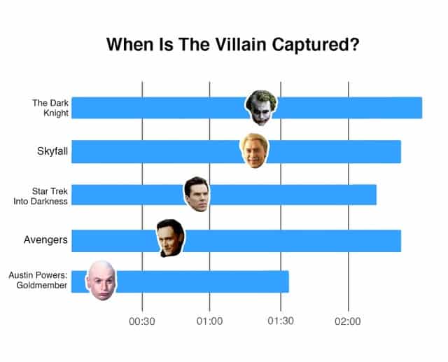
19. When is the villain captured?
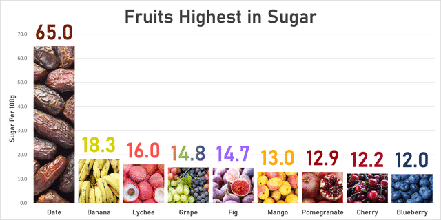
20. Fruits highest in sugar.
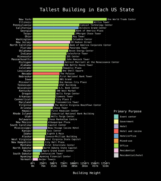
21. Tallest Building in Each US State.