Data Is Beautiful (15 Charts & Graphs)
I did my best to work in a bunch of non-COVID-19 related posts, but it’s kind of all anyone is thinking or talking about. I’m sure you’re feeling the fatigue from the bombardment of coronavirus news, so I’ll do my best to keep a good mix coming your way.
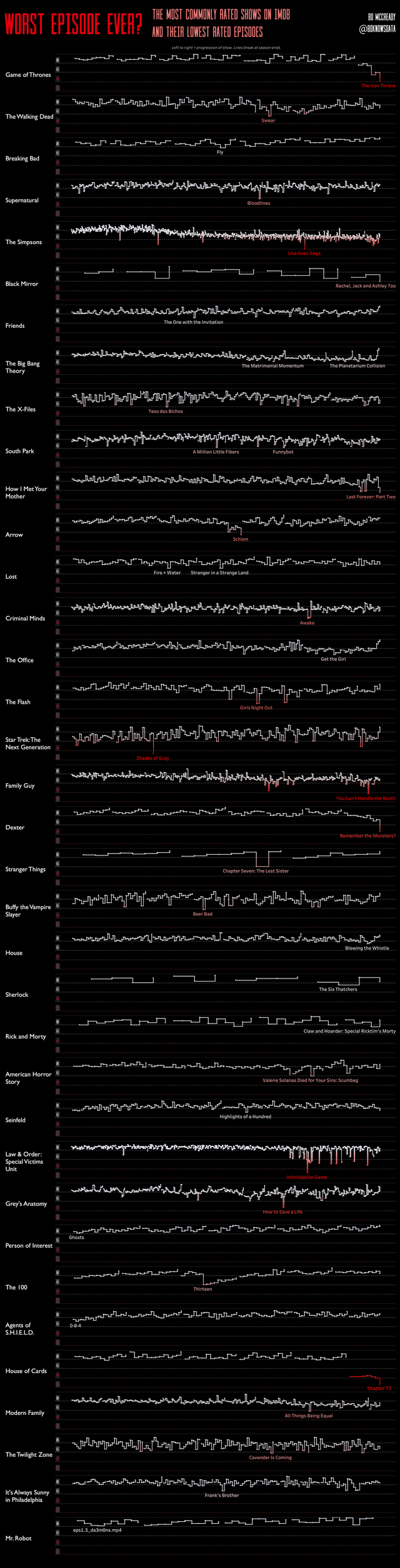
1. Worst Episode Ever? The Most Commonly Rated Shows on IMDb and Their Lowest Rated Episodes
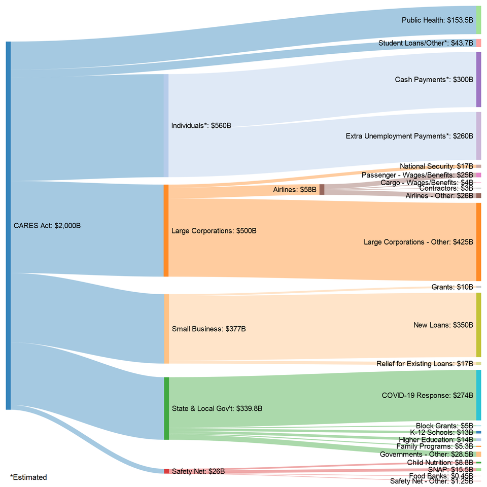
2. Where the money goes in the US Senate’s $2T coronavirus stimulus bill.
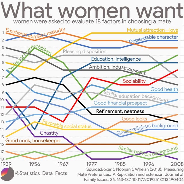
3. What women want over the years.
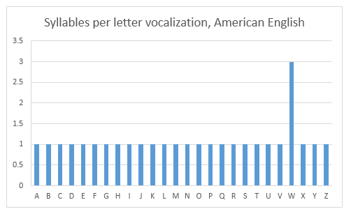
4. Syllables per letter vocalization, American English.
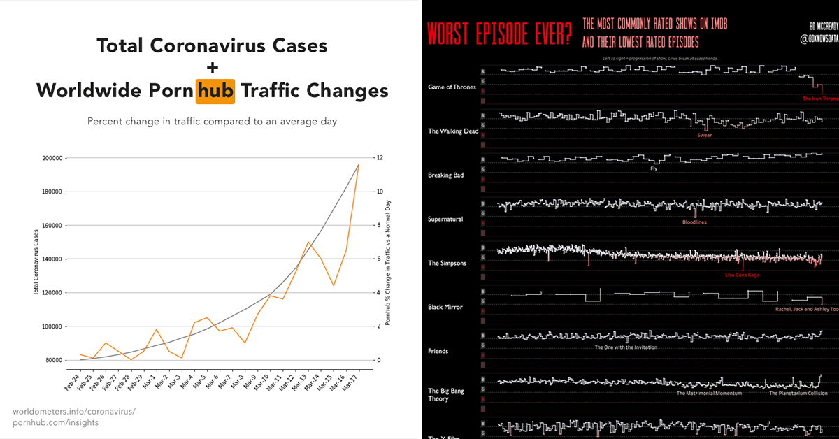
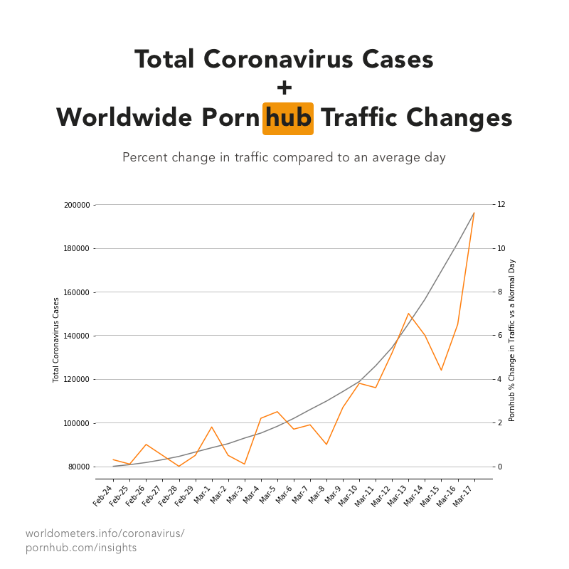
5. Total coronavirus cases and worldwide Pornhub traffic relative to normal.
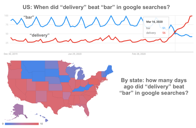
6. Where in the US are people still googling “bar” more than “delivery”?
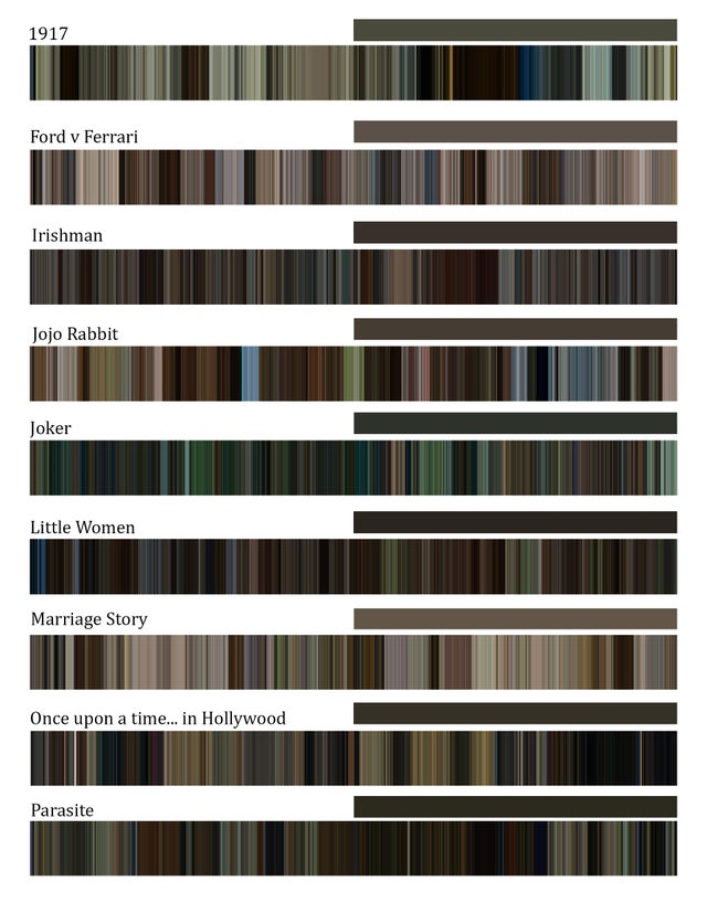
7. Timelines of the average color of frames of 2020 Academy Awards contenders.
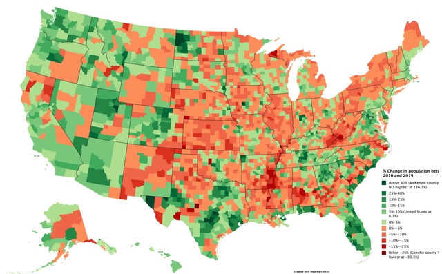
8. Change in population by county between 2010 and 2019.
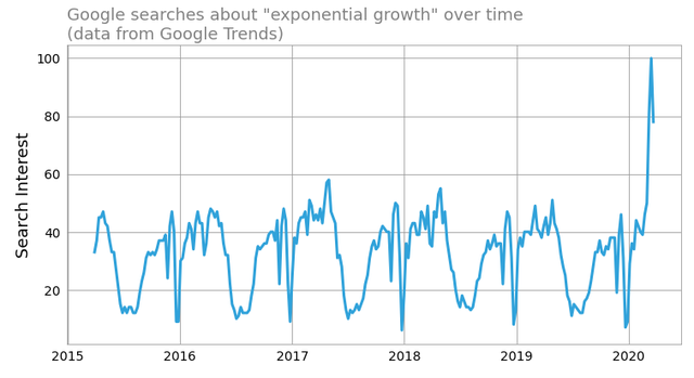
9. Google searches about” exponential growth” over time.
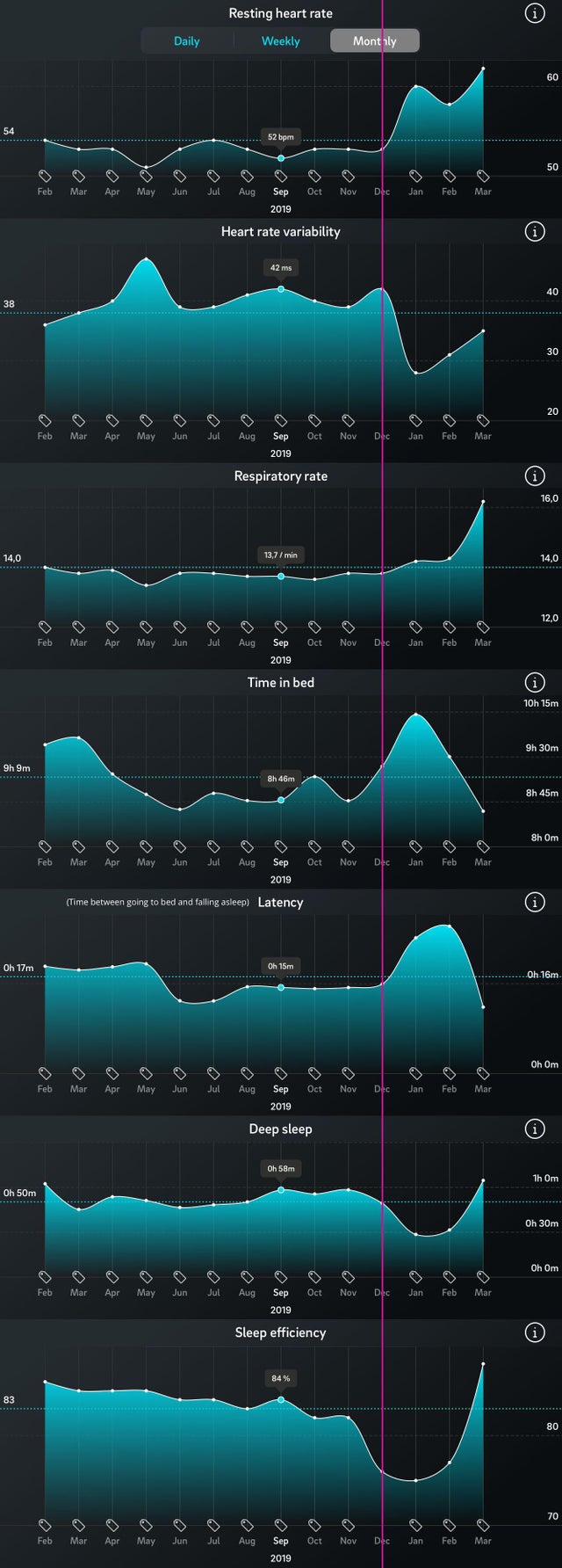
10. Effects of a bad breakup on sleep and health.
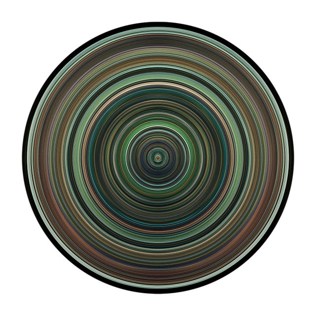
11. The sleek colors of “Joker” by Todd Phillips. One circular line = one frame, for a total of 1600 frames extracted at regular intervals from the movie. Its beginning lies in the middle of the disc and spreads outwards.
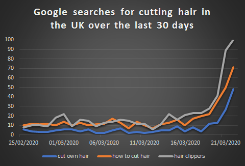
12. Google searches for how to cut hair in the UK for the last 30 days.
13.
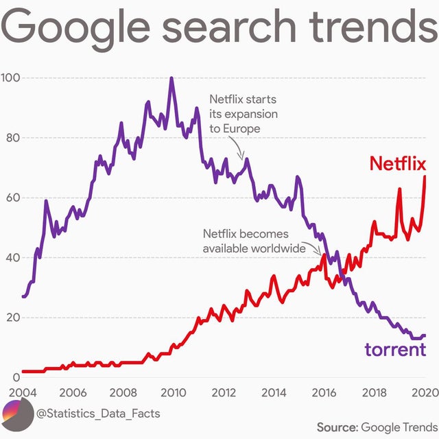
14. Google search trends: Netflix vs Torrent.
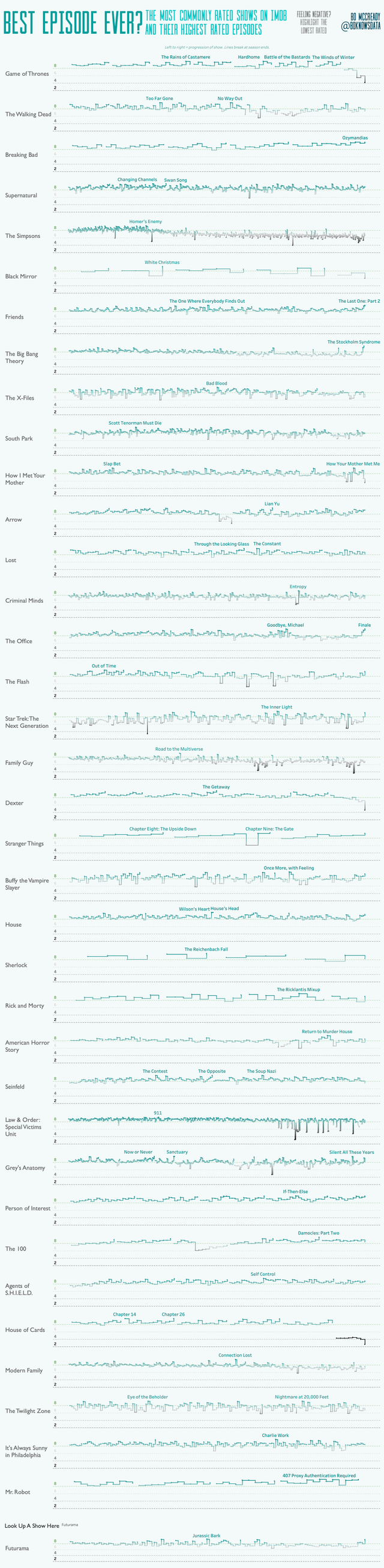
15. Best Episode Ever? The Most Commonly Rated Shows on IMDb and their HIGHEST Rated Episodes.