There’s A Map For That (15 Interesting Pics)
Now maps are apps, but it used to be a 27’x27′ piece of paper folded up in your dad’s glovebox. We’ve come a long way.
Maps are incredible now. With the ability to make them on computers mixed with the sheer amount of knowledge we’ve amassed, you can pack a lot of information into one. Here are the 15 best I found this week.
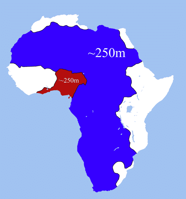
1. These two areas of Africa have roughly equal populations.
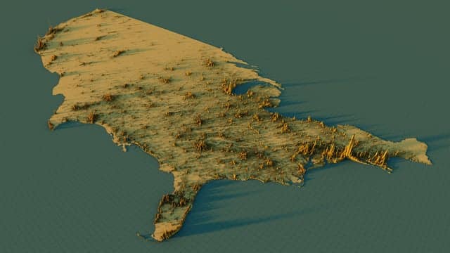
2. US (contiguous) population density map.
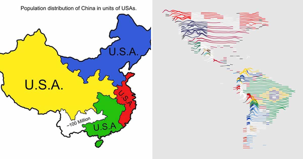
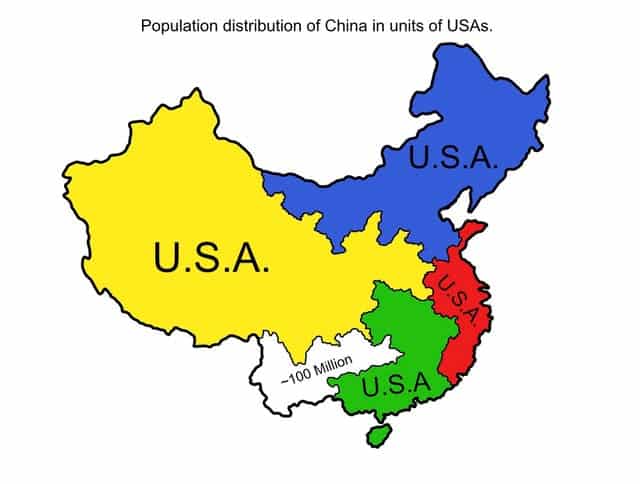
3. This Population map of China somebody requested.
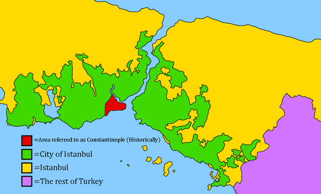
4. The difference between Constantinople, City of Istanbul, and Istanbul.
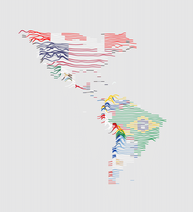
5. The elevation of the Americas in just a few lines!
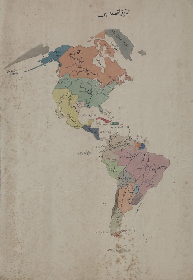
6. 19th century Ottoman map of the Americas.
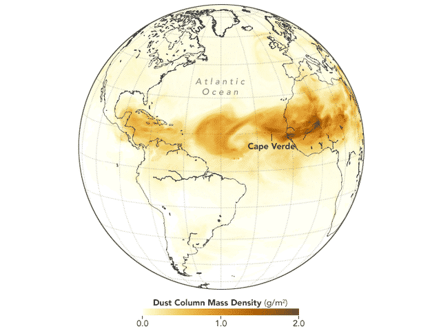
7. Sand from the Sahara and places as far as Iraq frequently reaches the Americas, reaching as far as Texas.
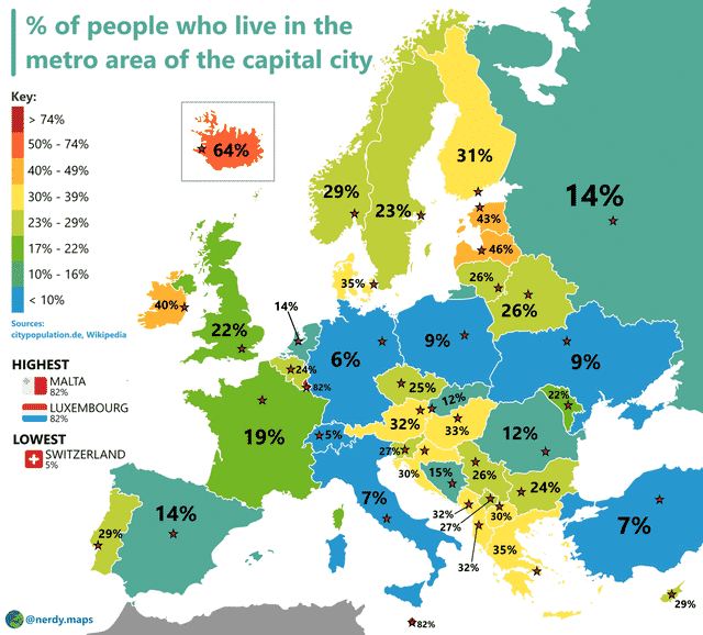
8. Percentage of people who live in the metropolitan area of the capital city.
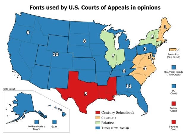
9. Fonts used by U.S. Courts of Appeals in opinions.
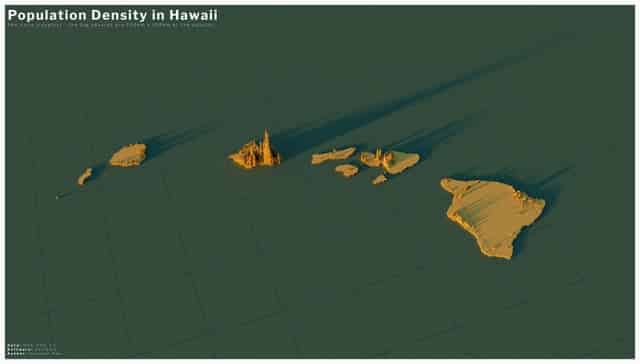
10. Population density in Hawaii.
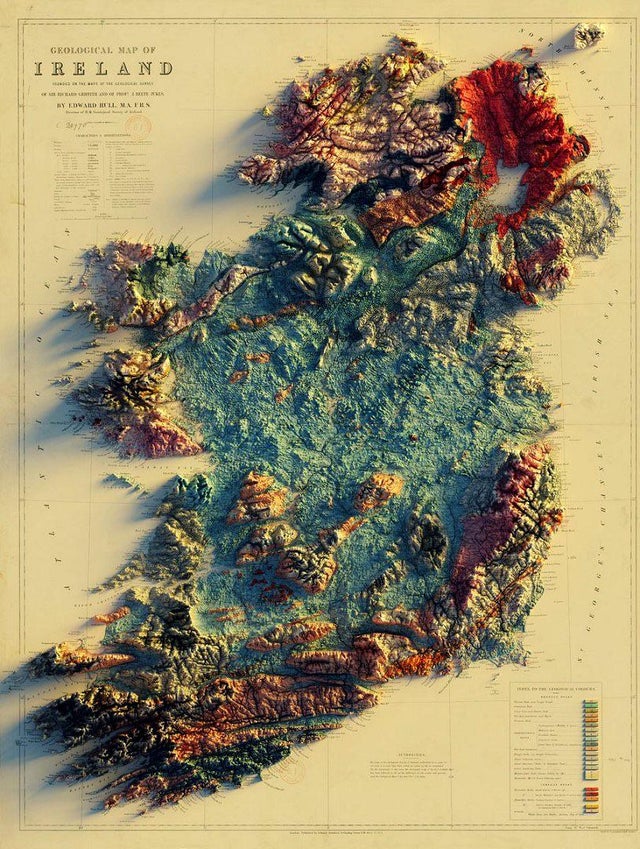
11. Geological map of Ireland by @geo_spatialist on Twitter.
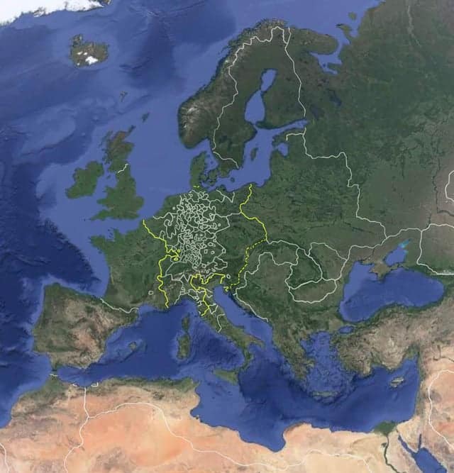
12. Google Earth in 1600.
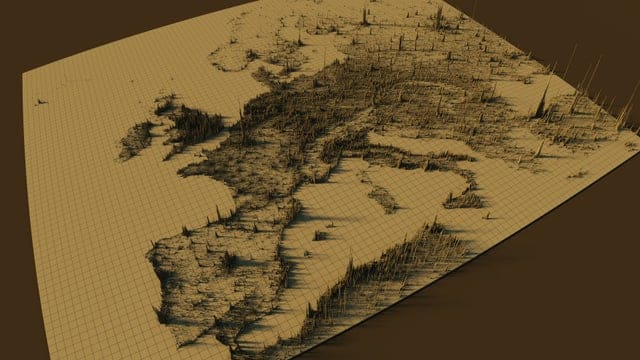
13. Population density in Europe.
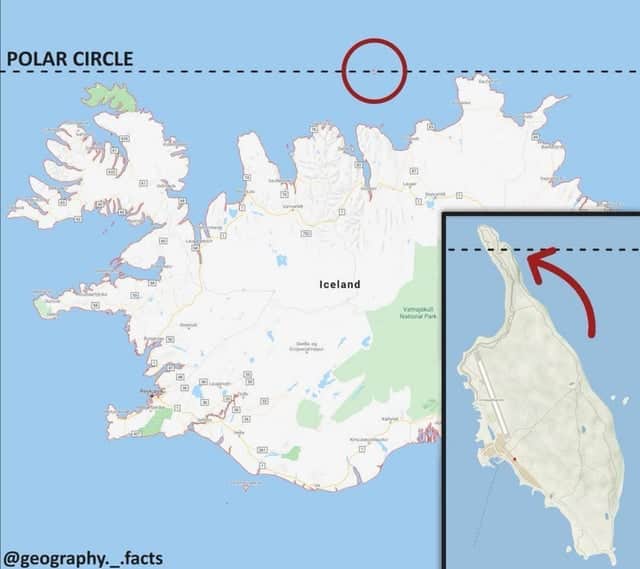
14. The Arctic Circle crosses Iceland only on a little island.
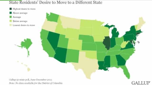
15. The U.S. mapped by residents’ desire to move to a different state.
